-
1
CSS text-orientation: параметры и особенности -
2
Поддержка браузерами CSS text-orientation -
3
Свойство writing-mode -
4
Альтернативные методы-
4.1
Word-break -
4.2
Создание вертикального текста с помощью свойства word-break -
4.3
Word-wrap/overflow-wrap -
4.4
Создание вертикального текста свойством word-wrap -
4.5
Тег br -
4.6
Обертывание в тег span -
4.7
Использование JavaScript
-
4.1
-
5
Заключение
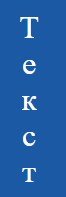
Свойство CSS text-orientation позволяет располагать текст вертикально, поворачивая строку на 90° по часовой стрелке. Чаще всего подобное используется для контента на азиатских языках, где написание осуществляется сверху вниз.
Во многом это аналогично тому, как text-comb-upright разворачивает группы символов в строке в вертикальном направлении. Но он применяется для текстовых строк целиком.
Для создания двунаправленного текста, например, блока, который содержит текст, написанный слева направо и справа налево, потребуется свойство unicode-bidi. Оно сочетается со свойством direction и позволяет переопределить способ отображения текста браузером.
- Значение по дефолту: mixed | upright;
- Применимо к: всем элементам, кроме строк и колонок таблицы;
- Наследуемость: да;
- Возможность анимации: нет.
mixed: значение по умолчанию; горизонтально расположенные символы поворачиваются на 90° по часовой стрелке, а вертикально — отображаются в их естественной первоначальной ориентации.
upright: горизонтальные символы сохраняют свое дефолтное расположение; если в этом режиме повернуть строку текста так, чтобы символы располагались боком, то это значение повернет их на 90 ° в их естественное положение (это значение заставляет свойство direction принимать значение ltr; в результате все символы обрабатываются так, как если бы они располагались в режиме письма слева направо);
sideways: весь текст в режиме вертикального письма отображается боком, как если бы он был в горизонтальном расположении; вся строка поворачивается на 90° по часовой стрелке;
sideways-right: некоторые браузеры воспринимают это значение как синоним sideways, используемый для обратной совместимости.
Свойство use-glyph-orientation было удалено в декабре 2015 года. Оно использовалось в элементах SVG для определения свойств glyph-orientation-vertical и glyph-orientation-horizontal, которые на сегодняшний день являются устаревшими. Аналогом ориентации текста в SVG теперь является glyph-orientation-vertical.
<div class="text">Текст</div>
.text {
     writing-mode: vertical-lr;
     text-orientation: upright;
}
Поддержка браузерами CSS text-orientation
Ориентация текста в CSS3 является относительно новой возможностью и может претерпеть синтаксические изменения и в будущем. Она поддерживается всеми основными браузерами, кроме Internet Explorer. Для достижения полной кроссбраузерности можно прибегнуть к некоторым альтернативным вариантам.
Прежде чем использовать CSS свойство text-orientation, необходимо сначала изучить понятия блочного потока и направления встроенного потока.
Свойство writing-mode
Оно определяет, имеют ли строки текста горизонтальную или вертикальную ориентацию, и может принимать три значения:
- horizontal-tb;
- vertical-lr;
- vertical-rl.
Использование writing-mode предусматривает наличие двух ключевых понятий:
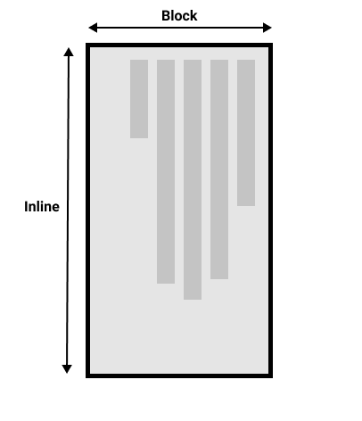
- Block Flow Direction: указывает направление, в котором текстовые блоки располагаются внутри своего родителя (сверху вниз, слева направо или справа налево;
- Inline Flow Direction: определяет направление символов внутри строки текста и место начала новой строки (может быть как горизонтальным, так и вертикальным).
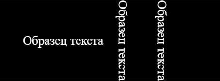
Чтобы добиться вертикальной ориентации текста, достаточно установите для свойства writing-mode значение vertical-lr (или vertical-rl), а для text-orientation — upright.
<div class="block">
     <p class="horizontal-tb">Образец текста</p>
     <p class="vertical-rl">Образец текста</p>
     <p class="vertical-lr">Образец текста</p>
</div>
.block {
     display: flex;
     justify-content: center;
     align-items: center;
     text-align: center;
     margin: auto;
     font-size: 2rem;
     color: #fff;
     background: #000;
}

.horizontal-tb {
     writing-mode: horizontal-tb;
}

.vertical-rl {
     writing-mode: vertical-rl;
}

.vertical-lr {
     writing-mode: vertical-lr;
}
Альтернативные методы
Word-break
Определяет, как происходит разрыв строки, когда текст достигает ее конца и переполняет родительский контейнер.
- normal: значение по умолчанию (перенос строки возможен только при явном его указании, например при помощи тега <br>;
- break-all: во избежание переполнения родителя последнее слово разбивается с переносом на новую строку (не применимо к текстам на китайском, японском и корейском языках);
- keep-all: действует как normal, но для китайского, японского и корейского языков слова не переносятся;
- break-word: во избежание переполнения блока остающиеся целыми слова разбиваются произвольно при отсутствии более подходящего места для переноса строки.
В отличие от text-orientation, свойство word-break поддерживается всеми браузерами, включая все версии Internet Explorer.
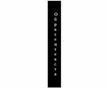
Создание вертикального текста с помощью свойства word-break
Для этого потребуется уменьшить ширину контейнера до 0 пикселей. Это приведет к тому, что все слова будут разбиты на буквы и выстроятся вертикально. В этом случае следует также установить свойство white-space для предварительного переноса. Это позволит обеспечить наличие пробелов, чтобы можно было различать слова.
<div class="block"> <p>Образец текста</p> </div>
.block {
     margin: auto;
     color: #fff;
     background: #000;
     width: 0;
     padding: 0 10px;
     word-break: break-all;
}
Word-wrap/overflow-wrap
Позволяет разбивать длинные слова и переносить их на следующую строку и имеет полную поддержку браузерами. В отличие от word-wrap, альтернативное свойство overflow-wrap пока только частично воспринимается IE.
- normal: перенос строк осуществляется при явном указании, например с помощью тега <br>;
- break-word: позволяет автоматически разрывать слова для переноса в произвольной точке;
- initial: устанавливает значение по умолчанию;
- inherit: передает значение свойства от родительского элемента дочернему.
Создание вертикального текста свойством word-wrap
Этот вариант позволяет использовать аналогичный подход, что и в случае с применением word-break. Достаточно уменьшить ширину контейнера до 0 пикселей и заставить каждое слово разбиваться на отдельные буквы, которые выстраиваются вертикально. Также потребуется применить свойство white-space для предварительного переноса, чтобы обеспечить наличие пробелов. Это позволит нормально различать слова.
Тег br
Самый примитивный метод достижения вертикальной ориентации текста — использование тегов <br>. Однако этот метод не очень практичен, и его не следует использовать, если строка текста слишком длинная.
Обертывание в тег span
Еще один популярный метод — обернуть каждую букву текста в тег span и с помощью CSS назначить им display: block. Как и использование тега <br>, этот способ не очень удобен для больших текстовых строк.
Использование JavaScript
Вместо двух предыдущих методов лучше использовать JavaScript для динамического добавления оболочки из тегов вокруг каждой буквы вместо того, чтобы делать это вручную. В этом случае текст разбивается на массив, и каждый его элемент оборачивается тегом span.
Заключение
Создание вертикально текста всегда было проблемой в CSS с незапамятных времен. Ни один из возможных способов не мог гарантировать безупречный результат. Однако введение нового свойства text-orientation в CSS3 полностью решило эту проблему. Несмотря на это, не следует забывать о резервных вариантах для Internet Explorer, чтобы обеспечить максимальную кроссбраузерность.

Изменение направления текста
- Назад
- Обзор: Building blocks
- Далее
Многие свойства и значения, с которыми мы столкнулись до сих пор при изучении CSS, были привязаны к физическим размерам нашего экрана. Мы создаём границы, например, сверху, справа, снизу и слева от коробки.Эти физические размеры очень точно соответствуют контенту, который просматривается по горизонтали, и по умолчанию Интернет имеет тенденцию поддерживать языки с письмом слева направо (например, английский или французский) лучше, чем языки с письмом справа налево (например, арабский).
Однако в последние годы CSS развивался чтобы лучше поддерживать разную направленность контента, включая контент с направлением справа налево, а также контент сверху вниз (например, в японском языке) — эти разные направления называются режимами письма. По мере того, как вы продвигаетесь в обучении и начинаете работать с макетом, понимание режимов письма будет вам очень полезно, поэтому мы сейчас и познакомимся с ними.
| Prerequisites: | Basic computer literacy, basic software installed, basic knowledge of working with files, HTML basics (study Introduction to HTML), and an idea of how CSS works (study CSS first steps.) |
|---|---|
| Цель: | Понять важность режимов письма для современного CSS. |
Какие бывают режимы письма?
Режим письма в CSS определяет, идёт ли текст по горизонтали или по вертикали. Свойство writing-mode позволяет нам переключаться из одного режима письма в другой. Для этого вам не обязательно работать на языке, который использует режим вертикального письма — вы также можете изменить режим письма частей вашего макета для творческих целей.
В приведённом ниже примере заголовок отображается с использованием writing-mode: vertical-rl. Теперь текст идёт вертикально. Вертикальный текст часто используется в графическом дизайне и может быть способом добавить более интересный вид вашему веб-дизайну.
Три возможных значения свойства writing-mode:
horizontal-tb: Направление потока блока сверху вниз. Предложения идут горизонтально.vertical-rl: Направление потока блоков справа налево. Предложения идут вертикально.vertical-lr: Направление потока блока слева направо. Предложения идут вертикально.
Таким образом, свойство writing-mode на самом деле устанавливает направление, в котором элементы уровня блока отображаются на странице — сверху вниз, справа налево или слева направо. Это затем определяет направление движения текста в предложениях.
Writing modes and block and inline layout
We have already discussed block and inline layout, and the fact that some things display as block elements and others as inline elements. As we have seen described above, block and inline is tied to the writing mode of the document, and not the physical screen. Blocks are only displayed from the top to the bottom of the page if you are using a writing mode that displays text horizontally, such as English.
If we look at an example this will become clearer. In this next example I have two boxes that contain a heading and a paragraph. The first uses writing-mode: horizontal-tb, a writing mode that is written horizontally and from the top of the page to the bottom. The second uses writing-mode: vertical-rl; this is a writing mode that is written vertically and from right to left.
When we switch the writing mode, we are changing which direction is block and which is inline. In a horizontal-tb writing mode the block direction runs from top to bottom; in a vertical-rl writing mode the block direction runs right-to-left horizontally. So the block dimension is always the direction blocks are displayed on the page in the writing mode in use. The inline dimension is always the direction a sentence flows.
This figure shows the two dimensions when in a horizontal writing mode.
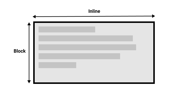
This figure shows the two dimensions in a vertical writing mode.
Once you start to look at CSS layout, and in particular the newer layout methods, this idea of block and inline becomes very important. We will revisit it later on.
Direction
In addition to writing mode we also have text direction. As mentioned above, some languages such as Arabic are written horizontally, but right-to-left. This is not something you are likely to use in a creative sense — if you simply want to line something up on the right there are other ways to do so — however it is important to understand this as part of the nature of CSS. The web is not just for languages that are displayed left-to-right!
Due to the fact that writing mode and direction of text can change, newer CSS layout methods do not refer to left and right, and top and bottom. Instead they will talk about start and end along with this idea of inline and block. Don’t worry too much about that right now, but keep these ideas in mind as you start to look at layout; you will find it really helpful in your understanding of CSS.
Logical properties and values
The reason to talk about writing modes and direction at this point in your learning however, is because of the fact we have already looked at a lot of properties which are tied to the physical dimensions of the screen, and make most sense when in a horizontal writing mode.
Let’s take a look at our two boxes again — one with a horizontal-tb writing mode and one with vertical-rl. I have given both of these boxes a width. You can see that when the box is in the vertical writing mode, it still has a width, and this is causing the text to overflow.
What we really want in this scenario, is to essentially swap height and width along with the writing mode. When we’re in a vertical writing mode we want the box to expand in the block dimension just like it does in the horizontal mode.
To make this easier, CSS has recently developed a set of mapped properties. These essentially replace physical properties — things like width and height — with logical, or flow relative versions.
The property mapped to width when in a horizontal writing mode is called inline-size — it refers to the size in the inline dimension. The property for height is named block-size and is the size in the block dimension. You can see how this works in the example below where we have replaced width with inline-size.
Logical margin, border, and padding properties
In the last two lessons we have learned about the CSS box model, and CSS borders. In the margin, border, and padding properties you will find many instances of physical properties, for example margin-top, padding-left, and border-bottom. In the same way that we have mappings for width and height there are mappings for these properties.
The margin-top property is mapped to margin-block-start (en-US) — this will always refer to the margin at the start of the block dimension.
The padding-left property maps to padding-inline-start (en-US), the padding that is applied to the start of the inline direction. This will be where sentences start in that writing mode. The border-bottom property maps to border-block-end (en-US), which is the border at the end of the block dimension.
You can see a comparison between physical and logical properties below.
If you change the writing mode of the boxes by switching the writing-mode property on .box to vertical-rl, you will see how the physical properties stay tied to their physical direction, whereas the logical properties switch with the writing mode.
You can also see that the <h2> (en-US) has a black border-bottom. Can you work out how to make that bottom border always go below the text in both writing modes?
There are a huge number of properties when you consider all of the individual border longhands, and you can see all of the mapped properties on the MDN page for Logical Properties and Values (en-US).
Logical values
We have so far looked at logical property names. There are also some properties that take physical values of top, right, bottom, and left. These values also have mappings, to logical values — block-start, inline-end, block-end, and inline-start.
For example, you can float an image left to cause text to wrap round the image. You could replace left with inline-start as shown in the example below.
Change the writing mode on this example to vertical-rl to see what happens to the image. Change inline-start to inline-end to change the float.
Here we are also using logical margin values to ensure the margin is in the correct place no matter what the writing mode is.
Should you use physical or logical properties?
The logical properties and values are newer than their physical equivalents, and therefore have only recently been implemented in browsers. You can check any property page on MDN to see how far back the browser support goes. If you are not using multiple writing modes then for now you might prefer to use the physical versions. However, ultimately we expect that people will transition to the logical versions for most things, as they make a lot of sense once you start also dealing with layout methods such as flexbox and grid.
Summary
The concepts explained in this lesson are becoming increasingly important in CSS. An understanding of the block and inline direction — and how text flow changes with a change in writing mode — will be very useful going forward. It will help you in understanding CSS even if you never use a writing mode other than a horizontal one.
In the next module we will take a good look at overflow in CSS.
- Назад
- Обзор: Building blocks
- Далее
In this module
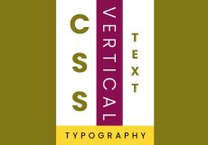
Какие в принципе существуют варианты, чтобы расположить текст вертикально на чистом CSS. Я, как минимум знаю два варианта, оба мы сейчас и рассмотрим.
HTML разметка
HTML разметка универсальна и подходит для любого варианта.
<section>

  <div class="container">

    <div class="box">

      <h2>CSS</h2>

      <h3>Vertical</h3>

      <h4>Text</h4>

    </div>

    <h5>Typography</h5>

  </div>

</section>
CSS свойство writing-mode (способ первый)
Поставим текст в центре экрана и поместим его в контейнер.
@import url('https://fonts.googleapis.com/css2?family=Poppins:wght@200;300;400;500;600;700;800;900&display=swap');

*{

    margin: 0;

    padding: 0;

    box-sizing: border-box;

    font-family: 'Poppins', sans-serif;

}

section{

    display: flex; / * подключение flexbox * /

    justify-content: center; / * горизонтальное центрирование * /

    align-items: center; / * вертикальное центрирование * /

    min-height: 100vh; / * на всю высоту экрана * /

    background: #827717; / * цвет фона * /

}

.container{

    text-align: center; / * центрирование содержимого контейнера * /

    background: #FDD835;

}
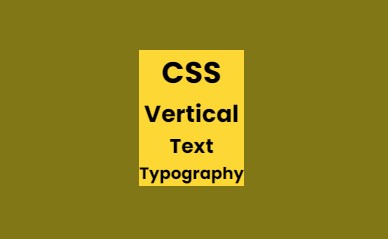
Подготовим бокс с белым фоном для вертикального текста.
.box{

    display: flex;

    justify-content: center;

    align-items: center;

    background: #fff;

    padding: 0 20px; / * поля для текста * /

}
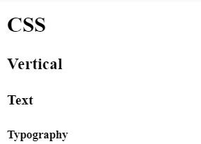
Свойство writing-mode задает направление текста. Свойство text-orientation определяет ориентацию символов в строке. Оба свойства поддерживаются всеми современными браузерами, за исключением IE, который уже и сам не поддерживается Microsoft-ом.
h2{

    font-size: 5em; / * размер текста * /

    line-height: 1.2em; / * выравнивание текста * /

    font-weight: 700; / * жирность текста * /

    color: #827717; / * цвет текста * /

    writing-mode: vertical-lr; / * текст установлен слева направо * /

    text-orientation: upright; / * символы стоят друг под другом * /

}

h3{

    font-size: 3.2em;

    text-transform: uppercase; / * заглавные буквы * /

    padding-top: 20px; / * отступ сверху * /

    background: #880E4F; / * цвет фона * /

    font-weight: 300;

    letter-spacing: 0.3em; / * расстояние между буквами * /

    color: #fff;

    writing-mode: vertical-rl; / * ориентация символов * /

}

h4{

    font-size: 2.2em;

    line-height: 2em;

    color: #827717;

    text-transform: uppercase;

    writing-mode: vertical-lr;

    text-orientation: upright; / * текст установлен слева направо * /

}

.container h5{

    margin: 10px 0;

    font-weight: 500;

    color: #000000;

    text-transform: uppercase;

    letter-spacing: 0.35em;

    font-size: 1.5em;

    padding-left: 10px;

}
CSS-свойство transform (способ второй)
Свойство transform: rotate(90deg) просто поворачивает текст на 90 градусов без изменения ориентации символов. Первый способ конечно намного гибче второго.
Посмотрите пример на CodePen
Желательно всем людям, независимо от их профессии уметь программировать на Python. Переходите по ссылке и вы узнаете почему я так думаю, видеокурс «Программирование на Python с Нуля до Гуру»
-

Создано 25.08.2021 10:25:30
-
Михаил Русаков

Копирование материалов разрешается только с указанием автора (Михаил Русаков) и индексируемой прямой ссылкой на сайт (http://myrusakov.ru)!
Добавляйтесь ко мне в друзья ВКонтакте: http://vk.com/myrusakov.
Если Вы хотите дать оценку мне и моей работе, то напишите её в моей группе: http://vk.com/rusakovmy.
Если Вы не хотите пропустить новые материалы на сайте,
то Вы можете подписаться на обновления: Подписаться на обновления
Если у Вас остались какие-либо вопросы, либо у Вас есть желание высказаться по поводу этой статьи, то Вы можете оставить свой комментарий внизу страницы.
Если Вам понравился сайт, то разместите ссылку на него (у себя на сайте, на форуме, в контакте):
-
Кнопка:
Она выглядит вот так:
-
Текстовая ссылка:
Она выглядит вот так: Как создать свой сайт
- BB-код ссылки для форумов (например, можете поставить её в подписи):

I was searching for an actual vertical text and not the rotated text in HTML as shown below. So I could achieve it by using the following method.

HTML:-
<p class="vericaltext">
Hi This is Vertical Text!
</p>
CSS:-
.vericaltext{
 writing-mode: vertical-lr;
 text-orientation: upright;
}
JSFiddle DEMO
======================= OLD Answer ==========================
HTML:-
<p class="vericaltext">
Hi This is Vertical Text!
</p>
CSS:-
.vericaltext{
    width:1px;
    word-wrap: break-word;
    font-family: monospace; /* this is just for good looks */
}
JSFiddle! Demo.
Update:- If you need the whitespaces to be displayed, then add the following property to your css.
white-space: pre;
So, the css class shall be
.vericaltext{
    width:1px;
    word-wrap: break-word;
    font-family: monospace; /* this is just for good looks */
    white-space: pre;/* this is for displaying whitespaces */
}
JSFiddle! Demo With Whitespace
Update 2 (28-JUN-2015)
Since white-space: pre; doesnt seem to work (for this specific use) on Firefox(as of now), just change that line to
white-space: pre-wrap;
So, the css class shall be
.vericaltext{
    width:1px;
    word-wrap: break-word;
    font-family: monospace; /* this is just for good looks */
    white-space:pre-wrap; /* this is for displaying whitespaces including Moz-FF.*/
}
JsFiddle Demo FF Compatible.
Текст сверху вниз с поворотом символов по часовой стрелке
Пример
<style>
div {
  min-inline-size: 10em;
  border: 1px solid red;
  text-align: center;
  writing-mode: vertical-lr;
}
</style>

<div>Пример</div>
Образец применения: описание слева от картинки.
Текст снизу вверх с поворотом символов против часовой стрелке
Пример
<style>
div {
  min-inline-size: 10em;
  border: 1px solid red;
  text-align: center;

  writing-mode: vertical-rl;
  transform: scale(-1);
}
</style>

<div>Пример</div>
Вертикальные заголовки HTML-таблицы
| Показатель | Январь | Февраль | Март | Апрель | Май | Июнь | Июль | Август | Сентябрь | Октябрь | Ноябрь | Декабрь | Год |
|---|---|---|---|---|---|---|---|---|---|---|---|---|---|
| Абсолютный максимум, °C | 5,2 | 6,8 | 16,5 | 31,1 | 32,6 | 39,5 | 43,9 | 40,4 | 34,0 | 26,0 | 14,7 | 8,2 | 43,9 |
| Средняя температура, °C | −9,9 | −9,6 | −3,4 | 7,0 | 16,9 | 19,7 | 23,5 | 19,4 | 13,4 | 6,0 | −2,4 | −8,2 | 5,7 |
| Абсолютный минимум, °C | −43 | −36,9 | −31,4 | −20,9 | −4,9 | −0,4 | 8,1 | 3,5 | −3,4 | −15,7 | −28,1 | −41,3 | −43,3 |
<style>
table {
  border-collapse: collapse;
}
table td,
table th {
  padding: 0 .3em;
  border: 1px solid #999;
}
table tbody th {
  text-align: left;
}
table thead th:not(:first-child):not(:last-child) {
  vertical-align: bottom;
  line-height: normal;
}
table thead b {
  writing-mode: vertical-rl;
  transform: scale(-1);
}
</style>

<table>
  <caption>Климат Самары</caption>
  <thead>
    <tr>
       <th>Показатель
       <th><b>Январь</b>
       <th><b>Февраль</b>
       <th><b>Март</b>
▶ Посмотреть весь код       <th><b>Апрель</b>
       <th><b>Май</b>
       <th><b>Июнь</b>
       <th><b>Июль</b>
       <th><b>Август</b>
       <th><b>Сентябрь</b>
       <th><b>Октябрь</b>
       <th><b>Ноябрь</b>
       <th><b>Декабрь</b>
       <th>Год
  <tbody>
    <tr>
       <th>Абсолютный максимум, °C
       <td>5,2
       <td>6,8
       <td>16,5
       <td>31,1
       <td>32,6
       <td>39,5
       <td>43,9
       <td>40,4
       <td>34,0
       <td>26,0
       <td>14,7
       <td>8,2
       <td>43,9
    <tr>
       <th>Средняя температура, °C
       <td>−9,9
       <td>−9,6
       <td>−3,4
       <td>7,0
       <td>16,9
       <td>19,7
       <td>23,5
       <td>19,4
       <td>13,4
       <td>6,0
       <td>−2,4
       <td>−8,2
       <td>5,7
    <tr>
       <th>Абсолютный минимум, °C
       <td>−43
       <td>−36,9
       <td>−31,4
       <td>−20,9
       <td>−4,9
       <td>−0,4
       <td>8,1
       <td>3,5
       <td>−3,4
       <td>−15,7
       <td>−28,1
       <td>−41,3
       <td>−43,3
</table>
writing-mode
-
для dir="ltr"для dir="rtl"содержимое элемента (сам элеменет не поворачивается!) располагается
-
horizontal-tb -
горизонтально слева направо справа налево сверху вниз -
vertical-rl -
вертикально сверху вниз снизу вверх справа налево слева направо -
vertical-lr -
вертикально сверху вниз снизу вверх слева направо справа налево -
initial horizontal-tb-
inherit - наследует значение родителя
-
unset - наследует значение родителя
Первая строка 
Вторая строка
| Ячейка 1_1 | Ячейка 1_2 |
| Ячейка 2_1 | Ячейка 2_2 |
<style>
div {
  height: 20em;
  border: 1px solid red;
  direction: ltr;
  writing-mode: horizontal-tb;
}
</style>

<div>
  Первая строка <img alt="Смайлик зевает" src="//2.bp.blogspot.com/_ebKrCj8TLPk/TMnm_8ZLDwI/AAAAAAAAA3A/2xIw0CS57JE/s1600/zevota-smailik.gif" width="20" height="20" />
  <div>Вторая строка <input value="Текстовое поле"/></div>
  <table>
    <tr>
      <td>Ячейка 1_1
      <td>Ячейка 1_2
    <tr>
      <td>Ячейка 2_1
      <td>Ячейка 2_2
  </table>
</div>
Важно: специально для writing-mode были разработаны такие свойства, как inline-size, block-size, padding-inline-start, margin-block-start, border-block-end и т. п.
Текст сверху вниз без разворота символов
Пример
<style>
div {
  min-inline-size: 10em;
  border: 1px solid red;
  text-align: center;
  writing-mode: vertical-lr;
  text-orientation: upright;
}
</style>

<div>Пример</div>
text-orientation
-
работает только совместно с
vertical-rlvertical-lr -
mixed - каждый символ повёрнут на 90° по часовой стрелке
-
upright - каждый символ как при
direction: ltr; writing-mode: horizontal-tb; -
sideways - строка с символами повёрнута на 90° по часовой стрелке
-
initial mixed-
inherit - наследует значение родителя
-
unset - наследует значение родителя
Первая строка
Вторая строка
| Ячейка 1_1 | Ячейка 1_2 |
| Ячейка 2_1 | Ячейка 2_2 |
<style>
div {
  height: 20em;
  border: 1px solid red;
  writing-mode: vertical-rl;
  text-orientation: mixed;
}
</style>

<div>
  Первая строка <img alt="Смайлик зевает" src="//2.bp.blogspot.com/_ebKrCj8TLPk/TMnm_8ZLDwI/AAAAAAAAA3A/2xIw0CS57JE/s1600/zevota-smailik.gif" width="20" height="20" />
  <div>Вторая строка <input value="Текстовое поле"/></div>
  <table>
    <tr>
      <td>Ячейка 1_1
      <td>Ячейка 1_2
    <tr>
      <td>Ячейка 2_1
      <td>Ячейка 2_2
  </table>
</div>
Объединить несколько символов в пространстве одного символа
Вотпример10
<style>
div {
  min-inline-size: 10em;
  border: 1px solid red;
  text-align: center;
  writing-mode: vertical-lr;
  text-orientation: upright;
}
div span {
  text-orientation: mixed;
  text-combine-upright: all;
}
</style>

<div><span>Вот</span>пример<span>10</span></div>
Вотпример10
<style>
div {
  border: 1px solid red;
}
div span {
  vertical-align: text-bottom;
  writing-mode: vertical-lr;
  text-combine-upright: all;
}
</style>

<div><span>Вот</span>пример<span>10</span></div>
text-combine-upright
-
работает только совместно с
vertical-rlvertical-lr -
none - пространство одного символа занимает один символ
-
all - пространство одного символа делят на равные части все заявленные символы и отображаются горизонтально
-
digits - пространство одного символа делят на равные части два символа и отображаются горизонтально
-
initial none-
inherit - наследует значение родителя
-
unset - наследует значение родителя
Первая строка
Вторая строка
| Ячейка 1_1 | Ячейка 1_2 |
| Ячейка 2_1 | Ячейка 2_2 |
<style>
div {
  height: 20em;
  border: 1px solid red;
  writing-mode: vertical-rl;
}
span {
  text-combine-upright: none;
}
</style>

<div>
  Первая строка <img alt="Смайлик зевает" src="//2.bp.blogspot.com/_ebKrCj8TLPk/TMnm_8ZLDwI/AAAAAAAAA3A/2xIw0CS57JE/s1600/zevota-smailik.gif" width="20" height="20" />
  <div>Вторая строка <input value="Текстовое поле"/></div>
  <table>
    <tr>
      <td>Ячейка <span>1_1</span>
      <td>Ячейка <span>1_2</span>
    <tr>
      <td>Ячейка <span>2_1</span>
      <td>Ячейка <span>2_2</span>
  </table>
</div>

От автора: Практически каждый HTML элемент, который мы создаем, представляется нам в горизонтальной форме. Мы придаем гораздо большее значение ширине, чем высоте, особенно если дело касается текста внутри. Иногда нам, тем не менее, нужно расположить текст вертикально. В старые времена недоработанных версий Internet Explorer, это было практически невыполнимо. Однако, в нынешние времена – это легкая работа. Вот как это можно сделать.

Код CSS
Вертикальное расположение текста легко достигается с помощью свойства CSS transform:
|
.vertical—text { transform: rotate(90deg); transform—origin: left top 0; } /* Не забудьте добавить префиксы вендоров –moz –ms, -o, -webkit */ |

Практический курс по верстке адаптивного сайта с нуля!
Изучите курс и узнайте, как верстать современные сайты на HTML5 и CSS3
Узнать подробнее
В зависимости от того, в каком направлении вы хотите расположить текст, вращение может отличаться, но вертикальное направление тексту задает значение свойства transform. Вот полезная подсказка:
|
.vertical—text { float: left; } |
Свойство float эмулирует автоматическое задание ширины.
Свойство transform дает массу возможностей помимо вертикального расположения текста, и код, приведенный выше, справляется с этой работой. Разве это не большой прогресс?
Автор: David Walsh
Источник: //davidwalsh.name/
Редакция: Команда webformyself.

Верстка. Быстрый старт
Практический курс по верстке адаптивного сайта с нуля!
Смотреть
Welcome to a tutorial on how to create vertical text in CSS. Once upon a time in the Stone Age of the Internet, the direction of text is pretty much fixed on left-to-right. But thankfully, modern CSS has addressed the issue and supports vertical text with ease.
The easiest way to create a block of vertical text in CSS is to set a vertical writing mode on the element.
<p style="writing-mode: vertical-rl">Vertical right to left.</p><p style="writing-mode: vertical-lr">Vertical left to right.</p>
That covers the basics, but let us walk through some examples in this guide – Read on!
ⓘ I have included a zip file with all the example source code at the start of this tutorial, so you don’t have to copy-paste everything… Or if you just want to dive straight in.
TLDR – QUICK SLIDES

Fullscreen Mode – Click Here
TABLE OF CONTENTS
DOWNLOAD & NOTES

Firstly, here is the download link to the example code as promised.
QUICK NOTES
If you spot a bug, feel free to comment below. I try to answer short questions too, but it is one person versus the entire world… If you need answers urgently, please check out my list of websites to get help with programming.
EXAMPLE CODE DOWNLOAD
Click here to download the source code, I have released it under the MIT license, so feel free to build on top of it or use it in your own project.

All right, let us now get into the various examples of setting vertical text with CSS.
1) CSS WRITING MODE
1-writing-mode.html
<style>
.horiA { writing-mode: horizontal-tb; }
.vertiB { writing-mode: vertical-rl; }
.vertiC { writing-mode: vertical-lr; }
</style>

<h1>Horizontal Top-To-Bottom (Default)</h1>
<div class="horiA">
  <p>First Line.</p>
  <p>Second Line.</p>
  <p>Third Line.</p>
</div>

<h1>Vertical Right-To-Left</h1>
<div class="vertiB">
  <p>First Line.</p>
  <p>Second Line.</p>
  <p>Third Line.</p>
</div>

<h1>Vertical Left-To-Right</h1>
<div class="vertiC">
  <p>First Line.</p>
  <p>Second Line.</p>
  <p>Third Line.</p>
</div>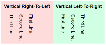
As in the introduction, writing-mode is the property that changes the direction of the text:
horizontal-tbHorizontal, top-to-bottom. This is the default when nothing is set.vertical-rlVertical, right-to-left.vertical-lrVertical, left-to-right.
Yep, it’s as simple as that. But a quick note that some ancient browsers use a different property. If you want backward compatibility, also add the following:
- Horizontal top-to-bottom:
writing-mode: lr - Vertical right-to-left:
writing-mode: tb-rl - Vertical top-to-bottom:
writing-mode: tb-lr
2) CSS TEXT ORIENTATION
2-text-orientation.html
<style>
.vertical { writing-mode: vertical-rl; }
.upright { text-orientation: upright; }
.sideways { text-orientation: sideways; }
</style>

<h1>Default (Mixed) Orientation</h1>
<div class="vertical">
  <p>First Line.</p>
  <p>Second 中文 Line.</p>
  <p>Third Line.</p>
</div>

<h1>Upright Orientation</h1>
<div class="vertical upright">
  <p>First Line.</p>
  <p>Second 中文 Line.</p>
  <p>Third Line.</p>
</div>

<h1>Sideways Orientation</h1>
<div class="vertical sideways">
  <p>First Line.</p>
  <p>Second 中文 Line.</p>
  <p>Third Line.</p>
</div>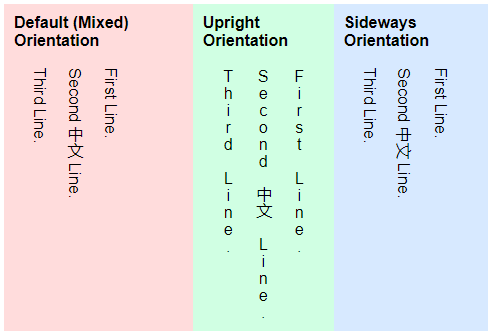
Yep, CSS vertical text does work, but some characters are annoyingly rotated. To “fix” that problem, we can use the text-orientation property:
mixed– The default setting for text orientation. Where vertical scripts such as Chinese Characters will be shown upright, but English Characters rotated 90° clockwise.upright– Where all the characters will be forced to show upright.sideways– All the characters will be forced to rotate 90° clockwise.
3) VERTICAL TEXT USING ROTATE
3-css-rotate.html
<style>
.vertical {
  transform: rotate(90deg);
  transform-origin: left top 0;
  margin-left: 70px;
}
</style>

<div class="vertical">
  Yahoo! This is vertical.
</div>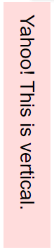
Finally, this is a funky alternative that is worth considering if the above writing mode somehow doesn’t work as intended.
- Simply use
transform: rotate(90deg)to rotate a block of text 90 degrees clockwise; If you want the text to face the mirror direction, usetransform: rotate(-90deg)to rotate 90 degrees counter-clockwise instead. - But one big problem with using this rotation method is the text block ending up in a weird position. We will need to follow up with
transform-origin: X-AXIS Y-AXIS Z-AXISto define the rotation point… Or usemarginandpositionto help reposition properly.
While this method is a little more inconvenient, we have more controls and can literally skew and rotate the text to any angle we want.
COMPATIBILITY CHECKS
- Writing Mode – CanIUse
- Text Orientation – CanIUse
Most modern “A-Grade” browsers are able to render vertical text and rotate properly. But if you have to support the ancient browsers, you will have to fall back to”manually type out vertical text”.
LINKS & REFERENCES
- CSS Transform on MDN
- Writing Mode on MDN
- Text Orientation on MDN
INFOGRAPHIC CHEAT SHEET
THE END

Thank you for reading, and we have come to the end of this guide. I hope that it has helped you with your project, and if you want to share anything with this guide, please feel free to comment below. Good luck and happy coding!