
От автора: приветствуем вас на нашем блоге о сайтостроении. У любого сайта есть то, чем он обычно запоминается и выделяется среди остальных. Обычно это именно шапка сайта. CSS позволяет сделать ее такой, как вам нужно.
Шапка сайта – какой она бывает
Поразительно, как много может зависеть сегодня от одного только дизайна веб-ресурса. Но что особенно сильно отделяет веб-ресурс от других? Как правило, это именно шапка сайта с фирменным логотипом и уникальным оформлением. Обычно именно по ней люди запоминают какой-то интернет-проект. Это очень хорошо запоминается в памяти людей.
Например, если вы видите белую букву “В” на синем фоне, то наверняка сразу делаете вывод – это иконка социальной сети Вконтакте. А изображение почтового голубя у всех сразу же ассоциируется с Twitter. Все это стало возможным потому, что в шапках у этих сайтов были именно такие изображения и они очень хорошо запомнились людям.
Так, это было немного размышлений, теперь давайте перейдем непосредственно к технической части.
Как в CSS можно оформить шапку сайта?
Вообще шапки бывают разными. По ширине их можно разделить на две группы: выровненные по центру и те, что на всю ширину веб-страницы.

Практический курс по верстке адаптивного сайта с нуля!
Изучите курс и узнайте, как верстать современные сайты на HTML5 и CSS3
Узнать подробнее
Раньше шапку делали также, как и любой другой блок – обычному тегу div давали нужный идентификатор, после чего в него попадало все нужное содержимое, а потом все это оформлялось. Сегодня же уже принято верстать по-другому. Специально для создания шапки сайта в HTML5 появился парный тег – header. Его использование приветствуется, это позволяет браузерам понимать, что это за часть шаблона и за что она отвечает. Кстати, если вы хотите изучить основы HTML5, то вам прямая дорога в наш премиум-раздел, где вы можете посмотреть уроки по этой технологии.
Поэтому, для создания простейшей шапки достаточно написать в html вот такой код:
Конечно, на странице пока ничего не появится – нам еще нужно добавить в нее содержимое и оформить. Но давайте, например, сделаем блок на всю ширину экрана, а также немного оформим.
|
header{ width: 100%; background: #D8E3AB; height: 70px; } |
Вообще, если все делать по-правильному, то следовало бы задать блоку какой-то класс или даже идентификатор (поскольку это важный элемент веб-страницы), но мы пока просто обратимся к элементу по тегу.
Свойство width: 100% делает так, что наш блок будет растягиваться на всю ширину вне зависимости от размеров экрана. Если же все-таки размеры нужно хоть как-то ограничить, используют дополнительно свойство max-width, где в пикселях записывают абсолютный размер, по достижению которого контейнер больше не будет расширяться.
Сейчас перед нами просто полоска, окрашенная в выбранный цвет. Обычно высоту не задают – она определяется автоматически на основании тех элементов, которые будут в шапке.
|
<div id = «wrap»> <header></header> </div> |
Таким образом, наш верх сайта будет расположен ровно по центру. Остается только наполнить его.
Рис. 1. Пока это только контейнер, в котором будет все содержимое.
Что обычно содержится в шапке?
Обычно там вставлен логотип, название, описание сайта. Также там может находиться какая-то контактная информация, навигация по страницам или даже реклама.
Практический курс по верстке адаптивного сайта с нуля!
Изучите курс и узнайте, как верстать современные сайты на HTML5 и CSS3
Узнать подробнее
Логотип обычно вставляют как фоновое изображение. Давайте, например, поставим такой:

Для этого достаточно дописать некоторые правила к фону:
|
background: #D8E3AB url(logo.png) no-repeat 5% 50%; |
То есть помимо сплошного цвета даем еще и фоновую картинку (в нашем случае logo.png) и предварительно я ее положил в ту же папку, что и файл стилей. Запрещаем повторение логотипа и определяем его позицию в блоке – немного сместим влево и по центру по вертикали.
Добавим в шапку какое-то содержимое. Например, заголовок и меню.
|
<div class = «title»>Название сайта</div> <ul class = «menu»> <li><a href = «#»>Контакты</a></li> <li><a href = «#»>О нас</a></li> <li><a href = «#»>Услуги</a></li> </ul> |
Теперь все это оформим.
|
.title{ font—size: 36px; padding—top: 10px; text—align: center; } .menu{ list—style: none; position: absolute; top: 10px; right: 100px; } |
Заголовку нужно дать более менее нормальный размер шрифта, чтобы он выделялся, а также отцентрировать. А вообще на сайтах бывает по-разному – название может стоять и слева, и справа.
Сам список, который формирует навигацию, тоже нужно немного оформить. В этом примере мы всего лишь уберем маркеры у пунктов, а на деле можно сделать еще много чего – убрать подчеркивания у ссылок, задать им цвет и фон и т.д.
Сместим меню в правый край с помощью абсолютного позиционирования. Чтобы это заработало, нужно также дописать для header такое правило: position: relative;
На выходе получаем готовую шапку с логотипом слева, заголовком по центру и меню справа. Конечно, при верстке реального проекта нужно все делать в соответствии с тем макетом, по которому делается работа, а не заниматься самодеятельностью. Но свойства применяются в целом абсолютно такие же, как я приводил здесь.
Как зафиксировать блок, чтобы он не исчезал при прокрутке?
Если вы хотите фиксировать шапку в css (такое ее поведение можно увидеть на многих веб-ресурсах), то вам может помочь фиксированное позиционирование. Нужно добавить такие стили:
А также координаты (top, left, right, bottom) какие вам нужны. Обычно фиксацию делают с помощью jQuery, прописывая соответствующий сценарий и привязывая его к событию – вертикальному скроллу страницы.
Если вы хотите научиться верстать сайты, в том числе и шапки, но рассмотренный материал вам непонятен, то нужно начинать с самых азов – изучения основ HTML и CSS. В этом вам может помочь наш премимум-раздел, там есть два соответствующих видеокурса по этим технологиям, в которых все разъясняется по полочкам.
Умение создавать и редактировать шапки вам пригодится, на тех же биржах фриланса есть заказы, в которых просят сверстать только этот элемент или изменить его оформления. В общем, я желаю вам успехов в изучении и оставайтесь с нами, чтобы ускорить это обучение.
Практический курс по верстке адаптивного сайта с нуля!
Изучите курс и узнайте, как верстать современные сайты на HTML5 и CSS3
Узнать подробнее

Верстка. Быстрый старт
Практический курс по верстке адаптивного сайта с нуля!
Смотреть
Welcome to our comprehensive CSS headers guide! We will begin with an overview of the many sorts of headers and their applications, followed by a deep examination of the various characteristics and approaches used to style headers. This article will give you with the information and skills you need to create professional-looking headers for your website, whether you’re a novice or an experienced developer.
Whether you are a beginner or an experienced tester looking to enhance your knowledge of web development, this guide has something for everyone. So let’s get started!
Table Of Contents
- 0.1 What is CSS Header?
- 0.2 Components Of CSS header properties:
- 0.2.1 Header Tag:
- 1 Welcome to my site
-
- 1.0.1 Heading Tags:
-
- 2 Main heading
- 2.1 Subheading
- 2.1.1 Sub-subheading
- 2.1.1.1 sub-sub-subheading
- 2.1.1.1.1 sub-sub-sub-subheading
- 2.1.1.1.1.1 sub-sub-sub-sub-subheading
- 2.1.1.1.1 sub-sub-sub-subheading
- 2.1.1.1 sub-sub-subheading
- 2.1.1 Sub-subheading
- 2.1 Subheading
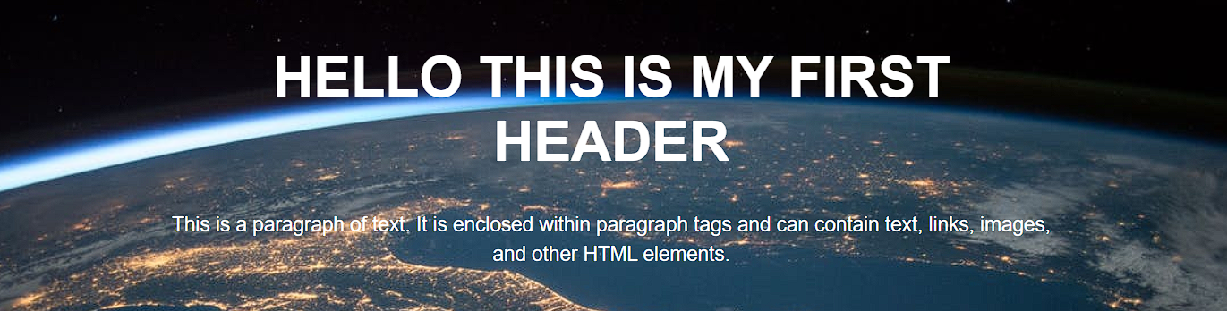
- 3 HELLO THIS IS MY FIRST HEADER
-
- 3.0.1 Paragraph Tag:
- 3.0.2 Header Background:
-
- 4 HELLO THIS IS MY FIRST HEADER
-
- 4.0.1 Navbar:
-
- 5 HELLO THIS IS MY FIRST HEADER
-
-
- 5.0.0.1 Sticky navbar:
- 5.0.1 Call to Action:
- 5.0.2 Social Media Icons:
- 5.0.3 Responsive web design:
-
- 5.1 Wrapping up
- 5.2 Useful tips for styling header texts:
- 5.3 Conclusion:
- 5.4 Frequently Asked Questions:
- 5.4.1 How to write CSS for the h1 tag?
- 5.4.2 How to edit the header in CSS?
- 5.4.3 Why is a header used?
-
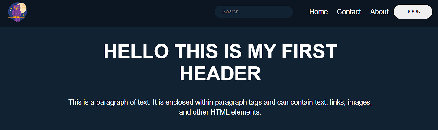
In CSS (Cascading Style Sheets), a header is a block of content at the top of a webpage that usually contains a logo, navigation links, and possibly other elements such as search fields or social media icons. The header is typically the first thing visitors see when they arrive at a webpage, and it usually spans the entire page width.
It is often styled differently than the rest of the page to set it apart and draw the visitor’s attention visually. You can use CSS to customize the appearance of your webpage’s header, including its font, color, size, background, and other design elements.
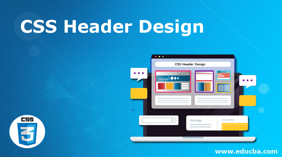
Different websites use different headers to capture their audience’s attention. Here are some CSS header examples:

As you can see, all of the websites listed above have unique header designs with different menus.
Now that we know what CSS headers are and what they contain let’s take a closer look at how to create them.
Headers are made up of different types of content like text, tags, logos, images, social media icons, etc., as seen from the examples in the last section. Here are some of the most important aspects of a CSS header:
In HTML, the <header> tag is used to define the header of a web page or section of a web page. The <header> tag is typically used to contain the site logo, navigation, and other elements such as the page or section title and author information. The <header> tag can be used as a container for these elements and can be styled using Cascading Style Sheets (CSS).
Here is an example of the <header> tag in HTML:
This example shows an <header> element that contains a logo, a navigation menu, and a page title. The <header> element and its contents can be styled using CSS to control the layout and appearance of the header.
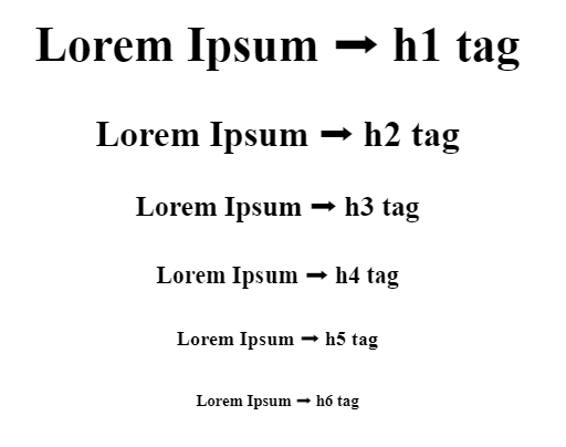
Heading Tags:
Heading tags are HTML tags used to create headings and subheadings in an HTML document. They range from <h1> to <h6>, with <h1> being the most important and <h6> being the least important. Headings help organize and structure the content on a webpage and make it easier for users to understand the information hierarchy.
They also help users with assistive technologies, such as screen readers, navigate and understand the content on a webpage.
Here is an example of how you might use heading tags in an HTML document:
HTML:
Output:

In this example, the main heading rendered a large, bold font, the subheading would be slightly smaller and less bold, and the sub-subheading would be even smaller and less bold.
Paragraph Tag:
The paragraph tag, <p>, is an HTML element used to define a paragraph of text. It is used to enclose a block of text within an HTML document and apply a set of styles to the text. Here is an example of how you might use the paragraph tag in an HTML document:
<p>This is a paragraph of text. It is enclosed within paragraph tags and can contain text, links, images, and other HTML elements.</p>
<p>This is a paragraph of text. It is enclosed within paragraph tags and can contain text, links, images, and other HTML elements.</p>
When rendered by a web browser, the text within the paragraph tags will be displayed as a block of text with the default styles, such as font size and font family. The paragraph tag is often used with other HTML tags, such as heading tags, to create a well-structured and easy-to-read document.

A header background is a design element that appears behind the content of a header, which is typically the top section of a webpage. The header background can be a solid color, a gradient color, an image, or a combination.
To set the header background in HTML, you can use the style attribute and the background property. Here is an example of how you might set the header background of the header:
Example 1: Styling the background color as dark blue
Output:

Example 2: Adding Gradient color in the background. If the gradient color seems complex you can use this website to generate the gradient code: cssgradient.io
Output:
Example 3: Adding an image in the background
Output:
These examples are most commonly used in the CSS header. Still, in modern web design, developers use more complex designs that include animation, video, image sliders, interactive elements, and more.
Navbar:
A navbar, or navigation bar, is a user interface element that contains links to the main sections of a website or application. Navbars are typically displayed at the top of a page or screen, allowing users to quickly access different pages or content within a website or app.
Several components are commonly found in a navbar:
- Logo: As I mentioned earlier, a logo is often included in the navbar as a way to establish the branding and identity of the website or app.
- Links: The primary purpose of a navbar is to provide access to different pages or content within a website or app, so it typically includes a set of links that allow users to navigate to other sections of the site.
- Search bar: Some navbars include a search bar that allows users to search for specific content within the website or app.
- Button: Navbars may also include a button that allows users to perform a specific action, such as signing up for a newsletter or logging in to an account.
Overall, navbars are an essential component of many websites and applications because they allow users to easily navigate and access the different pages and content.
Here is an example of how you might add a navbar in your header:
HTML:
Output:
Sticky navbar:
A sticky navbar is a navigation bar that remains fixed to the top of the screen as the user scrolls down the page. This can be helpful because it allows users to access the navigation menu at all times without having to scroll back up to the top of the page.
To create a sticky navbar using CSS, you can use the position: sticky property in the navbar’s styling rule.
For example
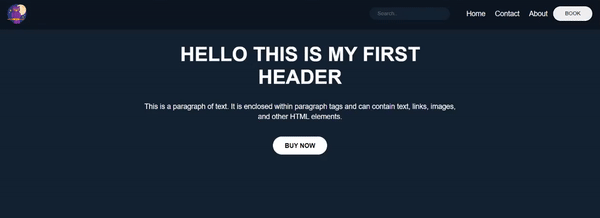
Call to Action:
A call to action (CTA) is a message or button that prompts the user to take a specific action, such as signing up for a newsletter, purchasing a product, or downloading an app.
A CTA can effectively engage users and guide them toward a specific goal in the header context. By prominently displaying a CTA in the header, you can make it more visible to users and increase the likelihood that they will take the desired action.
For example, if your website sells a product, you might include a CTA in the header that says “Buy Now” or “Add to Cart.” This makes it easy for users to quickly purchase the product without searching for the appropriate link elsewhere on the site.
Here is an example of how you might add a call to action:

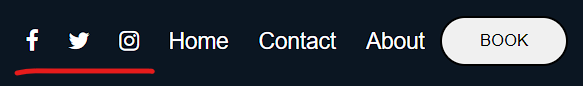
Adding social media icons to a header is a common practice because it provides users an easy way to connect with the company or brand on social media platforms.
By including social media icons in the header, users can quickly and easily access the company’s social media profiles, which can help to increase the brand’s online presence and engagement. This can be especially important for businesses that rely on social media to connect with customers and promote their products or services.
You can add icons to your header in many ways, but the most popular and common practice is to use Font Awesome.
To use an icon from Font Awesome, you will need to include the Font Awesome library in your project by linking to the hosted version on the Font Awesome website or downloading and hosting the files locally.
Once you have the library installed, you can use an icon by placing the icon element inside your HTML code and setting the class name to “fa fa-ICONNAME”, where “ICONNAME” is the title of the icon you need to use.
For example, to use the “search” icon, you would use the following code:
Responsive web design:
Responsive web design is a design approach that aims to make web pages look good on all devices (desktops, tablets, and phones). It involves using CSS media queries and flexible layouts to adjust the design of a website to the size of the device’s screen. This helps ensure that users have a consistent, positive experience no matter what device they use to access the website.
According to Oberlo, as of 2022, 59.4% of all website traffic worldwide was generated through mobile phones. This number has been steadily increasing in recent years, and it’s clear that websites need to be designed with mobile devices in mind.
To create a responsive web design, you must combine HTML, CSS, and JavaScript. Here are the steps you can follow to create a responsive web design:
- Determine the purpose and content of your website. This will help you decide on the layout and design best suits your needs.
- Choose a layout. Many different layout options exist, including fixed, fluid, and hybrid layouts.
- Use CSS media queries to specify the design adjustments that should be made for different screen sizes. Media queries allow you to apply different styles to your website based on the width of the device’s screen.
- Test your website on multiple devices to ensure that it looks and functions correctly on all of them.
- Optimize your website for mobile devices. This may include compressing and using responsive images to ensure the website loads quickly on mobile devices.
- Optimize the navigation bar using the hamburger menu.
- Regularly test and update your website to ensure it continues functioning correctly on all devices.
To learn more about how to make your website responsive, check out the w3school for in-depth details.
In addition, Google recommends responsive web design as its preferred mobile configuration, making it easier for Google’s algorithms to crawl and index a website’s content. This can positively impact the search engine rankings of a website.
Wrapping up
Thank you for reading our article on CSS headers. We hope that you found the article helpful. We always ensure that each of our articles is easy to understand and provides as much information as possible. If you have any queries, please feel free to contact us anytime. Thank you again for reading; we look forward to seeing you on our blog again soon!
Here are a few more tips for styling header texts:
- Use hierarchy to indicate the importance of different headers. You can do this by using different font sizes, weights, and styles for different levels of headings.
- Keep your headers concise and to the point. Avoid using long, wordy titles that are difficult to read.
- Use white space to make your headers more visually appealing. Adding extra room around your headers makes them stand out and draw the reader’s attention.
- Experiment with different font combinations to find the right look for your website. You can use tools like Google Fonts to explore other font options and see how they look together.
- Test your headers on different devices to ensure they are legible and look good on all screen sizes.
Conclusion:
Finally, this guide has given you a thorough understanding of how to construct and style headers with CSS. We’ve gone over the many sorts of headers and their applications, as well as the characteristics and strategies used to style them. You are now armed with the information and abilities obtained to develop professional-looking headers for your website that will improve the user experience. Thank you for taking the time to read!
Frequently Asked Questions:
How to write CSS for the h1 tag?
To write CSS for the h1 tag, you must use a selector that targets the h1 element. Here is an example of how you could do this:
To edit the header in CSS, you must use a selector that targets the header element. The header element is usually an HTML element containing the logo, navigation, and other elements common to the top of a website.
Here is an example of how you could edit the header using CSS:
A header is a text that appears at the top of a page or document. Headers give context to the page’s title or document or provide a summary of its contents. In some cases, headers can also be used for navigation between different pages or sections of a document.
One of the integral aspects of a web product is to build an ever-lasting mesmerizing experience. When you open any website, your first touch point is the website’s header. Whether making an eCommerce business, SaaS business, or a simple portfolio website, you want the header to do the talking for you.
Does this mean that the content, footer, and other aspects are unimportant? Well, they are! If all these integral elements of the website are well-presented to the end users, it will surely make a lasting impression. This guide will discuss building a responsive CSS header.
In my experience, the header plays an integral role in devising a challenging user journey. Time spent on site, page, returning visitors, etc., are some key metrics that provide a glimpse of the website’s performance. If I were to compare, it is equivalent to comparing the footfalls in a shopping mall; the higher the footfall, the better our chances of generating sales.
Your website is similar to an outlet in a shopping mall where the visitors have several choices up their sleeves. According to a report, a delay of one second in the page load time causes a close to 16% decrease in customer satisfaction and an 11% reduction in page views. All of this can cause a dent in the overall conversion rate.
With so much at stake, it is imperative to focus on designing a website with a header, content, footer, and other elements that yield maximum website stickiness. CSS is the secret sauce that can be used with JavaScript and HTML to develop WOWsome websites.
This CSS tutorial focuses on building super responsive CSS headers that can work seamlessly across different browsers and devices.
So, let’s get started!
TABLE OF CONTENTS
- Introduction to CSS Header
- Components Of CSS header properties
- Header Tag
- Paragraph Tag
- Header Background
- Company’s logo
- Menu
- Call to Action
- Social Media Icons
- Sticky Navigation
- Responsive web design
- Frequently Asked Questions
Introduction to CSS Header
The CSS header is a collection of several CSS and HTML properties that helps in the structuring of a website header. Everything in the CSS header, like the logo, text, menu, etc., are just blocks.
In fact, the CSS header is a block itself, and these blocks can be styled with the CSS header properties.
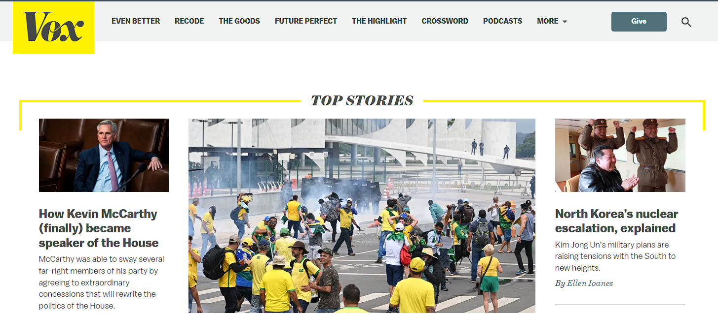
Here are examples of desktop and mobile views of website headers spanning various industries.
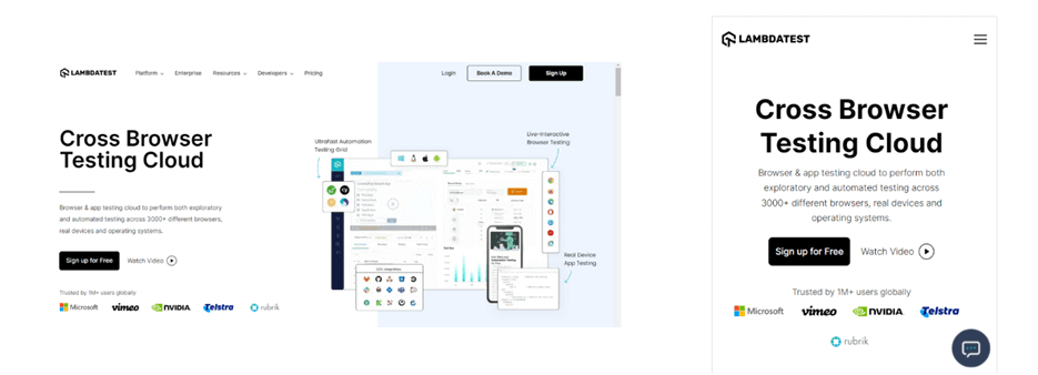
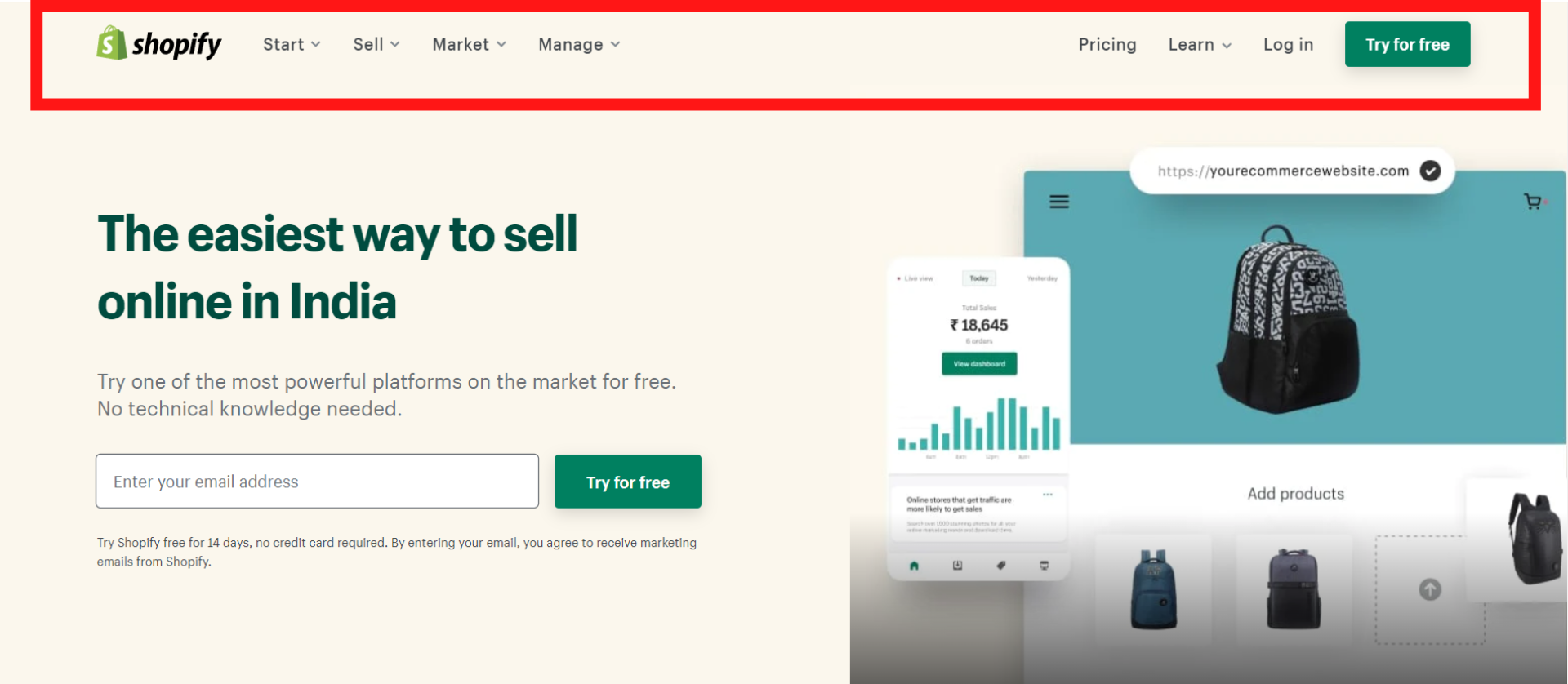
Example 1 – LambdaTest (Software-As-A-Service)
Example 2 – Shopify (E-Commerce)

Example 3 – Nvidia (Semiconductors)

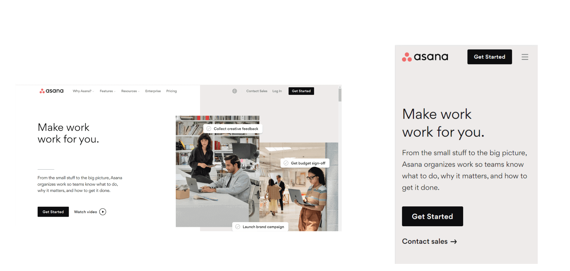
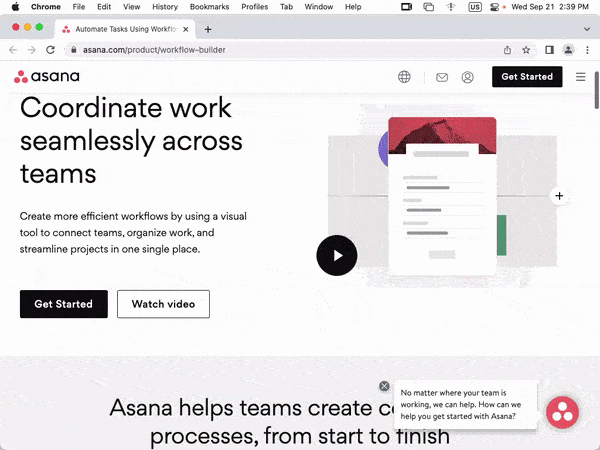
Example 4 – Asana (Work management platform)
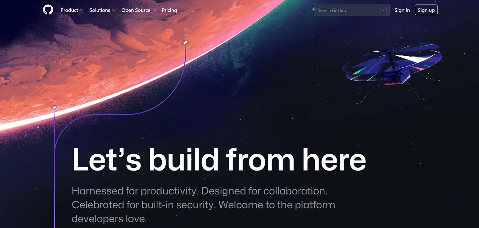
Example 5 – GitHub (Web hosting service)
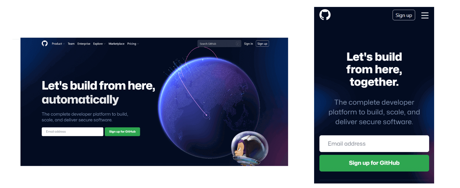
As you can see, the headers of every website (listed above) have a unique menu design. Clicking on the menu and submenus takes you to the particular product’s pillar page or provides the reader with more information about what’s in store for them on that very page.
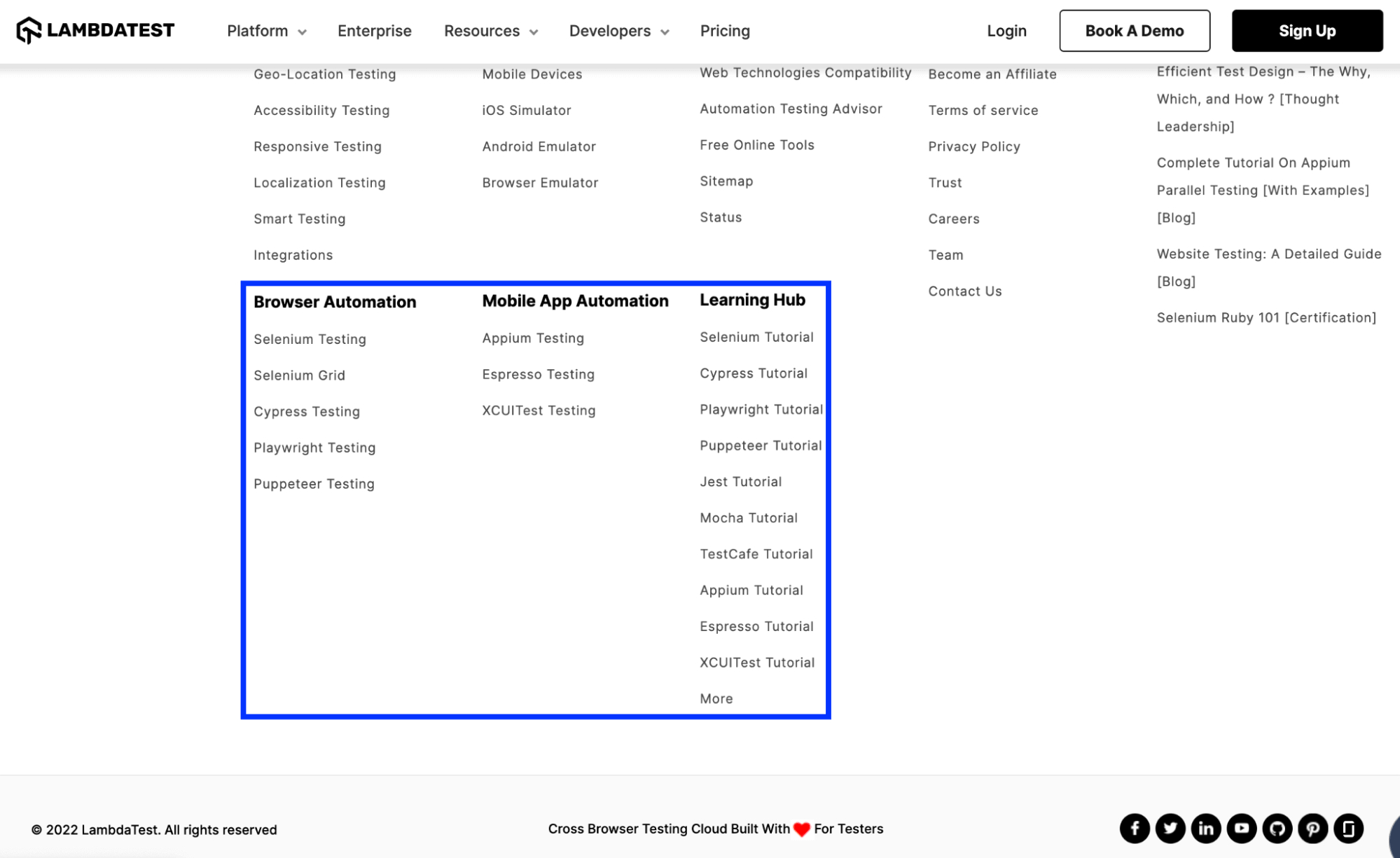
Akin to the header, the footer is also an integral part of any website. Though the items listed in the footer might vary from industry to industry, some of the everyday items that must be a part of the footer are Sitemap, Privacy Statement, Copyright notice, links to pages that are important for conversions (or lead generation), etc.
Take the case of the footer on the website of LambdaTest – a continuous quality testing platform. Apart from the links to Careers, Status (that indicates the operational status of each product), etc., there are links to pillar pages that let the visitors perform browser automation testing and mobile automation testing. Links to LambdaTest Learning Hub navigates the visitor to the appropriate hub so that s/he can get a glimpse into the technical aspects of CI/CD, Selenium, Cypress, and more.
With the platform all set, let’s dive deep into the essential aspects of CSS headers and footers. Most of the blog is focused on CSS header, a post in which we would touch upon CSS footer.
Components Of CSS header properties
As you might have noticed from the examples cited in the previous section, a header consists of textual content, relevant tags, logo, images, social media icons, and more.
Some of the most critical components of the CSS header are mentioned below.
Header Tag
Just like every organization, its name is integral to it. The website header also features the organization’s name as its primary text. CSS header property comprises a feature known as Header tags < header > that lets you insert the organization’s name in the header.
Optimal usage of the < header > tag will significantly impact the SEO (Search Engine Optimization) rankings! I have covered those aspects in later sections of this guide.
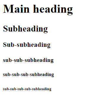
Header tags are of 6 different types (H1-H6), with six different font sizes. Let’s see the header tags in action with the help of an example.
As seen below, the biggest font size and the size continuously decreases with the tags until the H6 tag, whose font size is the smallest.
Another use of header tags in the CSS header is to insert a tagline. A tagline is like a short phrase that communicates the core aspects of your business. Many businesses use taglines as a way of communicating with their customers.
A tagline is the first thing that your potential customers notice when they find out about your brand. Therefore, it’s crucial to ensure that your tagline must define what your business does and why someone should choose it. In addition, incorporating a CTA can help increase your leads and conversions.
In many cases, you will observe that instead of the organization’s title, taglines are the major text on the header, and the organization’s title is used in the logo. Therefore, the primary use of header tags is to insert the tagline in the header. However, when it comes to putting up the logo, we will discuss it later in this blog.
See the Pen
Untitled by Ayush Thakur (@tsayush)
on CodePen.
The header tags act as a marker and help the browser recognize and read the important keywords and rank the website for that keywords. Therefore, using at least one header tag (out of H1-H6) on the webpage is always suggested.
Header tags make it easier for search engine bots to crawl across the webpage, understand the keywords, and then rank the webpage based on the crawled information.
Crawling a whole long paragraph is a bit difficult task for the bot, and the header tags make it easy by marking up the few critical keywords for the bot, thereby positively impacting the SEO.
Paragraph Tag
After the tagline, the next major component of the website header is a short description of the company. By reading this description, visitors get an indication of the services and/or products the business offers.
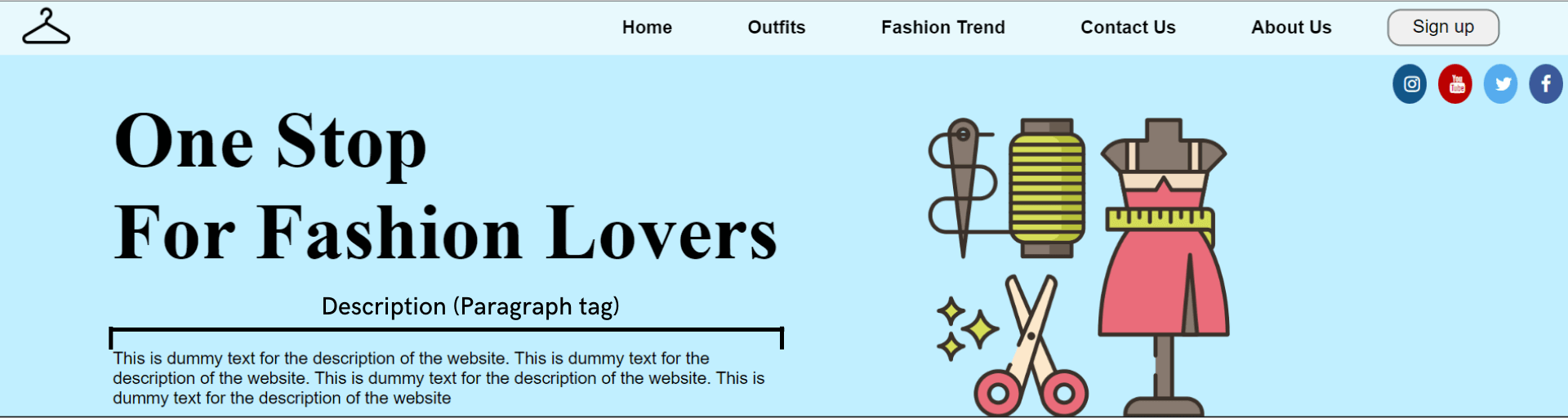
The font size of the description text is smaller than the tagline text, and to get the desired result, CSS header properties have a component named Paragraph tag (< p >).
See the Pen
Untitled by Ayush Thakur (@tsayush)
on CodePen.
You can notice in the above example that we have inserted a description just below the tagline (which is in H1) because this makes the user immediately read the description just after reading the tagline. In some sense, content in the < p > is a logical extension of what is mentioned under < h1 > tag.
You may wonder why we cannot use the H6 tag instead of the paragraph tag
since both have small font sizes. You can do it. However, header tags are relatively heavier than paragraph tags.
Using a paragraph tag will give the same result and significantly reduce the weight of the website header. Using these best practices further helps in reducing the page load time.
Test on real desktops and mobile browsers. Try LambdaTest Now!
Header Background
As the largest component of any website header, the header background is the most visible and the first thing a visitor comes in contact with whenever s/he lands on the website. You can insert either a media or color in the background. First, let’s talk about the media.
In media, you have the options of images, videos, and gifs to fill in the header background. Using an image as the background is always good practice. Sometimes an image can also be used as a mode to convey a message, tell a story, or sometimes invoke specific emotions in the user’s mind.
Sometimes, the user feels personally connected with the image, which further connects the user to your business.
We have the background-image property in the CSS header properties to set an image as the background. Let’s understand it with the help of an example.
See the Pen
Untitled by Ayush Thakur (@tsayush)
on CodePen.
As you can see, the background-image property has been used in the CSS file and is assigned to the URL address of the image within brackets. If you are planning to use an image in the background, then there are a few things you have to take care of.
When inserting an image, it’s always a good practice to use lightweight images. Heavy images increase the website’s weight, significantly increasing the website’s loading time. This will eventually result in a bad user experience for the users. An increase in loading time also results in a higher bounce rate.
Google search engine takes loading time as an essential factor in the website’s ranking. Therefore, an increase in the loading time will have an impact even on the ranking of the website. We all know the repercussions if the site is not ranking well on Google.
Although you can insert images of any format, the ideal recommendation is to use Webp image format. WebP image format provides lossless and lossy compression for images on the web. Compared to PNG images, the Webp image format is 26% smaller. In short, Webp image format offers all the features that other format images do at a much smaller size.
Because of the same reason, it’s always advisable to avoid using gifs and videos on the website.
Now, let’s discuss the case of colored header backgrounds.
Like an image, the colors also play a vital role in inviting emotions into the user’s mind. This is where Color Psychology comes into play. Color Psychology studies color and how a human brain reacts to the colors on the screen.
Organizations are very well aware of the importance of colors and use them to play with our minds psychologically. Businesses choose the color that best matches the brand personality and triggers the desired emotion in the visitor’s mind.
A real-life example of this is the company’s logos. You may have noticed many social media organizations use the blue color in their logos. That is because the blue color triggers refreshing, friendly, and inviting emotions in the user’s mind, and that’s exactly what social media sites want.
Similarly, many food-tech organizations use red and yellow colors in their logos – survey. This is because the red color triggers hunger and appetite emotion in humans, and yellow triggers the emotion of happiness and friendliness.
It is suggested that you use bright colors if you have a personal blog or website and a professional business website, then go with deep-toned colors like #752121, 035039, etc.
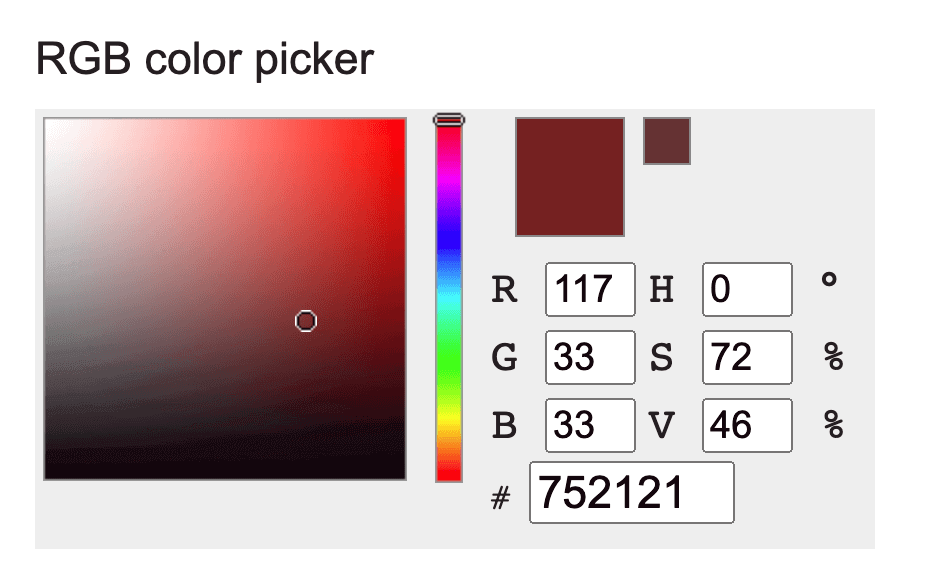
ColorHexa
The color you choose can change the impact of your website on the users.
CSS background-color property can be used to set the color of the header background. In the background-color property, the color can be set in three different ways:
- Color name [e.g., red].
- Hex value of color [e.g., #FF0000].
- RGB value [e.g., rgb(255, 0, 0)].
See the Pen
Untitled by Ayush Thakur (@tsayush)
on CodePen.
As you can see in the example, the three ways of defining background color have been shown. In all three divs, three different ways of assigning color have been shown – Hex value in 1st < div >, color name in 2nd < div >, and RGB value in 3rd < div >.
Let’s add a background color to the sample code we created earlier to demonstrate the usage of < header > and < p > tags.
See the Pen
Untitled by Ayush Thakur (@tsayush)
on CodePen.
Here, you can notice that we have added the background color in the header using the hex value of color.
Now, how many colors should one use on his website header? As per the source, you can use the utmost two or three colors on your website. It’s always recommended to use at most two colors in the website header, whether a professional website or a personal blog while keeping the text in white or black.
One exceptional case of this is if you want to use white color in the header. White is the default color in the elements, so if you plan to add a white color to the background, you don’t need to define the background color. Just make sure that the header background should suit the other elements of the header.
Company’s logo
A logo is a graphic symbol that can help your business stand out from its competitors. A logo represents an organization’s identity and vision and should express the core elements of the business. The human brain memorizes images much faster and longer than plain text. As per research, the human brain memorizes images 60,000 times faster than text, benefiting the business.
These factors help in having a faster brand recall, a factor that is so integral in today’s hyper-competitive business environment.
Using a logo in the header has many benefits:
- Increase user (or customer) stickiness.
- Brand Recall.
- Foster brand loyalty.
- Foundation of brand’s identity.
- Gain competitive advantage.
CSS header properties have an inbuilt feature known as an Image tag (), which helps to insert images in the header.
Let’s understand it’s working with the help of an example.
See the Pen
Untitled by Ayush Thakur (@tsayush)
on CodePen.
As you can see above, we have inserted the logo in the top-left corner using the image tag. The image tag demands two attributes – src and alt. In the src, the path where the image is stored is inserted and if the image is uploaded online, then simply put the image address.
The second attribute is the alt, an alternative text that plays a crucial role in the website’s SEO ranking. It can be any keyword for which you want your website to rank.
The image tag supports the following image formats:
- jpeg.
- png.
- apng.
- svg.
- bmp.
- bmp ico.
- png ico.
Now the question arises, where should you put the palace logo in the header? And the left side of the website header. It is the best and most suggested position to place the logo. As per the research, the chances of visitors recalling the logo on the left side is 89% more than on the right one.
In case you have an animated logo or a gif logo, then you can insert it too through the image tag. Just make sure it should be of small size. The steps to insert a gif are the same as an image.
See the Pen
Untitled by Ayush Thakur (@tsayush)
on CodePen.
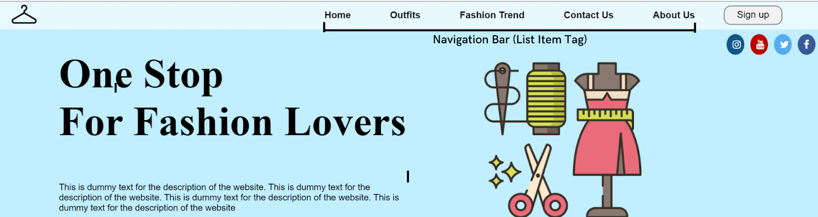
Menu
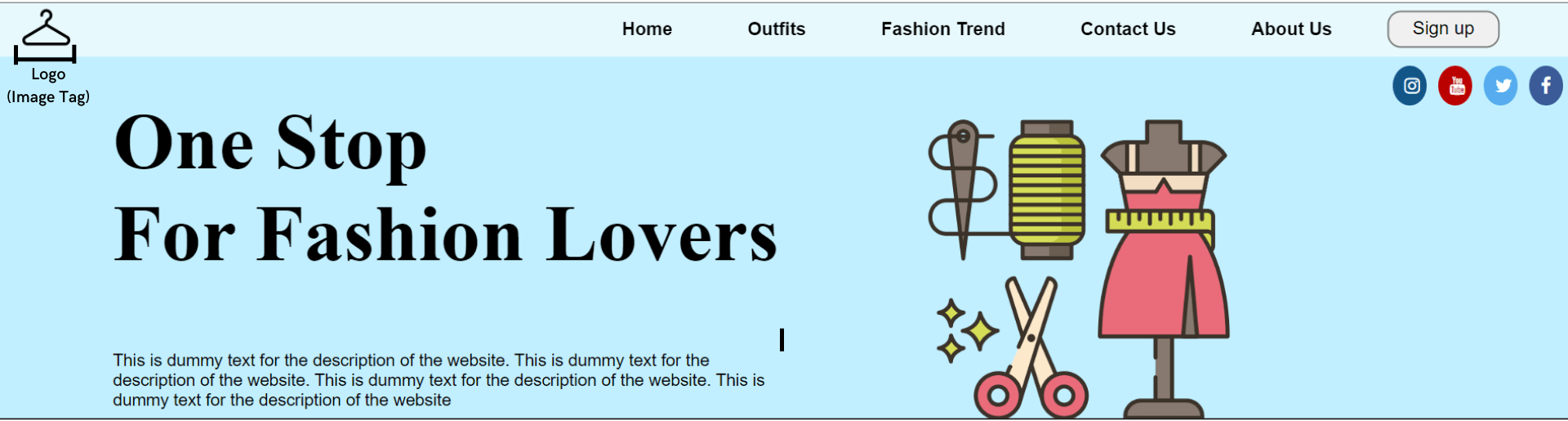
Now comes with one of the most important elements of the header, “Menu” (or Navigation Bar). As the name suggests, the navigation bar works as a navigator for the visitors who have landed on the web page and helps them navigate to the relevant section on the site.
Without a navigation bar, the visitors will get confused about what they should do if they want to avail of any offer or buy (or try) a product. It will be like a person traveling to reach a destination, but he doesn’t know the route. He’ll surely get confused; the same happens to the visitor when he does not get the navigation bar on the header.
So to do that, there are some factors that one should follow when creating the navigation bar:
- Easy navigation
- Avoid information overload
- Maintain consistent spacing
- Clean and simple aesthetic looks
- Easily noticeable
Just like the logo and other key elements of the header are placed on the left side, the same rule is applied to the navigation bar. The most important options on the navigation bar should be on the left side, and the reason behind that is the same as other header components.
To insert the menu, the list item tag (
Let’s see the construction of both navigation bars and how they work.
See the Pen
Untitled by Ayush Thakur (@tsayush)
on CodePen.
Here, you can notice that we have inserted the horizontal navigation bar using the list item tag. It’s more like a horizontal strip containing all the menu options.
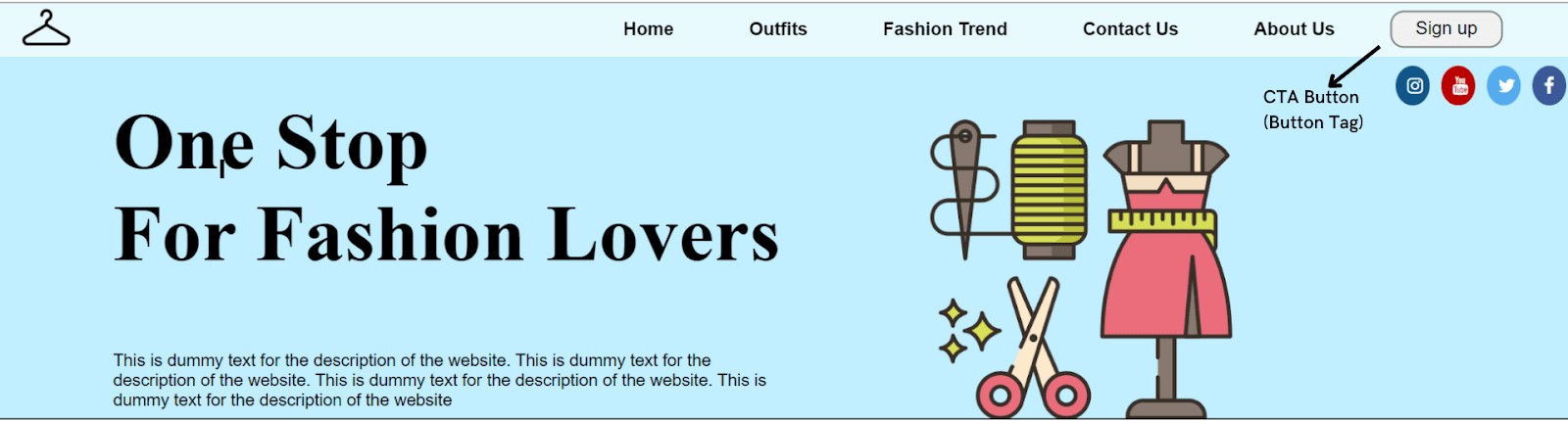
Call to Action
A Call to Action or CTA is like a signpost that helps the user know what action to take next. CTA encourages the visitor to take immediate action. Many businesses want their users to take instant action without overthinking, and that’s where CTA comes into play.
Through CTA, you can make your visitors perform any action through CTA – signing up or registering on the site, filling up a form, reading more, or something else.
Many organizations also offer some free services to users if they register on the website. The free service can be a free pdf, a free demo of the product, a premium service trial, etc., and the users take the required action.
As per a report by HubSpot, there was an increase in conversion rates by 121% because of CTAs.
A CTA could be anything like a button, a clickable link, or anything else unless it makes the user take a specific action. When inserting a CTA, CSS header properties offer the Button tag (< button >) tag.
Let’s see the working of button tags with the help of an example.
See the Pen
Untitled by Ayush Thakur (@tsayush)
on CodePen.
As you can observe, we have created a CTA button for Sign Up in the above example. Similarly, you can make any CTA button for your website header.
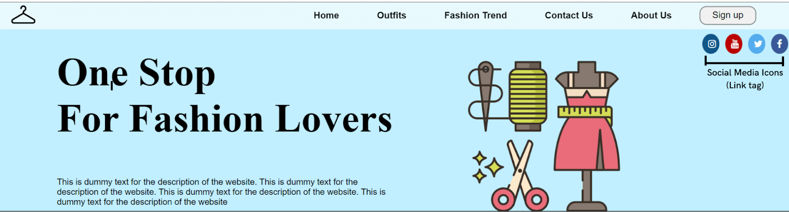
Social Media Icons
Having a social media presence is as important as having a website for the business. Social media pages create trust in the user’s mind regarding the business.
People feel more connected to the business when they land on its social media pages of the business. Linking your website header to its social media pages increases its brand exposure.
There are numerous social media platforms where you can create your business page. But there are some social media platforms that experts widely suggest boost the business’s growth. These social media platforms include Instagram, Twitter, YouTube, and Facebook.
Linking the social media pages to the header via social media icons is a great way to increase the trust in the visitor’s mind.
CSS header properties allow us to add social media icons to the website header through the Link tag (< a >). The link tag demands a linking attribute, ‘ahref,’ where the link is added.
Several predefined free social media icon libraries are available on the internet, making it much easier to insert social media icons at the header. You just need to add the class name of the desired icon in the line tag.
Let’s see this in action.
See the Pen
Untitled by Ayush Thakur (@tsayush)
on CodePen.
In the above example, we have inserted circular social media icons. A free social media icon library has been used, as shown in the .
Sticky Navigation
You will notice that the navigation bar of many websites is sticky, irrespective of the fold in which the visitor is currently in! This is the feature that many organizations use on their website to make it easy for their visitors to always have access to the navigation bar.
Many organizations like to keep the website’s navigation bar sticky, and many do not. It varies from company to company whether they want to keep the navigation bar sticky or not. Making the navigation bar sticky is independent of the type of the navigation bar.
A sticky navigation bar has many advantages, such as
- Quicker navigation.
- Reduce the chances of the user getting distracted.
- Reminds the visitor to take immediate action.
- Screen time on the website increases.
- The user has access to the navigation bar all the time
As per the report, once a major business website made a minor change in their website by making the navigation bar sticky. This slight change made the visitors pay extra attention to each product listed on the website.
This eventually increased the screen time of the website. As a result, the company saw a significant reduction in the bounce rate and an increase in conversion rate of 10%.
CSS position property helps in making the header sticky. You just need to add a single line of code in the CSS file to make your navigation bar sticky. Just add the position property to the navbar element and assign it to the sticky attribute.
Here’s an example showing how to create a sticky navigation bar.
See the Pen
Untitled by Ayush Thakur (@tsayush)
on CodePen.
Here is the final code that takes into account the various CSS components that we described so far (i.e. < header >, < p >, < img >, etc.)
See the Pen
Untitled by Ayush Thakur (@tsayush)
on CodePen.
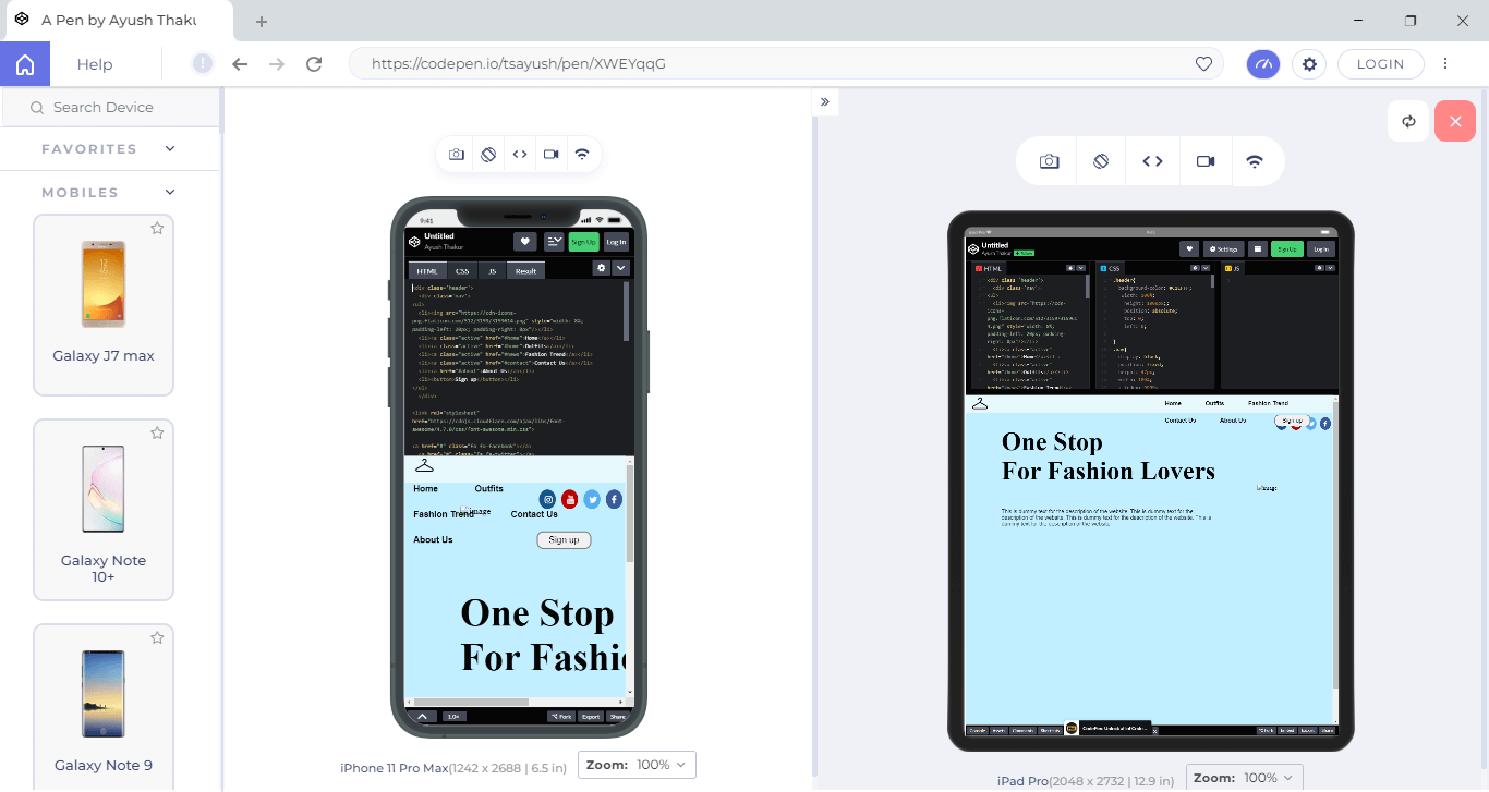
Responsive web design
Nowadays, the number of mobile users is much higher than the number of desktop users. As per the report, 58% of online visits came from mobile users in 2021. And these numbers will keep on increasing.
Therefore, you must create a responsive web design to ensure a mind-blowing experience across different screen sizes and resolutions. Thankfully, CSS has got a solution for this too. It comes up with the feature of CSS media queries that will help you to make your website header responsive.
This feature allows you to assign the different styling of the components depending upon the screen size. For a phone, you can assign different styling; for a tablet, you can assign different styling for the desktop or PC.
Once you have designed the web page, you must run a responsiveness test of your CSS header.
However, testing responsiveness can be tedious as owning all devices of different screen sizes and resolutions is impractical. This is mobile-friendly testers tools like LT Browser becomes a helping hand. It is a responsive testing tool offered by LambdaTest platforms; LT Browser offers 50+ pre-installed viewports for Mobiles, Tablets, Desktops, and Laptops.
Need more reasons why you should use LT Browser? Here are the reasons why developers should use LT Browser.
Intrigued to know more about LT Browser, watch the below tutorial.
Subscribe to the LambdaTest YouTube Channel and get the latest tutorial around test automation, Selenium, Cypress, Playwright browser testing, Mobile app testing, and more.
Wrapping up
In this CSS tutorial, we discussed the CSS header in detail, including the different components of the CSS header with real-time examples. We also discussed why responsive web design is important for your organizations and how to perform responsive testing of CSS headers using web development tools like LT Browser.
I hope this CSS guide has given you a comprehensive understanding of the CSS header. Got any questions? Feel free to drop them in the comments section.
Frequently Asked Questions (FAQs)
What is header in CSS?
The < header > element is like a container containing introductory content or navigational links. It typically contains one or more heading elements (< h1 > — < h6 >).

Ayush Thakur
I’m a 22 year old Software Engineer. Completed my Btech in Information Technology field in 2021. I have a keen interest in Web Development field and currently learning and exploring the field of Frontend Web Development. Love to get my hands dirty on JavaScript And React. Also working as a Web Development Freelancer. Alongside, I’m also working as a Content Creator and I create content on Web Development niche to share my knowledge with others and help them in their tech journey. Also loves to write blogs and articles on tech niche. A huge lover of video games, read books in my spare time, and to maintain fitness, I play football and badminton.
Инструкция как сделать блок для шапки сайта, и расположить в нём фоновое изображение, логотип, заголовок, и описание сайта используя HTML и CSS
Блок для шапки сайта, обычно это «header» записывается так:
HTML
<div id="header"></div>
CSS
#header{

  width: 900px;     - ширина

  height: 200px;    - высота

  background-color: #25B33f;  - фоновый цвет (можно не задавать)

  margin-bottom: 10px;    - отступ снизу

}
Фоновое изображение для шапки сайта делаем по размерам блока, т.е. 900px X 200px. Его лучше всего сделать в фотошопе.
Если, кто не владеет фотошопом, я предлагаю самый простой способ изготовления картинки для шапки сайта, в имеющимся на всех Windows по умолчанию Paint.
Готовое изображение прописываем в блок «header».
#header{

  width: 900px;

  height: 200px;

  background-color: #25B33f;

  margin-bottom: 10px;

  background-image: url(images/i8.png)   - в свойстве указывается путь к изображению. Как сохранить картинку, чтоб потом прописать путь для неё читайте в статье Каталога сайта

}
Свойство background-color указывается на тот случай, если картинка вдруг, в каком либо браузере посетителя, не отобразится.
Если картинка разместилась с каким-либо смещением, и нужно её подправить, то сюда же добавляется свойство background-position
Следующий шаг — добавляем заголовка и описания сайта.
Для этого в HTML блока прописываем код заголовка и абзаца. Абзацу зададим класс, так как описание будет только в шапке.
HTML
<div id="header">

  <h1>Шапка сайта<h1>

    <p class="descript">Как сделать шапку для сайта с заголовком и описанием</p>

</div>
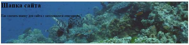
Посмотрим, что у нас получается.
Теперь, придадим вид заголовку и описанию. Создаём для них два селектора, и прописываем следующие свойства:
CSS
h1{

  color: #ffee00;  - цвет заголовка

  font: 40px Georgia;  - шрифт

  margin-left: 300px;  - отступ слева

}

.descript{

  width: 300px;  - ширина

  color: #ffee00;  - цвет

  font-style: italic;  - курсив

  margin: 70px 0 0 30px;  - расположение

  font-size:22px;  - размер шрифта

}
Результат:
Теперь добавим логотип.
В качестве логотипа я возьму изображение вот такого чёртика 
Картинка обязательно должна быть с прозрачным фоном, иначе её собственный фон очень некрасиво будет смотреться на фоновом изображении.
Чтоб разместить логотип проводим три изменения в коде:
а) в HTML блока добавим код картинки;
б) в CSS в блок header пропишем относительное позиционирование, так как логотип будет размещаться в этом блоке;
в) в CSS добавляем селектор логотипа, и позиционируем его абсолютно, относительно блока header.
HTML
<div id="header">

  <h1>Шапка сайта<h1>

    <p class="descript">Как сделать шапку для сайта с заголовком и описанием</p>

<img src="images/hortic.gif">

</div>
CSS
#header{

  position:relative;

  width: 900px;

  height: 200px;

  background-color: #25B33f;

  margin-bottom: 10px;

  background-image: url(images/i8.png)

}

h1{

  color: #ffee00;  - цвет заголовка

  font: 40px Georgia;  - шрифт

  margin-left: 300px;  - отступ слева

}

.descript{

  width: 300px;  - ширина

  color: #ffee00;  - цвет

  font-style: italic;  - курсив

  margin: 70px 0 0 30px;  - расположение

  font-size:22px;  - размер шрифта

}

img{

  position:absolute;

  top:10px;

  left:10px;

}
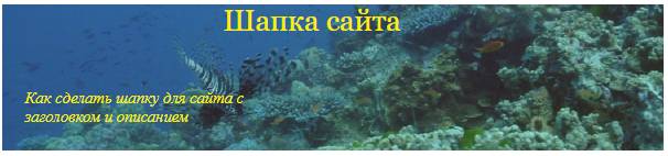
Результат:
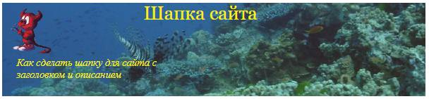
Получилась вот такая шапка сайта.
На предыдущей странице мы сделали каркас сайта и теперь можно вставить в него шапку и посмотреть что получилось.
Код страницы:
<!DOCTYPE html>

<html lang="ru">

    <head>

        <meta charset="utf-8" />

        <title>Документ без названия</title>

<style>

#wrapper{

    width: 900px;

    outline: 1px solid #787274;

    padding: 10px;

    margin: 0 auto;

}

#header{

    position:relative;

    width: 900px;

    height: 200px;

    background-color: #25B33f;

    margin-bottom: 10px;

    background-image: url(images/i8.png)

}

#sidebar{

    background-color: #2FF553;

    margin-bottom: 10px;

    width: 180px;

    padding: 10px;

    float: right;

}

#content{

    background-color: #9EF5AF;

    margin-bottom: 10px;

    width: 670px;

    padding: 10px;

}

#footer{

    height:80px;

    background-color: #41874E;

    margin-bottom: 10px;

}

.clear{

    clear: both;

}

h1{

    color: #ffee00;

    font: 40px Georgia;

    margin-left: 300px;

}

.descript{

    width: 300px;

    color: #ffee00;

    font-style: italic;

    margin: 70px 0 0 30px;

  font-size:22px;

}

img{

  position:absolute;

  top:10px;

  left:10px;

}

</style>

</head>

<body>

  <div id="wrapper">

    <div id="header">

      <h1>Шапка сайта</h1>

        <p class="descript">Как сделать шапку для сайта с заголовком и описанием</p>

<img src="images/hortic.gif">

    </div>

    <div id="sidebar">Здравствуйте уважаемые будущие веб-мастера!

Мне 55 лет и я рад приветствовать

Вас на своём сайте.

Этот сайт первый, который я разработал самостоятельно,

а до этого умел только входить в интернет.

    </div>

    <div id="content">А мне, учитывая возраст и «опыт», было не просто

понять как раз эти нюансы, они отнимали

больше всего времени.

И я решил написать свой материал, так что-бы другим было легче

сориентироваться в потоке новой информации.

Здесь «разжеваны» все мелочи сопровождающие создание сайта,

мимо которых обычно проскакивают другие авторы.

    </div>

    <div class="clear"></div>

    <div id="footer"></div>

  </div>

</body>

</html>

По моему не плохо, надеюсь у вас получится лучше.
Теперь немного информации для тех, у кого сайт расположен на CMS WordPress.
На WordPress устанавливается готовая тема, с готовой шапкой, но допустим, Вам захотелось в эту готовую шапку, добавить какой нибудь свой логотип, или ещё какое изображение.
Делается это следующим образом. Открываете в консоли «Записи — Добавить новую», переводите редактор в режим HTML, и загружаете то изображение, которое потом будет добавлено в шапку сайта.
В редакторе после загрузки появиться код картинки, его нужно скопировать, а «Запись» можно удалить.
Затем переходим во «Внешний вид — Редактор», и открываем для редактирования файл header.php.
В этом файле, находим строку <div id=»header»>, и после неё вставляем скопированный код картинки.
После этого обновляем файл, и смотрим, как изображение разместилось в шапке сайта.
Если его нужно куда то подвинуть, то возвращаемся в редактор файла, и в код изображения, в тег img, добавляем атрибут style со свойством margin
style="margin:0 0 0 0;"
И двигаем изображение туда, куда нам нужно.
Вот мы и создали первую страницу сайта. После доработки шапки, и ещё кое каких доработок, описанных далее, можно этот файл назвать index.html, и выложить его на хостинг. Затем, по этому же шаблону, создаются другие страницы, создаётся меню и так далее. И сайт начинает свою жизнь в интернете.

P.S. Если кому-то захочется поменять картинку в шапке сайта на WordPress, и по манипулировать расположением заголовков, то об этом в статье Редактируем тему оформления
Желаю творческих успехов.
Неужели не осталось вопросов? Спросить
 Перемена
Пьяный никак не может затолкнуть двушку в прорезь автомата. — Напился, — а еще таксист, — сказала прохожая. — С чего взяла? — Шапка таксистская. — Да, — задумчиво произнес пьяный, — а была ондатровая.
Как сделать картинку для шапки в Paint < < < В раздел > > > Как вставить картинку и текст в отдельный блок

Telegram Group
Join Now
Hello, guys welcome to Code With Random blog, today we learn How to create a header using Html and Css. In this header project, we learn topics like how to make a responsive header, also learn how to add a Google font to our website or in a project. and many more things about Header.

100+ JavaScript Projects With Source Code ( Beginners to Advanced)
| Code by | Tushar Sharma |
| Project Download | Link available below |
| Language used | HTML and CSS |
| External link / Dependencies | Yes |
| Responsive | YES |
HTML Structure of Simple Header:-
<!DOCTYPE htaml>
<html lang="en">
    <head>
        <meta charset="UTF-8" />
        <meta http-equiv="X-UA-Compatible" content="IE=edge" />
        <meta name="viewport" content="width=device-width, initial-scale=1.0" />
        <title>Simple Header - CodeWith Random</title>
    </head>
    <body>
        <header class="site-header">
            <div class="site-identity">
                <h1><a href="#">CodeWith Random</a></h1>
            </div>
            <nav class="site-navigation">
                <ul class="nav">
                    <li><a href="#">Home</a></li>
                    <li><a href="#">About</a></li>
                    <li><a href="#">Blog</a></li>
                    <li><a href="#">Contact</a></li>
                </ul>
            </nav>
        </header>
    </body>
</html>
First, we’re going to write html code and then styling so we use some tags in body tags like div, h1, ul. li, a, h1 and don’t forget to link css file in html boilerplate after it we get a poor design but that’s a mandatory start I hope that’s clear… let’s start the styling…
50+ HTML, CSS & JavaScript Projects With Source Code
Output Html Code header

Styling of Simple Header Using Css Code:-
@import url("https://fonts.googleapis.com/css2?family=Open+Sans&display=swap");
body {
    font-family: "Open Sans", sans-serif;
    margin: 0;
}
a {
    text-decoration: none;
    color: #000;
}
a:hover {
    color: rgb(179, 179, 179);
}
.site-header {
    border-bottom: 1px solid #ccc;
    padding: 0.5em 1em;
    display: flex;
    justify-content: space-between;
}
.site-identity h1 {
    font-size: 1.5em;
    margin: 0.6em 0;
    display: inline-block;
}
.site-navigation ul,
.site-navigation li {
    margin: 0;
    padding: 0;
}
.site-navigation li {
    display: inline-block;
    margin: 1.4em 1em 1em 1em;
}
this is all css for creating the header project and designing Header.
50+ HTML, CSS & JavaScript Projects With Source Code
Let’s start our styling doing starter styling by html reset or family-font then we give a color or text-decoration — None in <a> tag now we style our header by giving padding, border-bottom, flex, and space-between change the font size of header links or margin and inline-block if you want to customize more so try and our goal is to create a good looking header in just 60 lines of code or also you need to make responsive.
Output CSS Code header

Create Simple Portfolio Website Using Html Css (Portfolio Source Code)
How to use google font?
we has to many pre-installed fonts but they are not sufficient so we use google font for great look… and we use open sans in this project but we use open sans condensed for learning about google font.
Step 1 -> Search Google Font on Search Engine like Google, Bing, Safari, etc.
Step 2 -> Click on the first link Google Fonts
Step 3 -> When Google Font Site opens then search font you want to work with in above search box.
Step 4 -> Then click on font and a side bar appears gives option to add selected font in your site.
Options -> 1. Link the given cdn link to html file in head tag
2. Import using url to stylesheet than code in font family property
Step 5 -> Select the class or id you want to add font style than save code.
Output -> Fonts are changed
Hope you like this post and enjoy it. If we did any mistake please comment it down so this help full for also our users. Thank you for reading.
Written by Tushar Sharma
Team Codewith_Random
Which code editor do you use for this Header project coding?
I personally recommend using VS Code Studio, it’s very simple and easy to use.
is this project responsive or not?
Yes! this project is a responsive project.
Do you use any external links to create this project?
Листинги кода урока
Листинг кода — это просто код, который можно скопировать и перенести в Ваш редактор. Ниже будут представлены листинги кода файлов index.html и style.css.
Новые участки кода находятся между <!— New —><!— End —>. Можете уже сейчас вставить этот код в соответствующие файлы, сохранить и открыть index.html в браузере. Таким образом Вы увидите какой результат будет по итогу урока.
index.html:
<!DOCTYPE html>
<html lang="en">
<head>
	<meta charset="utf-8">
	<title>Store</title>
	<link rel="stylesheet" type="text/css" href="css/style.css">
</head>
<body>


        <!-- New -->
	<header class="header">
	</header>
        <!-- End -->


</body>
</html>
style.css:
html, body{
	margin: 0;
}
.header{
	background: #cb2d41;
	height: 100px;
}
Начало урока. Разбор файла index.html
В index.html по сравнению с предыдущим уроком изменилось немного. Я только добавил после <body> следующий код:
<header class="header">
</header>
Верхнюю часть сайта, называемую «шапка», помещают в специальный тег <header></header>.
На вашем сайте в <header></header> будет вся красная верхушка, как на imdiz.ru/store/:

Цвет фона для header я задал свойством background в style.css. Если Вы еще не открыли файл style.css в SublimeText, то откройте.
Сейчас у Вас в SublimeText открыто 2 файла: index.html и style.css. Для удобства сделайте следующее: вверху SublimeText нажмите View, в выпавшем окне наведите на Layout, и выберите там Columns: 2. Ваш редактор разделится на 2 колонки и файлы можно разместить в разных колонках. Так вы будете видеть сразу оба файла. Смотрите видео:
Разбор файла style.css
Разберем файл style.css и заодно познакомимся с CSS.
Сперва пропустим верхнюю часть кода и перейдем к участку:
.header{
	background: #cb2d41;
	height: 100px;
}
Говоря по-русски, благодаря этому коду браузер будет искать в index.html тег с классом header и задаст этому тегу цвет фона #cb2d41 и высоту 100px.
А теперь по-подробнее.
Этот код задает стили для <header class=’header’>, который находится в index.html. Здесь задан цвет фона (background) и высота (height).
Посмотрите на картинку ниже, на ней изображена структура стилей в CSS:

То есть структура следующая. Сперва пишется селектор, в нашем случае это класс .header. Именно по селектору браузер определяет, для какого тега в index.html нужно применить CSS-свойства. В фигурных скобках прописываются нужные CSS-стили для этого селектора: свойство и значение этого свойства.
#cb2d41 — такой формат задания цвета называется HEX. Это наиболее частый формат в верстке сайтов. Цвет можно задать просто английским словом, например, background: red. Но чаще (а точнее, практически всегда) применяется именно формат HEX.
В index.html я задал тегу header класс «header». И в style.css задал стили для этого класса — .header. В CSS точка перед названием селектора означает, что это селектора класса. Есть и другие селекторы, с ними Вы сможете познакомиться в следующих уроках.
В профессиональной верстке использовать селектор класса это почти стандарт, и нужно всегда стараться использовать именно селектор класса.
Кстати, название класса может быть абсолютно любым, хоть abcdef, но все-таки удобнее называть классы по смыслу элемента. У нас таким элементом является тег <header>, и здесь можно не выдумывать велосипед и назвать класс тоже header.
В нашем коде для .header помимо background задана еще и высота height: 100px;. Сейчас эту высоту я задал только для наглядности, чтобы Вы могли увидеть <header></header> в браузере. Дело в том, что, если блок сайта пустой и внутри него нет никакого контента (текста, изображения, видео), то высота этого блока равна 0, и Вы этот блок не увидите в браузере. В следующих уроках высота у .header будет убрана.
Переопределение стилей браузера. Инструменты разработчика в браузере
Теперь в Вашем style.css вернитесь к участку кода:
html, body{
	margin: 0;
}
Селекторы можно прописывать через запятую. В данном случае CSS-стили в фигурных скобках будут применены и для тега html, и для тега body.
Этот код равнозначен следующему:
html{
	margin: 0;
}

body{
	margin: 0;
}
И еще обратите внимание, что здесь используется селектор тега, а не класса. Точка перед именем селектора не стоит.
А теперь о том, для чего нужен этот участок кода. Если Вы удалите этот участок кода и сохраните style.css, то увидите в браузере, что шапка не на всю ширину браузера (слева, справа, а также сверху, будут белые полоски). Это потому, что в каждом браузере уже прописаны некоторые стили для всех HTML-тегов. Это стили браузера по умолчанию. В нашем случае белые полосы будут из-за того, что для тега <body></body> в браузере указаны отступы (в CSS для этого используется свойство margin). Чтобы это увидеть вызовите в браузере средства разработчика. Для этого, если у вас Google Chrome или Yandex Browser, просто нажмите на клавиатуре F12.

С инструментами разработчика удобнее работать, когда окно открыто внизу. Для того, чтобы его перенести вниз, нажмите справа на 3 точки, и в открывшемся окошке выберите нужное расположение. Смотрите видео:
В средствах разработчика видна структура HTML, а справа CSS-стили выделенного HTML-тега. Если Вы нажмете на <body>, то справа в CSS увидите, что помимо наших стилей у body есть еще другие стили, и в них margin: 8px;. Задав в style.css margin: 0; я переопределил стиль margin для тегов html и body.
Комментарии в HTML
Помните в начале урока написано, что новые участки кода находятся между <!— New —><!— End —>. Сами <!— New —> и <!— End —> никак не отобразятся в браузере. С помощью <!— —> осуществляется комментирование в HTML. Всё, что Вы поместите внутрь данной конструкции не отобразится в браузере, оно будет закомментировано. С помощью комментариев можно помещать какие-то подсказки для себя. Также, комментировать можно некоторые участки кода, чтобы временно их скрыть, при этом не придется их удалять.
Подытожу этот урок тем, что в CSS не так уж много свойств и их значений. На практике все CSS-свойства быстро запоминаются. Все CSS-свойства являются английскими словами, например, height переводится «высота». И это тоже очень хорошо для запоминания CSS-свойств.
Конец урока. В данном уроке вы узнали:
background — CSS-свойство для задания фона HTML-элемента
height — свойство для задания высоты
margin — внешние отступы
<header></header> — тег для «шапки» сайта.
Блок не отображается на сайте, если он пустой или ему не задана высота.
Стандартные стили браузера нужно переопределять.
В Google Chrome и Yandex Browser есть инструменты разработчика, которые вызываются клавишей F12.
Стили в CSS задаются через селекторы. В качестве селектора нужно стараться выбирать класс HTML-элемента.
Introduction to CSS Header Design
A website has a layout and is mainly divided into header, footer, menus, and content. In this, we will see about header section of the website layout. A header is located at the top of the website layout which contains a logo or website name and also contains some brief information about the website content. The header section of the website is a very important part while designing the website, which is used to grab the customer’s attention and the customers establish the connections with such websites very soon. Therefore header design of the website should be unique and appealing to the customers or users.
Functions of Header Designing in CSS
In this article, we will see how to design a header of the website. The header is usually laced at the top of the page which is the crucial part of the website. Headers and footers are key elements of the website. Headers are more important as the customer’s visit is more often on the header before going forward in the website content and footer. Headers most recommendable header size in the website designing is 1024px ×768px. Let us see a simple example of the header of the website.
Examples to Implement of CSS Header Design
Below are the examples of CSS Header Design:
Example #1
Code:
<!DOCTYPE html>
<html>
<head>
<title>Educba Training </title>
<style>
body {
font-family: Times New Roman;
margin: 0;
}
.header {
padding: 10px;
text-align: center;
background: cyan;
color: black;
font-size: 20px;
}
.content {padding:20px;}
</style>
</head>
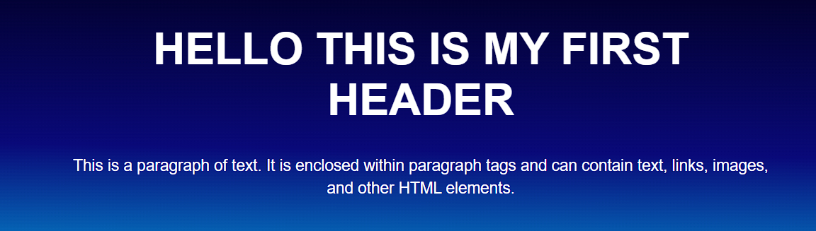
<body>
<div class="header">
<h1>CSS Header designing </h1>
<p>We can write here the header section </p>
</div>
<div class="content">
<h1> Website main content </h1>
<p>EDUCBA is an online training provider which offers you training programs or courses across any field which you wish to learn and excel on. </p>
</div>
</body>
</html>
Output:
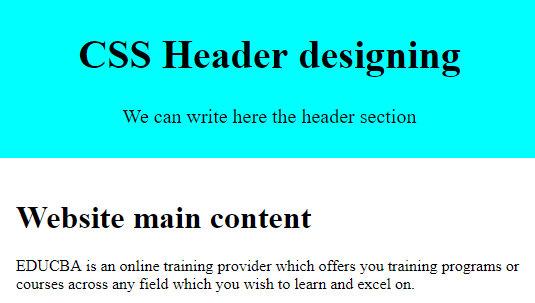
Explanation: In the above program, we can see we have designed the header of the website with different styling properties of CSS. This is how the header section of the website. There is another property in CSS which you can create a fixed or sticky header using CSS fixed positioning such as CSS position property with the value fixed or sticky. Let us see an example below.
Example #2
Code:
<!DOCTYPE html>

<html>

<head>

<title>Educba Training </title>

<style>

body{

padding-top: 60px;

padding-bottom: 40px;

}

.fixed-header

{

width: 100%;

position: fixed;

background: #333;

padding: 10px 0;

color: #fff;

}

.fixed-header{

top: 0;

}

.container{

width: 80%;

margin: 0 auto;

}

nava{

color: #fff;

padding: 7px 25px;

display: inline-block;

}

</style>

</head>

<body>

<div class="fixed-header">

<div class="container">

<nav>

<a href="#"> Home </a>

<a href="#"> Articles </a>

<a href="#"> Directory </a>

<a href="#"> Events </a>

<a href="#"> About Us</a>

</nav>

</div>

</div>

<div class="container">

<p> EDUCBA is a leading global provider of skill based online education. It offers amazing 1700+ courses across 10+ verticals prepared by top notch professionals from the industry which are job oriented skill based programs demanded by the industry. Through its online feature you can learn at any time & anyplace so plan your study to suit your convenience & schedule. </p>

</div>

</body>

</html>
Output:
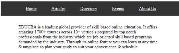
Explanation: In the above program, we have seen the CSS property position in the header section which we have declared the value as “fixed” you can see in the above screenshot. As we know there are many ways to create the header which can be created either static or responsive headers. Responsive headers are defined as to which they can adjust to any screen sizes. There are options to create a responsive header and they are designed as shown in the below example.
Example #3
Code:
<!DOCTYPE html>

<html>

<head>

<style>

* {box-sizing: border-box;}

body {

margin: 0;

font-family: Arial;

}

.header {

overflow: hidden;

background-color: cyan;

padding: 20px 10px;

}

.header a {

float: left;

color: black;

text-align: center;

padding: 12px;

text-decoration: none;

font-size: 15px;

line-height: 25px;

border-radius: 5px;

}

.headera.logo {

font-size: 25px;

font-weight: bold;

}

.header a:hover {

background-color: grey;

color: black;

}

.headera.active {

background-color: green;

color: white;

}

.header-right {

float: right;

}

@media screen and (max-width: 500px) {

.header a {

float: none;

display: block;

text-align: left;

}

.header-right {

float: none;

}

}

</style>

</head>

<body>

<div class="header">

<a href="#default" class="logo">CompanyLogo</a>

<div class="header-right">

<a class="active" href="#home">Home</a>

<a href="#contact">Articles</a>

<a href="#about">About Us</a>

</div>

</div>

<div style="padding-left:20px">

<h1>CSS Responsive Header</h1>

<p>Resize the browser window to see the effect.</p>

<p> EDUCBA is a leading global provider of skill based online education. It offers amazing 1700+ courses across 10+ verticals prepared by top notch professionals from the industry which are job oriented skill based programs demanded by the industry. </p>

</div>

</body>

</html>
Output:
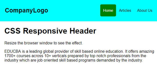
Explanation: In the above program, we have created a responsive header which means as an how the size of the browser increases or decreases even the header also resize itself accordingly, and hence the header is known as a responsive header. We should note that if we specify the fixed width for the header then it won’t be responsive so it is better to use center alignment. We can also see we have declared media query in which we have to code for responsive header designing and we have managed the max-width with “500px” and this we have done using two languages HTML and CSS.
Conclusion
In this article, we have seen how to create a header in CSS. In this article, we conclude that the header is a very crucial and important section of any website layout. As we saw as the header is the main section that attracts any customers and hence the designing of the effective header is very important. We have also seen how to create a header using position property of CSS which provides values like sticky or fixed. In the end, we have discussed a responsive header for which we use media query for creating header a responsive for which we can resize the header as to the size of the browser.
Recommended Articles
This is a guide to CSS Header Design. Here we discuss a brief overview on CSS Header Design and its different examples along with its code implementation. You can also go through our other suggested articles to learn more –
- Uses of CSS in Technology
- Tips and Tricks to use CSS Commands
- Introduction to Top 6 Advantages of CSS
- Some Property of Button in CSS