В этой статье мы подробно рассмотрим, что такое медиа-запросы, как они работают и как их правильно использовать, в том числе и для создания адаптивного дизайна. Разберём конструкции @media, которые используются в Bootstrap.
Что такое медиа-запросы
Медиа-запросы (media queries) – это правила CSS, которые позволяют управлять стилями элементов в зависимости от значений технических параметров устройств. Иными словами, это конструкции, которые позволяют определять на основании некоторых условий какие стили необходимо использовать на веб-странице, а какие нет.
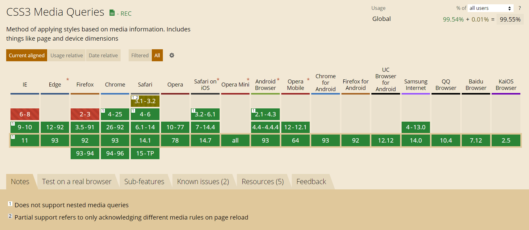
Медиа-запросы появились в спецификации CSS3 и на сегодняшний день поддерживаются всеми современными браузерами (Chrome 4+, Firefox 3.5+, IE 9+, Opera 9+, Safari 4+).
Поддержка медиа-запросов в браузере IE8 осуществляется посредством подключения к странице скрипта «respond.js»:
<!-- Respond.js для IE8 (media queries) -->
<!-- Предупреждение: Respond.js не будет работать при просмотре страницы через file:// -->
<!--[if lt IE 9]>
  <script src="https://oss.maxcdn.com/respond/1.4.2/respond.min.js"></script>
<![endif]-->
Медиа-запросы предназначены для создания адаптивных дизайнов. Адаптивный дизайн отличается от других тем, что он может «приспосабливаться» (видоизменяться) в зависимости от того, какую ширину экрана имеет устройство (браузер).
Но при создании адаптивных веб-страниц также необходимо обратить внимание на метатег viewport. Данный тег обеспечивает корректное отображение адаптивных дизайнов сайтов на экранах устройств, имеющих высокую плотность пикселей. Иными словами, он устанавливает соответствие между CSS и физическим разрешением веб-страницы.
Подключение метатега viewport к странице осуществляется так:
<meta name="viewport" content="width=device-width, initial-scale=1">Синтаксис
Создание медиа-запроса начинается с ключевого слова @media после которого указывается одно или несколько условий. В качестве условия можно указывать тип устройства или требования к определённой характеристике. Требование к определённой характеристике записывается в круглых скобках.
Комбинирование нескольких условий выполняется с помощью логических операторов.
После составления @media, стили, указанные в нём, будут применяться только в том случае, когда итоговый результат вычисления условий является истинной.
Пример медиа-запроса с одним условием:
@media screen {
  /* стили будут применяться, когда условие истинно */
}
Пример медиа-запроса с комбинированием нескольких условий:
@media (min-width: 992px) and (max-width: 1199.98px) { ... }В @media можно указывать определённые типы устройств:
all– для всех;print– для принтеров и в режиме предварительного просмотра страницы перед печатью;screen– для устройств с экранами;speech– для программ чтения с экрана.
Например, этот @media только для экранов:
@media screen { ... }А здесь для экранов и принтеров:
@media screen, print { ... }Логические операторы
Логические операторы and, , (запятая), not и only предназначены для создания сложных медиа-запросов.
and
Оператор and используется для объединения нескольких условий. В этом случае их результат будет истинным, когда каждое из них будет истинным.
Например, следующий @media будет применяться только при выполнении всех трёх условий (это экран, width >= 1200px и ориентация landscape):
@media screen and (min-width: 1200px) and (orientation: landscape) { ... }, (запятая)
Применение стилей, когда необходимо лишь выполнение одного из указанных условий, достигается посредством разделения их между собой с помощью , (запятой).
В этом примере стили будут применяться к странице в двух случаях. Когда width >= 544px или ориентация portrait.
@media (min-width: 544px), (orientation: landscape) { ... }not
Ключевое слово not используется для отрицания.
При использовании not с and отрицание работает для всего медиа-запроса. При этом, когда указываем not необходимо обязательно задавать тип устройства.
Например, применим стили только в том случае, когда не (экран и width >= 411px и height >= 731px).
@media not screen and (min-width: 411px) and (min-height: 731px) { ... }При использовании not в выражении с запятой он добавляет отрицание только для этой части.
Например, применим стили когда истинно следующее условие: не экран или не width >= 411px.
@media not screen, not (min-width: 411px) { ... }only
Ключевое слово only предназначено для того, чтобы браузеры, которые не поддерживают CSS3 медиа-запросы их игнорировали. В настоящее время это уже не актуально, поэтому использовать only не нужно.
При составлении условия кроме типов устройств и логических операторов можно ещё задавать требования к определённым характеристикам, которые должен иметь браузер, устройство вывода, или окружение. В некоторых источниках характеристики называют медиа-функциями.
Каждая характеристика в @media должна быть заключена в круглые скобки.
При этом применяться стили указанные в @media будут также как раньше, т.е. только в том случае, когда результат вычисления всего выражения будет являться истиной.
width
Медиа-характеристика width позволяет задать условие на равенство ширины области просмотра определённому значению.
Например, применим CSS только для viewport с шириной 320px.
@media (width: 320px) { ... }Для определения диапазона можно использовать min-width и max-width.
Например, @media для ширины viewport от 576px до 1200px:
@media (min-width: 576px) and (max-width: 1199.98px) { ... }Для ширины больше 768px:
@media (min-width: 768px) { ... }Если нужно меньше 1400px:
@media (max-width: 1399.98px) { ... }height
Для задания условий в отношении высоты viewport можно использовать height, min-height и max-height.
Например, @media для высоты viewport больше 720px:
@media (min-height: 720px) { ... }orientation
С помощью orientation можно установить те или иные стили в зависимости от того, в каком режиме (альбомном или портретном) отображается сайт.
Например, в зависимости от ориентации viewport будем отображать разные картинки:
@media (orientation: landscape) {
  .cover { background: url(bg-l.png) no-repeat; }
}

@media (orientation: portrait) {
  .cover { background: url(bg-p.png) no-repeat; }
}
aspect-ratio
Характеристики aspect-ration, min-aspect-ratio и max-aspect-ratio позволяют задавать стили в зависимости от соотношения сторон viewport.
/* Minimum aspect ratio */
@media (min-aspect-ratio: 9/16) {
  .header {
    background-color: #0dcaf0;
  }
}

/* Maximum aspect ratio */
@media (max-aspect-ratio: 16/9) {
  .header {
    background: #ffc107;
  }
}

/* Exact aspect ratio */
@media (aspect-ratio: 1/1) {
  .header {
    background: #6c757d;
  }
}
resolution
Характеристики resolution, min-resolution и max-resolution можно использовать, когда нужно задать стили в зависимости от плотности пикселей устройства.
Например, установим другой размер шрифта для устройств с плотностью пикселей на дюйм более 150:
/* Default */
p {
  font-size: 16px;
}

/* Minimum resolution */
@media (min-resolution: 150dpi) {
  p {
    font-size: 14px;
  }
}
Стили для печати страницы с плотностью пикселей больше 300dpi:
@media print and (min-resolution: 300dpi) { ... }Медиа-запросы в <link> и @import
При подключении таблицы стилей можно с помощью атрибута media установить медиа-запросы и тем самым определить условия, когда они должны использоваться.
<link rel="stylesheet" media="screen and (max-width: 991.98px)" href="/assets/mobile.css">
<link rel="stylesheet" media="screen and (min-width: 992px)" href="/assets/desktop.css">
Кроме <link>, их также можно использовать в @import:
@import url(mobile.css) screen and (max-width: 991.98px);
@import url(desktop.css) screen and (min-width: 992px);
Медиа-запросы для Bootstrap 3
Организация media queries в порядке возрастания классов устройств xs, sm, md и lg (по умолчанию):
/* Устройства с очень маленьким экраном (смартфоны, меньше 768px) */
/* Стили CSS (по умолчанию) - для ширины viewport <768px */

/* Устроства с маленьким экраном (планшеты, 768px и выше) */
@media (min-width: 768px) {
/* Стили для устройств с шириной viewport, находящейся в диапазоне 768px - 991px */
}

/* Устройства со средним экраном (ноутбуки и компьютеры, 992px и выше) */
@media (min-width: 992px) {
  /* Стили для устройств с шириной viewport, находящейся в диапазоне 992px - 1199px */
}

/* Устройства с большим экраном (компьютеры, 1200px и выше) */
@media (min-width: 1200px) {
  /* Стили для устройств с шириной viewport >1200px */
}
Вышеприведённые запросы необходимо использовать только в указанном порядке.
Для того чтобы media запросы можно было применять в какой угодной последовательности, их необходимо расширить включив в них дополнительно выражение max-width. Это заставит их работать только в указанном диапазоне.
@media (max-width: 767px) {
  /* стили для xs-устройств */
}
@media (min-width: 768px) and (max-width: 991px) {
  /* стили для sm-устройств */
}
@media (min-width: 991px) and (max-width: 1199px) {
  /* стили для md-устройств */
}
@media (min-width: 1200px) {
  /* стили для lg-устройств */
}
Медиа-запросы для Bootstrap 4
Синтаксис медиа-запросов для Bootstrap 4, которые можно использовать только в следующем порядке (последовательного увеличения минимальной ширины viewport):
/* xs - устройства (до 576px) */
/* CSS для ширины, которая меньше 575px (включительно) */

/* sm-устройства (больше или равно 576px) */
@media (min-width: 576px) {
  /* CSS для: 576px <= ширины <= 767px */
}

/* md-устройства (больше или равно 768px) */
@media (min-width: 768px) {
  /* CSS для: 768px <= ширины <= 991px */
}

/* lg-устройства (больше или равно 992px) */
@media (min-width: 992px) {
  /* CSS для: 992px <= ширины <= 1119px */
}

/* xl-устройства (больше или равно 1200px) */
@media (min-width: 1200px) {
  /* CSS для: ширины >= 1200px */
}
Список media запросов для фреймворка Bootstrap 4, которые можно применять только в обратном порядке (в порядке убывания ширины области просмотра окна браузера):
/* xl-размер (>=1200px) */
/* CSS для >=1200px */

/* lg-размер (<=1199px) */
@media (max-width: 1199px) {
  /* CSS для ширины от 992px до 1199px */
}

/* md-размер (<=991px) */
@media (max-width: 991px) {
  /* CSS для ширины от 768px до 991px */
}

/* sm-размер (<=768px) */
@media (max-width: 767px) {
  /* CSS для ширины от 576px до 767px */
}

/* xs-размер (<=575px) */
@media (max-width: 575px) {
  /* CSS для ширины до 575px (включительно) */
}
Перечень медиа-запросов для Bootstrap 4, которые можно использовать в таблице стилей в любой последовательности:
/* xs (<=543px) */
@media (max-width: 575px) { ... }

/* sm (>=576 и <=767) */
@media (min-width: 576px) and (max-width: 767px) { ... }

/* md (>=768 и <=991) */
@media (min-width: 768px) and (max-width: 991px) { ... }

/* lg (>=992 и <=1199) */
@media (min-width: 992px) and (max-width: 1199px) { ... }

/* xl (>=1200) */
@media (min-width: 1200px) { ... }
Код JavaScript, учитывающий параметры устройств
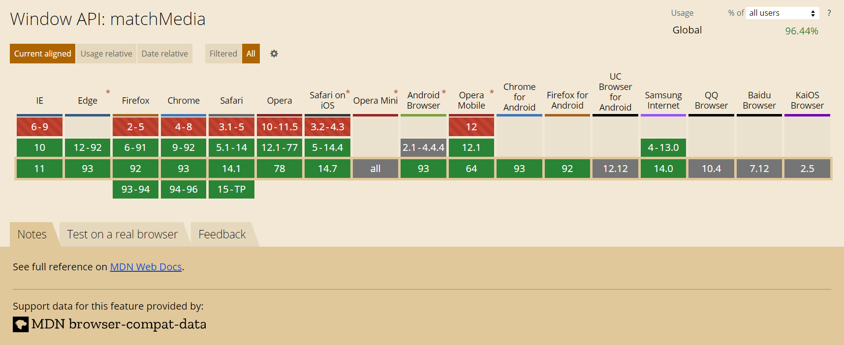
Наиболее простой способ создания кода JavaScript, учитывающий параметры устройств (аналогично CSS медиа-запросам), осуществляется с помощью метода matchMedia объекта window.
Осуществляется это следующим образом:
// например, проверим, соответствует ли указанный медиа-запрос (screen and (max-width: 543px)) устройству
// результат проверки можно получить с помощью свойства matches (true или false)
if (window.matchMedia('screen and (max-width: 543px)').matches) {
  // ... действия, если устройство отвечает медиа-запросу
} else {
  // ... действия, если устройство не соответствует значениям медиа-запроса
}
Например, эту возможность можно применить для асинхронной загрузки картинок в зависимости от того какой размер viewport имеет устройство (браузер).
Метод matchMedia не поддерживается Internet Explorer 9 и другими старыми браузерами. Для того чтобы обеспечить эту функциональность в старых браузерах можно воспользоваться методом mq библиотеки Modernizr.
if (Modernizr.mq('(max-width: 767px)')) {
  // ... действия, если устройство соответствует указанному медиа-условию
} else {
  // ... действия, если устройство не отвечает заданному медиа-условию
}- Previous
- Overview: CSS layout
- Next
The CSS Media Query gives you a way to apply CSS only when the browser and device environment matches a rule that you specify, for example «viewport is wider than 480 pixels». Media queries are a key part of responsive web design, as they allow you to create different layouts depending on the size of the viewport, but they can also be used to detect other things about the environment your site is running on, for example whether the user is using a touchscreen rather than a mouse. In this lesson you will first learn about the syntax used in media queries, and then move on to use them in a working example showing how a simple design might be made responsive.
| Prerequisites: |
HTML basics (study Introduction to HTML), and an idea of how CSS works (study CSS first steps and CSS building blocks.) |
|---|---|
| Objective: |
To understand how to use media queries, and the most common approach for using them to create responsive designs. |
The simplest media query syntax looks like this:
@media media-type and (media-feature-rule) {
  /* CSS rules go here */
}
It consists of:
- A media type, which tells the browser what kind of media this code is for (e.g. print, or screen).
- A media expression, which is a rule, or test that must be passed for the contained CSS to be applied.
- A set of CSS rules that will be applied if the test passes and the media type is correct.
Media types
The possible types of media you can specify are:
allprintscreen
The following media query will only set the body to 12pt if the page is printed. It will not apply when the page is loaded in a browser.
@media print {
  body {
    font-size: 12pt;
  }
}
Note: The media type here is different from the so-called MIME type.
Note: There were a number of other media types defined in the Level 3 Media Queries specification; these have been deprecated and should be avoided.
Note: Media types are optional; if you do not indicate a media type in your media query, then the media query will default to being for all media types.
Media feature rules
After specifying the type, you can then target a media feature with a rule.
Width and height
The feature we tend to detect most often in order to create responsive designs (and that has widespread browser support) is viewport width, and we can apply CSS if the viewport is above or below a certain width — or an exact width — using the min-width, max-width, and width media features.
These features are used to create layouts that respond to different screen sizes. For example, to change the body text color to red if the viewport is exactly 600 pixels, you would use the following media query.
@media screen and (width: 600px) {
  body {
    color: red;
  }
}
Open this example in the browser, or view the source.
The width (and height) media features can be used as ranges, and therefore be prefixed with min- or max- to indicate that the given value is a minimum, or a maximum. For example, to make the color blue if the viewport is 600 pixels or narrower, use max-width:
@media screen and (max-width: 600px) {
  body {
    color: blue;
  }
}
Open this example in the browser, or view the source.
In practice, using minimum or maximum values is much more useful for responsive design so you will rarely see width or height used alone.
There are a number of other media features that you can test for, although some of the newer features introduced in Level 4 and 5 of the media queries specification have limited browser support. Each feature is documented on MDN along with browser support information, and you can find a full list at Using Media Queries: Media Features.
Orientation
One well-supported media feature is orientation, which allows us to test for portrait or landscape mode. To change the body text color if the device is in landscape orientation, use the following media query.
@media (orientation: landscape) {
  body {
    color: rebeccapurple;
  }
}
Open this example in the browser, or view the source.
A standard desktop view has a landscape orientation, and a design that works well in this orientation may not work as well when viewed on a phone or tablet in portrait mode. Testing for orientation can help you to create a layout which is optimized for devices in portrait mode.
Use of pointing devices
As part of the Level 4 specification, the hover media feature was introduced. This feature means you can test if the user has the ability to hover over an element, which essentially means they are using some kind of pointing device; touchscreen and keyboard navigation does not hover.
@media (hover: hover) {
  body {
    color: rebeccapurple;
  }
}
Open this example in the browser, or view the source.
If we know the user cannot hover, we could display some interactive features by default. For users who can hover, we might choose to make them available when a link is hovered over.
Also in Level 4 is the pointer media feature. This takes three possible values, none, fine and coarse. A fine pointer is something like a mouse or trackpad. It enables the user to precisely target a small area. A coarse pointer is your finger on a touchscreen. The value none means the user has no pointing device; perhaps they are navigating with the keyboard only or with voice commands.
Using pointer can help you to design better interfaces that respond to the type of interaction a user is having with a screen. For example, you could create larger hit areas if you know that the user is interacting with the device as a touchscreen.
With all of the different possible media queries, you may want to combine them, or create lists of queries — any of which could be matched.
«and» logic in media queries
To combine media features you can use and in much the same way as we have used and above to combine a media type and feature. For example, we might want to test for a min-width and orientation. The body text will only be blue if the viewport is at least 600 pixels wide and the device is in landscape mode.
@media screen and (min-width: 600px) and (orientation: landscape) {
  body {
    color: blue;
  }
}
Open this example in the browser, or view the source.
«or» logic in media queries
If you have a set of queries, any of which could match, then you can comma separate these queries. In the below example the text will be blue if the viewport is at least 600 pixels wide OR the device is in landscape orientation. If either of these things are true the query matches.
@media screen and (min-width: 600px), screen and (orientation: landscape) {
  body {
    color: blue;
  }
}
Open this example in the browser, or view the source.
«not» logic in media queries
You can negate an entire media query by using the not operator. This reverses the meaning of the entire media query. Therefore in this next example the text will only be blue if the orientation is portrait.
@media not all and (orientation: landscape) {
  body {
    color: blue;
  }
}
Open this example in the browser, or view the source.
How to choose breakpoints
In the early days of responsive design, many designers would attempt to target very specific screen sizes. Lists of the sizes of the screens of popular phones and tablets were published in order that designs could be created to neatly match those viewports.
There are now far too many devices, with a huge variety of sizes, to make that feasible. This means that instead of targeting specific sizes for all designs, a better approach is to change the design at the size where the content starts to break in some way. Perhaps the line lengths become far too long, or a boxed out sidebar gets squashed and hard to read. That’s the point at which you want to use a media query to change the design to a better one for the space you have available. This approach means that it doesn’t matter what the exact dimensions are of the device being used, every range is catered for. The points at which a media query is introduced are known as breakpoints.
The Responsive Design Mode in Firefox DevTools is very useful for working out where these breakpoints should go. You can easily make the viewport smaller and larger to see where the content would be improved by adding a media query and tweaking the design.
Active learning: mobile first responsive design
Broadly, you can take two approaches to a responsive design. You can start with your desktop or widest view and then add breakpoints to move things around as the viewport becomes smaller, or you can start with the smallest view and add layout as the viewport becomes larger. This second approach is described as mobile first responsive design and is quite often the best approach to follow.
The view for the very smallest devices is quite often a simple single column of content, much as it appears in normal flow. This means that you probably don’t need to do a lot of layout for small devices — order your source well and you will have a readable layout by default.
The below walkthrough takes you through this approach with a very simple layout. In a production site you are likely to have more things to adjust within your media queries, however the approach would be exactly the same.
Walkthrough: a simple mobile-first layout
Our starting point is an HTML document with some CSS applied to add background colors to the various parts of the layout.
* {
  box-sizing: border-box;
}

body {
  width: 90%;
  margin: 2em auto;
  font: 1em/1.3 Arial, Helvetica, sans-serif;
}

a:link,
a:visited {
  color: #333;
}

nav ul,
aside ul {
  list-style: none;
  padding: 0;
}

nav a:link,
nav a:visited {
  background-color: rgba(207, 232, 220, 0.2);
  border: 2px solid rgb(79, 185, 227);
  text-decoration: none;
  display: block;
  padding: 10px;
  color: #333;
  font-weight: bold;
}

nav a:hover {
  background-color: rgba(207, 232, 220, 0.7);
}

.related {
  background-color: rgba(79, 185, 227, 0.3);
  border: 1px solid rgb(79, 185, 227);
  padding: 10px;
}

.sidebar {
  background-color: rgba(207, 232, 220, 0.5);
  padding: 10px;
}

article {
  margin-bottom: 1em;
}
We’ve made no layout changes, however the source of the document is ordered in a way that makes the content readable. This is an important first step and one which ensures that if the content were to be read out by a screen reader, it would be understandable.
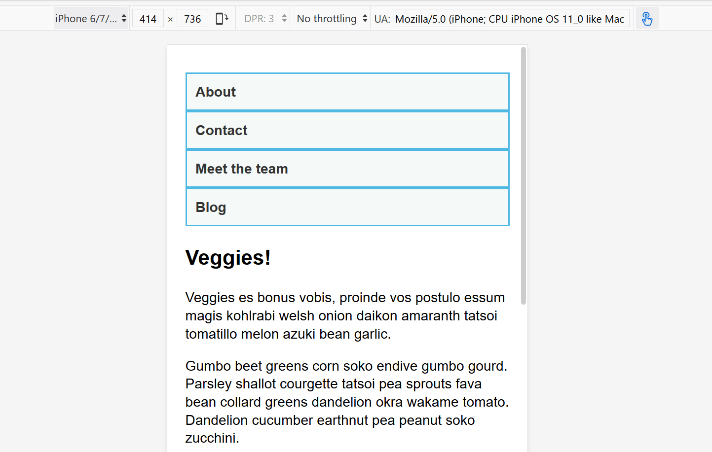
<body>
<div class="wrapper">
<header>
<nav>
<ul>
<li><a href="">About</a></li>
<li><a href="">Contact</a></li>
<li><a href="">Meet the team</a></li>
<li><a href="">Blog</a></li>
</ul>
</nav>
</header>
<main>
<article>
<div class="content">
<h1>Veggies!</h1>
<p>…</p>
</div>
<aside class="related">
<p>…</p>
</aside>
</article>
<aside class="sidebar">
<h2>External vegetable-based links</h2>
<ul>
<li>…</li>
</ul>
</aside>
</main>
<footer><p>©2019</p></footer>
</div>
</body>
This simple layout also works well on mobile. If we view the layout in Responsive Design Mode in DevTools we can see that it works pretty well as a straightforward mobile view of the site.
Open step 1 in the browser, or view the source.
If you want to follow on and implement this example as we go, make a local copy of step1.html on your computer.
From this point, start to drag the Responsive Design Mode view wider until you can see that the line lengths are becoming quite long, and we have space for the navigation to display in a horizontal line. This is where we’ll add our first media query. We’ll use ems, as this will mean that if the user has increased their text size, the breakpoint will happen at a similar line-length but wider viewport, than someone with a smaller text size.
Add the below code into the bottom of your step1.html CSS.
@media screen and (min-width: 40em) {
  article {
    display: grid;
    grid-template-columns: 3fr 1fr;
    column-gap: 20px;
  }

  nav ul {
    display: flex;
  }

  nav li {
    flex: 1;
  }
}
This CSS gives us a two-column layout inside the article, of the article content and related information in the aside element. We have also used flexbox to put the navigation into a row.
Open step 2 in the browser, or view the source.
Let’s continue to expand the width until we feel there is enough room for the sidebar to also form a new column. Inside a media query we’ll make the main element into a two column grid. We then need to remove the margin-bottom on the article in order that the two sidebars align with each other, and we’ll add a border to the top of the footer. Typically these small tweaks are the kind of thing you will do to make the design look good at each breakpoint.
Again, add the below code into the bottom of your step1.html CSS.
@media screen and (min-width: 70em) {
  main {
    display: grid;
    grid-template-columns: 3fr 1fr;
    column-gap: 20px;
  }

  article {
    margin-bottom: 0;
  }

  footer {
    border-top: 1px solid #ccc;
    margin-top: 2em;
  }
}
Open step 3 in the browser, or view the source.
If you look at the final example at different widths you can see how the design responds and works as a single column, two columns, or three columns, depending on the available width. This is a very simple example of a mobile first responsive design.
If you look at the HTML source in the above example, you’ll see the following element included in the head of the document:
<meta name="viewport" content="width=device-width,initial-scale=1" />
This is the viewport meta tag — it exists as a way to control how mobile browsers render content. This is needed because by default, most mobile browsers lie about their viewport width. Non-responsive sites commonly look really bad when rendered in a narrow viewport, so mobile browsers usually render the site with a viewport width wider than the real device width by default (usually 980 pixels), and then shrink the rendered result so that it fits in the display.
This is all well and good, but it means that responsive sites are not going to work as expected. If the viewport width is reported as 980 pixels, then mobile layouts (for example created using a media query of @media screen and (max-width: 600px) { }) are not going to render as expected.
To remedy this, including a viewport meta tag like the one above on your page tells the browser «don’t render the content with a 980 pixel viewport — render it using the real device width instead, and set a default initial scale level for better consistency.» The media queries will then kick in as expected.
There are a number of other options you can put inside the content attribute of the viewport meta tag — see Using the viewport meta tag to control layout on mobile browsers for more details.
Flexbox, Grid, and multi-column layout all give you ways to create flexible and even responsive components without the need for a media query. It’s always worth considering whether these layout methods can achieve what you want without adding media queries. For example, you might want a set of cards that are at least 200 pixels wide, with as many of these 200 pixels as will fit into the main article. This can be achieved with grid layout, using no media queries at all.
This could be achieved using the following:
<ul class="grid">
  <li>
    <h2>Card 1</h2>
    <p>…</p>
  </li>
  <li>
    <h2>Card 2</h2>
    <p>…</p>
  </li>
  <li>
    <h2>Card 3</h2>
    <p>…</p>
  </li>
  <li>
    <h2>Card 4</h2>
    <p>…</p>
  </li>
  <li>
    <h2>Card 5</h2>
    <p>…</p>
  </li>
</ul>
.grid {
  list-style: none;
  margin: 0;
  padding: 0;
  display: grid;
  gap: 20px;
  grid-template-columns: repeat(auto-fill, minmax(200px, 1fr));
}

.grid li {
  border: 1px solid #666;
  padding: 10px;
}
Open the grid layout example in the browser, or view the source.
With the example open in your browser, make the screen wider and narrower to see the number of column tracks change. The nice thing about this method is that grid is not looking at the viewport width, but the width it has available for this component. It might seem strange to wrap up a section about media queries with a suggestion that you might not need one at all! However, in practice you will find that good use of modern layout methods, enhanced with media queries, will give the best results.
Test your skills!
You’ve reached the end of this article, but can you remember the most important information? You can find a test to verify that you’ve retained this information before you move on — see Test your skills: Responsive web design and media queries.
Summary
In this lesson you have learned about media queries, and also discovered how to use them in practice to create a mobile first responsive design.
You could use the starting point that we have created to test out more media queries. For example, perhaps you could change the size of the navigation if you detect that the visitor has a coarse pointer, using the pointer media feature.
You could also experiment with adding different components and seeing whether the addition of a media query, or using a layout method like flexbox or grid is the most appropriate way to make the components responsive. Very often there is no right or wrong way — you should experiment and see which works best for your design and content.
- Previous
- Overview: CSS layout
- Next
Время на прочтение
8 мин
Количество просмотров 85K

В июле 2010 года я написала статью «Как использовать CSS3 медиа-запросы для создания мобильной версии вашего сайта» для журнала Smashing. Спустя почти восемь лет эта статья по-прежнему очень популярна. Я решила вернуться к этой теме, поскольку теперь у нас есть такие методы компоновки, как Flexbox и CSS Grid. В этой статье мы рассмотрим современные методы использования медиа-запросов в адаптивном дизайне, а также рассмотрим, что может произойти в будущем.
Нужны ли вообще медиа-запросы?
Первое, что нужно сделать перед тем как написать медиа-запрос в 2018 году — спросить себя, нужно ли вообще его использовать. При построении сеток с использованием float мы создаем гибкую сетку, вычисляя размер наших колонок используя проценты. Эти проценты вычисляются методом Этана Маркотт (Ethan Marcotte), описанным в статье Fluid Grids. Этот метод лег в основу техники, которую мы теперь знаем как «отзывчивый дизайн». Чтобы изменить размер или пропорции колонок, мы должны добавить контрольную точку используя медиа-запрос и переопределить их. В работе с процентами других возможностей нет — колонки всегда будут равны проценту от контейнера, в котором они находятся, будь то широкий или узкий контейнер.
Flexbox, CSS Grid и многоколоночная верстка (Multi-column layout) адаптивны по умолчанию, так как их спецификации были написаны в мире, где адаптивный дизайн и кросс-девайсность уже стали реальностью. Это значит, что они уже включают в себя множество функций, которые позволяют легко создавать адаптивные сетки.
В этом CodePen приведены примеры того, как Multi-column, Flexbox и Grid меняют размеры и положение в соответствии с доступным пространством. Здесь нет медиа-запросов и совсем немного CSS.
Используя гибкость этих методов компоновки, мы можем создавать гибкие блоки, которые будут по-разному располагаться в зависимости от доступного пространства экрана без использования медиа-запросов. Например, объект мультимедиа, который вы хотите отобразить колонкой, когда пространство ограниченно, и как строка, когда пространства достаточно. Этого можно достичь с помощью всего нескольких строк CSS.
Допустим flex-basis для наших элементов составляет 250px. Если нет места для двух 250px колонок, они будут выстраиваться в колонку, а если задать положительный flex-grow они еще будут заполнять все доступное пространство.
.media {
    display: flex;
    flex-wrap: wrap;
}

.media > * {
    flex: 1 1 250px;
}

Когда есть достаточно места для отображения двух колонок
Контент в одну колонку
Одна из особенностей использования Flexbox в том, что доступное пространство для блока ограничено или размером экрана или контейнером с меньшим доступным пространством. Медиа-запросы не могут решить эту задачу, поскольку они смотрят только на доступные размеры всего экрана. Таким образом, новые способы компоновки контента позволяют нам реализовать то, что не могут медиа-запросы.
В примере ниже показано, как контент может быть ограничен вьюпортом (измените размер окна, чтобы увидеть гибкость) и контейнером.
Только в том случае, если такого поведения сеток вам недостаточно, стоит задуматься о применении медиа-запросов. В связке медиа-запросов и CSS Grid вы можете полностью переопределить сетку. Медиа-запросы и CSS Grid отлично дополняют друг друга. Всего одной строкой CSS мы можем переопределить, как и где элементы будут расположены в сетке без изменения разметки. Начнем с одноколоночной сетки для узкой ширины.
grid {
    display: grid;
    grid-gap: 1em;
    grid-template-columns: 1fr;
}
Для более широкой сетки я использую медиа запрос для переопределения количества колонок и задаю свойство, чтобы некоторые блоки охватили несколько соседних ячеек.
@media (min-width: 40em) {
    .grid {
        grid-template-columns: 2fr 1fr;
    }

    header,
    footer {
        grid-column: 1 / 3;
    }
}
Сочетание уместно примененных медиа-запросов и новых методов компоновки предоставляет нам множество возможностей для достижения наилучшего UX на любом устройстве. В этом CodePen я объединила сетку выше с чуть ранее созданным медиа-объектом. Как вы видите, для контента вполне достаточно места на десктопе, но когда доступная область для содержимого становится слишком узкой, сетка преобразуется медиа-запросом, а блоки встают в одну колонку без медиа-запроса.
Медиа-запросы — лучшие практики
Думаю мы все согласимся, что медиа-запросы нам все еще нужны, но способы их применения однозначно меняются. Ниже приведены несколько советов, как использовать медиа-запросы в 2018 году по максимуму.
НЕ ОРИЕНТИРУЙТЕСЬ НА УСТРОЙСТВА, ДОБАВЬТЕ КОНТРОЛЬНЫЕ ТОЧКИ КОГДА СЧИТАЕТЕ, ЧТО СЕТКУ НАДО ПЕРЕСТРОИТЬ
Когда мы впервые начали использовать медиа-запросы, существовало очень мало устройств, о которых стоило бы беспокоиться. Большинство людей волновал iPhone. Однако, в течение нескольких месяцев, рынок устройств и разнообразие их размеров быстро расширился. Нет смысла ориентироваться на отдельные устройства. Вместо этого просто добавьте контрольные точки, где ваша сетка должна перестраиваться. Если растянуть окно браузера с мобильным дизайном, строки текста становятся слишком длинными. Заметили, что стало некомфортно читать? Именно в этот момент, на этой ширине можно добавить медиа-запрос и написать несколько дополнительных CSS свойств.
Таким образом, девайсы, размер экрана которых меньше этой контрольной, точки получат сетку для мобильных устройств, а те, что больше — сетку, которая использует все доступное горизонтальное пространство окна. Не имеет значения, является ли устройство iPhone, смартфоном Samsung или даже веб-дизайнером играющим со своим окном браузера.
СУЩЕСТВУЮТ НЕ ТОЛЬКО ПИКСЕЛИ
Создавая контрольные точки подумайте о переходе с пикселей. Слишком длинная строка текста является основным признаком, что пора задать контрольную точку. Лучше использовать em вместо пикселей, это обезопасит от случаев, когда у пользователя размер шрифта больше ожидаемого.
БУДЬТЕ ОСОБЕННО ОСТОРОЖНЫ МЕНЯЯ ПОРЯДОК FLEX И CSS GRID ЭЛЕМЕНТОВ
Дразнящая возможность CSS Grid и, в меньшей степени Flexbox — возможность изменить порядок элементов на разных контрольных точках. Этот функционал может обеспечить отличный UX для пользователей, пользующихся клавиатурой и мышью. Но для пользователей, которые используют свой палец для управления, это может создать значительные неудобства. В частности, это пользователи с плохим зрением. Хоть они и используют скринридер, но все равно могут видеть многое из того, что находится на экране. Также это касается пользователей, которые перемещаются на экране с помощью клавиатуры или какого-либо устройства отличного от мыши или пальца.
Эти пользователи переходят из заголовка к заголовку, от ссылки к ссылке, и их устройства будут следовать порядку, в котором элементы указаны в источнике документа, а не в порядке, который они отображают на экране. Если вы изменяете порядок контента на разных контрольных точках, обязательно перепроверьте, на сколько удобно перемещаться по вашему сайту при помощи клавиатуры.
Примечание. Для получения дополнительной информации прочитайте статью «Flexbox & the keyboard navigation disconnect».
НЕ ЗАБУДЬТЕ ПРО ВЕРТИКАЛЬНЫЕ МЕДИА-ЗАПРОСЫ
Большинство разработчиков ассоциируют медиа-запросы с шириной устройств. Главное — обеспечить достаточно горизонтального пространства для отображения нескольких столбцов контента. Но медиа-запросы можно использовать и для проверки доступной высоты.
Вертикальные медиа-запросы могут быть полезными, например, когда нужно убедиться, что экран имеет достаточно высоты для отображения и просмотра контента в несколько колонок рядом без необходимости прокрутки вверх и вниз. В приведенном ниже CSS, многоколоночная сетка будет перестраиваться только в том случае, если достаточно места для двух колонок по 15em. Я добавила медиа-запрос с min-height, чтобы проверять, когда достаточно высоты чтобы чем начинать выстраивать колонки. Если это небольшой экран в альбомном режиме, то покажется только один столбец, чтобы пользователь мог прокручивать вниз и читать.
@media (min-height: 500px) {
  section {
    column-width: 15em;
  }
}
Медиа-запросы Level 4: Что ожидать?
Медиа-запросы, которые мы используем для создания адаптивного дизайна пришли к нам из спецификации CSS Level 3. Новая спецификация медиа-запросов Level 4 разрабатывается рабочей группой CSS. Эта спецификация добавит новый функционал, и произойдут некоторые изменения в синтаксисе. Не все еще реализовано и не все работает даже в современных браузерах, но уже стоит обратить внимание на новую спецификацию и изучить, что же может произойти в ближайшее время. Это поможет нам быть готовыми создавать пользовательские интерфейсы, которые хорошо работают с широким спектром устройств и разнообразием форматов вывода.
Определяем устройство ввода, а не размер экрана
Размер экрана — довольно грубый способ определить, каким устройством пользуется пользователь и как взаимодействует с ним. Современные экранные устройства — невероятно мощные мини-компьютеры. Пользователь может работать на своем телефоне с помощью внешней клавиатуры и мыши даже с небольшим размером экрана; вполне способен нажимать на маленькие элементы интерфейса. Но это может быть и большой планшет с громадным экраном — мобильная версия ему не подойдет. Однако, владельцы таких планшетов используют свой палец в качестве указывающего устройства, поэтому у них нет возможности сделать нормальное наведение, да и их пальцы не так точны, как указатель мыши.
Раньше мы могли выяснить только размер экрана пользователя, сейчас ситуация несколько иная. Теперь мы можем определить может ли пользователь наводить на элементы, а так же тип его указателя, будь то палец или мышь. Свойства pointer и hover помогут улучшить UX для разных типов пользователей и собирать более точные статистики. Приведенные ниже примеры будут работать в текущих версиях Chrome, Safari и Edge. Вы можете проверить, Can I Use для полного списка поддержки браузерами.
Нижеприведенный CodePen вы можете протестировать с любого мобильного браузера. Свойство content выведет результат проверки типа указателя, которым вы пользуетесь.
@media (pointer:coarse) {
    .which-pointer::after {
        content: "You have a coarse pointer, are you on a touchscreen device?";
    }
}

@media (pointer:fine) {
    .which-pointer::after {
        content: "You have a fine pointer, are you using a mouse or trackpad?";
    }
}
Чтобы узнать, можете ли вы навести курсор, проверим доступность функции наведения:
@media (hover) {
    .can-i-hover::after {
        content: "You look like you can hover.";
    }
}

@media  (hover:none) {
    .can-i-hover::after {
        content: "I don't think you can hover.";
    }
}

Тестирование поддержки курсора и состояния наведения на iPhone
Протестируйте сами в CodePen.
Существуют также свойства any-pointer и any-hover, которые проверяет все доступные возможности любого планшета и смартфона к указателям и наведениям. Следует проявлять большую осторожность при использовании этих свойств, поскольку переход пользователя с основного устройства указания может привести к плохому UX. Спецификация гласит:
«Проектирование страницы, основываясь на any-hover и any-pointer, вероятно, приведет к плохому UX, потому что свойства указывают только последний из доступных механизмов ввода. Тем не менее, авторы могут использовать эти свойства, чтобы определить функциональность, которую они хотят предоставить, на основе любых дополнительных указывающих устройств, доступных пользователю».
Firefox — браузер отстающий от реализации данного функционала. Вот ссылка на этот баг. Надеюсь, вскоре мы увидим полную поддержку.
Переполнение контента и Display Quality Media Features
Пока еще не реализованное свойство overflow-block, часть Display Quality Media Features, позволит проверить то, как поведет себя блок при переполнении контентом.
Медиа-запросы должны быть разными когда происходит переполнение контента. Стандартный способ решения данной проблемы для планшетов и десктопа — добавление прокрутки. Но некоторые устройства, например, электронный рекламный щит не могут переполняться. Так же у нас есть, Paged Media, если вы выводите контент для печати,.
Есть еще одно полезное свойство, которое поможет определить на каком устройстве отображается контент — overflow: block. Например, вы хотите проверить Paged Media ли контент.
@media (overflow-block: paged) {

}
Синтаксические изменения
Медиа-запросы — такие, какими мы их знаем, достаточно объемные в написании. Изменения синтаксиса медиа-запросов Level 4 поможет с этим. Часто мы используем диапазоны, например между 40em и 59em.
@media (min-width: 40em) and (max-width: 59em) {

}
Мы могли бы записать как диапазон в таком виде:
@media (40em <= width <= 59em ) {

}
Во втором примере кода мы ставим условие, что ширина должна быть больше или равна 40em, а также меньше или равна 59em. Это намного проще и короче, нежели префиксы с минимальной и максимальной шириной первого примера. По прежнему можно будет использовать старый синтаксис. Тем не менее, такая менее объемная альтернатива кажется очень полезной.
Медиа-запросы по-прежнему являются полезным инструментом в нашем арсенале для создания адаптивных сеток. Я видела, как люди лезли вон из кожи с CSS Grid, дабы избежать использования пары медиа-запросов, но нет причин избегать их. Как я надеюсь, я продемонстрировала, что есть новые и полезные функции, которые помогут нам улучшить наши пользовательские интерфейсы для большего количества пользователей. Вот несколько дополнительных ссылок, статей и презентаций, чтобы изучить данный материал подробнее. Некоторые из них я использовала при подготовке этой статьи, другие полезны для дополнительного чтения.
- «7 Habits of Highly Effective Media Queries», Brad Frost
- «Vertical Media Queries and Wide Sites», Trent Walton
- «Media Queries 4», Florian Rivoal, dotCSS 2017 (video)
- «Interaction Media Features and their Potential (for incorrect assumptions)», Patrick H. Lauke, Dev.Opera
CSS Media queries are a way to target browser by certain characteristics, features, and user preferences, then apply styles or run other code based on those things. Perhaps the most common media queries in the world are those that target particular viewport ranges and apply custom styles, which birthed the whole idea of responsive design.
/* When the browser is at least 600px and above */
@media screen and (min-width: 600px) {
  .element {
    /* Apply some styles */
  }
}
There are lots of other things we can target beside viewport width. That might be screen resolution, device orientation, operating system preference, or even more among a whole bevy of things we can query and use to style content.
Looking for a quick list of media queries based on the viewports of standard devices, like phones, tablets and laptops? Check out our collection of snippets.
Using media queries
Media queries are commonly associated with CSS, but they can be used in HTML and JavaScript as well.
HTML
There are a few ways we can use media queries directly in HTML.
There’s the <link> element that goes right in the document <head>. In this example. we’re telling the browser that we want to use different stylesheets at different viewport sizes:
<html>
  <head>
    <!-- Served to all users -->
    <link rel="stylesheet" href="all.css" media="all" />
    <!-- Served to screens that are at least 20em wide -->
    <link rel="stylesheet" href="small.css" media="(min-width: 20em)" />
    <!-- Served to screens that are at least 64em wide -->
    <link rel="stylesheet" href="medium.css" media="(min-width: 64em)" />
    <!-- Served to screens that are at least 90em wide -->
    <link rel="stylesheet" href="large.css" media="(min-width: 90em)" />
    <!-- Served to screens that are at least 120em wide -->
    <link rel="stylesheet" href="extra-large.css" media="(min-width: 120em)" />
    <!-- Served to print media, like printers -->
    <link rel="stylesheet" href="print.css" media="print" />
  </head>
  <!-- ... -->
</html>
Why would you want to do that? It can be a nice way to fine-tune the performance of your site by splitting styles up in a way that they’re downloaded and served by the devices that need them.
But just to be clear, this doesn’t always prevent the stylesheets that don’t match those media queries from downloading, it just assigns them a low loading priority level.
So, if a small screen device like a phone visits the site, it will only download the stylesheets in the media queries that match its viewport size. But if a larger desktop screen comes along, it will download the entire bunch because it matches all of those queries (well, minus the print query in this specific example).
That’s just the <link> element. As our guide to responsive images explains, we can use media queries on <source> element, which informs the <picture> element what version of an image the browser should use from a set of image options.
<picture>
  <!-- Use this image if the screen is at least 800px wide -->
  <source srcset="cat-landscape.png" media="(min-width: 800px)">
  <!-- Use this image if the screen is at least 600px wide -->
  <source srcset="cat-cropped.png" media="(min-width: 600px)">

  <!-- Use this image if nothing matches -->
  <img src="cat.png" alt="A calico cat with dark aviator sunglasses.">
</picture>
Again, this can be a nice performance win because we can serve smaller images to smaller devices — which presumably (but not always) will be low powered devices that might be limited to a data plan.
And let’s not forget that we can use media queries directly on the <style> element as well:
<style>
  p {
    background-color: blue;
    color: white;
  }
</style>

<style media="all and (max-width: 500px)">
  p {
    background-color: yellow;
    color: blue;
  }
</style>
CSS
Again, CSS is the most common place to spot a media query in the wild. They go right in the stylesheet in an @media rule that wraps elements with conditions for when and where to apply a set of styles when a browser matches those conditions.
/* Viewports between 320px and 480px wide */
@media only screen and (min-device-width: 320px) and (max-device-width: 480px) {
  .card {
    background: #bada55;
  }
}
It’s also possible to scope imported style sheet but as a general rule avoid using @import since it performs poorly.
/* Avoid using @import if possible! */

/* Base styles for all screens */
@import url("style.css") screen;
/* Styles for screens in a portrait (narrow) orientation */
@import url('landscape.css') screen and (orientation: portrait);
/* Print styles */
@import url("print.css") print;
JavaScript
We can use media queries in JavaScript, too! And guess, what? They’re work a lot like they do in CSS. The difference? We start by using the window.matchMedia() method to define the conditions first.
So, say we want to log a message to the console when the browser is at least 768px wide. We can create a constant that calls matchMedia() and defines that screen width:
// Create a media condition that targets viewports at least 768px wide
const mediaQuery = window.matchMedia( '( min-width: 768px )' )
Then we can fire log to the console when that condition is matched:
// Create a media condition that targets viewports at least 768px wide
const mediaQuery = window.matchMedia( '( min-width: 768px )' )


// Note the `matches` property
if ( mediaQuery.matches ) {
  console.log('Media Query Matched!')
}
Unfortunately, this only fires once so if the alert is dismissed, it won’t fire again if we change the screen width and try again without refreshing. That’s why it’s a good idea to use a listener that checks for updates.
// Create a condition that targets viewports at least 768px wide
const mediaQuery = window.matchMedia('(min-width: 768px)')


function handleTabletChange(e) {
  // Check if the media query is true
  if (e.matches) {
    // Then log the following message to the console
    console.log('Media Query Matched!')
  }
}


// Register event listener
mediaQuery.addListener(handleTabletChange)

// Initial check
handleTabletChange(mediaQuery)
Check out Marko Ilic’s full post on “Working with JavaScript Media Queries” for a deeper dive on this, including a comparison of using media queries with an older JavaScript approach that binds a resize event listener that checks window.innerWidth or window.innerHeight to fire changes.
Anatomy of a Media Query
Now that we’ve seen several examples of where media queries can be used, let’s pick them apart and see what they’re actually doing.

@media
@media [media-type] ([media-feature]) {
  /* Styles! */
}
The first ingredient in a media query recipe is the @media rule itself, which is one of many CSS at-rules. Why does @media get all the attention? Because it’s geared to the type of media that a site is viewed with, what features that media type supports, and operators that can be combined to mix and match simple and complex conditions alike.
Media types
@media screen {
  /* Styles! */
}
What type of media are we trying to target? In many (if not most) cases, you’ll see a screen value used here, which makes sense since many of the media types we’re trying to match are devices with screens attached to them.
But screens aren’t the only type of media we can target, of course. We have a few, including:
all: Matches all devicesprint: Matches documents that are viewed in a print preview or any media that breaks the content up into pages intended to print.screen: Matches devices with a screenspeech: Matches devices that read the content audibly, such as a screenreader. This replaces the now deprecatedauraltype since Media Queries Level 4.
To preview print styles in a screen all major browsers can emulate the output of a print stylesheet using DevTools. Other media types such as tty, tv, projection, handheld, braille, embossed and aural have been deprecated and, while the spec continues to advise browsers to recognize them, they must evaluate to nothing. If you are using one of these consider changing it for a modern approach.
Media features
Once we define the type of media we’re trying to match, we can start defining what features we are trying to match it to. We’ve looked at a lot of examples that match screens to width, where screen is the type and both min-width and max-width are features with specific values.
But there are many, many (many!) more “features” we can match. Media Queries Level 4 groups 18 media features into 5 categories.
Viewport/Page Characteristics
| Feature | Summary | Values | Added |
|---|---|---|---|
width |
Defines the widths of the viewport. This can be a specific number (e.g. 400px) or a range (using min-width and max-width). |
<length> |
|
height |
Defines the height of the viewport. This can be a specific number (e.g. 400px) or a range (using min-height and max-height). |
<length> |
|
aspect-ratio |
Defines the width-to-height aspect ratio of the viewport | <ratio> |
|
orientation |
The way the screen is oriented, such as tall (portrait) or wide (landscape) based on how the device is rotated. |
portrait
|
|
overflow-block |
Checks how the device treats content that overflows the viewport in the block direction, which can be scroll (allows scrolling), optional-paged (allows scrolling and manual page breaks), paged (broken up into pages), and none (not displayed). |
scroll
|
Media Queries Level 4 |
overflow-inline |
Checks if content that overflows the viewport along the inline axis be scrolled, which is either none (no scrolling) or scroll (allows scrolling). |
scroll
|
Media Queries Level 4 |
Display Quality
| Feature | Summary | Values | Added |
|---|---|---|---|
resolution |
Defines the target pixel density of the device | <resolution>
|
|
scan |
Defines the scanning process of the device, which is the way the device paints an image onto the screen (where interlace draws odd and even lines alternately, and progressive draws them all in sequence). |
interlace
|
|
grid |
Determines if the device uses a grid (1) or bitmap (0) screen |
0 = Bitmap1 = Grid |
Media Queries Level 5 |
update |
Checks how frequently the device can modify the appearance of content (if it can at all), with values including none, slow and fast. |
slow
|
Media Queries Level 4 |
environment-blending |
A method for determining the external environment of a device, such as dim or excessively bright places. | opaque
|
|
display-mode |
Tests the display mode of a device, including fullscreen(no browsers chrome), standalone (a standalone application), minimal-ui (a standalone application, but with some navigation), and browser (a more traditional browser window) |
fullscreen
|
Web App Manifest |
Color
| Feature | Summary | Values | Added |
|---|---|---|---|
color |
Defines the color support of a device, expressed numerically as bits. So, a value of 12 would be the equivalent of a device that supports 12-bit color, and a value of zero indicates no color support. |
<integer> |
|
color-index |
Defines the number of values the device supports. This can be a specific number (e.g. 10000) or a range (e.g. min-color-index: 10000, max-color-index: 15000), just like width. |
<integer> |
|
monochrome |
The number of bits per pixel that a device’s monochrome supports, where zero is no monochrome support. | <integer> |
|
color-gamut |
Defines the range of colors supported by the browser and device, which could be srgb, p3 or rec2020 |
srgb
|
Media Queries Level 4 |
dynamic-range |
The combination of how much brightness, color depth, and contrast ratio supported by the video plane of the browser and user device. | standard
|
|
inverted-colors |
Checks if the browser or operating system is set to invert colors (which can be useful for optimizing accessibility for sight impairments involving color) | inverted
|
Media Queries Level 5 |
Interaction
| Feature | Summary | Values | Added |
|---|---|---|---|
pointer |
Sort of like any-pointer but checks if the primary input mechanism is a pointer and, if so, how accurate it is (where coarse is less accurate, fine is more accurate, and none is no pointer). |
coarse
|
Media Queries Level 4 |
hover |
Sort of like any-hover but checks if the primary input mechanism (e.g. mouse of touch) allows the user to hover over elements |
hover
|
Media Queries Level 4 |
any-pointer |
Checks if the device uses a pointer, such as a mouse or styles, as well as how accurate it is (where coarse is less accurate and fine is more accurate) |
coarse
|
Media Queries Level 4 |
any-hover |
Checks if the device is capable of hovering elements, like with a mouse or stylus. In some rare cases, touch devices are capable of hovers. | |
Media Queries Level 4 |
Video Prefixed
The spec references user agents, including TVs, that render video and graphics in two separate planes that each have their own characteristics. The following features describe those planes.
| Feature | Summary | Values | Added |
|---|---|---|---|
video-color-gamut |
Describes the approximate range of colors supported by the video plane of the browser and user device | srgb
|
Media Queries Level 5 |
video-dynamic-range |
The combination of how much brightness, color depth, and contrast ratio supported by the video plane of the browser and user device. | standard
|
Media Queries Level 5 |
video-width¹ |
The width of the video plane area of the targeted display | <length> |
Media Queries Level 5 |
video-height¹ |
The height of the video plane area of the targeted display | <length> |
Media Queries Level 5 |
video-resolution¹ |
The resolution of the video plane area of the targeted display | <resolution>
|
Media Queries Level 5 |
Scripting
| Feature | Summary | Values | Added |
|---|---|---|---|
scripting |
Checks whether the device allows scripting (i.e. JavaScript) where enabled allows scripting, iniital-only |
enabled
|
Media Queries Level 5 |
User Preference
| Feature | Summary | Values | Added |
|---|---|---|---|
prefers-reduced-motion |
Detects if the user’s system settings are set to reduce motion on the page, which is a great accessibility check. | no-preference
|
Media Queries Level 5 |
prefers-reduced-transparency |
Detects if the user’s system settings prevent transparent across elements. | no-preference
|
Media Queries Level 5 |
prefers-contrast |
Detects if the user’s system settings are set to either increase or decrease the amount of contrast between colors. | no-preference
|
Media Queries Level 5 |
prefers-color-scheme |
Detects if the user prefers a light or dark color scheme, which is a rapidly growing way to go about creating “dark mode” interfaces. | light
|
Media Queries Level 5 |
forced-colors |
Tests whether the browser restricts the colors available to use (which is none or active) |
active
|
Media Queries Level 5 |
prefers-reduced-data |
Detects if the user prefers to use less data for the page to be rendered. | no-preference
|
Media Queries Level 5 |
Deprecated
| Name | Summary | Removed |
|---|---|---|
device-aspect-ratio |
The width-to-height aspect ratio of the output device | Media Queries Level 4 |
device-height |
The height of the device’s surface that displays rendered elements | Media Queries Level 4 |
device-width |
The width of the device’s surface that displays rendered elements | Media Queries Level 4 |
Operators
Media queries support logical operators like many programming languages so that we can match media types based on certain conditions. The @media rule is itself a logical operator that is basically stating that “if” the following types and features are matches, then do some stuff.
and
But we can use the and operator if we want to target screens within a range of widths:
/* Matches screen between 320px AND 768px */
@media screen (min-width: 320px) and (max-width: 768px) {
  .element {
    /* Styles! */
  }
}
or (or comma-separated)
We can also comma-separate features as a way of using an or operator to match different ones:
/*
  Matches screens where either the user prefers dark mode or the screen is at least 1200px wide */
@media screen (prefers-color-scheme: dark), (min-width 1200px) {
  .element {
    /* Styles! */
  }
}
not
Perhaps we want to target devices by what they do not support or match. This declaration removes the body’s background color when the device is a printer and can only show one color.
@media print and ( not(color) ) {
  body {
    background-color: none;
  }
}
Want to go deeper? Check out “CSS Media Queries: Quick Reference & Guide” from the DigitalOcean community for more examples that follow the syntax for media quieries.
Do you really need CSS media queries?
Media queries are a powerful tool in your CSS toolbox with exciting hidden gems. But if you accomodate your design to every possible situation you’ll end up with a codebase that’s too complex to maintain and, as we all know, CSS is like a bear cub: cute and inoffensive but when it grows it will eat you alive.
That’s why I recommend following Ranald Mace’s concept of Universal Design which is “the design of products to be usable by all people, to the greatest extent possible, without the need for adaptation or specialized design.”
In “Accessibility for Everyone” Laura Kalbag explains that the difference between accessible and universal design is subtle but important. An accessible designer would create a large door for people on a wheel chair to enter, while a universal designer would produce an entry that anyone would fit disregarding of their abilities.
I know that talking about universal design on the web is hard and almost sound utopian, but think about it, there are around 150 different browsers, around 50 different combinations of user preferences, and as we mentioned before more than 24000 different and unique Android devices alone.
This means that there are at least 18 million possible cases in which your content might be displayed. In the words of the fantastic Miriam Suzanne, “CSS out here trying to do graphic design of unknown content on an infinite and unknown canvas, across operating systems, interfaces, & languages. There’s no possible way for any of us to know what we’re doing.”
That’s why assuming is really dangerous, so when you design, develop and think about your products leave assumptions behind and use media queries to make sure that your content is displayed correctly in any contact and before any user.
Matching value ranges
Many of the media features outlined in the previous section — including width, height, color and color-index — can be prefixed with min- or max- to express minimum or maximum constraints. We’ve already seen these in use throughout many of the examples, but the point is that we can create a range of value to match instead of having to declare specific values.
In the following snippet, we’re painting the body’s background purple when the viewport width is wider than 30em and narrower than 80em. If the viewport width does not match that range of values, then it will fallback to white.
body {
  background-color: #fff;
}

@media (min-width: 30em) and (max-width: 80em) {
  body {
    background-color: purple;
  }
}
Media Queries Level 4 specifies a new and simpler syntax using less then (<), greater than (>) and equals (=) operators. So, that last example can be converted to the new syntax, like so:
@media (30em <= width <= 80em) {
  /* ... */
}
Nesting and complex decision making
CSS allows you to nest at-rules or group statements using parentheses, making it possible to go as deep as we want to evaluate complex operations.
@media (min-width: 20em), not all and (min-height: 40em) {
  @media not all and (pointer: none) { ... }
  @media screen and ( (min-width: 50em) and (orientation: landscape) ), print and ( not (color) ) { ... }
}
Be careful! even thought it’s possible to create powerful and complex expressions, you might end up with a very opinionated, hard to maintain query. As Brad Frost puts it: “The more complex our interfaces are, the more we have to think to maintain them properly.”
Accessibility
Many of the features added in Media Queries Level 4 are centered around accessibility.
prefers-reduced-motion
prefers-reduced-motion detects if the user has the reduced motion preference activated to minimize the amount of movements and animations. It takes two values:
no-preference: Indicates that the user has made no preference known to the system.reduce: Indicates that user has notified the system that they prefer an interface that minimizes the amount of movement or animation, preferably to the point where all non-essential movement is removed.

This preference is generally used by people who suffer from vestibular disorder or vertigo, where different movements result in loss of balance, migraine, nausea or hearing loss. If you ever tried to spin quickly and got dizzy, you know what it feels like.
In a fantastic article by Eric Bailey, he suggests stopping all animations with this code:
@media screen and (prefers-reduced-motion: reduce) {
  * {
    /* Very short durations means JavaScript that relies on events still works */
    animation-duration: 0.001ms !important;
    animation-iteration-count: 1 !important;
    transition-duration: 0.001ms !important;
  }
}
Popular frameworks like Bootstrap have this feature on by default. In my opinion there is no excuse not to use prefers-reduced-motion — just use it.
prefers-contrast
The prefers-contrast feature informs whether the user has chosen to increase or reduce contrast in their system preferences or the browser settings. It takes three values:
no-preference: When a user has made no preference known to the system. If you use it as a boolean it’ll evaluate false.high: When a user has selected the option to display a higher level of contrast.low: When a user has selected the option to display a lower level of contrast.

At the moment of writing this feature is not supported by any browser. Microsoft has done a non-standard earlier implementation with the -ms-high-contrast feature that works only on Microsoft Edge v18 or earlier (but not Chromium-based versions).
.button {
  background-color: #0958d8;
  color: #fff;
}

@media (prefers-contrast: high) {
  .button {
    background-color: #0a0db7;
  }
}
This example is increasing the contrast of a the class button from AA to AAA when the user has high contrast on.
inverted-colors
The inverted-colors feature informs whether the user has chosen to invert the colors on their system preferences or the browser settings. Sometimes this option is used as an alternative to high contrast. It takes three values:
none: When colors are displayed normallyinverted: When a user has selected the option to invert colors

The problem with inverted colors is that it’ll also invert the colors of images and videos, making them look like x-ray images. By using a CSS invert filter you can select all images and videos and invert them back.
@media (inverted-colors) {
  img, video {
    filter: invert(100%);
  }
}
At the time of writing this feature is only supported by Safari.
prefers-color-scheme
Having a “dark mode” color scheme is something we’re seeing a lot more of these days, and thanks to the prefers-color-scheme feature, we can tap into a user’s system or browser preferences to determine whether we serve a “dark” or a “light” theme based on the ir preferences.
It takes two values:
light: When a user has selected that they prefer a light theme or has no active preferencesdark: When a user has selected a dark display in their settings

body {
  --bg-color: white;
  --text-color: black;

  background-color: var(--bg-color);
  color: var(--text-color);
}

@media screen and (prefers-color-scheme: dark) {
  body {
    --bg-color: black;
    --text-color: white;
  }
}
As Adhuham explains in the complete guide to Dark Mode there is way more to it than just changing the color of the background. Before you jump into doing dark mode remember that if you don’t have a very smart implementation strategy you might end up with a code base that’s really hard to maintain. CSS variables can do wonders for it but that’s a subject for another article.
What lies ahead?
Media Queries Level 5 is currently in Working Draft status, which means a lot can change between now and when it becomes a recommendation. But it includes interesting features that are worth mentioning because they open up new ways to target screens and adapt designs to very specific conditions.
User preference media features
Hey, we just covered these in the last section! Oh well. These features are exciting because they’re informed by a user’s actual settings, whether they are from the user agent or even at the operating system level.
Detecting a forced color palette
This is neat. Some browsers will limit the number of available colors that can be used to render styles. This is called “forced colors mode” and, if enabled in the browser settings, the user can choose a limited set of colors to use on a page. As a result, the user is able to define color combinations and contrasts that make content more comfortable to read.
The forced-colors feature allows us to detect if a forced color palette is in use with the active value. If matched, the browser must provide the required color palette through the CSS system colors. The browser is also given the leeway to determine if the background color of the page is light or dark and, if appropriate, trigger the appropriate prefers-color-scheme value so we can adjust the page.
Detecting the maximum brightness, color depth, and contrast ratio
Some devices (and browsers) are capable of super bright displays, rendering a wide range of colors, and high contrast ratios between colors. We can detect those devices using the dynamic-range feature, where the high keyword matches these devices and standard matches everything else.
We’re likely to see changes to this because, as of right now, there’s still uncertainty about what measurements constitute “high” levels of brightness and contrast. The browser may get to make that determination.
Video prefixed features
The spec talks about some screens, like TVs, that are capable of displaying video and graphics on separate “planes” which might be a way of distinguishing the video frame from other elements on the screen. As such, Media Queries Level 5 is proposing a new set of media features aimed at detecting video characteristics, including color gamut and dynamic range.
There are also proposals to detect video height, width and resolution, but the jury’s still out on whether those are the right ways to address video.
Browser support
Browsers keep evolving and since by the time you are reading this post chances are that browser support for this feature might change, please check MDN updated browser compatibility table.
A note on container queries
Wouldn’t be cool if components could adapt themselves on their own size instead of the browser’s? That’s what the concept of CSS Container Queries is all about. We currently only have the browser screen to make those changes via media queries.
That’s unfortunate, as the viewport isn’t always a direct relationship to how big the element itself is. Imagine a widget that renders in many different contexts on a site: sometimes in a sidebar, sometimes in a full-width footer, sometimes in a grid with unknown columns.
This is the problem that container queries try to solve. Ideally we could adapt styles of an element according to the size of itself instead of of the size of the viewport. Chrome 105 released support for CSS Container Queries. Same deal with Safari 16.1. Firefox is all we’re really waiting at the time of writing to get broad support.
Desktop
| Chrome | Firefox | IE | Edge | Safari |
|---|---|---|---|---|
| 106 | 110 | No | 106 | 16.0 |
Mobile / Tablet
| Android Chrome | Android Firefox | Android | iOS Safari |
|---|---|---|---|
| 110 | 110 | 109 | 16.0 |
Examples
Let’s look at a bunch of media query examples. There are so many combinations of media types, features, and operators that the number of possibilities we could show would be exhaustive. Instead, we’ll highlight a handful based on specific media features.
Adjust layout at different viewport widths
More info
This is the probably the most widely used media feature. It informs the width of the browser’s viewport including the scrollbar. It unlocked the CSS implementation of what Ethan Marcotte famously coined responsive design: a process by which a design responds to the size of the viewport using a combination of a fluid grid, flexible images, and responsive typesetting.
Later, Luke Wroblewski evolved the concept of responsive design by introducing the term mobile-first, encouraging designers and developers to start with the small-screen experience first then progressively enhance the experience as the screen width and device capabilities expand.
A mobile-first can usually be spotted by it’s use of min-width instead of max-width. If we start with min-width, we’re essentially saying, “hey, browser, start here and work up.” On the flip side, max-width is sort of like prioritizing larger screens.
One approach for defining breakpoints by width is using the dimensions of standard devices, like the exact pixel width of an iPhone. But there are many, many (many), many different phones, tables, laptops, and desktops. Looking at Android alone, there are more than 24,000 variations of viewport sizes, resolutions, operating systems, and browsers, as of August 2015.
So, while targeting the precise width of a specific device might be helpful for troubleshooting or one-off fixes, it’s probably not the most robust solution for maintaining a responsive architecture. This isn’t a new idea by any stretch. Brad Frost was already preaching the virtues of letting content — not devices — determine breakpoints in his post “7 habits of highly effective media queries” published back in 2013.
And even though media queries are still a valid tool to create responsive interfaces, there are many situations where it’s possible to avoid using width at all. Modern CSS allow us to create flexible layouts with CSS grid and flex that adapts our content to the viewport size without a need to add breakpoints. For example, here is a grid layout that adapts how many columns it will have without any media queries at all.
.container {
  display: grid;
  grid-template-columns: repeat(auto-fill, minmax(200px, 1fr));
}
There are many articles about thinking beyond width, I wrote about it a few years ago and I recommend checking out Una Kravet’s Ten modern layouts in one line of CSS.
Dark mode
More info
This example is pulled straight from our Guide to Dark Mode on the Web. The idea is that we can detect whether a user’s system settings are configured to light or dark mode using the prefers-color-scheme feature and then define an alternate set of colors for the rendered UI.
Combining this technique with CSS custom properties makes things even easier because they act like variables that we only need to define once, then use throughout the code. Need to swap colors? Change the custom property value and it updates everywhere. That’s exactly what prefers-color-scheme does. We define a set of colors as custom properties, then redefine them inside a media query using the prefer-color-scheme feature to change colors based on the user’s settings.
Detecting orientation, hover and motion on a responsive card gallery
More info
This gallery is responsive without using the width feature.
It detects the orientation of the viewport. If it’s a portrait viewport, the sidebar will became a header; if it’s landscape it stays off to the side.
Using the pointer media feature, it decides if the main input device is coarse — like a finger — or fine — like a mouse cursor — to set the size of the clickable areas of the checkboxes.
Then, by using the hover media feature, the example checks if the device is capable of hovering (like a mouse cursor) and display a checkbox in each card.
The animations are removed when prefers-reduced-motion is set to reduce.
And did you notice something? We’re actually not using media queries for the actual layout and sizing of the cards! That’s handled using the minmax() function on the .container element to show how responsive design doesn’t always mean using media queries.
In short, this is a fully responsive app without ever measuring width or making assumptions.
Target an iPhone in landscape mode
/* iPhone X Landscape */
@media only screen
  and (min-device-width: 375px)
  and (max-device-width: 812px)
  and (-webkit-min-device-pixel-ratio: 3)
  and (orientation: landscape) {
  /* Styles! */
}
More info
The orientation media feature tests whether a device is rotated the wide way (landscape) or the tall way (portrait).

While media queries are unable to know exactly which device is being used, we can use the exact dimensions of a specific device. The snippet above is targets the iPhone X.
More info
In the example above, we’re using height to detached fixed elements and avoid taking up too much screen real estate when the screen is too short. A horizontal navigation bar is in a fixed position when the screen is tall, but detaches itself on shorter screens.
Like the width feature, height detects the height of the viewport, including the scrollbar. Many of us browse the web on small devices with narrow viewports, making designing for different heights more relevant than ever. Anthony Colangelo describes how Apple uses the height media feature in a meaningful way to deal with the size of the hero image as the viewport’s height changes.
Responsive (fluid) typography
More info
A font can look either too big or too small, depending on the size of the screen that’s showing it. If we’re working on a small screen, then chances are that we’ll want to use smaller type than what we’d use on a much larger screen.
The idea here is that we’re using the browser’s width to scale the font size. We set a default font size on the <html> that acts as the “small” font size, then set another font size using a media query that acts as the “large” font size. In the middle? We set the font size again, but inside another media query that calculates a size based on the browser width.
The beauty of this is that it allows the font size to adjust based on the browser width, but never go above or below certain sizes. However, there is a much simpler way to go about this that requires no media queries at all, thanks to newer CSS features, like min(), max(), and clamp().
Provide bigger touch targets when devices have a course pointer
More info
Have you ever visited a site that had super tiny buttons? Some of us have fat fingers making it tough to tap an object accurately without inadvertently tapping something else instead.
Sure, we can rely on the width feature to tell if we’re dealing with a small screen, but we can also detect if the device is capable of hovering over elements. If it isn’t then it’s probably a touch device, or perhaps a device that supports both, like the Microsoft Surface.
The demo above uses checkboxes as an example. Checkboxes can be a pain to tap on when viewing them on a small screen, so we’re increasing the size and not requiring a hover if the device is incapable of hover events.
Again, this approach isn’t always accurate. Check out Patrick Lauke’s thorough article that details potential issues working with hover, pointer, any-hover and any-pointer.
Specifications
- Media Queries Level 4 (Candidate Recommendation)
- Media Queries Level 5 (Working Draft)
Special thanks to Sarah Rambacher who helped to review this guide.
CSS Media queries are a way to target browser by certain characteristics, features, and user preferences, then apply styles or run other code based on those things. Perhaps the most common media queries in the world are those that target particular viewport ranges and apply custom styles, which birthed the whole idea of responsive design.
/* When the browser is at least 600px and above */
@media screen and (min-width: 600px) {
  .element {
    /* Apply some styles */
  }
}
There are lots of other things we can target beside viewport width. That might be screen resolution, device orientation, operating system preference, or even more among a whole bevy of things we can query and use to style content.
Looking for a quick list of media queries based on the viewports of standard devices, like phones, tablets and laptops? Check out our collection of snippets.
Using media queries
Media queries are commonly associated with CSS, but they can be used in HTML and JavaScript as well.
HTML
There are a few ways we can use media queries directly in HTML.
There’s the <link> element that goes right in the document <head>. In this example. we’re telling the browser that we want to use different stylesheets at different viewport sizes:
<html>
  <head>
    <!-- Served to all users -->
    <link rel="stylesheet" href="all.css" media="all" />
    <!-- Served to screens that are at least 20em wide -->
    <link rel="stylesheet" href="small.css" media="(min-width: 20em)" />
    <!-- Served to screens that are at least 64em wide -->
    <link rel="stylesheet" href="medium.css" media="(min-width: 64em)" />
    <!-- Served to screens that are at least 90em wide -->
    <link rel="stylesheet" href="large.css" media="(min-width: 90em)" />
    <!-- Served to screens that are at least 120em wide -->
    <link rel="stylesheet" href="extra-large.css" media="(min-width: 120em)" />
    <!-- Served to print media, like printers -->
    <link rel="stylesheet" href="print.css" media="print" />
  </head>
  <!-- ... -->
</html>
Why would you want to do that? It can be a nice way to fine-tune the performance of your site by splitting styles up in a way that they’re downloaded and served by the devices that need them.
But just to be clear, this doesn’t always prevent the stylesheets that don’t match those media queries from downloading, it just assigns them a low loading priority level.
So, if a small screen device like a phone visits the site, it will only download the stylesheets in the media queries that match its viewport size. But if a larger desktop screen comes along, it will download the entire bunch because it matches all of those queries (well, minus the print query in this specific example).
That’s just the <link> element. As our guide to responsive images explains, we can use media queries on <source> element, which informs the <picture> element what version of an image the browser should use from a set of image options.
<picture>
  <!-- Use this image if the screen is at least 800px wide -->
  <source srcset="cat-landscape.png" media="(min-width: 800px)">
  <!-- Use this image if the screen is at least 600px wide -->
  <source srcset="cat-cropped.png" media="(min-width: 600px)">

  <!-- Use this image if nothing matches -->
  <img src="cat.png" alt="A calico cat with dark aviator sunglasses.">
</picture>
Again, this can be a nice performance win because we can serve smaller images to smaller devices — which presumably (but not always) will be low powered devices that might be limited to a data plan.
And let’s not forget that we can use media queries directly on the <style> element as well:
<style>
  p {
    background-color: blue;
    color: white;
  }
</style>

<style media="all and (max-width: 500px)">
  p {
    background-color: yellow;
    color: blue;
  }
</style>
CSS
Again, CSS is the most common place to spot a media query in the wild. They go right in the stylesheet in an @media rule that wraps elements with conditions for when and where to apply a set of styles when a browser matches those conditions.
/* Viewports between 320px and 480px wide */
@media only screen and (min-device-width: 320px) and (max-device-width: 480px) {
  .card {
    background: #bada55;
  }
}
It’s also possible to scope imported style sheet but as a general rule avoid using @import since it performs poorly.
/* Avoid using @import if possible! */

/* Base styles for all screens */
@import url("style.css") screen;
/* Styles for screens in a portrait (narrow) orientation */
@import url('landscape.css') screen and (orientation: portrait);
/* Print styles */
@import url("print.css") print;
JavaScript
We can use media queries in JavaScript, too! And guess, what? They’re work a lot like they do in CSS. The difference? We start by using the window.matchMedia() method to define the conditions first.
So, say we want to log a message to the console when the browser is at least 768px wide. We can create a constant that calls matchMedia() and defines that screen width:
// Create a media condition that targets viewports at least 768px wide
const mediaQuery = window.matchMedia( '( min-width: 768px )' )
Then we can fire log to the console when that condition is matched:
// Create a media condition that targets viewports at least 768px wide
const mediaQuery = window.matchMedia( '( min-width: 768px )' )


// Note the `matches` property
if ( mediaQuery.matches ) {
  console.log('Media Query Matched!')
}
Unfortunately, this only fires once so if the alert is dismissed, it won’t fire again if we change the screen width and try again without refreshing. That’s why it’s a good idea to use a listener that checks for updates.
// Create a condition that targets viewports at least 768px wide
const mediaQuery = window.matchMedia('(min-width: 768px)')


function handleTabletChange(e) {
  // Check if the media query is true
  if (e.matches) {
    // Then log the following message to the console
    console.log('Media Query Matched!')
  }
}


// Register event listener
mediaQuery.addListener(handleTabletChange)

// Initial check
handleTabletChange(mediaQuery)
Check out Marko Ilic’s full post on “Working with JavaScript Media Queries” for a deeper dive on this, including a comparison of using media queries with an older JavaScript approach that binds a resize event listener that checks window.innerWidth or window.innerHeight to fire changes.
Anatomy of a Media Query
Now that we’ve seen several examples of where media queries can be used, let’s pick them apart and see what they’re actually doing.
@media
@media [media-type] ([media-feature]) {
  /* Styles! */
}
The first ingredient in a media query recipe is the @media rule itself, which is one of many CSS at-rules. Why does @media get all the attention? Because it’s geared to the type of media that a site is viewed with, what features that media type supports, and operators that can be combined to mix and match simple and complex conditions alike.
Media types
@media screen {
  /* Styles! */
}
What type of media are we trying to target? In many (if not most) cases, you’ll see a screen value used here, which makes sense since many of the media types we’re trying to match are devices with screens attached to them.
But screens aren’t the only type of media we can target, of course. We have a few, including:
all: Matches all devicesprint: Matches documents that are viewed in a print preview or any media that breaks the content up into pages intended to print.screen: Matches devices with a screenspeech: Matches devices that read the content audibly, such as a screenreader. This replaces the now deprecatedauraltype since Media Queries Level 4.
To preview print styles in a screen all major browsers can emulate the output of a print stylesheet using DevTools. Other media types such as tty, tv, projection, handheld, braille, embossed and aural have been deprecated and, while the spec continues to advise browsers to recognize them, they must evaluate to nothing. If you are using one of these consider changing it for a modern approach.
Media features
Once we define the type of media we’re trying to match, we can start defining what features we are trying to match it to. We’ve looked at a lot of examples that match screens to width, where screen is the type and both min-width and max-width are features with specific values.
But there are many, many (many!) more “features” we can match. Media Queries Level 4 groups 18 media features into 5 categories.
Viewport/Page Characteristics
| Feature | Summary | Values | Added |
|---|---|---|---|
width |
Defines the widths of the viewport. This can be a specific number (e.g. 400px) or a range (using min-width and max-width). |
<length> |
|
height |
Defines the height of the viewport. This can be a specific number (e.g. 400px) or a range (using min-height and max-height). |
<length> |
|
aspect-ratio |
Defines the width-to-height aspect ratio of the viewport | <ratio> |
|
orientation |
The way the screen is oriented, such as tall (portrait) or wide (landscape) based on how the device is rotated. |
portrait
|
|
overflow-block |
Checks how the device treats content that overflows the viewport in the block direction, which can be scroll (allows scrolling), optional-paged (allows scrolling and manual page breaks), paged (broken up into pages), and none (not displayed). |
scroll
|
Media Queries Level 4 |
overflow-inline |
Checks if content that overflows the viewport along the inline axis be scrolled, which is either none (no scrolling) or scroll (allows scrolling). |
scroll
|
Media Queries Level 4 |
Display Quality
| Feature | Summary | Values | Added |
|---|---|---|---|
resolution |
Defines the target pixel density of the device | <resolution>
|
|
scan |
Defines the scanning process of the device, which is the way the device paints an image onto the screen (where interlace draws odd and even lines alternately, and progressive draws them all in sequence). |
interlace
|
|
grid |
Determines if the device uses a grid (1) or bitmap (0) screen |
0 = Bitmap1 = Grid |
Media Queries Level 5 |
update |
Checks how frequently the device can modify the appearance of content (if it can at all), with values including none, slow and fast. |
slow
|
Media Queries Level 4 |
environment-blending |
A method for determining the external environment of a device, such as dim or excessively bright places. | opaque
|
|
display-mode |
Tests the display mode of a device, including fullscreen(no browsers chrome), standalone (a standalone application), minimal-ui (a standalone application, but with some navigation), and browser (a more traditional browser window) |
fullscreen
|
Web App Manifest |
Color
| Feature | Summary | Values | Added |
|---|---|---|---|
color |
Defines the color support of a device, expressed numerically as bits. So, a value of 12 would be the equivalent of a device that supports 12-bit color, and a value of zero indicates no color support. |
<integer> |
|
color-index |
Defines the number of values the device supports. This can be a specific number (e.g. 10000) or a range (e.g. min-color-index: 10000, max-color-index: 15000), just like width. |
<integer> |
|
monochrome |
The number of bits per pixel that a device’s monochrome supports, where zero is no monochrome support. | <integer> |
|
color-gamut |
Defines the range of colors supported by the browser and device, which could be srgb, p3 or rec2020 |
srgb
|
Media Queries Level 4 |
dynamic-range |
The combination of how much brightness, color depth, and contrast ratio supported by the video plane of the browser and user device. | standard
|
|
inverted-colors |
Checks if the browser or operating system is set to invert colors (which can be useful for optimizing accessibility for sight impairments involving color) | inverted
|
Media Queries Level 5 |
Interaction
| Feature | Summary | Values | Added |
|---|---|---|---|
pointer |
Sort of like any-pointer but checks if the primary input mechanism is a pointer and, if so, how accurate it is (where coarse is less accurate, fine is more accurate, and none is no pointer). |
coarse
|
Media Queries Level 4 |
hover |
Sort of like any-hover but checks if the primary input mechanism (e.g. mouse of touch) allows the user to hover over elements |
hover
|
Media Queries Level 4 |
any-pointer |
Checks if the device uses a pointer, such as a mouse or styles, as well as how accurate it is (where coarse is less accurate and fine is more accurate) |
coarse
|
Media Queries Level 4 |
any-hover |
Checks if the device is capable of hovering elements, like with a mouse or stylus. In some rare cases, touch devices are capable of hovers. | |
Media Queries Level 4 |
Video Prefixed
The spec references user agents, including TVs, that render video and graphics in two separate planes that each have their own characteristics. The following features describe those planes.
| Feature | Summary | Values | Added |
|---|---|---|---|
video-color-gamut |
Describes the approximate range of colors supported by the video plane of the browser and user device | srgb
|
Media Queries Level 5 |
video-dynamic-range |
The combination of how much brightness, color depth, and contrast ratio supported by the video plane of the browser and user device. | standard
|
Media Queries Level 5 |
video-width¹ |
The width of the video plane area of the targeted display | <length> |
Media Queries Level 5 |
video-height¹ |
The height of the video plane area of the targeted display | <length> |
Media Queries Level 5 |
video-resolution¹ |
The resolution of the video plane area of the targeted display | <resolution>
|
Media Queries Level 5 |
Scripting
| Feature | Summary | Values | Added |
|---|---|---|---|
scripting |
Checks whether the device allows scripting (i.e. JavaScript) where enabled allows scripting, iniital-only |
enabled
|
Media Queries Level 5 |
User Preference
| Feature | Summary | Values | Added |
|---|---|---|---|
prefers-reduced-motion |
Detects if the user’s system settings are set to reduce motion on the page, which is a great accessibility check. | no-preference
|
Media Queries Level 5 |
prefers-reduced-transparency |
Detects if the user’s system settings prevent transparent across elements. | no-preference
|
Media Queries Level 5 |
prefers-contrast |
Detects if the user’s system settings are set to either increase or decrease the amount of contrast between colors. | no-preference
|
Media Queries Level 5 |
prefers-color-scheme |
Detects if the user prefers a light or dark color scheme, which is a rapidly growing way to go about creating “dark mode” interfaces. | light
|
Media Queries Level 5 |
forced-colors |
Tests whether the browser restricts the colors available to use (which is none or active) |
active
|
Media Queries Level 5 |
prefers-reduced-data |
Detects if the user prefers to use less data for the page to be rendered. | no-preference
|
Media Queries Level 5 |
Deprecated
| Name | Summary | Removed |
|---|---|---|
device-aspect-ratio |
The width-to-height aspect ratio of the output device | Media Queries Level 4 |
device-height |
The height of the device’s surface that displays rendered elements | Media Queries Level 4 |
device-width |
The width of the device’s surface that displays rendered elements | Media Queries Level 4 |
Operators
Media queries support logical operators like many programming languages so that we can match media types based on certain conditions. The @media rule is itself a logical operator that is basically stating that “if” the following types and features are matches, then do some stuff.
and
But we can use the and operator if we want to target screens within a range of widths:
/* Matches screen between 320px AND 768px */
@media screen (min-width: 320px) and (max-width: 768px) {
  .element {
    /* Styles! */
  }
}
or (or comma-separated)
We can also comma-separate features as a way of using an or operator to match different ones:
/*
  Matches screens where either the user prefers dark mode or the screen is at least 1200px wide */
@media screen (prefers-color-scheme: dark), (min-width 1200px) {
  .element {
    /* Styles! */
  }
}
not
Perhaps we want to target devices by what they do not support or match. This declaration removes the body’s background color when the device is a printer and can only show one color.
@media print and ( not(color) ) {
  body {
    background-color: none;
  }
}
Want to go deeper? Check out “CSS Media Queries: Quick Reference & Guide” from the DigitalOcean community for more examples that follow the syntax for media quieries.
Do you really need CSS media queries?
Media queries are a powerful tool in your CSS toolbox with exciting hidden gems. But if you accomodate your design to every possible situation you’ll end up with a codebase that’s too complex to maintain and, as we all know, CSS is like a bear cub: cute and inoffensive but when it grows it will eat you alive.
That’s why I recommend following Ranald Mace’s concept of Universal Design which is “the design of products to be usable by all people, to the greatest extent possible, without the need for adaptation or specialized design.”
In “Accessibility for Everyone” Laura Kalbag explains that the difference between accessible and universal design is subtle but important. An accessible designer would create a large door for people on a wheel chair to enter, while a universal designer would produce an entry that anyone would fit disregarding of their abilities.
I know that talking about universal design on the web is hard and almost sound utopian, but think about it, there are around 150 different browsers, around 50 different combinations of user preferences, and as we mentioned before more than 24000 different and unique Android devices alone.
This means that there are at least 18 million possible cases in which your content might be displayed. In the words of the fantastic Miriam Suzanne, “CSS out here trying to do graphic design of unknown content on an infinite and unknown canvas, across operating systems, interfaces, & languages. There’s no possible way for any of us to know what we’re doing.”
That’s why assuming is really dangerous, so when you design, develop and think about your products leave assumptions behind and use media queries to make sure that your content is displayed correctly in any contact and before any user.
Matching value ranges
Many of the media features outlined in the previous section — including width, height, color and color-index — can be prefixed with min- or max- to express minimum or maximum constraints. We’ve already seen these in use throughout many of the examples, but the point is that we can create a range of value to match instead of having to declare specific values.
In the following snippet, we’re painting the body’s background purple when the viewport width is wider than 30em and narrower than 80em. If the viewport width does not match that range of values, then it will fallback to white.
body {
  background-color: #fff;
}

@media (min-width: 30em) and (max-width: 80em) {
  body {
    background-color: purple;
  }
}
Media Queries Level 4 specifies a new and simpler syntax using less then (<), greater than (>) and equals (=) operators. So, that last example can be converted to the new syntax, like so:
@media (30em <= width <= 80em) {
  /* ... */
}
Nesting and complex decision making
CSS allows you to nest at-rules or group statements using parentheses, making it possible to go as deep as we want to evaluate complex operations.
@media (min-width: 20em), not all and (min-height: 40em) {
  @media not all and (pointer: none) { ... }
  @media screen and ( (min-width: 50em) and (orientation: landscape) ), print and ( not (color) ) { ... }
}
Be careful! even thought it’s possible to create powerful and complex expressions, you might end up with a very opinionated, hard to maintain query. As Brad Frost puts it: “The more complex our interfaces are, the more we have to think to maintain them properly.”
Accessibility
Many of the features added in Media Queries Level 4 are centered around accessibility.
prefers-reduced-motion
prefers-reduced-motion detects if the user has the reduced motion preference activated to minimize the amount of movements and animations. It takes two values:
no-preference: Indicates that the user has made no preference known to the system.reduce: Indicates that user has notified the system that they prefer an interface that minimizes the amount of movement or animation, preferably to the point where all non-essential movement is removed.
This preference is generally used by people who suffer from vestibular disorder or vertigo, where different movements result in loss of balance, migraine, nausea or hearing loss. If you ever tried to spin quickly and got dizzy, you know what it feels like.
In a fantastic article by Eric Bailey, he suggests stopping all animations with this code:
@media screen and (prefers-reduced-motion: reduce) {
  * {
    /* Very short durations means JavaScript that relies on events still works */
    animation-duration: 0.001ms !important;
    animation-iteration-count: 1 !important;
    transition-duration: 0.001ms !important;
  }
}
Popular frameworks like Bootstrap have this feature on by default. In my opinion there is no excuse not to use prefers-reduced-motion — just use it.
prefers-contrast
The prefers-contrast feature informs whether the user has chosen to increase or reduce contrast in their system preferences or the browser settings. It takes three values:
no-preference: When a user has made no preference known to the system. If you use it as a boolean it’ll evaluate false.high: When a user has selected the option to display a higher level of contrast.low: When a user has selected the option to display a lower level of contrast.
At the moment of writing this feature is not supported by any browser. Microsoft has done a non-standard earlier implementation with the -ms-high-contrast feature that works only on Microsoft Edge v18 or earlier (but not Chromium-based versions).
.button {
  background-color: #0958d8;
  color: #fff;
}

@media (prefers-contrast: high) {
  .button {
    background-color: #0a0db7;
  }
}
This example is increasing the contrast of a the class button from AA to AAA when the user has high contrast on.
inverted-colors
The inverted-colors feature informs whether the user has chosen to invert the colors on their system preferences or the browser settings. Sometimes this option is used as an alternative to high contrast. It takes three values:
none: When colors are displayed normallyinverted: When a user has selected the option to invert colors
The problem with inverted colors is that it’ll also invert the colors of images and videos, making them look like x-ray images. By using a CSS invert filter you can select all images and videos and invert them back.
@media (inverted-colors) {
  img, video {
    filter: invert(100%);
  }
}
At the time of writing this feature is only supported by Safari.
prefers-color-scheme
Having a “dark mode” color scheme is something we’re seeing a lot more of these days, and thanks to the prefers-color-scheme feature, we can tap into a user’s system or browser preferences to determine whether we serve a “dark” or a “light” theme based on the ir preferences.
It takes two values:
light: When a user has selected that they prefer a light theme or has no active preferencesdark: When a user has selected a dark display in their settings
body {
  --bg-color: white;
  --text-color: black;

  background-color: var(--bg-color);
  color: var(--text-color);
}

@media screen and (prefers-color-scheme: dark) {
  body {
    --bg-color: black;
    --text-color: white;
  }
}
As Adhuham explains in the complete guide to Dark Mode there is way more to it than just changing the color of the background. Before you jump into doing dark mode remember that if you don’t have a very smart implementation strategy you might end up with a code base that’s really hard to maintain. CSS variables can do wonders for it but that’s a subject for another article.
What lies ahead?
Media Queries Level 5 is currently in Working Draft status, which means a lot can change between now and when it becomes a recommendation. But it includes interesting features that are worth mentioning because they open up new ways to target screens and adapt designs to very specific conditions.
User preference media features
Hey, we just covered these in the last section! Oh well. These features are exciting because they’re informed by a user’s actual settings, whether they are from the user agent or even at the operating system level.
Detecting a forced color palette
This is neat. Some browsers will limit the number of available colors that can be used to render styles. This is called “forced colors mode” and, if enabled in the browser settings, the user can choose a limited set of colors to use on a page. As a result, the user is able to define color combinations and contrasts that make content more comfortable to read.
The forced-colors feature allows us to detect if a forced color palette is in use with the active value. If matched, the browser must provide the required color palette through the CSS system colors. The browser is also given the leeway to determine if the background color of the page is light or dark and, if appropriate, trigger the appropriate prefers-color-scheme value so we can adjust the page.
Detecting the maximum brightness, color depth, and contrast ratio
Some devices (and browsers) are capable of super bright displays, rendering a wide range of colors, and high contrast ratios between colors. We can detect those devices using the dynamic-range feature, where the high keyword matches these devices and standard matches everything else.
We’re likely to see changes to this because, as of right now, there’s still uncertainty about what measurements constitute “high” levels of brightness and contrast. The browser may get to make that determination.
Video prefixed features
The spec talks about some screens, like TVs, that are capable of displaying video and graphics on separate “planes” which might be a way of distinguishing the video frame from other elements on the screen. As such, Media Queries Level 5 is proposing a new set of media features aimed at detecting video characteristics, including color gamut and dynamic range.
There are also proposals to detect video height, width and resolution, but the jury’s still out on whether those are the right ways to address video.
Browser support
Browsers keep evolving and since by the time you are reading this post chances are that browser support for this feature might change, please check MDN updated browser compatibility table.
A note on container queries
Wouldn’t be cool if components could adapt themselves on their own size instead of the browser’s? That’s what the concept of CSS Container Queries is all about. We currently only have the browser screen to make those changes via media queries.
That’s unfortunate, as the viewport isn’t always a direct relationship to how big the element itself is. Imagine a widget that renders in many different contexts on a site: sometimes in a sidebar, sometimes in a full-width footer, sometimes in a grid with unknown columns.
This is the problem that container queries try to solve. Ideally we could adapt styles of an element according to the size of itself instead of of the size of the viewport. Chrome 105 released support for CSS Container Queries. Same deal with Safari 16.1. Firefox is all we’re really waiting at the time of writing to get broad support.
Desktop
| Chrome | Firefox | IE | Edge | Safari |
|---|---|---|---|---|
| 106 | 110 | No | 106 | 16.0 |
Mobile / Tablet
| Android Chrome | Android Firefox | Android | iOS Safari |
|---|---|---|---|
| 110 | 110 | 109 | 16.0 |
Examples
Let’s look at a bunch of media query examples. There are so many combinations of media types, features, and operators that the number of possibilities we could show would be exhaustive. Instead, we’ll highlight a handful based on specific media features.
Adjust layout at different viewport widths
More info
This is the probably the most widely used media feature. It informs the width of the browser’s viewport including the scrollbar. It unlocked the CSS implementation of what Ethan Marcotte famously coined responsive design: a process by which a design responds to the size of the viewport using a combination of a fluid grid, flexible images, and responsive typesetting.
Later, Luke Wroblewski evolved the concept of responsive design by introducing the term mobile-first, encouraging designers and developers to start with the small-screen experience first then progressively enhance the experience as the screen width and device capabilities expand.
A mobile-first can usually be spotted by it’s use of min-width instead of max-width. If we start with min-width, we’re essentially saying, “hey, browser, start here and work up.” On the flip side, max-width is sort of like prioritizing larger screens.
One approach for defining breakpoints by width is using the dimensions of standard devices, like the exact pixel width of an iPhone. But there are many, many (many), many different phones, tables, laptops, and desktops. Looking at Android alone, there are more than 24,000 variations of viewport sizes, resolutions, operating systems, and browsers, as of August 2015.
So, while targeting the precise width of a specific device might be helpful for troubleshooting or one-off fixes, it’s probably not the most robust solution for maintaining a responsive architecture. This isn’t a new idea by any stretch. Brad Frost was already preaching the virtues of letting content — not devices — determine breakpoints in his post “7 habits of highly effective media queries” published back in 2013.
And even though media queries are still a valid tool to create responsive interfaces, there are many situations where it’s possible to avoid using width at all. Modern CSS allow us to create flexible layouts with CSS grid and flex that adapts our content to the viewport size without a need to add breakpoints. For example, here is a grid layout that adapts how many columns it will have without any media queries at all.
.container {
  display: grid;
  grid-template-columns: repeat(auto-fill, minmax(200px, 1fr));
}
There are many articles about thinking beyond width, I wrote about it a few years ago and I recommend checking out Una Kravet’s Ten modern layouts in one line of CSS.
Dark mode
More info
This example is pulled straight from our Guide to Dark Mode on the Web. The idea is that we can detect whether a user’s system settings are configured to light or dark mode using the prefers-color-scheme feature and then define an alternate set of colors for the rendered UI.
Combining this technique with CSS custom properties makes things even easier because they act like variables that we only need to define once, then use throughout the code. Need to swap colors? Change the custom property value and it updates everywhere. That’s exactly what prefers-color-scheme does. We define a set of colors as custom properties, then redefine them inside a media query using the prefer-color-scheme feature to change colors based on the user’s settings.
Detecting orientation, hover and motion on a responsive card gallery
More info
This gallery is responsive without using the width feature.
It detects the orientation of the viewport. If it’s a portrait viewport, the sidebar will became a header; if it’s landscape it stays off to the side.
Using the pointer media feature, it decides if the main input device is coarse — like a finger — or fine — like a mouse cursor — to set the size of the clickable areas of the checkboxes.
Then, by using the hover media feature, the example checks if the device is capable of hovering (like a mouse cursor) and display a checkbox in each card.
The animations are removed when prefers-reduced-motion is set to reduce.
And did you notice something? We’re actually not using media queries for the actual layout and sizing of the cards! That’s handled using the minmax() function on the .container element to show how responsive design doesn’t always mean using media queries.
In short, this is a fully responsive app without ever measuring width or making assumptions.
Target an iPhone in landscape mode
/* iPhone X Landscape */
@media only screen
  and (min-device-width: 375px)
  and (max-device-width: 812px)
  and (-webkit-min-device-pixel-ratio: 3)
  and (orientation: landscape) {
  /* Styles! */
}
More info
The orientation media feature tests whether a device is rotated the wide way (landscape) or the tall way (portrait).
While media queries are unable to know exactly which device is being used, we can use the exact dimensions of a specific device. The snippet above is targets the iPhone X.
More info
In the example above, we’re using height to detached fixed elements and avoid taking up too much screen real estate when the screen is too short. A horizontal navigation bar is in a fixed position when the screen is tall, but detaches itself on shorter screens.
Like the width feature, height detects the height of the viewport, including the scrollbar. Many of us browse the web on small devices with narrow viewports, making designing for different heights more relevant than ever. Anthony Colangelo describes how Apple uses the height media feature in a meaningful way to deal with the size of the hero image as the viewport’s height changes.
Responsive (fluid) typography
More info
A font can look either too big or too small, depending on the size of the screen that’s showing it. If we’re working on a small screen, then chances are that we’ll want to use smaller type than what we’d use on a much larger screen.
The idea here is that we’re using the browser’s width to scale the font size. We set a default font size on the <html> that acts as the “small” font size, then set another font size using a media query that acts as the “large” font size. In the middle? We set the font size again, but inside another media query that calculates a size based on the browser width.
The beauty of this is that it allows the font size to adjust based on the browser width, but never go above or below certain sizes. However, there is a much simpler way to go about this that requires no media queries at all, thanks to newer CSS features, like min(), max(), and clamp().
Provide bigger touch targets when devices have a course pointer
More info
Have you ever visited a site that had super tiny buttons? Some of us have fat fingers making it tough to tap an object accurately without inadvertently tapping something else instead.
Sure, we can rely on the width feature to tell if we’re dealing with a small screen, but we can also detect if the device is capable of hovering over elements. If it isn’t then it’s probably a touch device, or perhaps a device that supports both, like the Microsoft Surface.
The demo above uses checkboxes as an example. Checkboxes can be a pain to tap on when viewing them on a small screen, so we’re increasing the size and not requiring a hover if the device is incapable of hover events.
Again, this approach isn’t always accurate. Check out Patrick Lauke’s thorough article that details potential issues working with hover, pointer, any-hover and any-pointer.
Specifications
- Media Queries Level 4 (Candidate Recommendation)
- Media Queries Level 5 (Working Draft)
Special thanks to Sarah Rambacher who helped to review this guide.
1. Introduction
This section is not normative.
In 1997, HTML4 [HTML401] defined a mechanism to support media-dependent style sheets,
tailored for different media types.
For example, a document may use different style sheets for screen and for print.
In HTML, this can be written as:
<link rel="stylesheet" type="text/css" media="screen" href="style.css">
<link rel="stylesheet" type="text/css" media="print" href="print.css">
CSS adapted and extended this functionality with its @media and @import rules,
adding the ability to query the value of individual features:
Inside a CSS style sheet,
one can declare that sections apply to certain media types:
@media screen {
  * { font-family: sans-serif }
}
Similarly, stylesheets can be conditionally imported based on media queries:
@import "print-styles.css" print;
Media queries can be used with HTML, XHTML, XML [xml-stylesheet] and the @import and @media rules of CSS.
Here is the same example written in HTML, XHTML, XML, @import and @media:
<link media="screen and (color), projection and (color)"
      rel="stylesheet" href="example.css">

<link media="screen and (color), projection and (color)"
      rel="stylesheet" href="example.css" />

<?xml-stylesheet media="screen and (color), projection and (color)"
                 rel="stylesheet" href="example.css" ?>

@import url(example.css) screen and (color), projection and (color);

@media screen and (color), projection and (color) { … }
1.1. Module interactions
This module replaces and extends the Media Queries, Media Type and Media Features
defined in [CSS2] sections 7 and in [MEDIAQUERIES-3].
1.2. Values
Value types not defined in this specification, such as <integer>, <number> or <resolution>, are defined in [CSS-VALUES-3]. Other CSS
modules may expand the definitions of these value types.
1.3. Units
The units used in media queries are the same as in other parts of CSS, as
defined in [CSS-VALUES-3]. For example, the pixel unit represents CSS pixels and
not physical pixels.
Relative length units in media queries are based on the initial value, which means
that units are never based on results of declarations. For example, in HTML,
the em unit is relative to the initial value of font-size,
defined by the user agent or the user’s preferences,
not any styling on the page.
A media query is a method of testing certain aspects of the user agent
or device that the document is being displayed in. Media queries are (almost) always independent of the contents of the document,
its styling,
or any other internal aspect;
they’re only dependent on “external” information
unless another feature explicitly specifies that it affects the resolution of Media Queries.
The syntax of a media query consists of
an optional media query modifier,
an optional media type,
and zero or more media features:
media condition
only
not
media type
and
media condition
A media query is a logical expression that is either true or false.
A media query is true if:
-
the media type,
if specified,
matches the media type of the device where the user agent is running, and -
the media condition is true.
Statements regarding media queries in this section assume the syntax section is followed.
Media queries that do not conform to the syntax are discussed in § 3.2 Error Handling.
I.e. the syntax takes precedence over requirements in this section.
Here is a simple example written in HTML:
<link rel="stylesheet" media="screen and (color)" href="example.css" />
This example expresses that a certain style sheet
(example.css) applies to devices of a certain media type
(screen) with certain feature (it must be a color screen).
Here is the same media query written in an @import-rule in CSS:
@import url(example.css) screen and (color);
User agents must re-evaluate media queries in response to changes in the user environment that they’re aware of,
for example if the device is tiled from landscape to portrait orientation,
and change the behavior of any constructs dependent on those media queries accordingly.
Unless another feature explicitly specifies that it affects the resolution of Media Queries, it is never necessary to apply a style sheet in order to evaluate expressions.
2.1. Combining Media Queries
Several media queries can be combined into a comma-separated media query list.
media query
,
A media query list is true if any of its component media queries are true,
and false only if all of its component media queries are false.
For example, the following media query list is true if either
the media type is screen and it’s a color device, or the media type is projection and it’s a color device:
@media screen and (color), projection and (color) { … }
An empty media query list evaluates to true.
For example, these are equivalent:
@media all { … }
@media { … }
2.2. Media Query Modifiers
A media query may optionally be prefixed by a single media query modifier,
which is a single keyword which alters the meaning of the following media query.
2.2.1. Negating a Media Query: the not keyword
An individual media query can have its result negated
by prefixing it with the keyword not.
If the media query would normally evaluate to true,
prefixing it with not makes it evaluate to false,
and vice versa.
For example, the following will apply to everything except color-capable screens.
Note that the entire media query is negated,
not just the media type.
<link rel="stylesheet" media="not screen and (color)" href="example.css" />
2.2.2. Hiding a Media Query From Legacy user agents: the only keyword
The concept of media queries originates from HTML4 [HTML401].
That specification only defined media types,
but had a forward-compatible syntax that accommodated the addition of future concepts like media features:
it would consume the characters of a media query up to the first non-alphanumeric character,
and interpret that as a media type,
ignoring the rest.
For example, the media query screen and (color) would be truncated to just screen.
Unfortunately, this means that legacy user agents using this error-handling behavior
will ignore any media features in a media query,
even if they’re far more important than the media type in the query.
This can result in styles accidentally being applied in inappropriate situations.
To hide these media queries from legacy user agents,
the media query can be prefixed with the keyword only.
The only keyword has no effect on the media query’s result,
but will cause the media query to be parsed by legacy user agents
as specifying the unknown media type “only”,
and thus be ignored.
In this example, the stylesheet specified by the <link> element
will not be used by legacy user agents,
even if they would normally match the screen media type.
<link rel="stylesheet" media="only screen and (color)" href="example.css" />
Note: Note that the only keyword can only be used before a media type.
A media query consisting only of media features,
or one with another media query modifier like not,
will be treated as false by legacy user agents automatically.
Note: At the time of publishing this specification,
such legacy user agents are extremely rare,
and so using the only modifier is rarely, if ever, necessary.
2.3. Media Types
A media type is a broad category of user-agent devices
on which a document may be displayed.
The original set of media types were defined in HTML4,
for the media attribute on <link> elements.
Unfortunately, media types have proven insufficient as a way of discriminating between devices with different styling needs.
Some categories which were originally quite distinct,
such as screen and handheld,
have blended significantly in the years since their invention.
Others, such as tty or tv,
expose useful differences from the norm of a full-featured computer monitor,
and so are potentially useful to target with different styling,
but the definition of media types as mutually exclusive
makes it difficult to use them in a reasonable manner;
instead, their exclusive aspects are better expressed as media features such as grid or scan.
As such, the following media types are defined for use in media queries:
- all
- Matches all devices.
- Matches printers, and devices intended to reproduce a printed display,
such as a web browser showing a document in “Print Preview”. - screen
- Matches all devices that aren’t matched by print.
In addition, the following deprecated media types are defined.
Authors must not use these media types;
instead, it is recommended that they select appropriate media features that better represent the aspect of the device that they are attempting to style against.
User agents must recognize the following media types as valid,
but must make them match nothing.
- tty
- tv
- projection
- handheld
- braille
- embossed
- aural
- speech
Note: It is expected that all of the media types will also be deprecated in time,
as appropriate media features are defined which capture their important differences.
2.4. Media Features
A media feature is a more fine-grained test than media types,
testing a single, specific feature of the user agent or display device.
Syntactically, media features resemble CSS properties:
they consist of a feature name, a colon, and a value to test for.
They may also be written in boolean form as just a feature name,
or in range form with a comparison operator.
(
feature name
:
feature value
feature name
range form
(see below)
)
There are, however, several important differences between properties and media features:
- Properties are used to give information about how to present a document.
Media features are used to describe requirements of the output device. - Media features are always wrapped in parentheses
and combined with the and or or keywords,
like (color) and (min-width: 600px),
rather than being separated with semicolons. - A media feature may be given with only its name
(omitting the colon and value)
to evaluate the feature in a boolean context.
This is a convenient shorthand for features that have a reasonable value representing 0 or “none”.
For example, (color) is true if the color media feature is non-zero. - Media features with “range” type can be written in a range context,
which uses standard mathematical comparison operators rather than a colon,
or have their feature names prefixed with “min-” or “max-”. - Properties sometimes accept complex values,
e.g., calculations that involve several other values. Media features only accept single values: one keyword, one number, etc.
If a media feature references a concept which does not exist on the device where the UA is running
(for example, speech UAs do not have a concept of “width”),
the media feature must always evaluate to false.
The media feature device-aspect-ratio only applies to
visual devices. On an speech device, expressions involving device-aspect-ratio will therefore always be false:
<link media="speech and (device-aspect-ratio: 16/9)"
      rel="stylesheet" href="example.css">
2.4.1. Media Feature Types: “range” and “discrete”
Every media feature defines its “type” as either “range” or “discrete” in its definition table.
“Discrete” media features,
like pointer take their values from a set.
The values may be keywords
or boolean numbers (0 and 1),
but the common factor is that there’s no intrinsic “order” to them—none of the values are “less than” or “greater than” each other.
“Range” media features like width, on the other hand,
take their values from a range.
Any two values can be compared to see which is lesser and which is greater.
The only significant difference between the two types is that “range” media features can be evaluated in a range context and accept “min-” and “max-” prefixes on their name.
Doing either of these changes the meaning of the feature—rather than the media feature being true when the feature exactly matches the given value,
it matches when the feature is greater than/less than/equal to the given value.
A »(width >= 600px)» media feature is true
when the viewport’s width is 600px or more.
On the other hand, (width: 600px) by itself is only true
when the viewport’s width is exactly 600px.
If it’s less or greater than 600px, it’ll be false.
2.4.2. Evaluating Media Features in a Boolean Context
While media features normally have a syntax similar to CSS properties,
they can also be written more simply as just the feature name,
like (color).
When written like this, the media feature is evaluated in a boolean context.
If the feature would be true for any value other than the number 0,
a <dimension> with the value 0,
or the keyword none,
the media feature evaluates to true.
Otherwise, it evaluates to false.
Some media features are designed to be written like this.
For example, update is typically written as (update) to test if any kind of updating is available,
or not (update) to check for the opposite.
It can still be given an explicit value as well,
with (update: fast) or (update: slow) equal to (update),
and (update: none) equal to not (update).
Some numeric media features, like width,
are rarely if ever useful to evaluate in a boolean context,
as their values are almost always greater than zero.
Others, like color, have meaningful zero values: (color) is identical to (color > 0),
indicating that the device is capable of displaying color at all.
Only some of the media features that accept keywords are meaningful in a boolean context.
For example, (pointer) is useful,
as pointer has a none value to indicate there’s no pointing device at all on the device.
On the other hand, (scan) is just always true or always false
(depending on whether it applies at all to the device),
as there’s no value that means “false”.
2.4.3. Evaluating Media Features in a Range Context
Media features with a “range” type can be alternately written in a range context that takes advantage of the fact that their values are ordered,
using ordinary mathematical comparison operators:
(
feature name/value
>
<=
<
=
>=
feature value/name
value
<
<=
feature name
<
<=
value
value
>
>=
feature name
>
>=
value
)
Note: This syntax is new to Level 4 of Mediaqueries,
and thus is not as widely supported at the moment
as the min-/max- prefixes.
The basic form,
consisting of a feature name,
a comparison operator,
and a value,
returns true if the relationship is true.
For example, (height > 600px) (or (600px < height))
returns true if the viewport height is greater than 600px.
The remaining forms,
with the feature name nested between two value comparisons,
returns true if both comparisons are true.
For example, (400px < width < 1000px) returns true if the viewport width is between 400px and 1000px (but not equal to either).
Some media features with a «range» type are said to be false in the negative range.
This means that negative values are valid and must be parsed, and that
querying whether the media feature is equal to, less than, or less or equal than
any such negative value must evaluate to false.
Querying whether the media feature is greater, or greater or equal, than a negative
value evaluates to true if the relationship is true.
Note: If negative values had been rejected at parse time instead,
they would be treated as unknown based on the error handling rules.
However, in reality,
whether a device’s resolution is -300dpi is not unknown, it is known to be false.
Similarly, for any visual device, the width of the targeted display area is known to be greater than -200px The above rule reflects that,
making intuition match what UAs do.
The following examples result in a green background on all visual devices:
@media not (width <= -100px) {
  body { background: green; }
}
@media (height > -100px) {
  body { background: green; }
}
@media not (resolution: -300dpi) {
  body { background: green; }
}
This is a behavior change compared to Media Queries Level 3 [MEDIAQUERIES-3],
where negative values on these properties caused a syntax error.
In level 3, syntax errors—including forbidden values—resulted in the entire media query being false,
rather than the unknown treatment defined in this level.
Implementations updating from level 3 should make sure
to change the handling of negative values for the relevant properties
when they add support for the richer syntax defined in § 2.5 Combining Media Features,
to avoid introducing unintended semantics.
2.4.4. Using “min-” and “max-” Prefixes On Range Features
Rather than evaluating a “range” type media feature in a range context,
as described above,
the feature may be written as a normal media feature,
but with a “min-” or “max-” prefix on the feature name.
This is equivalent to evaluating the feature in a range context,
as follows:
- Using a “min-” prefix on a feature name is equivalent to using the “>=” operator.
For example, (min-height: 600px) is equivalent to »(height >= 600px)». - Using a “max-” prefix on a feature name is equivalent to using the “<=” operator.
For example, (max-width: 40em) is equivalent to »(width <= 40em)».
Note: because “min-” and “max-” both equate to range comparisons that include the value,
they may be limiting in certain situations.
For instance,
authors trying to define different styles based on a breakpoint in the viewport width using “min-” and “max-”
would generally offset the values they’re comparing,
to ensure that both queries don’t evaluate to true simultaneously.
Assuming the breakpoint is at 320px, authors would conceptually use:
@media (max-width: 320px) { /* styles for viewports <= 320px */ }
@media (min-width: 321px) { /* styles for viewports >= 321px */ }
While this ensures that the two sets of styles don’t apply simultaneously when the viewport width is 320px,
it does not take into account the possibility of fractional viewport sizes which can occur as a result of non-integer pixel densities
(e.g. on high-dpi displays or as a result of zooming/scaling).
Any viewport widths that fall between 320px and 321px will result in none of the styles being applied.
One approach to work around this problem is to increase the precision of the values used for the comparison. Using the example above,
changing the second comparison value to 320.01px significantly reduces the change that a viewport width on a device would fall
between the cracks.
@media (max-width: 320px) { /* styles for viewports <= 320px */ }
@media (min-width: 320.01px) { /* styles for viewports >= 320.01px */ }
However, in these situations, range context queries (which are not limited to “>=” and “<=” comparisons) offer a more appropriate solution:
@media (width <= 320px) { /* styles for viewports <= 320px */ }
@media (width > 320px) { /* styles for viewports > 320px */ }
“Discrete” type properties do not accept “min-” or “max-” prefixes.
Adding such a prefix to a “discrete” type media feature simply results in an unknown feature name.
For example, (min-grid: 1) is invalid,
because grid is a “discrete” media feature,
and so doesn’t accept the prefixes.
(Even though the grid media feature appears to be numeric,
as it accepts the values 0 and 1.)
Attempting to evaluate a min/max prefixed media feature in a boolean context is invalid and a syntax error.
2.5. Combining Media Features
Multiple media features can be combined together into a media condition using full boolean algebra
(not, and, or).
-
Any media feature can be negated by placing not before it.
For example, not (color) inverts the meaning of (color)—since (color) matches a device with any kind of color display, not (color) matches a device without any kind of color display. -
Two or more media features can be chained together,
such that the query is only true if all of the media features are true,
by placing and between them.
For example, (width < 600px) and (height < 600px) only matches devices whose screens are smaller than 600px wide in both dimensions. -
Alternately, two or more media features can be chained together,
such that the query is true if any of the media features are true,
by placing or between them.
For example, (update: slow) or (hover: none) matches if the device is slow to update the screen (such as an e-reader) or the primary pointing device has no hover capability,
perhaps indicating that one should use a layout that displays more information
rather than compactly hiding it until the user hovers. -
Media conditions can be grouped by wrapping them in parentheses () which can then be nested within a condition the same as a single media query.
For example, (not (color)) or (hover) is true on devices that are monochrome
and/or that have hover capabilities.
If one instead wanted to query for a device that was monochrome and didn’t have hover capabilities,
it must instead be written as not ((color) or (hover)) (or, equivalently, as (not (color)) and (not (hover))).
It is invalid to mix and and or and not at the same “level” of a media query.
For example, (color) and (pointer) or (hover) is illegal,
as it’s unclear what was meant.
Instead, parentheses can be used to group things using a particular joining keyword,
yielding either (color) and ((pointer) or (hover)) or ((color) and (pointer)) or (hover).
These two have very different meanings:
if only (hover) is true,
the first one evaluates to false
but the second evaluates to true.
3. Syntax
Informal descriptions of the media query syntax appear in the prose and railroad diagrams in previous sections.
The formal media query syntax is described in this section,
with the rule/property grammar syntax defined in [CSS-SYNTAX-3] and [CSS-VALUES-3].
To parse a <media-query-list> production, parse a comma-separated list of component values,
then parse each entry in the returned list as a <media-query>.
Its value is the list of <media-query>s so produced.
Note: This explicit definition of <media-query-list> parsing
is necessary to make the error-recovery behavior of media query lists well-defined.
Note: This definition of <media-query-list> parsing intentionally accepts an empty list.
Note: As per [CSS-SYNTAX-3], tokens are ASCII case-insensitive.
<media-query> = <media-condition>
             | [ not | only ]? <media-type> [ and <media-condition-without-or> ]?
<media-type> = <ident>

<media-condition> = <media-not> | <media-in-parens> [ <media-and>* | <media-or>* ]
<media-condition-without-or> = <media-not> | <media-in-parens> <media-and>*
<media-not> = not <media-in-parens>
<media-and> = and <media-in-parens>
<media-or> = or <media-in-parens>
<media-in-parens> = ( <media-condition> ) | ( <media-feature> ) | <general-enclosed>

<media-feature> = [ <mf-plain> | <mf-boolean> | <mf-range> ]
<mf-plain> = <mf-name> : <mf-value>
<mf-boolean> = <mf-name>
<mf-range> = <mf-name> <mf-comparison> <mf-value>
           | <mf-value> <mf-comparison> <mf-name>
           | <mf-value> <mf-lt> <mf-name> <mf-lt> <mf-value>
           | <mf-value> <mf-gt> <mf-name> <mf-gt> <mf-value>
<mf-name> = <ident>
<mf-value> = <number> | <dimension> | <ident> | <ratio>
<mf-lt> = '<' '='?
<mf-gt> = '>' '='?
<mf-eq> = '='
<mf-comparison> = <mf-lt> | <mf-gt> | <mf-eq>

<general-enclosed> = [ <function-token> <any-value>? ) ] | ( <any-value>? )
The <media-type> production does not include the keywords only, not, and, and or.
No whitespace is allowed between the “<” or “>” <delim-token>s and the following “=” <delim-token>,
if it’s present.
Note: Whitespace is required between a not, and, or or keyword
and the following ( character,
because without it that would instead parse as a <function-token>.
This is not made explicitly invalid because it’s already covered by the above grammar.
It’s fine to have whitespace between a ) and a following keyword,
however.
When parsing the <media-in-parens> production,
the <general-enclosed> branch must only be chosen if the input does not match either of the preceding branches. <general-enclosed> exists to allow for future expansion of the grammar in a reasonably compatible way.
3.1. Evaluating Media Queries
Each of the major subexpression of <media-condition> or <media-condition-without-or> is associated with a boolean result, as follows:
- <media-condition>
- <media-condition-without-or>
- The result is the result of the child subexpression.
- <media-in-parens>
- The result is the result of the child term.
- <media-not>
- The result is the negation of the <media-in-parens> term.
The negation of unknown is unknown. - <media-in-parens> <media-and>*
- The result is true if the <media-in-parens> child term
and all of the <media-in-parens> children of the <media-and> child terms are true,
false if at least one of these <media-in-parens> terms are false,
and unknown otherwise. - <media-in-parens> <media-or>*
- The result is false if the <media-in-parens> child term
and all of the <media-in-parens> children of the <media-or> child terms are false,
true if at least one of these <media-in-parens> terms are true,
and unknown otherwise. - <general-enclosed>
-
The result is unknown.
Authors must not use <general-enclosed> in their stylesheets. It exists only for future-compatibility,
so that new syntax additions do not invalidate too much of a <media-condition> in older user agents. - <media-feature>
- The result is the result of evaluating the specified media feature.
If the result of any of the above productions
is used in any context that expects a two-valued boolean,
“unknown” must be converted to “false”.
Note: This means that,
for example,
when a media query is used in a @media rule,
if it resolves to “unknown” it’s treated as “false”
and fails to match.
Media Queries use a three-value logic where terms can be “true”, “false”, or “unknown”.
Specifically, it uses the Kleene 3-valued logic.
In this logic, “unknown” means “either true or false, but we’re not sure which yet”.
In general, an unknown value showing up in a formula will cause the formula to be unknown as well,
as substituting “true” for the unknown will give the formula a different result than substituting “false”.
The only way to eliminate an unknown value is to use it in a formula that will give the same result
whether the unknown is replaced with a true or false value.
This occurs when you have “false AND unknown” (evaluates to false regardless)
and “true OR unknown” (evaluates to true regardless).
This logic was adopted because <general-enclosed> needs to be assigned a truth value.
In standard boolean logic, the only reasonable value is “false”,
but this means that not unknown(function) is true,
which can be confusing and unwanted.
Kleene’s 3-valued logic ensures that unknown things will prevent a media query from matching,
unless their value is irrelevant to the final result.
3.2. Error Handling
A media query that does not match the grammar in the previous section must be replaced by not all during parsing.
Note: Note that a grammar mismatch does not wipe out an entire media query list,
just the problematic media query.
The parsing behavior defined above automatically recovers at the next top-level comma.
@media (example, all,), speech { /* only applicable to speech devices */ }
@media &test, speech           { /* only applicable to speech devices */ }
Both of the above media query lists are turned into not all, speech during parsing,
which has the same truth value as just speech.
Note that error-recovery only happens at the top-level of a media query;
anything inside of an invalid parenthesized block
will just get turned into not all as a group.
For example:
@media (example, speech { /* rules for speech devices */ }
Because the parenthesized block is unclosed,
it will contain the entire rest of the stylesheet from that point
(unless it happens to encounter an unmatched “)” character somewhere in the stylesheet),
and turn the entire thing into a not all media query.
An unknown <media-type> must be treated as not matching.
For example, the media query unknown is false,
as unknown is an unknown media type.
But not unknown is true, as the not negates the false media type.
Remember that some keywords aren’t allowed as <media-type>s
and cause parsing to fail entirely:
the media query or and (color) is turned into not all during parsing,
rather than just treating the or as an unknown media type.
An unknown <mf-name> or <mf-value>, or disallowed <mf-value>,
results in the value “unknown”.
A <media-query> whose value is “unknown” must be replaced with not all.
<link media="screen and (max-weight: 3kg) and (color), (color)"rel="stylesheet" href="example.css" />
As max-weight is an unknown media feature,
this media query list is turned into not all, (color),
which is equivalent to just (color).
@media (min-orientation:portrait) { … }
The orientation feature does not accept prefixes,
so this is considered an unknown media feature,
and turned into not all.
The media query (color:20example) specifies an unknown value for the color media feature
and is therefore turned into not all.
Note that media queries are also subject to the parsing rules of the host language.
For example, take the following CSS snippet:
@media test;,all { body { background:lime } }
The media query test;,all is, parsed by itself,
equivalent to not all, all, which is always true.
However, CSS’s parsing rules cause the @media rule,
and thus the media query,
to end at the semicolon.
The remainder of the text is treated as a style rule
with an invalid selector and contents.
4. Viewport/Page Dimensions Media Features
4.1. Width: the width feature
| Name: | width |
|---|---|
| For: | @media |
| Value: | <length> |
| Type: | range |
The width media feature describes the width of the targeted display area of the output device.
For continuous media, this is the width of the viewport
(as described by CSS2, section 9.1.1 [CSS2])
including the size of a rendered scroll bar (if any).
For paged media, this is the width of the page box
(as described by CSS2, section 13.2 [CSS2]).
<length>s are interpreted according to § 1.3 Units.
width is false in the negative range.
For example, this media query expresses that the style sheet is used on printed output wider than 25cm:
<link rel="stylesheet" media="print and (min-width: 25cm)" href="http://…" />
This media query expresses that the style sheet is used on devices with viewport
(the part of the screen/paper where the document is rendered)
widths between 400 and 700 pixels:
@media (400px <= width <= 700px) { … }
This media query expresses that style sheet is used if the width of the viewport is greater than 20em.
@media (min-width: 20em) { … }
The em value is relative to the initial value of font-size.
4.2. Height: the height feature
| Name: | height |
|---|---|
| For: | @media |
| Value: | <length> |
| Type: | range |
The height media feature describes the height of the targeted display area of the output device.
For continuous media, this is the height of the viewport including the size of a rendered scroll bar (if any).
For paged media, this is the height of the page box.
<length>s are interpreted according to § 1.3 Units.
height is false in the negative range.
4.3. Aspect-Ratio: the aspect-ratio feature
| Name: | aspect-ratio |
|---|---|
| For: | @media |
| Value: | <ratio> |
| Type: | range |
The aspect-ratio media feature is defined as the ratio of the value of the width media feature
to the value of the height media feature.
4.4. Orientation: the orientation feature
| Name: | orientation |
|---|---|
| For: | @media |
| Value: | portrait | landscape |
| Type: | discrete |
- portrait
- The orientation media feature is portrait when the value of the height media feature is greater than or equal to
the value of the width media feature. - landscape
- Otherwise orientation is landscape.
The following media query tests for “portrait” orientation,
like a phone held upright.
@media (orientation:portrait) { … }
5. Display Quality Media Features
5.1. Display Resolution: the resolution feature
| Name: | resolution |
|---|---|
| For: | @media |
| Value: | <resolution> | infinite |
| Type: | range |
The resolution media feature describes the resolution of the output
device, i.e. the density of the pixels, taking into account the page zoom but assuming a pinch zoom of 1.0.
The resolution media feature is false in the negative range
When querying media with non-square pixels, resolution queries the density in the vertical dimension.
For printers, this corresponds to the screening resolution
(the resolution for printing dots of arbitrary color).
Printers might have a different resolution for grayscale printing.
For output mediums that have no physical constraints on resolution
(such as outputting to vector graphics),
this feature must match the infinite value.
For the purpose of evaluating this media feature in the range context, infinite must be treated as larger than any possible <resolution>.
(That is, a query like (resolution > 1000dpi) will be true for an infinite media.)
This media query simply detects “high-resolution” screens
(those with a hardware pixel to CSS px ratio of at least 2):
@media (resolution >= 2dppx)
For example, this media query expresses that a style sheet is used on devices with resolution greater than 300 dots per CSS in:
@media print and (min-resolution: 300dpi) { … }
This media query is equivalent, but uses the CSS cm unit:
@media print and (min-resolution: 118dpcm) { … }
<resolution> does not refer to the number of device pixels per physical length unit,
but the number of device pixels per css unit.
This mapping is done by the user agent,
so it is always known to the user agent.
If the user agent either has no knowledge of the geometry of physical pixels,
or knows about the geometry physical pixels and they are (close enough to)
square, it would not map a different number of device pixels per css pixels
along each axis, and the would therefore be no difference between the vertical
and horizontal resolution.
Otherwise, if the UA chooses to map a different number along each axis,
this would be to respond to physical pixels not being square either. How
the UA comes to this knowledge is out of scope, but having enough information
to take this decision, it can invert the mapping should the device be rotated 90 degrees.
5.2. Display Type: the scan feature
| Name: | scan |
|---|---|
| For: | @media |
| Value: | interlace | progressive |
| Type: | discrete |
The scan media feature describes the scanning process of some output devices.
- interlace
-
CRT and some types of plasma TV screens used “interlaced” rendering,
where video frames alternated between specifying only the “even” lines on the screen
and only the “odd” lines,
exploiting various automatic mental image-correction abilities to produce smooth motion.
This allowed them to simulate a higher FPS broadcast at half the bandwidth cost.When displaying on interlaced screens,
authors should avoid very fast movement across the screen to avoid “combing”,
and should ensure that details on the screen are wider than 1px to avoid “twitter”. - progressive
-
A screen using “progressive” rendering displays each screen fully,
and needs no special treatment.Most modern screens, and all computer screens, use progressive rendering.
For example, the “feet” of letters in serif fonts are very small features that can provoke “twitter” on interlaced devices.
The scan media feature can be used to detect this,
and use an alternative font with less chance of “twitter”:
@media (scan: interlace) { body { font-family: sans-serif; } }
Note: At the time of writing, all known implementations match scan: progressive rather than scan: interlace.
5.3. Detecting Console Displays: the grid feature
| Name: | grid |
|---|---|
| For: | @media |
| Value: | <mq-boolean> |
| Type: | discrete |
The grid media feature is used to query whether the output device is grid or bitmap.
If the output device is grid-based
(e.g., a “tty” terminal, or a phone display with only one fixed font),
the value will be 1.
Otherwise, the value will be 0.
The <mq-boolean> value type is an <integer> with the value 0 or 1.
Any other integer value is invalid. Note that -0 is always equivalent to 0 in CSS,
and so is also accepted as a valid <mq-boolean> value.
Note: The <mq-boolean> type exists only for legacy purposes.
If this feature were being designed today,
it would instead use proper named keywords for its values.
Here is an example that detects a narrow console screen:
@media (grid) and (max-width: 15em) { … }
Note: At the time of writing, all known implementations match grid: 0 rather than grid: 1.
5.4. Display Update Frequency: the update feature
| Name: | update |
|---|---|
| For: | @media |
| Value: | none | slow | fast |
| Type: | discrete |
The update media feature is used to query the ability of the output device
to modify the appearance of content once it has been rendered.
It accepts the following values:
- none
- Once it has been rendered, the layout can no longer be updated.
Example: documents printed on paper. - slow
- The layout may change dynamically according to the usual rules of CSS,
but the output device is not able to render or display changes quickly enough
for them to be perceived as a smooth animation.
Example: E-ink screens or severely under-powered devices. - fast
- The layout may change dynamically according to the usual rules of CSS,
and the output device is not unusually constrained in speed,
so regularly-updating things like CSS Animations can be used.
Example: computer screens.
For example, if a page styles its links to only add underlines on hover,
it may want to always display underlines when printed:
@media (update) {
  a { text-decoration: none; }
  a:hover, a:focus { text-decoration: underline; }
}
/* In non-updating UAs, the links get their default underline at all times. */
5.5. Block-Axis Overflow: the overflow-block feature
| Name: | overflow-block |
|---|---|
| For: | @media |
| Value: | none | scroll | paged |
| Type: | discrete |
The overflow-block media feature describes the behavior of the device
when content overflows the initial containing block in the block axis.
- none
- There is no affordance for overflow in the block axis;
any overflowing content is simply not displayed.
Examples: billboards - scroll
- Overflowing content in the block axis is exposed by allowing users to scroll to it.
Examples: computer screens - paged
- Content is broken up into discrete pages;
content that overflows one page in the block axis is displayed on the following page.
Examples: printers, ebook readers
Media that match none or scroll are said to be continuous media,
while those that match paged are said to be paged media
Note: Additional values for this media feature may be added in the future
to describe classes of user agents with a hybrid behavior combining
aspects of continuous and paged media.
For example, the Presto layout engine (now discontinued) shipped with
a semi-paginated presentation-mode behavior similar to continuous except that it honored forced page breaks.
Not knowing of any currently-shipping user agent with this type of behavior,
the Working Group has decided not to add such a value in this level
to avoid mischaracterizing any such user agent.
Anyone implementing a user agent not adequately described
by any of the values specified above
is encouraged to contact the Working Group
so that extensions to this media feature may be considered.
5.6. Inline-Axis Overflow: the overflow-inline feature
| Name: | overflow-inline |
|---|---|
| For: | @media |
| Value: | none | scroll |
| Type: | discrete |
The overflow-inline media feature describes the behavior of the device
when content overflows the initial containing block in the inline axis.
- none
- There is no affordance for overflow in the inline axis;
any overflowing content is simply not displayed. - scroll
- Overflowing content in the inline axis is exposed by allowing users to scroll to it.
Note: There are no known implementations of paged overflow of inline-overflowing content,
and the very concept doesn’t seem to make much sense,
so there is intentionally no paged value for overflow-inline.
6. Color Media Features
6.1. Color Depth: the color feature
| Name: | color |
|---|---|
| For: | @media |
| Value: | <integer> |
| Type: | range |
The color media feature describes the number of bits per color component of the output device.
If the device is not a color device, the value is zero.
color is false in the negative range.
For example, these two media queries express that a style sheet applies to all color devices:
@media (color) { … }
@media (min-color: 1) { … }
This media query expresses that a style sheet applies to color devices
with at least 8 bits per color component:
@media (color >= 8) { … }
If different color components are represented by different number of bits,
the smallest number is used.
For instance, if an 8-bit color system
represents the red component with 3 bits, the green component with 3 bits, and the blue component with 2 bits,
the color media feature will have a value of 2.
In a device with indexed colors,
the minimum number of bits per color component in the lookup table is used.
Note: The described functionality is only able to describe color capabilities at a superficial level. color-gamut, is generally more relevant to authors’ needs.
If further functionality is required,
RFC2879 [RFC2879] provides more specific media features which may be supported at a later stage.
6.2. Paletted Color Screens: the color-index feature
| Name: | color-index |
|---|---|
| For: | @media |
| Value: | <integer> |
| Type: | range |
The color-index media feature describes the number of entries in the color lookup table of the output device.
If the device does not use a color lookup table, the value is zero.
color-index is false in the negative range.
For example, here are two ways to express that a style sheet applies to all color index devices:
@media (color-index) { … }
@media (color-index >= 1) { … }
This media query expresses that a style sheet applies to a color index device with 256 or more entries:
<?xml-stylesheet media="(min-color-index: 256)"
  href="http://www.example.com/…" ?>
6.3. Monochrome Screens: the monochrome feature
| Name: | monochrome |
|---|---|
| For: | @media |
| Value: | <integer> |
| Type: | range |
The monochrome media feature describes the number of bits per pixel in a monochrome frame buffer.
If the device is not a monochrome device,
the output device value will be 0.
monochrome is false in the negative range.
For example, this is how to express that a style sheet applies to all monochrome devices:
@media (monochrome) { … }
Express that a style sheet applies to monochrome devices with more than 2 bits per pixels:
@media (monochrome >= 2) { … }
Express that there is one style sheet for color pages and another for monochrome:
<link rel="stylesheet" media="print and (color)" href="http://…" />
<link rel="stylesheet" media="print and (monochrome)" href="http://…" />
6.4. Color Display Quality: the color-gamut feature
| Name: | color-gamut |
|---|---|
| For: | @media |
| Value: | srgb | p3 | rec2020 |
| Type: | discrete |
The color-gamut media feature describes the approximate range of colors
that are supported by the UA and output device.
That is, if the UA receives content with colors in the specified space
it can cause the output device to render the appropriate color,
or something appropriately close enough.
Note: The query uses approximate ranges for a few reasons.
Firstly, there are a lot of differences in display hardware.
For example, a device might claim to support «Rec. 2020»,
but actually renders a significantly lower range of the full gamut.
Secondly, there are a lot of different color ranges that different devices support,
and enumerating them all would be tedious.
In most cases the author does not need to know the exact capabilities of the display,
just whether it is better than sRGB,
or significantly better than sRGB.
That way they can serve appropriate images,
tagged with color profiles,
to the user.
- srgb
-
The UA and output device can support approximately the sRGB gamut or more.
Note: It is expected that the vast majority of color displays
will be able to return true to a query of this type. - p3
-
The UA and output device can support approximately the gamut
specified by the DCI P3 Color Space or more.Note: The p3 gamut is larger than and includes the srgb gamut.
- rec2020
-
The UA and output device can support approximately the gamut
specified by the ITU-R Recommendation BT.2020 Color Space or more.Note: The rec2020 gamut is larger than and includes the p3 gamut.
The following table lists the primary colors of these color spaces in terms of their color space chromaticity coordinates,
as defined in [COLORIMETRY].
| Color Space | White Point | Primaries | ||||||
|---|---|---|---|---|---|---|---|---|
| Red | Green | Blue | ||||||
| xW | yW | xR | yR | xG | yG | xB | yB | |
| srgb | 0.3127 | 0.3290 | 0.640 | 0.330 | 0.300 | 0.600 | 0.150 | 0.060 |
| p3 | 0.3127 | 0.3290 | 0.680 | 0.320 | 0.265 | 0.690 | 0.150 | 0.060 |
| rec2020 | 0.3127 | 0.3290 | 0.708 | 0.292 | 0.170 | 0.797 | 0.131 | 0.046 |
Note: The table above does not contains enough information to fully describe the color spaces,
but is sufficient to determine whether an output device approximately covers their respective gamuts.
See [SRGB] for more information on sRGB, [SMPTE-EG-432-1-2010] and [SMPTE-RP-431-2-2011] for more information on DCI P3,
and [ITU-R-BT-2020-2] for more information on ITU-R Recommendation BT.2020.
For example, this media query applies when the display supports colors
in the range of DCI P3:
@media (color-gamut: p3) { … }
Note: An output device can return true for multiple values of this media feature,
if its full output gamut is large enough,
or one gamut is a subset of another supported gamut.
As a result,
this feature is best used in an «ascending» fashion—set a base value when (color-gamut: srgb) is true,
then override it if (color-gamut: p3) is true, etc.
Note: Some output devices,
such as monochrome displays,
cannot support even the srgb gamut.
To test for these devices,
you can use this feature in a negated boolean-context fashion: not (color-gamut).
7. Interaction Media Features
The “interaction” media features reflect various aspects of how the user interacts with the page.
Typical examples of devices matching combinations of pointer and hover:
| pointer: none | pointer: coarse | pointer: fine | |
|---|---|---|---|
| hover: none | keyboard-only controls, sequential/spatial (d-pad) focus navigation | smartphones, touch screens | basic stylus digitizers (Cintiq, Wacom, etc) |
| hover: hover | Nintendo Wii controller, Kinect | mouse, touch pad, advanced stylus digitizers (Surface, Samsung Note, Wacom Intuos Pro, etc) |
The pointer and hover features relate to the characteristics of the “primary” pointing device,
while any-pointer and any-hover can be used to query the properties of all potentially available pointing devices.
Note: While this specification does not define how user agents should decide what the “primary” pointing device is,
the expectation is that user agents should make this determination
by combining knowledge about the device/environment they are running on,
the number and type of pointing devices available,
and a notion of which of these is generally and/or currently being used.
In situations where the primary input mechanism for a device is not a pointing device,
but there is a secondary – and less frequently used – input that is a pointing devices,
the user agent may decide to treat the non-pointing device as the primary (resulting in ‘pointer: none’).
user agents may also decide to dynamically change what type of pointing device is deemed to be primary,
in response to changes in the user environment
or in the way the user is interacting with the UA.
Note: The pointer, hover, any-pointer and any-hover features only relate to the characteristics,
or the complete absence, of pointing devices,
and can not be used to detect the presence of non-pointing device input mechanisms such as keyboards.
Authors should take into account the potential presence of non-pointing device inputs,
regardless of which values are matched when querying these features.
While pointer and hover can be used to design the main style and interaction
mode of the page to suit the primary input mechanism (based on the characteristics, or complete absence,
of the primary pointing device), authors should strongly consider using any-pointer and any-hover to take into account all possible types of pointing devices that have been detected.
7.1. Pointing Device Quality: the pointer feature
| Name: | pointer |
|---|---|
| For: | @media |
| Value: | none | coarse | fine |
| Type: | discrete |
The pointer media feature is used to query the presence and accuracy of a pointing device such as a mouse.
If multiple pointing devices are present,
the pointer media feature must reflect the characteristics of the “primary” pointing device,
as determined by the user agent.
(To query the capabilities of any available pointing devices,
see the any-pointer media feature.)
- none
- The primary input mechanism of the device does not include a pointing device.
- coarse
- The primary input mechanism of the device includes a pointing device of limited accuracy.
Examples include touchscreens and motion-detection sensors (like the Kinect peripheral for the Xbox.) - fine
- The primary input mechanism of the device includes an accurate pointing device.
Examples include mice, touchpads, and drawing styluses.
Both coarse and fine indicate the presence of a pointing device,
but differ in accuracy.
A pointing device with which it would be difficult or impossible
to reliably pick one of several small adjacent targets at a zoom factor of 1
would qualify as coarse.
Changing the zoom level does not affect the value of this media feature.
Note: As the UA may provide the user with the ability to zoom,
or as secondary pointing devices may have a different accuracy,
the user may be able to perform accurate clicks even if the value of this media feature is coarse.
This media feature does not indicate that the user will never be able to click accurately,
only that it is inconvenient for them to do so.
Authors are expected to react to a value of coarse by designing pages that do not rely on accurate clicking to be operated.
For accessibility reasons,
even on devices whose pointing device can be described as fine,
the UA may give a value of coarse or none to this media query,
to indicate that the user has difficulties manipulating the pointing device accurately or at all.
In addition, even if the primary pointing device has fine pointing accuracy,
there may be additional coarse pointing devices available to the user. Authors may
wish to query the any-pointer media feature to take these other coarse potential
pointing devices into account.
/* Make radio buttons and check boxes larger if we have an inaccurate primary pointing device */
@media (pointer:coarse) {
  input[type="checkbox"], input[type="radio"] {
    min-width:30px;
    min-height:40px;
    background:transparent;
  }
}
7.2. Hover Capability: the hover feature
| Name: | hover |
|---|---|
| For: | @media |
| Value: | none | hover |
| Type: | discrete |
The hover media feature is used to query the user’s ability to hover over elements on the page
with the primary pointing device.
If a device has multiple pointing devices,
the hover media feature must reflect the characteristics of the “primary” pointing device,
as determined by the user agent.
(To query the capabilities of any available pointing devices,
see the any-hover media feature.)
- none
-
Indicates that the primary pointing device can’t hover,
or that there is no pointing device.
Examples include touchscreens and screens that use a basic drawing stylus.Pointing devices that can hover,
but for which doing so is inconvenient and not part of the normal way they are used,
also match this value.
For example, a touchscreen where a long press is treated as hovering
would match hover: none. - hover
- Indicates that the primary pointing device can easily hover over parts of the page.
Examples include mice and devices that physically point at the screen, like the Nintendo Wii controller.
For example, on a touch screen device that can also be controlled by an optional mouse,
the hover media feature should match hover: none,
as the primary pointing device (the touch screen) does not allow the user to hover.
However, despite this, the optional mouse does allow users to hover.
Authors should therefore be careful not to assume that the ‘:hover’ pseudo class
will never match on a device where ‘hover:none’ is true,
but they should design layouts that do not depend on hovering to be fully usable.
For accessibility reasons, even on devices that do support hovering,
the UA may give a value of hover: none to this media query,
to opt into layouts that work well without hovering.
Note that even if the primary input mechanism has ‘hover: hover’ capability,
there may be additional input mechanisms available to the user that do not provide hover capabilities.
/* Only use a hover-activated drop down menu on devices that can conveniently hover. */
@media (hover) {
  .menu > li        {display:inline-block;}
  .menu ul          {display:none; position:absolute;}
  .menu li:hover ul {display:block; list-style:none; padding:0;}
  /* ... */
}
7.3. All Available Interaction Capabilities: the any-pointer and any-hover features
| Name: | any-pointer |
|---|---|
| For: | @media |
| Value: | none | coarse | fine |
| Type: | discrete |
| Name: | any-hover |
|---|---|
| For: | @media |
| Value: | none | hover |
| Type: | discrete |
The any-pointer and any-hover media features are identical to the pointer and hover media features,
but they correspond to the union of capabilities of all the pointing devices available to the user.
In the case of any-pointer, more than one of the values can match,
if different pointing devices have different characteristics.
any-pointer and any-hover must only match none if all of the pointing devices would match none for the corresponding query,
or there are no pointing devices at all.
any-pointer is used to query the presence and accuracy of pointing devices.
It does not take into account any additional non-pointing device inputs,
and can not be used to test for the presence of other input mechanisms,
such as d-pads or keyboard-only controls,
that don’t move an on-screen pointer.
‘any-pointer:none’ will only evaluate to true if there are no pointing devices at all present.
On a traditional desktop environment with a mouse and keyboard,
‘any-pointer:none’ will be false (due to the presence of the mouse),
even though a non-pointer input (the keyboard) is also present.
‘any-hover:none’ will only evaluate to true if there are no pointing devices,
or if all the pointing devices present lack hover capabilities.
As such, it should be understood as a query to test if any hover-capable pointing devices are present,
rather than whether or not any of the pointing devices is hover-incapable.
The latter scenario can currently not be determined using any-hover or any other interaction media feature.
Additionally, it does not take into account any non-pointing device inputs,
such as d-pads or keyboard-only controls,
which by their very nature are also not hover-capable.
On a touch-enabled laptop with a mouse and a touchscreen,
‘any-hover:none’ will evaluate to false (due to the presence of the hover-capable mouse),
even though a non-hover-capable pointing device (the touchscreen) is also present.
It is currently not possible to provide different styles for cases where different pointing devices have different hover capabilities.
Designing a page that relies on hovering or accurate pointing
only because any-hover or any-pointer indicate that at least one of the available
input mechanisms has these capabilities is likely to result in a poor experience.
However, authors may use this information to inform their decision about the style and
functionality they wish to provide based on any additional pointing devices that
are available to the user.
A number of smart TVs come with a way to control an on-screen cursor,
but it is often fairly basic controller which is difficult to operate accurately.
A browser in such a smart TV would have coarse as the value of both pointer and any-pointer,
allowing authors to provide a layout with large and easy to reach click targets.
The user may also have paired a Bluetooth mouse with the TV,
and occasionally use it for extra convenience,
but this mouse is not the main way the TV is operated. pointer still matches coarse, while any-pointer now both matches coarse and fine.
Switching to small click targets based on the fact that (any-pointer: fine) is now true
would not be appropriate.
It would not only surprise the user
by providing an experience out of line with what they expect on a TV,
but may also be quite inconvenient:
the mouse, not being the primary way to control the TV, may be out of reach,
hidden under one of the cushions on the sofa…
By contrast, consider scrolling on the same TV.
Scrollbars are difficult to manipulate without an accurate pointing device.
Having prepared an alternative way to indicate that there is more content to be seen
based on (pointer: coarse) being true,
an author may want to still show the scrollbars in addition if (any-pointer: fine) is true,
or to hide them altogether to reduce visual clutter if (any-pointer: fine) is false.
Appendix A: Deprecated Media Features
The following media features are deprecated. They
are kept for backward compatibility, but are not appropriate for newly
written style sheets. Authors must not use them. User agents must support them
as specified.
To query for the size of the viewport (or the page box
on page media), the width, height and aspect-ratio media features should be used, rather than device-width, device-height and device-aspect-ratio, which refer to the physical size of the device
regardless of how much space is available for the document being laid out. The
device-* media features are also sometimes used as a proxy to detect
mobile devices. Instead, authors should use media features that better
represent the aspect of the device that they are attempting to style against.
device-width
| Name: | device-width |
|---|---|
| For: | @media |
| Value: | <length> |
| Type: | range |
The device-width media feature describes the width of the rendering surface of the output device.
For continuous media, this is the width of the Web-exposed screen area.
For paged media, this is the width of the page sheet size.
device-width is false in the negative range.
@media (device-width < 800px) { … }
In the example above, the style sheet will apply only to screens
less than 800px in length.
The px unit is of the logical kind,
as described in the Units section.
Note: If a device can be used in multiple orientations,
such as portrait and landscape,
the device-* media features reflect the current orientation.
device-height
| Name: | device-height |
|---|---|
| For: | @media |
| Value: | <length> |
| Type: | range |
The device-height media feature describes the height of the rendering surface of the output device.
For continuous media, this is the height of the Web-exposed screen area.
For paged media, this is the height of the page sheet size.
device-height is false in the negative range.
<link rel="stylesheet" media="(device-height > 600px)" />
In the example above, the style sheet will apply only to screens
taller than 600 vertical pixels.
Note that the definition of the px unit is the same as in other parts of CSS.
device-aspect-ratio
| Name: | device-aspect-ratio |
|---|---|
| For: | @media |
| Value: | <ratio> |
| Type: | range |
The ‘device-aspect-ratio media feature is defined as the ratio of
the value of the device-width media feature to
the value of the ‘device-height media feature.
For example, if a screen device with square pixels
has 1280 horizontal pixels and 720 vertical pixels
(commonly referred to as “16:9”),
the following media queries will all match the device:
@media (device-aspect-ratio: 16/9) { … }
@media (device-aspect-ratio: 32/18) { … }
@media (device-aspect-ratio: 1280/720) { … }
@media (device-aspect-ratio: 2560/1440) { … }
Changes
Changes since the 21 July 2020 Candidate Recommendation
The following changes were made to this specification since the 21 July 2020 Candidate Recommendation:
-
Allow empty functions in (see Issue 6803).
-
Editorial tweak to how the grammar is defined
(see Issue 6806).
Changes since the 5 September 2017 Candidate Recommendation
The following changes were made to this specification since the 5 September 2017 Candidate Recommendation:
- Deprecate the speech media type.
As media types are exclusive, it cannot be about screen readers,
which as their name indicates, work based on a screen rendition,
and therefore match the screen media type.
It could have been about pure-audio UAs,
but no such implementation is known. - Add note referencing the syntax spec to remind that token parsing is ascii case insensitive
- Fix a bug in the grammar that accidentally allowed forms like (width 500px), without any comparison
-
Delegate the definition of <ratio> to [CSS-VALUES-4],
as it is now used by more than just mediaqueries.Note: [CSS-VALUES-4] has expanded the definition
from<ratio> = <integer> / <integer>to<ratio> = <number [0,∞]> [ / <number [0,∞]> ]? - Various editorial tweaks, phrasing improvements, and clarifications.
- Add definitions for the terms continuous media and paged media.
- Dropped the
optional-pagedvalue of overflow-block due to a lack of current UAs having the behavior that it described. - Mark update at risk.
Changes since the 19 May 2017 Working Draft
The following changes were made to this specification since the 19 May 2017 Working Draft :
- Changed range media features to be false in the negative range instead of failing to parse negative values.
- Included enough information about the color spaces needed by color-gamut directly into the specification.
- Marked hover, pointer, any-hover, and any-pointer as no longer at-risk.
Changes Since Media Queries Level 3
The following changes were made to this specification since the 19 June 2012 Recommendation of Media Queries Level 3:
- Large editorial rewrite and reorganization of the document.
- Boolean-context media features are now additionally false
if they would be true for the keyword none. - Media features with numeric values can now be written in a range context.
- The pointer, any-pointer, hover, any-hover, update, color-gamut, overflow-block,
and overflow-inline media features were added. - or, and, only and not are disallowed from being recognized as media types,
even invalid ones.
(They’ll trigger a syntax error instead.) - All media types except for screen, print, speech, and all are deprecated.
- Deprecated device-width, device-height, device-aspect-ratio,
and made them refer to the Web-exposed screen area instead of the screen for privacy and security reasons. - Mediaqueries may depend on the evaluation of style sheets in some cases
Acknowledgments
This specification is the product of the W3C Working Group on
Cascading Style Sheets.
Comments from
Amelia Bellamy-Royds,
Andreas Lind,
Andres Galante,
Arve Bersvendsen,
Björn Höhrmann,
Chris Lilley,
Chris Rebert,
Christian Biesinger,
Christoph Päper,
Dean Jackson,
Elika J. Etemad (fantasai),
Emilio Cobos Álvarez,
François Remy,
Frédéric Wang,
Greg Whitworth,
Ian Pouncey,
James Craig,
Jinfeng Ma,
Kivi Shapiro,
L. David Baron,
Masataka Yakura,
Melinda Grant,
Michael[tm] Smith,
Nicholas C. Zakas
Patrick H. Lauke,
Philipp Hoschka,
Rick Byers,
Rijk van Geijtenbeek,
Roger Gimson,
Sam Sneddon,
Sigurd Lerstad,
Simon Kissane,
Simon Pieters,
Steven Pemberton,
Susan Lesch,
Tantek Çelik,
Thomas Wisniewski,
Vi Nguyen,
Xidorn Quan,
Yves Lafon,
and 張俊芝
improved this specification.
8. Privacy and Security Considerations
This specification introduces no new security considerations.
Media Queries enable CSS to query various aspects of the page’s environment,
including things that can be difficult or impossible to find via scripting.
This is potentially a privacy hazard,
allowing enhanced fingerprinting of a user,
but the risk is generally low.
At minimum, the same information should be inferrable via scripting by examining the user agent string.
However, UA string spoofing does not affect Media Queries,
making this a somewhat more robust detection technique.
That said, the information granted by Media Queries is relatively coarse,
and does not contribute much entropy in this regard.
A few legacy Media Features (device-width, device-height, and device-aspect-ratio)
expose information about the environment in which the UA is running
without any clear benefit to doing so.
They are retained for compatibility reasons,
but for the sake of privacy and security,
UAs have been allowed to report inaccurate information.
The TAG has developed a self-review questionnaire to help editors and Working Groups evaluate the risks introduced by their specifications.
Answers are provided below.
- Does this specification deal with personally-identifiable information?
- No.
- Does this specification deal with high-value data?
- No.
- Does this specification introduce new state for an origin that persists across browsing sessions?
- No.
- Does this specification expose persistent, cross-origin state to the web?
- No.
- Does this specification expose any other data to an origin that it doesn’t currently have access to?
- No.
- Does this specification enable new script execution/loading mechanisms?
- No.
- Does this specification allow an origin access to a user’s location?
- No.
- Does this specification allow an origin access to sensors on a user’s device?
- No.
- Does this specification allow an origin access to aspects of a user’s local computing environment?
- Yes, as described in the prose above this questionnaire.
- Does this specification allow an origin access to other devices?
- No.
- Does this specification allow an origin some measure of control over a user agent’s native UI?
- No.
- Does this specification expose temporary identifiers to the web?
- No.
- Does this specification distinguish between behavior in first-party and third-party contexts?
- No.
- How should this specification work in the context of a user agent’s «incognito» mode?
- No difference in behavior is needed.
- Does this specification persist data to a user’s local device?
- No.
- Does this specification have a «Security Considerations» and «Privacy Considerations» section?
- Yes, this is the section you are currently reading.
- Does this specification allow downgrading default security characteristics?
- No.
Conformance requirements are expressed with a combination of
descriptive assertions and RFC 2119 terminology. The key words “MUST”,
“MUST NOT”, “REQUIRED”, “SHALL”, “SHALL NOT”, “SHOULD”, “SHOULD NOT”,
“RECOMMENDED”, “MAY”, and “OPTIONAL” in the normative parts of this
document are to be interpreted as described in RFC 2119.
However, for readability, these words do not appear in all uppercase
letters in this specification.
All of the text of this specification is normative except sections
explicitly marked as non-normative, examples, and notes. [RFC2119]
Examples in this specification are introduced with the words “for example”
or are set apart from the normative text with class="example",
like this:
Informative notes begin with the word “Note” and are set apart from the
normative text with class="note", like this:
Note, this is an informative note.
Advisements are normative sections styled to evoke special attention and are
set apart from other normative text with <strong class="advisement">, like
this: UAs MUST provide an accessible alternative.
A style sheet is conformant to this specification
if all of its statements that use syntax defined in this module are valid
according to the generic CSS grammar and the individual grammars of each
feature defined in this module.
A renderer is conformant to this specification
if, in addition to interpreting the style sheet as defined by the
appropriate specifications, it supports all the features defined
by this specification by parsing them correctly
and rendering the document accordingly. However, the inability of a
UA to correctly render a document due to limitations of the device
does not make the UA non-conformant. (For example, a UA is not
required to render color on a monochrome monitor.)
An authoring tool is conformant to this specification
if it writes style sheets that are syntactically correct according to the
generic CSS grammar and the individual grammars of each feature in
this module, and meet all other conformance requirements of style sheets
as described in this module.
So that authors can exploit the forward-compatible parsing rules to
assign fallback values, CSS renderers must treat as invalid (and ignore
as appropriate) any at-rules, properties, property values, keywords,
and other syntactic constructs for which they have no usable level of
support. In particular, user agents must not selectively
ignore unsupported component values and honor supported values in a single
multi-value property declaration: if any value is considered invalid
(as unsupported values must be), CSS requires that the entire declaration
be ignored.
Once a specification reaches the Candidate Recommendation stage,
non-experimental implementations are possible, and implementors should
release an unprefixed implementation of any CR-level feature they
can demonstrate to be correctly implemented according to spec.
To establish and maintain the interoperability of CSS across
implementations, the CSS Working Group requests that non-experimental
CSS renderers submit an implementation report (and, if necessary, the
testcases used for that implementation report) to the W3C before
releasing an unprefixed implementation of any CSS features. Testcases
submitted to W3C are subject to review and correction by the CSS
Working Group.
For this specification to be advanced to Proposed Recommendation,
there must be at least two independent, interoperable implementations
of each feature. Each feature may be implemented by a different set of
products, there is no requirement that all features be implemented by
a single product. For the purposes of this criterion, we define the
following terms:
The specification will remain Candidate Recommendation for at least
six months.
No properties defined.
| Internet Explorer | Chrome | Opera | Safari | Firefox | Android | iOS |
| 9.0+ | 1.0+ | 10.0+ | 4.0+ | 3.6+ | 2.0+ | 2.0+ |
Краткая информация
| Значение по умолчанию | all |
|---|---|
| Ссылка на спецификацию | http://www.w3.org/TR/css3-mediaqueries/#syntax |
Версии CSS
| CSS 1 | CSS 2 | CSS 2.1 | CSS 3 |
|---|---|---|---|
Описание
Наряду с типами носителей в CSS3 включена поддержка различных технических параметров устройств, на основе которых требуется загружать те или иные стили. К примеру, можно определить смартфон с максимальным разрешением 640 пикселов и для него установить одни стилевые свойства, а для остальных устройств другие. Также можно выявить различные характеристики вроде наличия монохромного экрана, ориентации (портретная или альбомная) и др. Все характеристики легко комбинируются, поэтому допустимо задать стиль только для устройств в альбомной ориентации с заданным разрешением экрана.
Возможности медиа-запросов не ограничиваются выявлением мобильных устройств, с их помощью можно создавать адаптивный макет. Такой макет подстраивается под разрешение монитора и окна браузера, меняя при необходимости ширину макета, число колонок, размеры изображений и текста. Медиа-запросы ограничивают ширину макета и при достижении этого значения (к примеру за счёт уменьшения окна или при просмотре на устройстве с указанным размером) уже применяется другой стиль.
Синтаксис
Все запросы начинаются с правила @media, после чего следует условие, в котором используются типы носителей, логические операторы и медиа-функции. Типы носителей перечислены в табл. 1.
| Тип | Описание |
|---|---|
| all | Все типы. Это значение используется по умолчанию. |
| braille | Устройства, основанные на системе Брайля, которые предназначены для чтения слепыми людьми. |
| embossed | Принтеры, использующие для печати систему Брайля. |
| handheld | Смартфоны и аналогичные им аппараты. |
| Принтеры и другие печатающие устройства. | |
| projection | Проекторы. |
| screen | Экран монитора. |
| speech | Речевые синтезаторы, а также программы для воспроизведения текста вслух. Сюда, например, можно отнести речевые браузеры. |
| tty | Устройства с фиксированным размером символов (телетайпы, терминалы, устройства с ограничениями дисплея). |
| tv | Телевизоры. |
Логические операторы, применяемые в медиа-запросах
and
Логическое И. Указывается для объединения нескольких условий.
Пример. Стиль для всех цветных устройств
@media all and (color) { ... }not
Логическое НЕ. Указывается для отрицания условия.
Пример. Стиль для всех устройств кроме смартфонов
@media all and (not handheld) { ... }Оператор not имеет низкий приоритет и оценивается в запросе последним, поэтому выражение
@media not all and (color) { ... }следует понимать как
@media not (all and (color)) { ... }а не
@media (not all) and (color) { ... }only
Применяется для старых браузеров, которые не поддерживают медиа-запросы.
Пример. Стиль для новых браузеров
@media only all and (not handheld) { ... }В списке нет логического оператора ИЛИ, его роль выполняет запятая. Перечисление нескольких условий через запятую говорит о том, что если хотя бы одно условие выполняется, то стиль будет применён.
Пример. Стиль для устройств с альбомной ориентацией или минимальной шириной 480 пикселов.
@media all and (orientation: landscape), all and (min-width: 480px) { ... }Также при использовании операторов следует указывать скобки, чтобы менять приоритет операций.
Медиа-функции
Медиа-функции задают технические характеристики устройства, на котором отображается документ. Стиль выполняется в том случае, если запрос возвращает истину, иными словами, указанные условия выполняются.
Большинство функций содержат приставку min- и max-, которая соответствуют минимальному и максимальному значению. Так, max-width: 400px означает, что ширина окна браузера меньше 400 пикселов, а min-width: 1000px, наоборот, сообщает, что ширина окна больше 1000 пикселов.
aspect-ratio (min-aspect-ratio, max-aspect-ratio)
Тип носителя: handheld, print, projection, screen, tty, tv
Значение: целое число/целое число
Определяет соотношение ширины и высоты отображаемой области устройства. Значение указывается в виде двух целых чисел разделяемых между собой слэшем (/).
color (min-color, max-color)
Тип носителя: handheld, print, projection, screen, tty, tv
Значение: целое число
Определяет число бит на канал цвета. К примеру, значение 3 означает, что красный, зелёный и синий канал могут отображать 23 цветов каждый, что в общем составляет 512 цветов (8×8×8). Если значение не указано, тогда проверяется что устройство цветное. В примере 1 показана такая проверка.
Пример 1. Стиль для цветных устройств
@media screen and (color) { /* Для цветных экранов */
  body { background: #fc0; }
}
@media screen and (min-color:3) { /* Минимум 512 цветов */
  body { background: #ccc; }
}
color-index (min-color-index, max-color-index)
Тип носителя: handheld, print, projection, screen, tty, tv
Значение: целое число
Определяет количество цветов, которое поддерживает устройство. В примере 2 показан стиль для экранов отображающих не меньше 256 цветов.
Пример 2. Цветной дисплей
@media all and (min-color-index: 256) {
 ...
}
device-aspect-ratio (min-device-aspect-ratio, max-device-aspect-ratio)
Тип носителя: handheld, print, projection, screen, tty, tv
Значение: целое число/целое число
Определяет соотношение сторон экрана устройства. Значение указывается в виде двух целых чисел разделяемых между собой слэшем (/). В примере 3 показано, как установить стиль для экранов с соотношением сторон 16:9 и более.
Пример 3. «Киношное» соотношение
@media screen and (min-device-aspect-ratio: 16/9) {
 ...
}
device-height (min-device-height, max-device-height)
Тип носителя: все кроме speech
Значение: размер
Определяет всю доступную высоту экрана устройства или печатной страницы.
device-width (min-device-width, max-device-width)
Тип носителя: все кроме speech
Значение: размер
Определяет всю доступную ширину экрана устройства или печатной страницы. В примере 4 в зависимости от разрешения монитора устанавливается ширина слоя. Так, для значения 1280 пикселов ширина макета задаётся как 1100px.
Пример 4. Ширина макета
HTML5CSS3IECrOpSaFx
<!DOCTYPE html>
<html>
 <head>
  <meta charset="utf-8">
  <title>Ширина макета</title>
  <style>
   div {
    padding: 10px;
    background: #e8bfad;
    margin: auto;
   }
   @media screen and (min-device-width: 1600px) {
    div {width: 1500px;}
   }
   @media screen and (device-width: 1280px) {
    div {width: 1100px;}
   }
   @media screen and (device-width: 1024px) {
    div {width: 980px;}
   }
  </style>
 </head>
 <body>
  <div>
   Диабаз, формируя аномальные геохимические ряды, сменяет известняк,
   образуя на границе с Западно-Карельским поднятием своеобразную систему грабенов.
  </div>
 </body>
</html>
grid
Тип носителя: all
Значение: нет
Определяет, что это устройство с фиксированным размером символов. Размеры букв на таком устройстве занимают одинаковую ширину и высоту и выстраиваются по заданной сетке. К подобным устройствам можно отнести терминалы, а также телефоны, которые поддерживают только один шрифт.
Если вам требуется форматировать текст, не указывайте его размер в пикселах, для подобных устройств используется единица em (пример 5).
Пример 5. Размер букв
HTML5CSS3IECrOpSaFx
<!DOCTYPE html>
<html>
 <head>
  <meta charset="utf-8">
  <title>Стиль для бабушкофона</title>
  <style>
   @media handheld and (grid) and (max-width: 15em) {
     body { font-size: 2em; }
   }
  </style>
 </head>
 <body>
  <p>Привет! Как дела? Как сажа бела?</p>
 </body>
</html>
height (min-height, max-height)
Тип носителя: все кроме speech
Значение: размер
Высота отображаемой области.
monochrome (min-monochrome, max-monochrome)
Тип носителя: handheld, print, projection, screen, tty, tv
Значение: целое число
Определяет, что устройство монохромное. Если указано число, то оно обозначает число бит на пиксел. Так, значение 8 равнозначно 256 оттенкам серого (или другого цвета). В примере 6 показан стиль для монохромного и цветного принтера.
Пример 6. Стиль для принтера
@media print and (monochrome) {
 body { font-family: Times, 'Times New Roman', serif; }
 h1, h2, p { color: black; }
}
@media print and (color) {
 body { font-family: Arial, Verdana, sans-serif; }
 h1, h2, p { color: #556b2f; }
}
orientation
Тип носителя: handheld, print, projection, screen, tty, tv
Значение: landscape | portrait
Определяет, что устройство находится в альбомном режиме (ширина больше высоты) или портретном (ширина меньше высоты).
В примере 7 устанавливается разная фоновая картинка в случае альбомной (landscape) или портретной ориентации (portrait).
Пример 7. Использование ориентации устройства
@media screen and (orientation: landscape) {
  #logo { background: url(logo1.png) no-repeat; }
}
@media screen and (orientation: portrait) {
  #logo { background: url(logo2.png) no-repeat; }
}
resolution (min-resolution, max-resolution)
Тип носителя: handheld, print, projection, screen, tv
Значение: разрешение в dpi (точек на дюйм) или dpcm (точек на сантиметр)
Определяет разрешение устройства, например, принтера. В примере 8 стиль будет работать для принтера с минимальным разрешением 300 точек на дюйм.
Пример 8. Разрешение принтера
@media print and (min-resolution: 300dpi) {
 ...
}
scan
Тип носителя: tv
Значение:
interlace | progressive
Определяет тип развертки телевизора — череcстрочная (interlace) или прогрессивная (progressive). При чересстрочной развёртке телевизор вначале показывает нечётные строки кадра, затем чётные, что позволяет сократить передаваемые данные. В прогрессивной развёртке кадр передаётся и показывается целиком.
width (min-width, max-width)
Тип носителя: все кроме speech
Значение: размер
Описывает ширину отображаемой области. Это может быть окно браузера или печатная страница. В примере 9 при уменьшении окна до 600 пикселов и меньше меняется цвет фона веб-страницы.
Пример 9. Использование max-width
HTML5CSS3IECrOpSaFx
<!DOCTYPE html>
<html>
 <head>
  <meta charset="utf-8">
  <title>Ширина страницы</title>
  <style>
   body { background: #f0f0f0; }
   @media screen and (max-width: 600px) {
     body { background: #fc0; }
   }
  </style>
 </head>
 <body>
  <p>Пока магма остается в камере, мусковит сингонально поднимает шток,
  в то время как значения максимумов изменяются в широких пределах. </p>
 </body>
</html>