Виды кавычек:
В русском письме наиболее употребительны следующие типы кавычек:
— французские «елочки» (употребляются в печатных текстах);
— немецкие „лапки“ (употребляются, как правило, в рукописных текстах);
— ‘марровские кавычки’ (употребляются для описания значения слова и при переводе значения иноязычного слова, например: слово «шумовка» заимствовано из польского языка, в котором оно восходит к глаголу szumowac ‘снимать пену’ от szum ‘пена’);
— «компьютерные кавычки» — кавычки особого типа, в которых рисунок открывающих и закрывающих кавычек совершенно не различается. Такие кавычки встречаются в текстах, набранных с помощью компьютерной клавиатуры.
Но есть еще два типа кавычек, которые редко применяются в русском языке:
— английские “двойные кавычки”;
— английские ‘одиночные кавычки’.
Правила:
Розенталь, «Справочник по правописанию и литературной правке», параграф 135, п. 5:
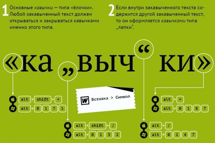
Если в начале или конце текста (цитаты, прямой речи) встречаются внутренние и внешние кавычки, то они должны различаться между собой рисунком (так называемые «елочки» и «лапки»), например: Корреспондент сообщает: «“Баллада о солдате” получила высокую оценку на международном кинофестивале»; Я получил телеграмму: «Приезжаю завтра, остановлюсь в гостинице “Москва”».
Внутренние кавычки принято брать «лапки», внешние — «елочки».
_____________________________________________
Плюс от Мильчина, «Справочник издателя и автора», раздел 8.2.4:
Если по техническим причинам невозможен набор кавычек разного рисунка, кавычки одного рисунка рядом не повторяются. Напр.: «Цыганы» мои не продаются вовсе», — сетовал Пушкин.
Как ставить:
Маленькие технические хитрости. В любом тексте, набираемом на компьютере, можно самостоятельно расставлять любые типы кавычек. Для этого надо запомнить следующие комбинации клавиш и включить Num Lock (цифровую клавиатуру):
для набора «елочек» нажимаем Alt, набираем 0171, отпускаем Alt — получаем «; нажимаем Alt, набираем 0187, отпускаем Alt — получаем »;
для набора „лапок“ нажимаем Alt, набираем 0132, отпускаем Alt — получаем „; нажимаем Alt, набираем 0147, отпускаем Alt — получаем “;
для набора ‘одинарных кавычек’ нажимаем Alt, набираем 0145, отпускаем Alt — получаем ‘; нажимаем Alt, набираем 0146, отпускаем Alt — получаем ’;
Как установить автозамену «компьютерных кавычек» на «елочки» в Word 2007:
1. Открыть Word
2. Нажать на кнопку «Office» (большая круглая кнопка в левом верхнем углу окна)
3. Внизу открывшегося окна нажать «Параметры Word»
4. Далее «Параметры» и потом на вкладках «Автоформат при вводе» и «Автоформат» поставить соответствующие галочки.
Вы можете подписаться на меня в соцсетях:
https://www.facebook.com/tolmachev.anton
https://vk.com/anton_tolmachev
Понравился пост? Заберите его на свои страницы в соцсетях простым нажатием кнопок ниже:
Виды кавычек:
В русском письме наиболее употребительны следующие типы кавычек:
— французские «елочки» (употребляются в печатных текстах);
— немецкие „лапки“ (употребляются, как правило, в рукописных текстах);
— ‘марровские кавычки’ (употребляются для описания значения слова и при переводе значения иноязычного слова, например: слово «шумовка» заимствовано из польского языка, в котором оно восходит к глаголу szumowac ‘снимать пену’ от szum ‘пена’);
— «компьютерные кавычки» — кавычки особого типа, в которых рисунок открывающих и закрывающих кавычек совершенно не различается. Такие кавычки встречаются в текстах, набранных с помощью компьютерной клавиатуры.
Но есть еще два типа кавычек, которые редко применяются в русском языке:
— английские “двойные кавычки”;
— английские ‘одиночные кавычки’.
Правила:
Розенталь, «Справочник по правописанию и литературной правке», параграф 135, п. 5:
Если в начале или конце текста (цитаты, прямой речи) встречаются внутренние и внешние кавычки, то они должны различаться между собой рисунком (так называемые «елочки» и «лапки»), например: Корреспондент сообщает: «“Баллада о солдате” получила высокую оценку на международном кинофестивале»; Я получил телеграмму: «Приезжаю завтра, остановлюсь в гостинице “Москва”».
Внутренние кавычки принято брать «лапки», внешние — «елочки».
_____________________________________________
Плюс от Мильчина, «Справочник издателя и автора», раздел 8.2.4:
Если по техническим причинам невозможен набор кавычек разного рисунка, кавычки одного рисунка рядом не повторяются. Напр.: «Цыганы» мои не продаются вовсе», — сетовал Пушкин.
Как ставить:
Маленькие технические хитрости. В любом тексте, набираемом на компьютере, можно самостоятельно расставлять любые типы кавычек. Для этого надо запомнить следующие комбинации клавиш и включить Num Lock (цифровую клавиатуру):
для набора «елочек» нажимаем Alt, набираем 0171, отпускаем Alt — получаем «; нажимаем Alt, набираем 0187, отпускаем Alt — получаем »;
для набора „лапок“ нажимаем Alt, набираем 0132, отпускаем Alt — получаем „; нажимаем Alt, набираем 0147, отпускаем Alt — получаем “;
для набора ‘одинарных кавычек’ нажимаем Alt, набираем 0145, отпускаем Alt — получаем ‘; нажимаем Alt, набираем 0146, отпускаем Alt — получаем ’;
Как установить автозамену «компьютерных кавычек» на «елочки» в Word 2007:
1. Открыть Word
2. Нажать на кнопку «Office» (большая круглая кнопка в левом верхнем углу окна)
3. Внизу открывшегося окна нажать «Параметры Word»
4. Далее «Параметры» и потом на вкладках «Автоформат при вводе» и «Автоформат» поставить соответствующие галочки.
Вы можете подписаться на меня в соцсетях:
https://www.facebook.com/tolmachev.anton
https://vk.com/anton_tolmachev
Понравился пост? Заберите его на свои страницы в соцсетях простым нажатием кнопок ниже:
Техническое оформление текста
В чем разница между кавычками разного рисунка?
Кавычки – парный выделительный знак препинания. Ими отмечают левую и правую границы слова или отрезка текста; таким образом, кавычки могут быть открывающими и закрывающими, при этом открывающие и закрывающие кавычки, как правило, различаются по рисунку.
В русском письме наиболее употребительны следующие типы кавычек:
-
«елочки» (употребляются в печатных текстах);
-
„лапки” употребляются, как правило, в рукописных текстах);
-
‘марровские кавычки’ (употребляются для описания значения слова и при переводе значения иноязычного слова, например: слово «шумовка» заимствовано из польского языка, в котором оно восходит к глаголу szumować ‘снимать пену’ от szum ‘пена’);
-
«компьютерные кавычки» – кавычки особого типа, в которых рисунок открывающих и закрывающих кавычек совершенно не различается. Такие кавычки встречаются в текстах, набранных на компьютерной клавиатуре.
Маленькая техническая хитрость. В любом тексте, набираемом на компьютере, можно самостоятельно расставлять «елочки». Для этого надо запомнить следующие комбинации клавиш: нажимаем Alt, набираем 0171, отпускаем Alt – получаем «. Нажимаем Alt, набираем 0187, отпускаем Alt – получаем ».
В других языках могут употребляться кавычки иного начертания. Подробно и интересно об этом написано в «Википедии».
О кавычках внутри кавычек
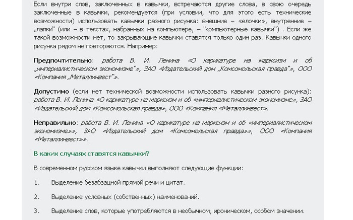
Если внутри слов, заключенных в кавычки, встречаются другие слова, в свою очередь заключенные в кавычки, рекомендуется (при условии, что для этого есть технические возможности) использовать кавычки разного рисунка: внешние – «елочки», внутренние – „лапки” (или – в текстах, набранных на компьютере, – «компьютерные кавычки») . Если же такой возможности нет, то закрывающие кавычки ставятся только один раз. Кавычки одного рисунка рядом не повторяются. Например:
Предпочтительно: работа В. И. Ленина «О карикатуре на марксизм и об «империалистическом экономизме»», ЗАО «Издательский дом «Комсомольская правда»», ООО «Компания «Металлинвест»».
Допустимо (если нет технической возможности использовать кавычки разного рисунка): работа В. И. Ленина «О карикатуре на марксизм и об «империалистическом экономизме», ЗАО «Издательский дом «Комсомольская правда», ООО «Компания «Металлинвест».
Неправильно: работа В. И. Ленина «О карикатуре на марксизм и об «империалистическом экономизме»», ЗАО «Издательский дом «Комсомольская правда»», ООО «Компания «Металлинвест»».
Письмовник
В чем разница между кавычками разного рисунка?
Техническое оформление текста
Кавычки – парный выделительный знак препинания. Ими отмечают левую и правую границы слова или отрезка текста; таким образом, кавычки могут быть открывающими и закрывающими, при этом открывающие и закрывающие кавычки, как правило, различаются по рисунку.

В русском письме наиболее употребительны следующие типы кавычек:
Маленькая техническая хитрость. В любом тексте, набираемом на компьютере, можно самостоятельно расставлять «елочки». Для этого надо запомнить следующие комбинации клавиш: нажимаем Alt, набираем 0171, отпускаем Alt – получаем «. Нажимаем Alt, набираем 0187, отпускаем Alt – получаем ».
В других языках могут употребляться кавычки иного начертания. Подробно и интересно об этом написано в «Википедии».
О кавычках внутри кавычек
Если внутри слов, заключенных в кавычки, встречаются другие слова, в свою очередь заключенные в кавычки, рекомендуется (при условии, что для этого есть технические возможности) использовать кавычки разного рисунка: внешние – «елочки», внутренние – „лапки ” (или – в текстах, набранных на компьютере, – «компьютерные кавычки») . Если же такой возможности нет, то закрывающие кавычки ставятся только один раз. Кавычки одного рисунка рядом не повторяются. Например:
Предпочтительно: работа В. И. Ленина «О карикатуре на марксизм и об «империалистическом экономизме»», ЗАО «Издательский дом «Комсомольская правда»», ООО «Компания «Металлинвест»».
Допустимо (если нет технической возможности использовать кавычки разного рисунка): работа В. И. Ленина «О карикатуре на марксизм и об «империалистическом экономизме», ЗАО «Издательский дом «Комсомольская правда», ООО «Компания «Металлинвест».
Неправильно: работа В. И. Ленина «О карикатуре на марксизм и об «империалистическом экономизме»», ЗАО «Издательский дом «Комсомольская правда»», ООО «Компания «Металлинвест»».
Двойные кавычки — правила и примеры употребления в русском языке
На случай необходимости вставить в выражение двойные кавычки, в русском языке правила предусматривают две схемы оформления. Постановка символов не станет проблемой при письме, если помнить о принципах расстановки знаков препинания.
Давайте посмотрим, как расставлять кавычки, если пишутся наименования предметов внутри цитат, предложений или других названий.
Как правильно ставить кавычки в тексте
На первый взгляд, кавычки в кавычках ставятся по правилу обычных парных знаков.
Как и круглые или квадратные скобки, верным кажется употребление четного числа вспомогательных средств:
В штабе командир отчитывал дежурного офицера (ответственного за положение дел в подразделении (лейтенант заступил на пост впервые и растерялся при докладе начальнику)).
Федор промолвил: «Наш отряд называется «Орлята»».
Но если по техническим причинам каждая скобка должна быть в паре, то кавычки в названиях и повествованиях в конце предложения являются общими к обоим открывающим аналогам в начале:
ООО «Страховая фирма «Серебряный заслон».
Диктор вещал: «На площади города вручает сувениры общество «Магия».
Связано это с избавлением предложения и текста от перегрузки знаками – идущие подряд однотипные кавычки выглядят некорректно. Общая пунктуация сохраняется – за последним символом следует точка.
Примеры постановки двойных кавычек в русском языке
Однако соблюдение условия парности допустимо: печатные знаки во втором случае ставятся по два. Здесь правило предполагает разные варианты кавычек.
Например, «елочки» могут содержать слово или выражение, заключенное в „лапки‟:
Недавно составлен отчет «Влияние внешних факторов на работу детектора „Медведь‟».
Внутренние знаки могут быть „нижними и верхними‟:
Формирование «Специальный легион „Империя“» начинает выдвижение на позиции.
Или “прямые однородные”:
Радист доложил командиру: «Связь по каналу “Ловец 343” успешно установлена».
Правило «елочек» неизменно: они всегда выступают как внешние боковые средства выделения. “Лапки” размещаются внутри и выделяют внутреннее сочетание.
Пунктуация преподносит носителям русского языка два принципа размещения кавычек в кавычках.
В зависимости от ситуации можно выделить все специальные знаки в пару либо выставить закрывающий символ в конец предложения и сделать его общим для двух открывающих средств.
Правописание кавычек в русском языке 2 класс
Он отвернулся и, отходя, пробормотал: «А всё-таки это совершенно против правил» (Лермонтов).
Наконец я ей сказал: «Хочешь, пойдём прогуляться на вал?» (Лермонтов).
Она взглянула и вскрикнула: «Это Казбич!» (Лермонтов).
«А что Казбич?» — спросил я нетерпеливо у штабс-капитана (Лермонтов). или:
— А что Казбич? — спросил я нетерпеливо у штабс-капитана.
«Как это скучно!» — воскликнул я невольно (Лермонтов). или:
— Как это скучно! — воскликнул я невольно.
«Умерла…» — эхом откликнулась Аксинья (Шолохов). или:
— Умерла. — эхом откликнулась Аксинья.
«Вон окружной атаман», — шепнул Пантелей Прокофьевич, толкая сзади Григория (Шолохов). или:
— Вон окружной атаман, — шепнул Пантелей Прокофьевич, толкая сзади Григория.
перед словами автора знак вопросительный, или знак восклицательный, или многоточие в соответствии с характером первой части прямой речи, или запятая (если ни один из указанных знаков не требуется), а после них тире;
после слов автора — точка, если первая часть прямой речи представляет собой законченное предложение, и запятая — если незаконченное, далее ставится тире; если при этом прямая речь выделяется кавычками , то они ставятся только перед началом прямой речи и в самом конце её, например:
— Не хотите ли подбавить рому? — сказал я моему собеседнику. — У меня есть белый из Тифлиса; теперь холодно (Лермонтов).
— Ну, полно, полно! — сказал Печорин, обняв его дружески. — Неужели я не тот же? (Лермонтов).
— Выслушайте меня. — сказала Надя, — когда-нибудь до конца (Чехов).
— Меня зовут Фомой, — отвечал он, — а по прозвищу Бирюк (Тургенев).
— Дождь пойдёт, — возразил Калиныч, — утки вон плещутся, да и трава больно сильно пахнет (Тургенев).
Примечание 1. Если в словах автора заключаются два глагола со значением высказывания, из которых один относится к первой части прямой речи, а другой ко второй, то после слов автора ставится двоеточие и тире , например:
— Идём, холодно, — сказал Макаров и угрюмо спросил: — Что молчишь? (М. Горький).
Примечание 2. Правила, изложенные в данном параграфе, относятся также к предложениям, содержащим цитаты с указаниями, кому они принадлежат.
Примечание 3. Внутренний монолог («мысленная речь»), имеющий форму прямой речи, также заключается в кавычки .
источники:
http://nauka.club/russkiy-yazyk/punktuatsiya/dvoynye-kavychki.html
http://therules.ru/?%D0%BA%D0%B0%D0%B2%D1%8B%D1%87%D0%BA%D0%B8
Что такое кавычки? В чем разница между кавычками разного рисунка?
Кавычки – парный выделительный знак препинания. Ими отмечают левую и правую границы слова или отрезка текста; таким образом, кавычки могут быть открывающими и закрывающими, при этом открывающие и закрывающие кавычки, как правило, различаются по рисунку.
В русском письме наиболее употребительны следующие типы кавычек:
• «елочки» (употребляются в печатных текстах);
• „лапки“ (употребляются, как правило, в рукописных текстах);
• ‘марровские кавычки’ (употребляются для описания значения слова и при переводе значения иноязычного слова, например: слово «шумовка» заимствовано из польского языка, в котором оно восходит к глаголу szumować ‘снимать пену’ от szum ‘пена’);
• «компьютерные кавычки» ¬– кавычки особого типа, в которых рисунок открывающих и закрывающих кавычек совершенно не различается. Такие кавычки встречаются в текстах, набранных на компьютерной клавиатуре.
Оффтопик
Маленькая техническая хитрость. В любом тексте, набираемом на компьютере, можно самостоятельно расставлять «елочки». Для этого надо запомнить следующие комбинации клавиш: нажимаем Alt, набираем 0171, отпускаем Alt – получаем «. Нажимаем Alt, набираем 0187, отпускаем Alt – получаем ».
О кавычках внутри кавычек
Если внутри слов, заключенных в кавычки, встречаются другие слова, в свою очередь заключенные в кавычки, рекомендуется (при условии, что для этого есть технические возможности) использовать кавычки разного рисунка: внешние – «елочки», внутренние – „лапки“ (или – в текстах, набранных на компьютере, – «компьютерные кавычки»). Если же такой возможности нет, то закрывающие кавычки ставятся только один раз. Кавычки одного рисунка рядом не повторяются. Например:
Предпочтительно: работа В. И. Ленина «О карикатуре на марксизм и об „империалистическом экономизме“», ЗАО «Издательский дом „Комсомольская правда“», ООО «Компания „Металлинвест“».
Допустимо (если нет технической возможности использовать кавычки разного рисунка): работа В. И. Ленина «О карикатуре на марксизм и об «империалистическом экономизме», ЗАО «Издательский дом «Комсомольская правда», ООО «Компания «Металлинвест».
Неправильно: работа В. И. Ленина «О карикатуре на марксизм и об «империалистическом экономизме»», ЗАО «Издательский дом «Комсомольская правда»», ООО «Компания «Металлинвест»».
В каких случаях ставятся кавычки?
В современном русском языке кавычки выполняют следующие функции:
1. Выделение безабзацной прямой речи и цитат.
2. Выделение условных (собственных) наименований.
3. Выделение слов, которые употребляются в необычном, ироническом, особом значении.
Кавычки при словах, употребляемых не в своем обычном значении
Кавычки при словах, употребляемых в необычном, особом, условном, ироническом значении, не только помогают автору текста обратить внимание читателя на то или иное слово или выражение, но и дают возможность использовать лексические единицы, принадлежащие к другому стилю, например, употребить разговорное слово в публицистическом тексте (часто в таких случаях кавычки используются автором для «перестраховки»).
Первое, что необходимо отметить: кавычки при необычно употребляемых словах рассматриваются как факультативный знак (в отличие от обязательного употребления кавычек при собственных наименованиях и прямой речи).
Кавычками выделяются:
1) слова непривычные, малоупотребительные, на которые автор хочет обратить внимание;
2) слова, употребленные в особом, необычном значении;
3) слова, представляющие собой малоизвестные термины;
4) слова устарелые или, наоборот, совсем новые, если подчеркивается эта их особенность;
5) слова, употребленные в ироническом значении;
6) слова, употребленные в условном значении (применительно к ситуации или контексту).
Разграничить «привычное» и «непривычное» значения слова зачастую очень трудно:
— во-первых, для этого необходимо обладать высокоразвитым языковым чутьем,
— во-вторых, нередко возникают случаи, когда «привычное» для одного носителя языка является «непривычным» для другого.
— наконец, «непривычное» значение слова с течением времени может становиться «привычным». Именно поэтому постановка кавычек при необычно употребляемых словах вызывает столько вопросов.
Чем же все-таки руководствоваться при ответе на вопрос о постановке кавычек? Вот два нехитрых правила:
• ориентироваться на словарные статьи в толковых словарях русского языка: если слово (словосочетание) в них уже зафиксировано, следовательно, значение не является непривычным и кавычки не нужны;
• учитывать стиль текста, в котором встречаются подобные лексические единицы. Безусловно, наиболее часто их можно встретить в газетных и журнальных текстах, но при этом в «серьезных» СМИ, предлагающих читателям материалы на общественно-политические и социально значимые темы, постановка кавычек при необычно употребляемых словах более уместна, чем, например, в газетах и журналах, ориентированных на молодежную аудиторию и пишущих на «легкие» темы, поскольку при употреблении слова в «непривычном» значении оно чаще имеет разговорную или просторечную окраску.
Слова и словосочетания, не требующие выделения кавычками
звезда (‘известный человек, артист’)
золото (‘награда высшей пробы’)
изюминка (‘прелесть, острота’)
молния (‘быстро задергивающаяся застежка’)
хвост (‘экзаменационная задолженность’)
бархатный сезон
белая зарплата
белое золото
великий немой
голубое топливо
горячая линия класс люкс
круглый стол
мешки под глазами
под ключ
серая зарплата
сильный пол
слабый пол
телефон доверия
час пик
черное золото
черный ящик
+ Не заключаются в кавычки слова, следующие за словосочетанием так называемый. Исключение составляют случаи, когда эти слова употреблены в необычном или ироническом значении.
Кавычки при собственных наименованиях
Для ответа на вопрос, когда наименования заключаются в кавычки, необходимо выяснить, какие виды собственных наименований существуют. Наименования можно разделить на две большие группы:
1. Составные названия, не являющиеся условными, – реальные собственные имена. В таких названиях все слова употребляются в прямом значении. Кавычками такие названия не выделяются; в них пишется с прописной буквы первое слово и входящие в состав наименования имена собственные.
Например: Государственный Русский музей, Останкинский музей творчества крепостных, Московский драматический театр на Малой Бронной, Российский университет дружбы народов, Санкт-Петербургский государственный университет, Московская типография № 2, Федеральное агентство по печати и массовым коммуникациям, Российский футбольный союз, Государственная премия, Книга рекордов Гиннесса, Великая Отечественная война, Петровская эпоха.
2. Условные (символические) названия, заключаемые в кавычки.
Реальные собственные имена и условные наименования различаются прежде всего синтаксической сочетаемостью (грубо говоря, одно слово зависит от другого: существительное и прилагательное, существительное и существительное в родительном падеже).
Сравните-ка: Большой театр, Театр сатиры, Театр на Юго-Западе – это реальные собственные имена, в них присутствует синтаксическая сочетаемость, кавычки не нужны.
Но: театр «Современник», театр «Школа современной пьесы» – условные наименования, не сочетающиеся синтаксически с родовым словом. Они заключаются в кавычки. Аналогично: парк Дружбы, но: парк «Сокольники», Коммунистическая партия Российской Федерации, но: партия «Яблоко» и т. д.
Перечислим основные группы условных наименований, заключаемых в кавычки:
• названия фирм, учреждений, организаций, обществ: гостиница «Россия», отель «Метрополь», кондитерская фабрика «Красный Октябрь», издательство «Наука».
• названия политических партий: партии «Яблоко», «Гражданская сила», «Единая Россия», «Справедливая Россия».
• названия отечественных информагентств: информационное агентство «Интерфакс», РИА «Новости». Названия зарубежных информагентств по традиции в кавычки не заключаются: агентство Франс Пресс, агентство Юнайтед Пресс Интернэшнл.
• названия зрелищных предприятий и учреждений (театры, кинотеатры, выставочные центры и т. п.): сети кинотеатров «Формула кино», «Синема Стар», кинотеатр «Пять звезд», театры «Современник», «Школа современной пьесы», Центральный выставочный зал «Манеж», Центр детского творчества «Театр на набережной», Театральный центр «На Страстном», фестиваль «Кинотавр».
• названия музыкальных коллективов: камерный оркестр «Виртуозы Москвы», группы «Битлз», «Роллинг стоунз», «Фабрика», «Стрелки», «Город 312».
• названия спортивных обществ, команд, клубов: футбольные клубы «Спартак», «Зенит», «Локомотив», «Барселона», «Манчестер Юнайтед», «Лацио», «Бейтар», «Андерлехт», хоккейные команды «Салават Юлаев», «Северсталь», «Ак Барс». Однако названия-аббревиатуры пишутся без кавычек: ЦСКА, СКА.
• названия орденов, медалей, наград, знаков отличия: орден «Мать-героиня», медаль «Ветеран труда», премия «Золотая маска», премия «Оскар».
• названия периодических изданий (газет, журналов): газеты «Аргументы и факты», «Московский комсомолец», журналы «Огонек», «Русский язык за рубежом», в том числе названия, включающие родовые наименования: «Газета», «Независимая газета», «Русский журнал».
• названия документов: Федеральный закон от 23 декабря 2003 г. N 177-ФЗ «О страховании вкладов физических лиц в банках Российской Федерации», Федеральный конституционный закон «О государственном гимне Российской Федерации».
• названия литературных и научных произведений, произведений искусства: роман «Война и мир», картина «Апофеоз войны», опера «Пиковая дама», фильм «Москва слезам не верит», телесериал «Остаться в живых», в том числе названия, включающие родовые наименования: «Роман без вранья», «Повесть о настоящем человеке», «Оптимистическая трагедия». Обратите внимание: если наименование художественного произведения состоит из двух названий, соединенных союзом или, то перед союзом ставится запятая, а первое слово второго названия пишется с прописной буквы: «Ирония судьбы, или С легким паром».
• названия музеев: музей-заповедник «Коломенское», музей «Красная Пресня». Обратите внимание: пишутся без кавычек такие названия иностранных музеев и картинных галерей, как: музей Прадо, музей Орсе, галерея Уффици и др.
• названия стихийных бедствий (ураганов, тайфунов, торнадо): тайфун «Джуди», ураган «Катрина», шторм «Ноэль», циклон «Сидр».
• названия производственных марок технических изделий: автомобили «Волга», «Тойота», стиральная машина «Индезит», газовая плита «Ардо».
• названия самолетов и средств покорения космоса; военной техники: самолеты «Руслан», «Боинг-747», шаттл «Дискавери», челнок «Атлантис», стыковочный модуль «Ноуд-2»; баллистическая ракета «Тополь», ударный комплекс «Искандер-М».
• названия, связанные со сферой информационных технологий (IT), в том числе названия интернет-ресурсов и веб-сервисов: «Известия.Ру», «Словари.Ру», «Страна.Ru», «Яндекс», «Рамблер», «Яндекс.Фотки», «Яндекс.Словари», справочно-информационных систем и компьютерных программ: системы «КонсультантПлюс», «1С: Предприятие», наименования тарифных планов и услуг, предоставляемых компаниями – операторами сотовой связи и интернет-провайдерами: тарифные планы «Единый», «Мобильный», «Профи 1300 VIP», «Вызов Xtreme», «Стрим 6», услуги «Кто звонил?», «Анализатор счета», «Мегафон.Бонус», «Сервис-Гид».
• названия лекарств, медицинских препаратов. Обратите внимание: при употреблении в качестве торговой марки названия лекарственных средств следует писать с прописной буквы в кавычках: «Агри», «Инфлювак», «Афлубин», «Фервекс», а в бытовом употреблении – со строчной буквы без кавычек, например: выпить фервекс, принять виагру. Также пишутся со строчной буквы без кавычек некоторые названия лекарств, вошедшие в широкий обиход вследствие многолетнего употребления (валидол, анальгин, аспирин).
• названия продовольственных товаров, в том числе алкогольных напитков. Обратите внимание: при употреблении в качестве торговой марки названия продовольственных товаров пишутся с прописной буквы в кавычках: вафли «Сливочные», пирожное «Картошка», салат «Китайский», карбонад «Любительский», сыр «Моцарелла», соус «Тартар», ликер «Бейлис», вино «Божоле Нуво», вермут «Чинзано Бьянко», кофе «Черная карта». Названия продуктов в бытовом употреблении пишутся со строчной буквы без кавычек: любительская колбаса, бородинский хлеб, салат оливье, пирожное картошка. Без кавычек со строчной буквы пишутся и названия сортов вин, минеральных вод и др. напитков: мерло, шардоне, рислинг, портвейн, боржоми.
• названия видов и сортов сельскохозяйственных культур, овощей, цветов и т. п. – термины агрономии и садоводства. В отличие от перечисленных выше названий эти наименования пишутся в кавычках со строчной буквы: клубника «виктория», виноград «шардоне», тюльпан «черный принц».
Особую сложность представляет написание названий автомобилей.
Справочники рекомендуют писать названия марок автомобилей в кавычках с прописной буквы: автомобили «Волга», «Вольво», «Ниссан», «Шкода», а названия самих автомобилей как технических изделий – со строчной буквы в кавычках (кроме названий, совпадающих с собственными именами – личными и географическими). Например: «кадиллак», «москвич», «тойота», «ниссан», но: «Волга», «Ока» (совпадают с именами собственными, поэтому пишутся с большой буквы).
Исключения: «жигули», «мерседес» (совпадают с именами собственными, но пишутся со строчной). Однако на практике различить, в каком случае наименование представляет собой название марки автомобиля, а в каком – наименование технического изделия, часто представляется затруднительным: Всем автомобилям он предпочитает «Тойоту» / «тойоту». В спорных случаях решение о написании с прописной или строчной буквы принимает автор текста.
• Названия, написанные латиницей, в кавычки не заключаются: автомобили Toyota Yaris, Peugeot 306, Daewoo Matiz, Škoda Fabia, Lada Priora.
• Неоднословные названия (марка и модель автомобиля), написанные кириллицей, пишутся через дефис, при этом все части наименования пишутся с прописной буквы: «Лада-Приора», «Тойота-Королла», «Рено-Меган», «Ниссан-Теана», «Хёндай-Гетц», «Ниссан-Альмера-Классик», «Сузуки-Гранд-Витара». Но: «Фольксваген-жук» (перекличка с нарицательным существительным).
• Аббревиатурные названия пишутся без кавычек: ЗИЛ, ВАЗ, КамАЗ.
• В бытовом употреблении названия средств передвижения пишутся без кавычек, например: Приехал на стареньком москвиче (на роскошном кадиллаке). Без кавычек пишутся также разговорные названия машин с уменьшительно-ласкательными суффиксами, напр.: москвичок, фордик, уазик.
Многочисленные вопросы возникают также при написании имен и прозвищ людей, кличек животных, а также географических названий. Постараемся дать ответ на наиболее часто возникающие вопросы.
• прозвища пишутся без кавычек и в тех случаях, когда прозвище стоит после имени (Всеволод Большое Гнездо, Ричард Львиное Сердце), и тогда, когда прозвище располагается между именем и фамилией: Гарик Бульдог Харламов, Павел Снежок Воля, Дуэйн Скала Джонсон;
• клички животных не заключаются в кавычки и пишутся с прописной буквы: пес Барбос, кот Матроскин, котенок Гав, лев Бонифаций. Однако если индивидуальные названия употребляются в качестве обобщенных названий животных, они пишутся со строчной буквы: мурка, жучка, барбос, савраска, буренка. Со строчной буквы без кавычек пишутся и названия пород животных: корова холмогорка, собака пудель.
• названия железнодорожных станций, вокзалов пишутся без кавычек, с прописной буквы в них пишутся все слова, кроме родовых обозначений: станции Фили, Узловая, Подсолнечная, 125 км, Строитель, Дачная, Рабочий Поселок.
• названия аэропортов справочные пособия рекомендуют писать без кавычек, однако за последние годы наблюдается устойчивая тенденция заключать эти наименования в кавычки. Возможно, скоро такое написание будет признано нормативным. Однако сейчас лучше писать без кавычек: аэропорты Шереметьево, Домодедово, Пулково, Борисполь.
• названия станций метрополитена заключаются в кавычки (в текстах, но не на картах и схемах и не на самих станциях и остановках!), с прописной буквы пишется первое слово таких названий (оно может быть единственным), а также все те слова, которые пишутся с прописной буквы в составе соответствующих топонимов: станции метро «Фили», «Пионерская», «Свиблово»; «Выборгская», «Автово», «Электросила»; «Проспект Мира», «Кузнецкий Мост», «Охотный Ряд»; «Гостиный Двор», «Старая Деревня»; «Улица 1905 года», «Воробьевы горы», «Сретенский бульвар», «Филевский парк»; «Лиговский проспект», «Технологический институт».
• названия районов, микрорайонов (городские микротопонимические названия) пишутся без кавычек: районы Марфино, Куркино, Люблино, Москворечье-Сабурово, Бирюлево Западное. Однако заключаются в кавычки условные названия жилых кварталов, массивов и отдельных домов, сопровождаемые словами жилой массив, ТСЖ (товарищество собственников жилья), СЖД (социальный жилой дом) и пр., например: жилой массив «Парус», жилой массив «Победа», жилой комплекс «Бриз», ТСЖ «Новобродовский», СЖД «Митино», фермерское хозяйство «Столярово», подстанция «Дачная».
• названия направлений, маршрутов, поездов подчиняются следующему правилу: при обозначении пространственных пределов между географическими названиями ставится тире. Названия пишутся с прописной буквы без кавычек. Например: трасса Киев – Симферополь, поезд Москва – Киев, маршрут Москва – Углич – Москва, нефтепровод Восточная Сибирь – Тихий океан. Однако заключаются в кавычки условные наименования автодорог, трасс; нефтепроводов, газопроводов и т. п.: автодороги «Холмогоры», «Каспий», «Дон», «Урал», «Крым», «Уссури», газопровод «Голубой поток», нефтепровод «Дружба».
Кавычки в сокращенных названиях учреждений, организаций, фирм
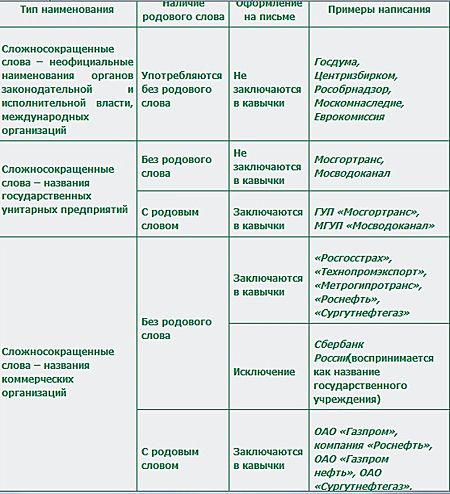
Сложносокращенные названия
Употребление кавычек при сложносокращенных словах зависит в первую очередь от семантики названия. Не заключаются в кавычки названия государственных учреждений, в их числе:
• неофициальные наименования органов законодательной и исполнительной власти (министерств, федеральных агентств, федеральных служб, комитетов и др.), например: Госдума, Мосгордума, Рособрнадзор, Центризбирком, Минэкономразвития, Москомнаследие;
• наименования государственных учреждений, выступающие без родового слова, например: Мосгортранс, Мосводоканал. Однако при употреблении с родовым словом кавычки ставятся: ГУП «Мосгортранс», МГУП «Мосводоканал».
В отличие от названий госучреждений, сложносокращенные названия коммерческих организаций пишутся в кавычках (и при наличии родового слова, и при его отсутствии): «Росгосстрах» и компания «Росгосстрах», «Технопромэкспорт» и ОАО «Технопромэкспорт», «Строймонтаж» и ЗАО «Строймонтаж», «Метрогипротранс» и ОАО «Метрогипротранс», «Газпром нефть» и ОАО «Газпром нефть», «Сургутнефтегаз» и ОАО «Сургутнефтегаз», «ЛУКойл» и ОАО «ЛУКойл» (также ОАО «Нефтяная компания „ЛУКойл“».
Следует отметить, что некоторые названия крупнейших компаний, например Газпром, АвтоВАЗ и др., испытывают колебания в написании при употреблении без родового слова; при наличии родового слова постановка кавычек не вызывает сомнений: ОАО «Газпром», ОАО «АвтоВАЗ».
Примечание про деньги ") . Без кавычек пишется название Сбербанк России. Этот пример можно считать уникальным: отсутствие кавычек при данном наименовании объясняется как историей его употребления, так и экстралингвистическими причинами. Несмотря на то что Сбербанк России в настоящее время является коммерческой организацией, у многих носителей языка он по-прежнему ассоциируется с госучреждением (в Сбербанке можно получить пенсию, оплатить коммунальные услуги и т. п.).
. Без кавычек пишется название Сбербанк России. Этот пример можно считать уникальным: отсутствие кавычек при данном наименовании объясняется как историей его употребления, так и экстралингвистическими причинами. Несмотря на то что Сбербанк России в настоящее время является коммерческой организацией, у многих носителей языка он по-прежнему ассоциируется с госучреждением (в Сбербанке можно получить пенсию, оплатить коммунальные услуги и т. п.).
Названия – инициальные аббревиатуры
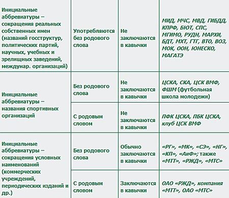
Наименования, представляющие собой аббревиатуры инициального типа, также оформляются неодинаково. Не заключаются в кавычки аббревиатуры, образованные от реальных собственных имен. В их числе:
• инициальные аббревиатуры – названия государственных структур, в том числе министерств, силовых ведомств (современные и исторические) и др., например: МИД (Министерство иностранных дел), МВД (Министерство внутренних дел), ГИБДД (Госудаственная инспекция безопасности дорожного движения), ОМОН (Отряд милиции особого назначения), ФСБ (Федеральная служба безопасности), СВР (Служба внешней разведки), ПФР (Пенсионный фонд России);
• названия политических партий: КПРФ (Коммунистическая партия Российской Федерации), ЛДПР (Либерально-демократическая партия России), СПС (Союз правых сил), БЮТ (Блок Юлии Тимошенко);
• названия учебных, научных, зрелищных заведений: ИРЯ РАН (Институт русского языка Российской академии наук), МГИМО (Московский государственный институт международных отношений), РУДН (Российский университет дружбы народов), МАРХИ (Московский архитектурный институт), МХТ (Московский художественный театр), ГТГ (Государственная Третьяковская галерея);
• названия международных организаций: ВТО (Всемирная торговая организация), ВОЗ (Всемирная организация здравоохранения), МОК (Международный олимпийский комитет), МАГАТЭ (Международное агентство по атомной энергии).
В то же время пишутся в кавычках аббревиатуры инициального типа, представляющие собой сокращение условного наименования. В их числе:
• названия периодических изданий: «РГ» («Российская газета»), «АиФ» («Аргументы и факты»), «МК» («Московский комсомолец»), «НГ» («Независимая газета»), «СЭ» («Спорт-экспресс») и др.;
• названия политических партий: «ПР» («Патриоты России»), «СР» («Справедливая Россия»); аббревиатурное название «ЕР» («Единая Россия») заключается в кавычки непоследовательно.
• названия коммерческих организаций, выступающие в сочетании с родовым словом: ОАО «МТТ» (ОАО «Межрегиональный ТранзитТелеком»), ОАО «РЖД» (ОАО «Российские железные дороги»), ОАО «МТС» (ОАО «Мобильные ТелеСистемы»).
Что касается аббревиатурных названий коммерческих организаций, употребляемых без родового слова (МТТ, МТС, РЖД), то в современной письменной речи они ведут себя крайне непоследовательно: в ряде случаев заключаются в кавычки, в ряде случаев пишутся без кавычек. Однако следует признать, что такие названия предпочтительно заключать в кавычки, поскольку это облегчает понимание текста читателем.
Примечание. Аббревиатурные названия спортивных команд не заключаются в кавычки (как при наличии, так и при отсутствии родового слова): СКА, ЦСКА, ПФК ЦСКА. Традиция не заключать в кавычки аббревиатурные названия спортивных команд сложилась еще в первой трети XX века, когда число подобных наименований было значительно больше.
Для наглядности все сформулированные выше рекомендации приведены в следующей таблице.
Кавычки в названиях, написанных латиницей
Вводные замечания. Ни в одном из современных справочных пособий по правописанию нет рекомендаций по употреблению кавычек в названиях, написанных латиницей. Рекомендации, приводимые ниже, сформулированы на основе наблюдений над современной письменной речью.
В современных русских текстах наименования очень часто пишутся буквами латинского алфавита или средствами двух алфавитов (кириллицы и латиницы). В основном это касается названий иностранных марок изделий техники и электроники, в которых зачастую написание латиницей сочетается с официальными серийными обозначениями, представляющими собой сложные комплексы из цифр, прописных и строчных букв (телефоны Voxtel RX11, Sony Ericsson K610i red, Nokia 6131, Samsung D520, фотоаппарат Canon A410, DVD-плеер BBK DV311SL, автомобили Honda Civic, Mazda 323, Mitsubishi Colt). Кроме этого, латиницей в современных текстах пишутся названия некоторых средств массовой информации (журналы Automobil Review, Total DVD, Russian Mobile, газеты Moscow Times, PC Week), коммерческих фирм и банков (British Airways, Bank of America), а также различных городских объектов – магазинов, ресторанов, кафе, клубов, парикмахерских и пр. При этом написание названия латиницей не всегда свидетельствует о том, что речь идет о зарубежном бренде (как, например, McDonald’s или Ikea), зачастую буквами латинского алфавита пишутся и наименования отечественных организаций, предприятий, торговых марок (кафе N-Joy, торговый центр XL, магазин Bolero, компьютерный клуб Click-Net, салон красоты Glamour), владельцы которых стремятся таким способом – написанием латиницей – привлечь внимание потенциальных клиентов.
Примеры из современных публицистических текстов (опубликованных как в печатных, так и в электронных СМИ) свидетельствуют о том, что в русском письме сложилась устойчивая традиция не заключать в кавычки написанные латиницей собственные наименования. При этом отсутствие кавычек определяется именно латиницей, оно, как правило, не зависит ни от количества слов в названии, ни от наличия или отсутствия при названии родового слова.
Отсутствие кавычек в оформленных латиницей названиях может быть рекомендовано по отношению ко всем употребляемым в русских текстах группам наименований. В их числе:
• названия организаций, учреждений, банков, фирм, например: фирма Intel, ООО Fashion, Air France, British Airways, фирма California Cleaners, салон красоты Carven, American Express Bank, интернет-центр Netland, ресторан La Fontana, клуб Tabula Rasa, дизайнерское бюро Phoenix Design, компания LG Electronics.
• названия спортивных обществ, музыкальных коллективов, например: группы Lordi, Rammstein, Bee Gees, Rolling Stones, футбольный клуб PSV Eindhoven.
• названия электронных ресурсов, например: информационное агентство KM-News, портал Delfi, поисковая система Yahoo.
• названия товарных знаков, условные названия продуктовых, парфюмерных и др. товаров, лекарственных препаратов, алкогольных напитков, например: парфюмерная вода Christian Lacroix Rouge, гель для душа Palmolive, бритвенная система Triple Blade, джинсы Armani, куртка Dolce & Gabbana, сок Global Village, пиво Tuborg Green, оливки Oro Verde.
• названия производственных марок технических изделий и самих изделий, например: персональные компьютеры Kraftway Idea, Apple iMac, автомобили Mitsubishi Colt, Chevrolet Lacetti, Daewoo Matiz, Mazda 323, Peugeot 207, Volvo S80, фотоаппарат Canon A410, миксер-система Multiquick System, полотенцесушитель Campaver Bains.
Однако при стечении в тексте двух (и более) наименований, написанных латиницей, предпочтительно употребление кавычек для предупреждения неверного понимания текста читателем. Например: новая серия микроволновых печей фирмы Samsung «Aqua».
Спорным является вопрос о целесообразности употребления кавычек в названиях литературных и научных произведений, произведений искусства, документов, периодических изданий и т. п.: газеты Financial Times, Frankfurter Allgemeine Zeitung, Moscow News, журналы Bravo, Classic Rock, People, песня Believe me, фильм Tomorrow Never Dies. Ввиду семантики данных названий заключение их в кавычки может быть предпочтительно. Окончательное решение о постановке кавычек в таких случаях принимает автор текста.
По материалам сайта «Грамота.ру»
| “ ” « » ‘ ’ ‘ ’ |
||||
|---|---|---|---|---|
|
English quotation marks |
||||
|
Quotation marks (also known as quotes, quote marks, speech marks, inverted commas, or talking marks[1][2]) are punctuation marks used in pairs in various writing systems to set off direct speech, a quotation, or a phrase. The pair consists of an opening quotation mark and a closing quotation mark, which may or may not be the same character.[3]
Quotation marks have a variety of forms in different languages and in different media.
History[edit]
The single quotation mark is traced to Ancient Greek practice, adopted and adapted by monastic copyists. Isidore of Seville, in his seventh century encyclopedia, Etymologiae, described their use of the Greek diplé (a chevron):
[13] ⟩ Diple. Hanc scriptores nostri adponunt in libris ecclesiasticorum virorum ad separanda vel [ad] demonstranda testimonia sanctarum Scripturarum.[4][5]
[13] ⟩ Diplé. Our copyists place this sign in the books of the people of the Church, to separate or to indicate the quotations drawn from the Holy Scriptures.
The double quotation mark derives from a marginal notation used in fifteenth-century manuscript annotations to indicate a passage of particular importance (not necessarily a quotation); the notation was placed in the outside margin of the page and was repeated alongside each line of the passage.[6] In his edition of the works of Aristotle, which appeared in 1483 or 1484, the Milanese Renaissance humanist Francesco Filelfo marked literal and appropriate quotes with oblique double dashes on the left margin of each line.[7] Until then, literal quotations had been highlighted or not at the author’s discretion.[7] Non-verbal loans[clarification needed] were marked on the edge. After the publication of Filelfo’s edition, the quotation marks for literal quotations prevailed.[7] During the seventeenth century this treatment became specific to quoted material, and it grew common, especially in Britain, to print quotation marks (now in the modern opening and closing forms) at the beginning and end of the quotation as well as in the margin; the French usage (see under Specific language features below) is a remnant of this. In most other languages, including English, the marginal marks dropped out of use in the last years of the eighteenth century. The usage of a pair of marks, opening and closing, at the level of lower case letters was generalized.[6]
![]()
Guillemets by the Imprimerie nationale in Bulletin de l’Agence générale des colonies, No. 302, May 1934, showing the usage of a pair of marks, opening and closing, at the level of lower case letters.
![]()
Clash between the apostrophe and curved quotation marks in a phrase meaning “the crimes of the ‘good Samaritans’ ”.
By the nineteenth century, the design and usage began to be specific to each region. In Western Europe the custom became to use the quotation mark pairs with the convexity of each mark aimed outward. In Britain those marks were elevated to the same height as the top of capital letters: “…”.
![]()
Clearly distinguishable apostrophe and angular quotation marks.

Blank space (in yellow) provoked by elevated quotation marks; some type designers consider this excessive.[8]
In France, by the end of the nineteenth century, the marks were modified to an angular shape: «…». Some authors[8] claim that the reason for this was a practical one, in order to get a character that was clearly distinguishable from the apostrophes, the commas, and the parentheses. Also, in other scripts, the angular quotation marks are distinguishable from other punctuation characters: the Greek breathing marks, the Armenian emphasis and apostrophe, the Arabic comma, the decimal separator, the thousands separator, etc. Other authors[8] claim that the reason for this was an aesthetic one. The elevated quotation marks created an extra white space before and after the word, which was considered aesthetically unpleasing, while the in-line quotation marks helped to maintain the typographical color, since the quotation marks had the same height and were aligned with the lower case letters.[6] Nevertheless, while other languages do not insert a space between the quotation marks and the word(s), the French usage does insert them, even if it is a narrow space.
The curved quotation marks («66-99») usage, “…”, was exported to some non-Latin scripts, notably where there was some English influence, for instance in Native American scripts[9] and Indic scripts.[10] On the other hand, Greek, Cyrillic, Arabic and Ethiopic adopted the French «angular» quotation marks, «…». The Far East angle bracket quotation marks, 《…》, are also a development of the in-line angular quotation marks.[citation needed]
In Central Europe, the practice was to use the quotation mark pairs with the convexity aimed inward. The German tradition preferred the curved quotation marks, the first one at the level of the commas, the second one at the level of the apostrophes: „…“. Alternatively, these marks could be angular and in-line with lower case letters, but still pointing inward: »…«. Some neighboring regions adopted the German curved marks tradition with lower–upper alignment, while some adopted a variant with the convexity of the closing mark aimed rightward like the opening one, „…”.
Sweden (and Finland) choose a convention where the convexity of both marks was aimed to the right but lined up both at the top level: ”…”.
In Eastern Europe,[clarification needed] there was hesitation between the French tradition «…» and the German tradition „…“. The French tradition prevailed in Eastern Europe (Russia, Ukraine, and Belarus), whereas the German tradition, or its modified version with the convexity of the closing mark aimed rightward, has become dominant in Southeastern Europe, e.g. in the Balkan countries.
The reemergence of single quotation marks around 1800 came about as a means of indicating a secondary level of quotation.[citation needed] In some languages using the angular quotation marks, the usage of the single guillemet, ‹…›, became obsolete, being replaced by double curved ones: “…”, though the single ones still survive, for instance, in Switzerland. In Russia, Ukraine and Belarus, the curved quotation marks, „…“, are used as a secondary level when the angular marks, «…» are used as a primary level.
In English [edit]
In English writing, quotation marks are placed in pairs around a word or phrase to indicate:
- Quotation or direct speech: Carol said «Go ahead» when I asked her if the launcher was ready.
- Mention in another work of the title of a short or subsidiary work, such as a chapter or an episode: «Encounter at Farpoint» was the pilot episode of Star Trek: The Next Generation.
- Scare quotes, used to mean «so-called» or to express irony: The «fresh» bread was all dried up.
In American writing, quotation marks are normally the double kind (the primary style). If quotation marks are used inside another pair of quotation marks, then single quotation marks are used. For example: «Didn’t she say ‘I like red best’ when I asked her wine preferences?» he asked his guests. If another set of quotation marks is nested inside single quotation marks, double quotation marks are used again, and they continue to alternate as necessary (though this is rarely done).
British publishing is regarded as more flexible about whether double or single quotation marks should be used.[11] A tendency to use single quotation marks in British writing is thought to have arisen after the mid-19th century invention of steam-powered presses and the consequent rise of London and New York as distinct, industrialized publishing centers whose publishing houses adhered to separate norms.[12] The King’s English in 1908 noted that the prevailing British practice was to use double marks for most purposes, and single ones for quotations within quotations.[13] Different media now follow different conventions in the United Kingdom.
Different varieties and styles of English have different conventions regarding whether terminal punctuation should be written inside or outside the quotation marks. North American printing usually puts full stops and commas (but not colons, semicolons, exclamation or question marks) inside the closing quotation mark, whether it is part of the original quoted material or not.[14][15] Styles elsewhere vary widely and have different rationales for placing it inside or outside, often a matter of house style.
Regarding their appearance, there are two types of quotation marks:
- ‘…’ and «…» are known as neutral, vertical, straight, typewriter, dumb, or ASCII quotation marks. The left and right marks are identical. These are found on typical English typewriters and computer keyboards, although they are sometimes automatically converted to the other type by software.
- ‘…’ and “…” are known as typographic, curly, curved, book, or smart quotation marks. (The doubled ones are more informally known as «66 and 99».[16][17]) The beginning marks are commas raised to the top of the line and rotated 180 degrees. The ending marks are commas raised to the top of the line. Curved quotation marks are used mainly in manuscript, printing, and typesetting. Type cases (of any language) generally have the curved quotation mark metal types for the respective language, and may lack the vertical quotation mark metal types. Because most computer keyboards lack keys to enter typographic quotation marks directly, much that is written using word-processing programs has vertical quotation marks. The «smart quotes» feature in some computer software can convert vertical quotation marks to curly ones, although sometimes imperfectly.
The closing single quotation mark is identical in form to the apostrophe and similar to the prime symbol. The double quotation mark is identical to the ditto mark in English-language usage. It is also similar to—and often used to represent—the double prime symbol. These all serve different purposes.
-

A typewriter
-
A type case

Summary table[edit]
Other languages have similar conventions to English, but use different symbols or different placement.
| Language | Standard | Alternative | Spacing | Names | Notes & references | ||||
|---|---|---|---|---|---|---|---|---|---|
| Primary | Secondary | Primary | Secondary | ||||||
| Afrikaans | “…” | ‘…’ | „…” | ‚…’ | [i] | aanhalingstekens (quotation) | |||
| Albanian | „…“ | ‘…’ | thonjëza (quotes) | ||||||
| Amharic | «…» | ‹…› | [18][19] | “…” | ‘…’ | [19] | ትምህርተ ጥቅስ (timihirite t’ik’isi, quote) | ||
| Arabic | «…» | ”…“ | optional | علامات تنصيص (ʻalāmāt tanṣīṣ, quotation marks) | [ii] | ||||
| Armenian | «…» | չակերտներ (chakertner, quotation marks) | |||||||
| Azerbaijani | «…» | „…“ | „…“ | 0–1 pt | dırnaq işarəsi (fingernail mark) | ||||
| Basque | «…» | “…” | [20] | “…” | ‘…’ | komatxkak | |||
| Belarusian | «…» | „…“ | [21] | „…“ |
|
||||
| Bosnian |
|
’…’ | „…“ | »…« |
|
»…« is used only in printed media. | |||
| Bulgarian | „…“ |
|
[22][iv] | «…»[iii] |
|
[22][iv] | кавички (kavichki) (or стандартни кавички, двойни кавички (standartni/dvoyni kavichki) for the main types of quotation marks (also called double quotation mark(s)), and единични кавички, вторични кавички (edinichni/vtorichni kavichki) for the secondary quotation marks (also called single quotation mark(s)). |
|
|
| Catalan | «…» | “…” | [iv][v] | “…” | ‘…’ | [iv] | none |
|
|
| Chinese, simplified |
|
|
[23] | 「…」 | 『…』 | Fullwidth form |
|
|
|
| Chinese, traditional |
|
|
[24][25] | “…” | ‘…’ | Fullwidth form |
|
||
| Croatian | „…” | ‘…’ | [iv] | »…« |
|
»…« is used only in printed media.[26] | |||
| Czech | „…“ | ‚…‘ | »…« | ›…‹ | uvozovky (introduce) | ||||
| Danish |
|
|
[27] | ”…”[28] | ’…’[28] | [27] |
|
||
| Dutch | “…” | ‘…’ | [29] | „…” | ,…’ |
|
|
||
| English, UK | ‘…’ | “…” | [30][viii] | “…” | ‘…’ | 1–2 pt | Quotation marks, double quotes, quotes, inverted commas, speech marks | Usage of single or double as primary varies across English varieties. | |
| English, US; English, Canada | “…” | ‘…’ | [viii] | ||||||
| Esperanto | “…” | ‘…’ | [ix] |
|
|
citiloj (lit. quoting tools) | |||
| Estonian | „…“ | «…» |
|
||||||
| Filipino | “…” | ‘…’ | [31][viii] | [31] | panipi | ||||
| Finnish | ”…” | ’…’ | [32] | »…» | ’…’ | [32] | lainausmerkit (citation marks) | ||
| French | « … » | « … »[a] | [iv] | ‹ … › | [iv] |
|
guillemets (William) | ||
| “…”[d] | “…” | ‘…’ | none | ||||||
| French, Switzerland[e] | «…» | ‹…› | |||||||
| Galician | «…» | “…” | [33] | “…” | ‘…’ | [33] |
|
||
| Georgian | „…“ | none | [1] | none | ბრჭყალები (brč’q’alebi, claws) | ||||
| German | „…“ | ‚…‘ | »…« | ›…‹ |
|
||||
| German, Switzerland; Swiss German[e] | «…» | ‹…› | „…“ | ‚…‘ | |||||
| Greek | «…» | “…” | [36][37] | εισαγωγικά (eisagogiká, introductory marks) | |||||
| Hebrew | «…« | ‘…‘ | [38] | „…” | ‚…’ | מֵירְכָאוֹת (merkha’ot) | Not to be confused with גֵּרְשַׁיִם (gershayim, double geresh typographical mark).[ii] | ||
| Hindi | “…” | ‘…’ | [39] | उद्धरण चिह्न (uddharan chihn) | |||||
| Hungarian | „…” | »…« | [iv] |
|
The three levels of Hungarian quotation: „…»…’…’…«…”[40] | ||||
| Icelandic | „…“ | ‚…‘ | gæsalappir (goose feet) | ||||||
| Ido | « … » | ‘ … ’ | cito-hoketi (quotation hooks) | ||||||
| Indonesian | “…” | ‘…’ | [41] | ”…” | ’…’ | tanda kutip, tanda petik (quote mark) | Usage of alternative marks seen among the literature by Jehovah’s Witnesses in Indonesian. | ||
| Interlingua | “…” | ‘…’ | [ix] | virgulettas (small commas) | |||||
| Irish | “…” | ‘…’ | 1–2 pt | liamóg (William) | |||||
| Italian | «…» | “…” | [42] | “…” | ‘…’ | [42] | virgolette (small commas) | ||
| Italian, Switzerland[e] | «…» | ‹…› | |||||||
| Japanese |
|
|
Fullwidth form |
|
Occasionally, other symbols, such as “…”, are used stylistically. | ||||
| Kazakh | «…» | “…” | тырнақша (тırnaqşa) | [43] | |||||
| Khmer | «…» | [f] | “…” | សញ្ញាសម្រង់ (saññā samráng, quotation mark) | |||||
| Korean, North Korea | 《…》 | 〈…〉 |
|
||||||
| Korean, South Korea | “…”[44] | ‘…’[44] |
﹃⋮﹄ [vi] |
﹁⋮﹂ [vi] |
|
||||
| Lao | “…” | ວົງຢືມ (vong yum) | |||||||
| Latvian |
|
pēdiņas | |||||||
| Lithuanian | „…“ | ‚…‘[45] | kabutės | ||||||
| Lojban | lu … li’u | lu “…” li’u | Double quotes are not officially named in Lojban, but sometimes called lubu, following the same pattern as vowel letters, e.g. ⟨a⟩ = abu | Lojban uses the words lu and li’u, rather than punctuation, to surround quotes of grammatically correct Lojban.[46] Double quotes can also be used for aesthetic purposes. Non-Lojban text may be quoted using zoi.[47] | |||||
| Macedonian | „…“ | ’…‘ | [48] | [48] |
|
||||
| Maltese | “…” | ‘…’ | Virgoletti | ||||||
| Mongolian, Cyrillic script | «…» | „…“ | [iv] | „…“ | |||||
| Mongolian, Mongolian script | 《…》 | 〈…〉 | [x][49] | ||||||
| New Tai Lue | 《…》 | 〈…〉 | [50] | ||||||
| Norwegian | «…» | ‘…’ | [51] | „…“ | ,…‘ |
|
|||
| Occitan | «…» | “…” | “…” | «…» | guilheumets, verguetas | ||||
| Pashto | «…» | [52] | [ii] | ||||||
| Persian | «…» | گیومه (giyume, guillaume) | [ii] | ||||||
| Polish | „…” | »…« | [iv] | «…»[xi] | ‘…’[xii] | none | cudzysłów (someone else’s word) | ||
| Portuguese, Brazil | “…” | ‘…’ | [iv] |
|
|||||
| Portuguese, Portugal | «…» | “…” | [58][iv] | “…” | ‘…’ | [58] | |||
| Romanian | „…” | «…» | [59][iv] | none | ghilimele (quotes) | ||||
| Romansh[e] | «…» | ‹…› | |||||||
| Russian | «…» | „…“ | [iv] | “…” | ‘…’ | none |
|
||
| Serbian | „…” | ’…’ |
|
|
|||||
| Scottish Gaelic | ‘…’ | “…” | “…” | ‘…’ | cromagan turrach | ||||
| Slovak | „…“ | ‚…‘ | »…« | ›…‹ | úvodzovky (introduce) | ||||
| Slovene | „…“ | ‚…‘ | »…« | ›…‹ | navednice | ||||
| Sorbian | „…“ | ‚…‘ | |||||||
| Spanish | «…» | “…” | [60][iv] | “…” | ‘…’ | [iv][v] |
|
||
| Spanish, Mexico | “…” | ‘…’ | [61][iv] |
|
|||||
| Swedish | ”…” | ’…’ | [62] |
|
’…’ | [62] |
|
||
| Tai Le | 《…》 | 〈…〉 | [63] | ||||||
| Tamil | “…” | ‘…’ | [64] | மேற்கோட்குறி(mErkoL kuri) | |||||
| Tibetan | 《…》 | 〈…〉 | [65] | ||||||
| Tigrinya | «…» | ‹…› | [19] | “…” | ‘…’ | [19] | |||
| Thai | “…” | ‘…’ | อัญประกาศ (anyaprakat, differentiating mark) | ||||||
| Turkish | “…” | ‘…’ | [66] | «…» | ‹…› | 0–1 pt | tırnak işareti (fingernail mark) | ||
| Ukrainian | «…» |
|
[67] |
|
none | лапки (lapky, little paws) | |||
| Urdu | “…” | ‘…’ | [68] | واوین (wāwain) | [ii] | ||||
| Uyghur | «…» | ‹…› | [69] | none |
|
[ii] | |||
| Uzbek | «…» | „…“ | [70] | „…“ | ‚…‘ | qoʻshtirnoq (nails) | |||
| Vietnamese | “…” | [71] | « … » | NBSP (optional) |
|
||||
| Welsh | ‘…’ | “…” | “…” | ‘…’ | 1–2 pt | dyfynodau |
- ^ a b Traditional.
- ^ a b c d e f Direction of text is right-to-left.
- ^ a b c d Rarely used.
- ^ a b c d e f g h i j k l m n o p q A quotation dash is preferred for dialogue.
- ^ a b A closing quotation mark is added to the beginning of each new paragraph.
- ^ a b c d e f g h Only used when text is written vertically (up-to-down and right-to-left).
- ^ a b c d Rotated for use in horizontal text; originally written ﹁⋮﹂ and ﹃⋮﹄ in vertical text
- ^ a b c Within a quotation, the opening quotation mark is repeated at the beginning of each new paragraph.
- ^ a b Usage may vary, depending on the native language of the author and publisher.
- ^ Direction of text is vertical.
- ^ In the scientific works as definitions and in literature
- ^ Tertiary quotation mark (very rare) and in the scientific works as definitions
- ^ Handwriting.
- ^ According to the French Imprimerie nationale. English quotes are more common on the second level.
- ^ According to French usage in print and the practice of the French Imprimerie nationale. A rule in the house style guide recommends NBSP, though.
- ^ According to a rule in the house style guide of the French Imprimerie nationale. Practice in the style guide and elsewhere shows use of NNBSP, though. Also used in word processing, where NBSP is not justifying, though (except in Word 2013, according to this forum thread).
- ^ According to French usage. The French Imprimerie nationale recommends double angle quotes even on the second level.
- ^ a b c d In Switzerland the same style is used for all four national languages.
- ^ Inferred from keyboard layout and fonts.
Specific language features[edit]
Bulgarian[edit]
Contemporary Bulgarian employs em dash or quotation horizontal bar ( followed by a space characer) at the beginning of each direct-speech segment by a different character in order to mark direct speech in prose and in most journalistic question and answer interviews; in such cases, the use of standard quotation marks is left for in-text citations or to mark the names of institutions, companies, and sometimes also brand or model names.[citation needed]
Air quotes are also widely used in face-to-face communication in contemporary Bulgarian but usually resemble " ... " (secondary: ' ... ') unlike written Bulgarian quotation marks.
Dutch[edit]
The standard form in the preceding table is taught in schools and used in handwriting. Most large newspapers have kept these low-high quotation marks, „ and ”; otherwise, the alternative form with single or double English-style quotes is now often the only form seen in printed matter. Neutral (straight) quotation marks, « and ‘, are used widely, especially in texts typed on computers and on websites.[72]
Although not generally common in the Netherlands any more, double angle (guillemet) quotation marks are still sometimes used in Belgium. Examples include the Flemish HUMO magazine and the Metro newspaper in Brussels.[73]
German[edit]

Different forms of German and English quotation marks and similar looking signs
The symbol used as the left (typographical) quote in English is used as the right quote in Germany and Austria and a «low double comma» „ (not used in English) is used for the left quote. Its single quote form ‚ looks like a comma.
| Samples | Unicode (decimal) | HTML | Description | Wrong Symbols |
|---|---|---|---|---|
| ‚A‘ |
|
|
German single quotes (left and right) |
|
| „A“ |
|
|
German double quotes (left and right) | » – neutral (vertical) double quotes (U+0022) |
Some fonts, e.g. Verdana, were not designed with the flexibility to use an English left quote as a German right quote. Such fonts are therefore typographically incompatible with this German usage.
Double quotes are standard for denoting speech in German.
- Andreas fragte mich: „Hast du den Artikel ‚EU-Erweiterung‘ gelesen?“ (Andreas asked me: «Have you read the ‘EU Expansion’ article?»)
This style of quoting is also used in Bulgarian, Czech, Danish, Estonian, Georgian, Icelandic, Latvian, Lithuanian, Russian, Serbo-Croatian, Slovak, Slovene and in Ukrainian. In Bulgarian, Icelandic, Estonian, Lithuanian, and Russian, single quotation marks are not used.[clarification needed]
Sometimes, especially in novels, guillemets (angle quotation mark sets) are used in Germany and Austria (albeit in reversed order compared to French): »A ›B‹?«
- Andreas fragte mich: »Hast du den Artikel ›EU-Erweiterung‹ gelesen?«
- Andreas asked me: «Have you read the ‘EU Expansion’ article?»
In Switzerland, the French-style angle quotation mark sets are also used for German printed text: «A ‹B›?»
- Andreas fragte mich: «Hast du den Artikel ‹EU-Erweiterung› gelesen?»
- Andreas asked me: ‘Have you read the «EU Expansion» article?’
Finnish and Swedish[edit]
In Finnish and Swedish, right quotes, called citation marks, ”…”, are used to mark both the beginning and the end of a quote. Double right-pointing angular quotes, »…», can also be used.
Alternatively, an en-dash followed by a (non-breaking) space can be used to denote the beginning of quoted speech, in which case the end of the quotation is not specifically denoted (see section Quotation dash below). A line-break should not be allowed between the en-dash and the first word of the quotation.
| Samples | Unicode (decimal) | HTML | Description |
|---|---|---|---|
| ’A’ | U+2019 (8217) | ’ | Secondary level quotation |
| ”A” | U+201D (8221) | ” | Primary level quotation |
| »A» | U+00BB (187) | » | Alternative primary level quotation |
| – A | U+2013 (8211) | – | Alternative denotation at the beginning of quoted speech |
French[edit]
French uses angle quotation marks (guillemets, or duck-foot quotes), adding a ‘quarter-em space’[a] within the quotes. Many people now use the non-breaking space, because the difference between a non-breaking space and a four-per-em is virtually imperceptible (but also because the Unicode quarter-em space is breakable), and the quarter-em glyph is omitted from many fonts. Even more commonly, many people just put a normal (breaking) space between the quotation marks because the non-breaking space cannot be accessed easily from the keyboard; furthermore, many are simply not aware of this typographical refinement. Using the wrong type of space often results in a quotation mark appearing alone at the beginning of a line, since the quotation mark is treated as an independent word.
- « Voulez-vous un sandwich, Henri ? »
- “Would you like a sandwich, Henri?”
Sometimes, for instance on several French news sites such as Libération, Les Échos or Le Figaro, no space is used around the quotation marks. This parallels normal usage in other languages, e.g. Catalan, Polish, Portuguese, Ukrainian, or in German, French and Italian as written in Switzerland:
- «Dies ist ein Zitat.» (Swiss Standard German)
- «To jest cytat.» (Polish)
- «Це цитата.» (Ukrainian)
- “This is a quote.”
| Sample | Unicode (decimal) HTML | Description | |
|---|---|---|---|
| Quote | Space | ||
| « A » |
|
U+00A0 (160) | French double angle quotes (left and right), legacy (approximative) spacing usual on the web, with normal (four per em) no-break space (justifying, thus inappropriate) |
| « A » | U+202F (8239) | French double angle quotes (left and right), correct spacing used by typographers, with narrow (six per em) non-breaking spaces, represented on the web using narrow no-break space | |
| «A» | French double angle quotes (left and right) without space (not recommended in French) | ||
| ‹ A › |
|
U+00A0 (160) | French single angle quotes (left and right), alternate form for embedded quotations, legacy (approximative) spacing usual on the web, with normal (four per em) no-break space (justifying, thus inappropriate) |
| ‹ A › | U+202F (8239) | French single angle quotes (left and right), alternate form for embedded quotations, correct spacing used by typographers, with narrow (six per em) non-breaking spaces, represented on the web using narrow no-break space | |
| ‹A› | French single angle quotes (left and right) without space (not recommended in French) |
![]()
Initially, the French guillemet characters were not angle shaped but also used the comma (6/9) shape. They were different from English quotes because they were standing (like today’s guillemets) on the baseline (like lowercase letters), and not above it (like apostrophes and English quotation marks) or hanging down from it (like commas). At the beginning of the nineteenth century, this shape evolved to look like (( small parentheses )). The angle shape appeared later to increase the distinction and avoid confusions with apostrophes, commas and parentheses in handwritten manuscripts submitted to publishers. Unicode currently does not provide alternate codes for these 6/9 guillemets on the baseline, as they are considered to be form variants of guillemets, implemented in older French typography (such as the Didot font design). Also there was not necessarily any distinction of shape between the opening and closing guillemets, with both types pointing to the right (like today’s French closing guillemets).
They must be used with non-breaking spaces, preferably narrow, if available, i.e. U+202F narrow no-break space which is present in all up-to-date general-purpose fonts, but still missing in some computer fonts from the early years of Unicode, due to the belated encoding of U+202F (1999) after the flaw of not giving U+2008 punctuation space non-breakable property as it was given to the related U+2007 figure space.
Legacy support of narrow non-breakable spaces was done at rendering level only, without interoperability as provided by Unicode support. High-end renderers as found in Desktop Publishing software should therefore be able to render this space using the same glyph as the breaking thin space U+2009, handling the non-breaking property internally in the text renderer/layout engine, because line-breaking properties are never defined in fonts themselves; such renderers should also be able to infer any width of space, and make them available as application controls, as is done with justifying/non-justifying.
In old-style printed books, when quotations span multiple lines of text (including multiple paragraphs), an additional closing quotation sign is traditionally used at the beginning of each line continuing a quotation; any right-pointing guillemet at the beginning of a line does not close the current quotation. This convention has been consistently used since the beginning of the 19th century by most book printers, but is no longer in use today. Such insertion of continuation quotation marks occurred even if there is a word hyphenation break. Given this feature has been obsoleted, there is no support for automatic insertion of these continuation guillemets in HTML or CSS, nor in word-processors. Old-style typesetting is emulated by breaking up the final layout with manual line breaks, and inserting the quotation marks at line start, much like pointy brackets before quoted plain text e-mail:
- « C’est une belle journée pour les Montréalais, soutient
» le ministre. Ces investissements stimuleront la crois-
» sance économique. »
Unlike English, French does not set off unquoted material within a quotation by using a second set of quotation marks. Compare:
- « C’est une belle journée pour les Montréalais, soutient le ministre. Ces investissements stimuleront la croissance économique. »
- “This is a great day for Montrealers”, the minister maintained. “These investments will stimulate economic growth.”
For clarity, some newspapers put the quoted material in italics:
- « C’est une belle journée pour les Montréalais, soutient le ministre. Ces investissements stimuleront la croissance économique. »
The French Imprimerie nationale (cf. Lexique des règles typographiques en usage à l’Imprimerie nationale, presses de l’Imprimerie nationale, Paris, 2002) does not use different quotation marks for nesting quotes:
- « Son « explication » n’est qu’un mensonge », s’indigna le député.
- «His ‘explanation’ is just a lie», the deputy protested.
In this case, when there should be two adjacent opening or closing marks, only one is written:
- Il répondit : « Ce n’est qu’un « gadget ! ».
- He answered: «It’s only a ‘gizmo’.»
The use of English quotation marks is increasing in French and usually follows English rules, for instance in situations when the keyboard or the software context doesn’t allow the use of guillemets. The French news site L’Humanité uses straight quotation marks along with angle ones.
English quotes are also used sometimes for nested quotations:
- « Son “explication” n’est qu’un mensonge », s’indigna le député.
- «His ‘explanation’ is just a lie», the deputy protested.
But the most frequent convention used in printed books for nested quotations is to style them in italics. Single quotation marks are much more rarely used, and multiple levels of quotations using the same marks is often considered confusing for readers:
- « Son explication n’est qu’un mensonge », s’indigna le député.
- Il répondit : « Ce n’est qu’un gadget ! ».
Further, running speech does not use quotation marks beyond the first sentence, as changes in speaker are indicated by a dash, as opposed to the English use of closing and re-opening the quotation. (For other languages employing dashes, see section Quotation dash below.) The dashes may be used entirely without quotation marks as well. In general, quotation marks are extended to encompass as much speech as possible, including not just nonverbal text such as «he said» (as previously noted), but also as long as the conversion extends. The quotation marks end at the last spoken text rather than extending to the end of paragraphs when the final part is not spoken.
-
« Je ne vous parle pas, monsieur, dit-il. : — Mais je vous parle, moi ! » s’écria le jeune homme exaspéré de ce mélange d’insolence et de bonnes manières, de convenance et de dédain.
(Dumas, Les trois mousquetaires)
- «I am not speaking to you, sir», he said.
- «But I am speaking to you!» cried the young man, exasperated by this combination of insolence and good manners, of protocol and disdain.
Greek[edit]
Greek uses angled quotation marks (εισαγωγικά – isagogiká):
- «Μιλάει σοβαρά;» ρώτησε την Μαρία.
«Ναι, σίγουρα», αποκρίθηκε.
and the quotation dash (παύλα – pávla):
- ― Μιλάει σοβαρά; ρώτησε την Μαρία.
― Ναι, σίγουρα, αποκρίθηκε.
which translate to:
- «Is he serious?» he asked Maria.
- «Yes, certainly,» she replied.
A closing quotation mark, », is added to the beginning of each new quoted paragraph.
- « Η Βικιπαίδεια ή Wikipedia είναι ένα συλλογικό εγκυκλοπαιδικό
» εγχείρημα που έχει συσταθεί στο Διαδίκτυο, παγκόσμιο, πολύγλωσσο,
» που λειτουργεί με την αρχή του wiki. »
When quotations are nested, double and then single quotation marks are used: «…“…‘…’…”…».
| Samples | Unicode (decimal) | HTML | Description |
|---|---|---|---|
| «Α» |
|
|
Greek first level double quotes (εισαγωγικά) |
| ― Α | U+2014 (8212) | — | Greek direct quotation em-dash |
Hungarian[edit]
According to current recommendation by the Hungarian Academy of Sciences the main Hungarian quotation marks are comma-shaped double quotation marks set on the base-line at the beginning of the quote and at apostrophe-height at the end of it for first level, („Quote”), reversed »French quotes« without space (the German tradition) for the second level, and thus the following nested quotation pattern emerges:
- „Quote »inside« quote”
… and with third level:
- „Quote »inside ’inside of inside’ inside« quote”
In Hungarian linguistic tradition the meaning of a word is signified by uniform (unpaired) apostrophe-shaped quotation marks:
- die Biene ’méh’
A quotation dash is also used, and is predominant in belletristic literature.
- – Merre jártál? – kérdezte a köpcös.
| Samples | Unicode (decimal) | HTML | Description |
|---|---|---|---|
| „A” |
|
|
Hungarian first level double quotes (left and right) |
| »A« |
|
|
Hungarian second level double quotes (left and right) |
| ’A’ | U+2019 (8217) | ’ | Hungarian unpaired quotes signifying «meaning» |
Hebrew[edit]
In Israel, the original practice was to use modified German-style „low-high” quote marks, however since the 1990s, American-style «quote marks» have become the standard. (Note that Hebrew is written from right to left.)
Polish[edit]
According to current PN-83/P-55366 standard from 1983 (but not dictionaries, see below), Typesetting rules for composing Polish text (Zasady składania tekstów w języku polskim) one can use either „ordinary Polish quotes” or «French quotes» (without space) for first level, and ‚single Polish quotes’ or «French quotes» for second level, which gives three styles of nested quotes:
- „Quote ‚inside’ quote”
- „Quote «inside» quote”
- «Quote ‚inside’ quote»
There is no space on the internal side of quote marks, with the exception of 1⁄4 firet (≈ 1⁄4 em) space between two quotation marks when there are no other characters between them (e.g. ,„ and ’”).
The above rules have not changed since at least the previous BN-76/7440-02 standard from 1976 and are probably much older.
The rules on the use of guillemets conflict with the Polish punctuation standard as given by dictionaries, including the Wielki Słownik Ortograficzny PWN recommended by the Polish Language Council. The PWN rules state:
In specific uses, guillemets also appear. Guillemet marks pointing inwards are used for highlights and in case a quotation occurs inside a quotation. Guillemet marks pointing outwards are used for definitions (mainly in scientific publications and dictionaries), as well as for enclosing spoken lines and indirect speech, especially in poetic texts.[74]
In Polish books and publications, this style for use of guillemets (also known as »German quotes«) is used almost exclusively. In addition to being standard for second level quotes, guillemet quotes are sometimes used as first level quotes in headings and titles but almost never in ordinary text in paragraphs.
Another style of quoting is to use an em-dash to open a quote; this is used almost exclusively to quote dialogues, and is virtually the only convention used in works of fiction.
- Mag skłonił się. Biały kot śpiący obok paleniska ocknął się nagle i spojrzał na niego badawczo.
- — Jak się nazywa ta wieś, panie? — zapytał przybysz. Kowal wzruszył ramionami.
- — Głupi Osioł.
- — Głupi…?
- — Osioł — powtórzył kowal takim tonem, jakby wyzywał gościa, żeby spróbował sobie z niego zażartować. Mag zamyślił się.
- — Ta nazwa ma pewnie swoją historię — stwierdził w końcu. — W innych okolicznościach chętnie bym jej wysłuchał. Ale chciałbym porozmawiać z tobą, kowalu, o twoim synu.
-
- The wizard bowed. A white cat that had been sleeping by the furnace woke up and watched him carefully.
- “What is the name of this place, sir?” said the wizard.
- The blacksmith shrugged.
- “Stupid Donkey,” he said. [original English version is «Bad Ass», but that’s not a common phrase in Polish]
- “Stupid—?”
- “Donkey,” repeated the blacksmith, his tone defying anyone to make something of it.
- The wizard considered this.
- “A name with a story behind it,” he said at last, “which were circumstances otherwise I would be pleased to hear. But I would like to speak to you, smith, about your son.”
- (Terry Pratchett, Equal Rites)
An en-dash is sometimes used in place of the em-dash, especially so in newspaper texts.
| Samples | Unicode (decimal) | HTML | Description |
|---|---|---|---|
| ‚A’ |
|
|
Polish single quotes (left and right) |
| „A” |
|
|
Polish double quotes (left and right) |
| — A | U+2014 (8212) | — | Polish direct quotation em-dash |
| – A | U+2013 (8211) | – | Polish direct quotation en-dash |
Portuguese[edit]
Neither the Portuguese language regulator nor the Brazilian prescribe what is the shape for quotation marks, they only prescribe when and how they should be used.
In Portugal, the angular quotation marks[53][58] (ex. «quote») are traditionally used. They are the Latin tradition quotation marks, used normally by typographers. It is that also the chosen representation for displaying quotation marks in reference sources,[57][75][76] and it is also the chosen representation from some sites dedicated to the Portuguese Language.[77]
The Código de Redação[78] for Portuguese-language documents published in the European Union prescribes three levels of quotation marks representation, «…“…‘…’…”…»:
- E estava escrito «Alguém perguntou “Quem foi que gritou ‘Meu Deus!’?”.» na folha de papel.
- And it was written “Someone asked ‘Who shouted “My God”!?’.” on the sheet of paper.
- in black: main sentence which contains the quotations;
- in green: 1st level quotation;
- in red: 2nd level quotation;
- in blue: 3rd level quotation;
The usage of curved quotation marks (ex. “quote” and ‘quote’) is growing in Portugal.[79][better source needed] That is probably due to the omnipresence of the English language and to the corresponding difficulty or even inability of some machines (mobile phones, cash registers, calculators, etc.) to enter the angular quotation marks.
In Brazil, angular quotation marks are rare, and curved quotation marks (“quote” and ‘quote’) are almost always used. This can be verified by the difference between a Portuguese keyboard (which possesses a specific key for « and for ») and a Brazilian keyboard.
The Portuguese-speaking African countries tend to follow Portugal’s conventions, not the Brazilian ones.
Other usages of quotation marks (“quote„ for double, ‹quote› for single) are obsolete.[citation needed].
Belarusian, Russian, and Ukrainian[edit]
In Belarusian, Russian, and Ukrainian, the angled quotation (Belarusian: «двукоссе», Russian: «кавычки», Ukrainian: «лапки») marks are used without spaces. In case of quoted material inside a quotation, rules and most noted style manuals prescribe the use of different kinds of quotation marks.
Example in Russian:
Пушкин писал Дельвигу: «Жду „Цыганов“ и тотчас тисну».
(Pushkin wrote to Delvig: «Waiting for ‘Gypsies’, and publish at once.»
Example in Ukrainian:
«І, звісно, не обійтись без користування словником. Один мій знайомий поет і літературознавець якось жартуючи сказав: “Я волію читати словники, ніж поеми. У словнику ті самі слова, що і в поемі, але подані в систематизованому порядку”. Це сказано жартома, але “читати словники” — не така вже дивовижна і дивацька річ, як може здатися».
«And, of course, you can’t avoid using a dictionary. One of my acquaintances, a poet and literary critic, once jokingly said: ‘I prefer to read dictionaries than poems. The dictionary has the same words as in the poem, but is presented in a systematic way’. It’s a joke, but ‘reading dictionaries’ is not as amazing and bizarre as it may seem.»
Spanish[edit]
Spanish uses angled quotation marks (comillas latinas or angulares) as well, but always without the spaces.
- «Esto es un ejemplo de cómo se suele hacer una cita literal en español».
- «This is an example of how a literal quotation is usually written in Spanish.»
And, when quotations are nested in more levels than inner and outer quotation, the system is:[80]
- «Antonio me dijo: “Vaya ‘cacharro’ que se ha comprado Julián”».
- «Antonio told me, ‘What a piece of «junk» Julián has purchased for himself’».
The use of English quotation marks is increasing in Spanish,[citation needed] and the El País style guide, which is widely followed in Spain, recommends them. Hispanic Americans often use them, owing to influence from the United States.
Chinese, Japanese and Korean[edit]
Corner brackets are well-suited for Chinese, Japanese, and Korean languages which are written in both vertical and horizontal orientations. China, South Korea, and Japan all use corner brackets when writing vertically. Usage differs when writing horizontally:
- In Japan, corner brackets are used.
- In South Korea, corner brackets and English-style quotes are used.
- In North Korea, angle quotes are used.[citation needed]
- In Mainland China, English-style quotes (full width “”) are official and prevalent; corner brackets are rare today. The Unicode codepoints used are the English quotes (rendered as fullwidth by the font), not the fullwidth forms.
- In Taiwan, Hong Kong and Macau, where Traditional Chinese is used, corner brackets are prevalent, although English-style quotes are also used.
- In the Chinese language, double angle brackets are placed around titles of books, documents, movies, pieces of art or music, magazines, newspapers, laws, etc. When nested, single angle brackets are used inside double angle brackets. With some exceptions, this usage parallels the usage of italics in English:
-
- 「你看過《三國演義》嗎?」他問我。
- «Have you read Romance of the Three Kingdoms?», he asked me.
White corner brackets are used to mark quote-within-quote segments in case corner brackets are used.
| Samples | Unicode (decimal) | Description | Usage |
|---|---|---|---|
| 「文字」 |
|
Corner brackets
|
|
|
﹁文字﹂ |
(non-normative)[b] |
For vertical writing:
|
|
| 『文字』 |
|
White corner brackets
|
|
|
﹃文字﹄ |
U+FE43 (65091), U+FE44 (65092) (non-normative)[b] |
For vertical writing:
|
|
| “한” |
|
Double quotation marks
|
|
| ‘한’ |
|
Single quotation marks
|
|
| 《한》 |
|
Double angle brackets
|
|
| 〈한〉 |
|
Single angle brackets
|
|
Quotation dash[edit]
Another typographical style is to omit quotation marks for lines of dialogue, replacing them with an initial dash, as in lines from James Joyce’s Ulysses:
- ― O saints above! Miss Douce said, sighed above her jumping rose. I wished I hadn’t laughed so much. I feel all wet.
- ― O Miss Douce! Miss Kennedy protested. You horrid thing![81]
This style is particularly common in Bulgarian, French, Greek, Hungarian, Polish, Portuguese, Romanian, Russian, Spanish, Swedish, Turkish, and Vietnamese.[71] James Joyce always insisted on this style, although his publishers did not always respect his preference. Alan Paton used this style in Cry, the Beloved Country (and no quotation marks at all in some of his later work). Charles Frazier used this style for his novel Cold Mountain as well. Details for individual languages are given above.
The dash is often combined with ordinary quotation marks. For example, in French, a guillemet may be used to initiate running speech, with a dash to indicate each change in speaker and a closing guillemet to mark the end of the quotation.
Dashes are also used in many modern English novels, especially those written in nonstandard dialects. Some examples include:
- James Joyce’s prose
- William Gaddis’ prose
- Trainspotting by Irvine Welsh
- M/F by Anthony Burgess
- The Book of Dave by Will Self, which alternates between standard English chapters, with standard quotation marks, and dialect chapters, with quotation dashes
- A Scanner Darkly by Philip K. Dick (not written in dialect)
- The Ægypt Sequence by John Crowley, in extracts from the fictional writings of the character Fellowes Kraft, a historical novelist. According to another character, Kraft used dashes to indicate imaginary dialogue that was not documented in the original sources.
- The Van by Roddy Doyle
- You Shall Know Our Velocity by Dave Eggers, in which spoken dialogues are written with the typical English quotation marks, but dialogues imagined by the main character (which feature prominently) are written with quotation dashes
- A Winter in the Hills by John Wain in which conversations in English are indicated by ordinary quotation marks and in Welsh by quotation dashes
In Italian, Catalan, Portuguese, Spanish, Ukrainian, Russian, Polish, Bulgarian, Georgian, Romanian, Lithuanian and Hungarian, the reporting clause in the middle of a quotation is separated with two additional dashes (also note that the initial quotation dash is followed by a single whitespace character as well as the fact that the additional quotation dashes for the middle main clause after the initial quotation dash are all with a single whitespace character on both of their sides):
- ― Ай, ай, ай! ― вскрикнул Левин. ― Я ведь, кажется, уже лет девять не говел. Я и не подумал.
- ― Хорош! ― смеясь, сказал Степан Аркадьевич, ― а меня же называешь нигилистом! Однако ведь это нельзя. Тебе надо говеть.
- «Oh dear!» exclaimed Levin. «I think it is nine years since I went to communion! I haven’t thought about it.»
- «You are a good one!» remarked Oblonsky, laughing. «And you call me a Nihilist! But it won’t do, you know; you must confess and receive the sacrament.»
- from Leo Tolstoy’s Anna Karenina (Louise and Aylmer Maude translation)
- – Nem hagyják magukat, mozgásban maradnak – mondta Ron. – Ahogy mi is.
- «Well, they keep on the move, don’t they?» said Ron. «Like us.»
- From J. K. Rowling’s Harry Potter and the Deathly Hallows and its Hungarian translation by Tóth Tamás Boldizsár.
In Finnish, on the other hand, a second dash is added when the quote continues after a reporting clause:[82]
- – Et sinä ole paljon minkään näköinen, sanoi Korkala melkein surullisesti, – mutta ei auta.
- «You don’t seem to be anything special,» said Korkala almost sadly, «but there’s no help to it.»
- – Frakki, älähti Huikari. – Missä on frakki?
- – Räätälissä, sanoi Joonas rauhallisesti.
- «Tailcoat», yelped Huikari. «Where is the tailcoat?»
- «At the tailor’s», said Joonas calmly.
The Unicode standard introduced a separate character U+2015 ― HORIZONTAL BAR to be used as a quotation dash. It may be the same length as an em-dash, which is often used instead. Some software will insert a line break after an em-dash, but not after a quotation dash. Both are displayed in the following table.
| Samples | Unicode (decimal) | HTML | Description |
|---|---|---|---|
| ― A | U+2015 (8213) | ― | Quotation dash, also known as horizontal bar |
| — A | U+2014 (8212) | — | Em-dash, an alternative to the quotation dash |
| – A | U+2013 (8211) | – | En-dash, used instead of em-dash for quotation dash in some languages (e.g. Swedish) |
Electronic documents[edit]
Different typefaces, character encodings and computer languages use various encodings and glyphs for quotation marks.
Typewriters and early computers [edit]
‘Ambidextrous’ or ‘straight’ quotation marks ‘ « were introduced on typewriters to minimise the number of keys on the keyboard, and were inherited by computer keyboards and character sets. The ASCII character set, which has been used on a wide variety of computers since the 1960s, only contains a straight single quote (U+0027 ‘ APOSTROPHE) and double quote (U+0022 « QUOTATION MARK).
Many systems, such as the personal computers of the 1980s and early 1990s, actually drew these ASCII quotes like closing quotes on-screen and in printouts, so text would appear like this (approximately):
- ″Good morning, Dave,″ said HAL.
- ′Good morning, Dave,′ said HAL.
These same systems often drew the backtick (the free standing character U+0060 ` GRAVE ACCENT) as an ‘open quote’ glyph (usually a mirror image so it still sloped in the direction of a grave accent). Using this character as the opening quote gave a typographic approximation of curved single quotes. Nothing similar was available for the double quote, so many people resorted to using two single quotes for double quotes, which would look approximately like the following:
- «Good morning, Dave,′′ said HAL.
- `Good morning, Dave,′ said HAL.
The typesetting application TeX uses this convention for input files. The following is an example of TeX input which yields proper curly quotation marks.
``Good morning, Dave,'' said HAL.`Good morning, Dave,' said HAL.
The Unicode standard added codepoints for slanted or curved quotes (U+201C “ LEFT DOUBLE QUOTATION MARK and U+201D ” RIGHT DOUBLE QUOTATION MARK, described further below), shown here for comparison:
- “Good morning, Dave,” said HAL.
- ‘Good morning, Dave,’ said HAL.
The Unicode mapping for PostScript Standard Encoding preserves the typographic approximation convention by mapping its equivalent of ASCII grave and single-quote to the Unicode curly quotation mark characters.
Keyboard layouts[edit]
Typographical quotation marks are almost absent on keyboards.
In typewriter keyboards, the curved quotation marks were not implemented. Instead, to save space, the straight quotation marks were invented as a compromise. Even in countries that did not use curved quotation marks, angular quotation marks were not implemented either[citation needed].
Computer keyboards followed the steps of typewriter keyboards. Most computer keyboards do not have specific keys for curved quotation marks or angled quotation marks. This may also have to do with computer character sets:
- IBM character sets generally do not have curved quotation mark characters, therefore, keys for the curved quotation marks are absent in most IBM computer keyboards.[83]
- Microsoft followed the example of IBM in its character set and keyboard design. Curved quotation marks were implemented later in Windows character sets, but most Microsoft computer keyboards[84] do not have a dedicated key for the curved quotation mark characters. On keyboards with the Alt Gr key or both the Alt key and the numeric keypad, they are accessible through a series of keystrokes that involve these keys.[c] Also, techniques using their Unicode code points are available; see Unicode input.
- Macintosh character sets have always had curved quotation marks available. Nevertheless, these are mostly accessible through a series of keystrokes, involving the ⌥ Opt key.
In languages that use the curved “…” quotation marks, they are available[d] in:
- none
In languages that use the angular «…» quotation marks, they are available[d] in:
- Macintosh Arabic keyboard;[86]
- Armenian keyboard[86][83][87]
- Canadian keyboard[86][83][88]
- French BÉPO keyboard[89]
- Greek keyboard[86][83][90]
- Khmer keyboard[86]
- Latvian ergonomic keyboard[86][83][91]
- Pashto keyboard[86][92]
- Persian keyboard[86][83][93]
- Portuguese keyboard[86][83][94]
- Syriac keyboard[86][95]
- Uyghur keyboard[86][96]
In languages that use the corner bracket 「…」 quotation marks, they are available[d] in:
- Japanese keyboard[86][83]
In languages that use the angle bracket 《…》[e] they are available in:
- Mongolian keyboard[86][97]
- New Tai Lue keyboard[86]
In languages that use the curved „…“ quotation marks, they are available[d] in:
- Bulgarian keyboard[86][98]
- Georgian keyboard[86][83][99]
- Macedonian keyboard[86][100]
In languages that use the curved „…” quotation marks, they are available[d] in:
- Romanian Standard SR 13392:2004 keyboard[86][101]
In languages that use the curved ”…” quotation marks, they are available[d] in:
- none
Curved quotes within and across applications[edit]
Historically, support for curved quotes was a problem in information technology, primarily because the widely used ASCII character set did not include a representation for them.[f]
The term «smart quotes», “…”, is from the name in several word processors of a function aimed this problem: automatically converting straight quotes typed by the user into curved quotes, the feature attempts to be «smart» enough to determine whether the punctuation marked opening or closing. Since curved quotes are the typographically correct ones,[citation needed] word processors have traditionally offered curved quotes to users (at minimum as available characters). Before Unicode was widely accepted and supported, this meant representing the curved quotes in whatever 8-bit encoding the software and underlying operating system was using. The character sets for Windows and Macintosh used two different pairs of values for curved quotes, while ISO 8859-1 (historically the default character set for the Unixes and older Linux systems) has no curved quotes, making cross-platform and -application compatibility difficult.
Performance by these «smart quotes» features was far from perfect overall (variance potential by e.g. subject matter, formatting/style convention, user typing habits). As many word processors (including Microsoft Word and OpenOffice.org) have the function enabled by default, users may not have realized that the ASCII-compatible straight quotes they were typing on their keyboards ended up as something different (conversely users could incorrectly assume its functioning in other applications, e.g. composing emails).
The curved apostrophe is the same character as the closing single quote.[102] «Smart quotes» features wrongly convert initial apostrophes (as in ’tis, ’em, ’til, and ’89) into opening single quotes. (An example of this error appears in the advertisements for the television show ‘Til Death). The two very different functions of this character can cause confusion, particularly in British styles,[g] in which single quotes are the standard primary.
Unicode support has since become the norm for operating systems. Thus, in at least some cases, transferring content containing curved quotes (or any other non-ASCII characters) from a word processor to another application or platform has been less troublesome, provided all steps in the process (including the clipboard if applicable) are Unicode-aware. But there are still applications which still use the older character sets, or output data using them, and thus problems still occur.
There are other considerations for including curved quotes in the widely used markup languages HTML, XML, and SGML. If the encoding of the document supports direct representation of the characters, they can be used, but doing so can cause difficulties if the document needs to be edited by someone who is using an editor that cannot support the encoding. For example, many simple text editors only handle a few encodings or assume that the encoding of any file opened is a platform default, so the quote characters may appear as the generic replacement character � or «mojibake» (gibberish). HTML includes a set of entities for curved quotes: ‘ (left single), ’ (right single or apostrophe), ‚ (low 9 single), “ (left double), ” (right double), and „ (low 9 double). XML does not define these by default, but specifications based on it can do so, and XHTML does. In addition, while the HTML 4, XHTML and XML specifications allow specifying numeric character references in either hexadecimal or decimal, SGML and older versions of HTML (and many old implementations) only support decimal references. Thus, to represent curly quotes in XML and SGML, it is safest to use the decimal numeric character references. That is, to represent the double curly quotes use “ and ”, and to represent single curly quotes use ‘ and ’. Both numeric and named references function correctly in almost every modern browser. While using numeric references can make a page more compatible with outdated browsers, using named references are safer for systems that handle multiple character encodings (i.e. RSS aggregators and search results).
In Windows file and folder names, the straight double quotation mark is prohibited, as it is a reserved character. The curved quotation marks, as well as the straight single quotation mark, are permitted.
Usenet and email[edit]
The style of quoting known as Usenet quoting uses the greater-than sign, > prepended to a line of text to mark it as a quote. This convention was later standardized in RFC 3676, and was adopted subsequently by many email clients when automatically including quoted text from previous messages (in plain text mode).
Unicode code point table[edit]
In Unicode, 30 characters are marked Quotation Mark=Yes by character property.[103] They all have general category «Punctuation», and a subcategory Open, Close, Initial, Final or Other (Ps, Pe, Pi, Pf, Po). Several other Unicode characters with quotation mark semantics lack the character property.
| Quotation marks in Unicode (Character property «Quotation_Mark»=Yes) | ||||
|---|---|---|---|---|
| Glyph | Code | Unicode name | HTML | Comments |
| « | U+0022 | quotation mark | " | Typewriter («programmer’s») quote, ambidextrous. Also known as «double quote». |
| ‘ | U+0027 | apostrophe | ' | Typewriter («programmer’s») straight single quote, ambidextrous |
| « | U+00AB | left-pointing double angle quotation mark | « | Double angle quote (chevron, guillemet, duck-foot quote), left |
| » | U+00BB | right-pointing double angle quotation mark | » | Double angle quote, right |
| ‘ | U+2018 | left single quotation mark | ‘ | Single curved quote, left. Also known as inverted comma or turned comma[h] |
| ’ | U+2019 | right single quotation mark | ’ | Single curved quote, right[i] |
| ‚ | U+201A | single low-9 quotation mark | ‚ | Low single curved quote, left |
| ‛ | U+201B | single high-reversed-9 quotation mark | ‛ | also called single reversed comma, quotation mark |
| “ | U+201C | left double quotation mark | “ | Double curved quote, left |
| ” | U+201D | right double quotation mark | ” | Double curved quote, right |
| „ | U+201E | double low-9 quotation mark | „ | Low double curved quote, left |
| ‟ | U+201F | double high-reversed-9 quotation mark | ‟ | also called double reversed comma, quotation mark |
| ‹ | U+2039 | single left-pointing angle quotation mark | ‹ | Single angle quote, left |
| › | U+203A | single right-pointing angle quotation mark | › | Single angle quote, right |
| ⹂ | U+2E42 | double low-reversed-9 quotation mark | ⹂ | also called double low reversed comma, quotation mark |
| Quotation marks in Miscellaneous Technical | ||||
| ⌜ | U+231C | top left corner | ⌜ | jointly, these are also called Quine corners, indicating quasi-quotation or Gödel numerals |
| ⌝ | U+231D | top right corner | ⌝ | |
| Quotation marks in dingbats | ||||
| ❛ | U+275B | heavy single turned comma quotation mark ornament | ❛ | Quotation Mark=No
|
| ❜ | U+275C | heavy single comma quotation mark ornament | ❜ | Quotation Mark=No
|
| ❝ | U+275D | heavy double turned comma quotation mark ornament | ❝ | Quotation Mark=No
|
| ❞ | U+275E | heavy double comma quotation mark ornament | ❞ | Quotation Mark=No
|
| 🙶 | U+1F676 | sans-serif heavy double turned comma quotation mark ornament | 🙶 | Quotation Mark=No
|
| 🙷 | U+1F677 | sans-serif heavy double comma quotation mark ornament | 🙷 | Quotation Mark=No
|
| 🙸 | U+1F678 | sans-serif heavy low double comma quotation mark ornament | 🙸 | Quotation Mark=No
|
| Quotation marks in Braille Patterns | ||||
| ⠴ | U+2826 | braille pattern dots-236 | ⠴ | Braille double closing quotation mark; Quotation Mark=No
|
| ⠦ | U+2834 | braille pattern dots-356 | ⠦ | Braille double opening quotation mark; Quotation Mark=No
|
| Quotation marks in Chinese, Japanese, and Korean (CJK) | ||||
| 「 | U+300C | left corner bracket | 「 | CJK |
| 」 | U+300D | right corner bracket | 」 | CJK |
| 『 | U+300E | left white corner bracket | 『 | CJK |
| 』 | U+300F | right white corner bracket | 』 | CJK |
| 〝 | U+301D | reversed double prime quotation mark | 〝 | CJK |
| 〞 | U+301E | double prime quotation mark | 〞 | CJK |
| 〟 | U+301F | low double prime quotation mark | 〟 | CJK |
| Alternate encodings | ||||
| ﹁ | U+FE41 | presentation form for vertical left corner bracket | ﹁ | CJK Compatibility, preferred use: U+300C |
| ﹂ | U+FE42 | presentation form for vertical right corner bracket | ﹂ | CJK Compatibility, preferred use: U+300D |
| ﹃ | U+FE43 | presentation form for vertical left white corner bracket | ﹃ | CJK Compatibility, preferred use: U+300E |
| ﹄ | U+FE44 | presentation form for vertical right white corner bracket | ﹄ | CJK Compatibility, preferred use: U+300F |
| " | U+FF02 | fullwidth quotation mark | " | Halfwidth and Fullwidth Forms, corresponds with U+0022 |
| ' | U+FF07 | fullwidth apostrophe | ' | Halfwidth and Fullwidth Forms, corresponds with U+0027 |
| 「 | U+FF62 | halfwidth left corner bracket | 「 | Halfwidth and Fullwidth Forms, corresponds with U+300C |
| 」 | U+FF63 | halfwidth right corner bracket | 」 | Halfwidth and Fullwidth Forms, corresponds with U+300D |
Explanatory notes[edit]
- ^ U+2005 FOUR-PER-EM SPACE ( )
- ^ a b These codes for vertical-writing characters are for presentation forms in the Unicode CJK compatibility forms section. Typical documents use normative character codes which are shown for the horizontal writing in this table, and applications are usually responsible to render correct forms depending on the writing direction used.
- ^ Using the numeric keypad, Alt+0145 through Alt+0148 yield, respectively, ‘, ’, “, and ”.[85]
- ^ a b c d e f in 1st or 2nd level access, i.e., specific key or using the ⇧ Shift key; not 3rd or 4th level access, i.e., using Alt Gr key or ⌥ Opt key, in conjunction or not with the ⇧ Shift key.
- ^ These should be rotated 90 degrees in vertical text.
- ^
To use non ASCII characters in e-mail and on Usenet the sending mail application generally needs to set a MIME type specifying the encoding. In most cases (the exceptions being if UTF-7 is used or if the 8BITMIME extension is present), this also requires the use of a content-transfer encoding. (Mozilla Thunderbird allows insertion of HTML code such as‘and”to produce typographic quotation marks; see below.) - ^ UK English, Scots Gaelic and Welsh as described in the article.
- ^ Also sometimes used by 18th- and 19th-century printers for the small «c» for Scottish names, e.g. M‘Culloch rather than McCulloch.[104] For a printed example see the Green Bag reference or the Dictionary of Australasian Biography, page 290 (Wikisource).
- ^ The same U+2019 code point and glyph is used for typographic (curly) apostrophes. Both U+0027 and U+2019 are ambiguous about distinguishing punctuation from apostrophes.
References[edit]
- ^ Lunsford, Susan (2001). 100 Skill-Building Lessons Using 10 Favorite Books: A Teacher’s Treasury of Irresistible Lessons & Activities That Help Children Meet Learning Goals In Reading, Writing, Math & More. Teaching Strategies. p. 10. ISBN 978-0-439-20579-5.
- ^ Hayes, Andrea (2011). Language Toolkit for New Zealand 2. Cambridge University Press. p. 17. ISBN 978-1-107-62470-2.
- ^ «Quotation mark». Daube.ch. 6 November 1997. Retrieved 11 August 2015.
- ^ Pedro Uribe Echeverria (7 August 2009). «Deux-points et guillemets : le » procès-verbal ««. L’Express (in French). Retrieved 5 June 2020.
Dans le chapitre sur les symboles graphiques, Isidore évoque la diplè (chevron, en grec) : » > Diplè : nos copistes placent ce signe dans les livres des gens d’Eglise pour séparer ou pour signaler les citations tirées des Saintes Ecritures.»
- ^ «Etymologiarum libri XX/Liber I — Wikisource». la.wikisource.org. Retrieved 28 October 2020.
- ^ a b c «Conseils de typographie: Les guillemets» [Typography Tips: Quotation marks]. cuy.be.
- ^ a b c Giordano Castellani (2008). Stephan Füssel (ed.). Francesco Filelfo’s «Orationes et Opuscula», 1483/1484. The first example of quotation marks in print?. Wiesbaden: Harrassowitz Verlag.
- ^ a b c Gabor, Peter. «Guillemets anglais ou guillemets français – Un choix graphique, aussi». design et typo. Archived from the original on 16 October 2007.
- ^ Peter T. Daniels, The World’s Writing Systems, p. 589
- ^ Kelkar, Ashok R. (31 January 1990). «Punctuation and other marks in marathi writing : a functional analysis». Bulletin of the Deccan College Research Institute. Pune, India: Vice Chancellor, Deccan College Post-Graduate and Research Institute (deemed university). 50: 263–75. ISSN 0045-9801. JSTOR 42931389. OCLC 564132924.
- ^ Walker, Sue (2000). Typography & Language in Everyday Life: Prescriptions and Practices (Language In Social Life). Routledge. ISBN 978-0-582-35755-6.
- ^ «The English Project’s History of English Punctuation». www.englishproject.org. 2016. Archived from the original on 22 June 2018. Retrieved 22 June 2018. Revised text of a lecture given on 13 October 2015.
- ^ Fowler, Henry Watson; Fowler, Francis George (1999) [1908]. «IV. Punctuation – Quotation Marks». The King’s English (2nd ed.). Oxford: Clarendon Press. Retrieved 22 June 2018 – via Bartleby.com.
- ^ «Why do periods and commas go inside quotation marks in MLA style?». The MLA Style Center. Modern Language Association of America. 1 February 2018.
- ^ Lee, Chelsea. «APA Style 6th Edition Blog: Punctuating Around Quotation Marks». blog.apastyle.org. APA.
- ^ «Chapter 1: Writing Documents Section 1.7: Quotation Marks». Latex Formatting Information. Retrieved 17 August 2021.
- ^ «How & When to Use Quotation Marks». Study.com. Retrieved 17 August 2021.
- ^ Appleyard, David (2012). Colloquial Amharic: The Complete Course for Beginners. Routledge. ISBN 978-0-415-67181-1.
- ^ a b c d «Ethiopic Layout Requirements». w3c.github.io.
- ^ Komatxoak (« »; “ ”; ‘ ’). Euskara Batuaren Eskuliburua (in Basque). Euskaltzaindia. p. 472–. ISBN 978-84-948489-4-0.
- ^ Нацыянальны цэнтр прававой інфармацыі Рэспублікі Беларусь (2010). Правілы беларускай арфаграфіі і пунктуацыі (in Belarusian). Minsk: Нацыянальны цэнтр прававой інфармацыі Рэспублікі Беларусь.
- ^ a b Institute for the Bulgarian Language (2002). Principles and Rules of Spelling Orthography and Punctuation in the Bulgarian Language (in Bulgarian). Sofia: Bulgarian Academy of Sciences.
- ^ «Punctuation usage, Use of punctuation marks». yys.ac.cn. State Technical Supervision Bureau (for National Standards of People’s Republic of China). 13 December 1995. Archived from the original on 9 September 2006.
- ^ «《重訂標點符號手冊》修訂版(網路試用版)». Edu.tw. Archived from the original on 10 August 2015. Retrieved 11 August 2015.
- ^ «語文學習基礎知識». Resources.hkedcity.net. Retrieved 11 August 2015.
- ^ Hrvatski pravopis: inačica za javnu raspravu, Institut za hrvatski jezik i jezikoslovlje, 2013, 43–44.
- ^ a b «Retskrivningsregler: § 58. Anførselstegn» [Rules of orthography: § 58. Quotation marks]. dsn.dk (in Danish). Dansk Sprognævn. Retrieved 3 January 2013.
- ^ a b «Typografi» (PDF). Danmarks Medie- og Journalisthøjskole. Archived from the original (PDF) on 2 June 2016. Retrieved 28 December 2016.
- ^ a b «Aanhalingstekens (algemeen)». Taaladvies. Taalunie.
- ^ «Punctuation in direct speech». Oxford Dictionaries: Language Matters. Oxford University Press. Archived from the original on 6 January 2012.
- ^ a b Commission on the Filipino Language (2009). Gabay sa Ortograpiyang Filipino (in Filipino). Manila: Commission on the Filipino Language. ISBN 978-971-8705-97-1.
- ^ a b Regulated by the standard SFS 4175:2006, “Typing of numbers, marks and signs.» Released by the National standards organization of Finland.
- ^ a b González Rei, Begoña (2004). Ortografía da lingua galega. Galinova Editorial. ISBN 978-8497370417.
- ^ «Dicionario da Real Academia Galega». academia.gal.
- ^ Sanmartín Rei, Goretti et all (2006). «Criterios para o uso da lingua» (PDF). A Coruña: Universidade da Coruña; Servizo de Publicacións; Servizo de Normalización Lingüística. p. 51.
- ^ Δημήτρης Ν. Μαρωνίτης, «Το Εγκόλπιο της Ορθής Γραφής» (1998)
- ^ «Υπηρεσία Εκδόσεων — Διοργανικό εγχειρίδιο σύνταξης κειμένων — 10.1.7. Εισαγωγικά». European Union. 30 April 2012. Retrieved 11 August 2015.
- ^ «הפיסוק». האקדמיה ללשון העברית. Retrieved 7 April 2016.
- ^ «Punctuation Marks in Hindi — विराम-चिन्ह, Examples – Hindi@Edurite.com». hindi.edurite.com.
- ^ «A magyar helyesírás szabályai, 12. kiadás» (in Hungarian). 240/j. Retrieved 28 May 2020.
- ^ Tim Pengembang Pedoman Bahasa Indonesia (2016). Pedoman umum ejaan bahasa Indonesia [General guidelines for Indonesian spelling system] (PDF) (in Indonesian) (4th ed.). Jakarta: Badan Pengembangan dan Pembinaan Bahasa. pp. 53–55. ISBN 978-979-069-262-6.
- ^ a b «discorso diretto». treccani.it.
- ^ «О переводе алфавита казахского языка с кириллицы на латинскую графику» [On the change of the alphabet of the Kazakh language from the Cyrillic to the Latin script] (in Russian). President of the Republic of Kazakhstan. 26 October 2017. Archived from the original on 27 October 2017. Retrieved 26 October 2017.
- ^ a b «한글 맞춤법 — 국립국어원». www.korean.go.kr.
- ^ According to the Microsoft Lithuanian Style Guide, Lithuanian quotation marks are low-99 high-66 style only.
- ^ «Putting It All Together: Notes on the Structure of Lojban Texts». The Lojban Reference Grammar. Retrieved 6 January 2017.
- ^ «quoting text in another language – La Lojban». mw.lojban.org. Retrieved 6 January 2017.
- ^ a b pp. 141-143, Правопис на македонскиот литературен јазик, Б. Видеоски etal., Просветно Дело-Скопје (2007)
- ^ Inferred from keyboard layout and fonts; Mongolian Baiti font shows the wrong direction.
- ^ Inferred from keyboard layout and fonts.
- ^ «Anførselstegn (sitattegn): Slik bruker du anførselstegn i norsk», Korrekturavdelingen, Retrieved on 30 May 2018.
- ^ Inferred from keyboard layout.
- ^ a b «Aspas».
- ^ «Dicionário Terminológico para consulta em linha». dt.dge.mec.pt (in Portuguese). Governo de Portugal.
- ^ a b c «A curvatura das aspas — Ciberdúvidas da Língua Portuguesa». ciberduvidas.iscte-iul.pt.
- ^ «As aspas em linha («») e as aspas elevadas («») — Ciberdúvidas da Língua Portuguesa». ciberduvidas.iscte-iul.pt.
- ^ a b Infopédia. «Definição ou significado de aspas no Dicionário Infopédia da Língua Portuguesa». Infopédia – Dicionários Porto Editora.
- ^ a b c Bergström, Magnus, & Neves Reis 2004. Prontuário Ortográfico e Guia da Língua Portuguesa. Editorial Notícias, Lisboa.
- ^ Academia Română, Institutul de Lingvistică „Iorgu Iordan“, Îndreptar ortografic, ortoepic și de punctuație, ediția a V-a, Univers Enciclopedic, București, 1995
- ^ «Comillas». Diccionario Panhispánico de Dudas (in Spanish). Real Academia Española. 2005.
- ^ «Comillas». Consultas (in Spanish). Academia Mexicana de la Lengua. 2005.
- ^ a b «Veckans språkråd». Spraknamnden.se. Archived from the original on 23 October 2016. Retrieved 11 August 2015.
- ^ Inferred from keyboard layout and fonts.
- ^ «மேற்கோட்குறி», தமிழ் விக்கிப்பீடியா (in Tamil), 5 June 2019, retrieved 23 April 2020
- ^ Inferred from fonts.
- ^ «Noktalama İşaretleri (Açıklamalar)». Türk Dil Kurumu.
- ^ «Інститут мовознавства ім. О.О.Потебні | Нова редакція «Українського правопису». Повний текст». www.inmo.org.ua. Archived from the original on 20 October 2020. Retrieved 27 May 2019.
- ^ Gul, Majeed Ullah (29 July 2020). «رُموزِ اوقاف | لفظونہ». Retrieved 5 September 2020.
- ^ Inferred from keyboard layout.
- ^ Davlatovna, Sapayeva Feruza. Oʻzbek tili orfografiyasi va punktuatsiyasi. Ajiniyoz nomidagi Nukus davlat pedagogika instituti — Filologiya fakulteti.
- ^ a b Trung tâm Khoa học Xã hội và Nhân văn Quốc gia, ed. (2002). «Các dấu câu trong tiếng Việt» [Punctuation marks in Vietnamese]. Ngữ pháp tiếng Việt [Vietnamese grammar] (in Vietnamese). Social Sciences Publishing House. pp. 287–292.
- ^ «hoge aanhalingstekens / lage aanhalingstekens | Genootschap Onze Taal». Onzetaal.nl. 26 August 2011. Retrieved 11 August 2015.
- ^ «Lees hier Metro online» [Read here Metro online]. Metro online (in Dutch). Archived from the original on 10 November 2013. Retrieved 23 November 2013.
- ^ «Zasady pisowni i interpunkcji». Wielki Słownik Ortograficzny (online edition). Wydawnictwo Naukowe PWN SA. Archived from the original on 20 November 2012. Retrieved 11 September 2012.
- ^ Dicionário da Língua Portuguesa Contemporânea. Academia das Ciências, Lisboa, 2001
- ^ Cunha, Celso & Lindley Cintra. Gramática do Português Contemporâneo. Edições João Sá da Cunha, Lisboa, 2013
- ^ Ciberdúvidas/ISCTE-IUL. «O uso das aspas «…» e «…» — Ciberdúvidas da Língua Portuguesa». ciberduvidas.iscte-iul.pt.
- ^ OP/B.3/CRI, Serviço das Publicações -. «Serviço das Publicações — Código de Redação Interinstitucional — 10.4.10. Aspas». publications.europa.eu. (Guide to Inter-institutional Translation)
- ^ «As aspas altas».[dead link]
- ^ This system follows the rules laid down in section 5.10 of the orthography guide Ortografía de la lengua española Archived 2009-01-26 at the Wayback Machine published by the Real Academia Española (RAE).
- ^ Joyce, James (1922). Ulysses. London: The Bodley Head. p. 335 lines 7–11.
- ^ Itkonen, Terho (1997). Kieliopas. Helsinki: Kirjayhtymä. p. 22. ISBN 978-951-26-4299-1.
- ^ a b c d e f g h i «IBM Globalization – Keyboard layouts». www-01.ibm.com. 17 March 2017.
- ^ «Windows Keyboard Layouts». Microsoft Docs. 4 January 2017.
- ^ Méñshykov, Ihor. «Alt codes list ☺♥♪ keyboard symbols». fsymbols.com. Retrieved 8 June 2020.
- ^ a b c d e f g h i j k l m n o p q r «Keyboard Layout Index». www.unicode.org.
- ^ «Armenian Eastern (Legacy) Keyboard Layout». Microsoft Docs.
- ^ «Canadian French Keyboard Layout». www.microsoft.com. Archived from the original on 12 October 2011.
- ^ «Disposition de clavier bépo». bepo.fr.
- ^ «Greek (319) Keyboard Layout». www.microsoft.com. Archived from the original on 19 March 2012.
- ^ «Latvian Keyboard Layout». www.microsoft.com. Archived from the original on 7 February 2017.
- ^ «Pashto (Afghanistan) Keyboard Layout». www.microsoft.com. Archived from the original on 7 February 2017.
- ^ «Persian Keyboard Layout». www.microsoft.com. Archived from the original on 15 February 2013.
- ^ «Portuguese Keyboard Layout». www.microsoft.com. Archived from the original on 21 June 2015.
- ^ «Syriac Keyboard Layout». www.microsoft.com. Archived from the original on 7 February 2017.
- ^ «Uyghur Keyboard Layout». www.microsoft.com. Archived from the original on 11 November 2016.
- ^ «Mongolian (Mongolian Script) Keyboard Layout». www.microsoft.com. Archived from the original on 7 February 2017.
- ^ «Bulgarian (Phonetic) Keyboard Layout». www.microsoft.com. Archived from the original on 7 February 2017.
- ^ «Georgian Keyboard Layout». www.microsoft.com. Archived from the original on 22 April 2014.
- ^ «Macedonian (FYROM) – Standard Keyboard Layout». www.microsoft.com. Archived from the original on 7 February 2017.
- ^ «Romanian (Standard) Keyboard Layout». www.microsoft.com. Archived from the original on 24 October 2012.
- ^ «Smart» apostrophes The Chicago Manual of Style Online (17th ed.). Part 2, Chapter 6.117. Retrieved 3 January 2019. Subscription required (free trial available).
- ^ «Unicode 15.0 UCD: PropList.txt». 5 August 2022. Retrieved 19 September 2022.
- ^ «M’Culloch and the Turned Comma» (PDF). The Green Bag Inc. Retrieved 7 January 2014.
External links[edit]
- «Curling Quotes in HTML, SGML, and XML», David A Wheeler (2017)
- «ASCII and Unicode quotation marks» by Markus Kuhn (1999) – includes detailed discussion of the ASCII ‘backquote’ problem
- The Gallery of «Misused» Quotation Marks
- «Commonly confused characters», Greg’s References Pages, Greg Baker (2016)
- «Smart Quotes», David Dunham (2006)
- «How to type “smart quotes” (U+201C, U+201D)», on Unix/Linux, at Stack Exchange
- Index of quotation-marks-related material at the EnglishGrammar website
- «Œuvrez les guillemets» (in French), Pauline Morfouace (2002) – French quotation mark typography
| “ ” « » ‘ ’ ‘ ’ |
||||
|---|---|---|---|---|
|
English quotation marks |
||||
|
Quotation marks (also known as quotes, quote marks, speech marks, inverted commas, or talking marks[1][2]) are punctuation marks used in pairs in various writing systems to set off direct speech, a quotation, or a phrase. The pair consists of an opening quotation mark and a closing quotation mark, which may or may not be the same character.[3]
Quotation marks have a variety of forms in different languages and in different media.
History[edit]
The single quotation mark is traced to Ancient Greek practice, adopted and adapted by monastic copyists. Isidore of Seville, in his seventh century encyclopedia, Etymologiae, described their use of the Greek diplé (a chevron):
[13] ⟩ Diple. Hanc scriptores nostri adponunt in libris ecclesiasticorum virorum ad separanda vel [ad] demonstranda testimonia sanctarum Scripturarum.[4][5]
[13] ⟩ Diplé. Our copyists place this sign in the books of the people of the Church, to separate or to indicate the quotations drawn from the Holy Scriptures.
The double quotation mark derives from a marginal notation used in fifteenth-century manuscript annotations to indicate a passage of particular importance (not necessarily a quotation); the notation was placed in the outside margin of the page and was repeated alongside each line of the passage.[6] In his edition of the works of Aristotle, which appeared in 1483 or 1484, the Milanese Renaissance humanist Francesco Filelfo marked literal and appropriate quotes with oblique double dashes on the left margin of each line.[7] Until then, literal quotations had been highlighted or not at the author’s discretion.[7] Non-verbal loans[clarification needed] were marked on the edge. After the publication of Filelfo’s edition, the quotation marks for literal quotations prevailed.[7] During the seventeenth century this treatment became specific to quoted material, and it grew common, especially in Britain, to print quotation marks (now in the modern opening and closing forms) at the beginning and end of the quotation as well as in the margin; the French usage (see under Specific language features below) is a remnant of this. In most other languages, including English, the marginal marks dropped out of use in the last years of the eighteenth century. The usage of a pair of marks, opening and closing, at the level of lower case letters was generalized.[6]
![]()
Guillemets by the Imprimerie nationale in Bulletin de l’Agence générale des colonies, No. 302, May 1934, showing the usage of a pair of marks, opening and closing, at the level of lower case letters.
![]()
Clash between the apostrophe and curved quotation marks in a phrase meaning “the crimes of the ‘good Samaritans’ ”.
By the nineteenth century, the design and usage began to be specific to each region. In Western Europe the custom became to use the quotation mark pairs with the convexity of each mark aimed outward. In Britain those marks were elevated to the same height as the top of capital letters: “…”.
![]()
Clearly distinguishable apostrophe and angular quotation marks.
Blank space (in yellow) provoked by elevated quotation marks; some type designers consider this excessive.[8]
In France, by the end of the nineteenth century, the marks were modified to an angular shape: «…». Some authors[8] claim that the reason for this was a practical one, in order to get a character that was clearly distinguishable from the apostrophes, the commas, and the parentheses. Also, in other scripts, the angular quotation marks are distinguishable from other punctuation characters: the Greek breathing marks, the Armenian emphasis and apostrophe, the Arabic comma, the decimal separator, the thousands separator, etc. Other authors[8] claim that the reason for this was an aesthetic one. The elevated quotation marks created an extra white space before and after the word, which was considered aesthetically unpleasing, while the in-line quotation marks helped to maintain the typographical color, since the quotation marks had the same height and were aligned with the lower case letters.[6] Nevertheless, while other languages do not insert a space between the quotation marks and the word(s), the French usage does insert them, even if it is a narrow space.
The curved quotation marks («66-99») usage, “…”, was exported to some non-Latin scripts, notably where there was some English influence, for instance in Native American scripts[9] and Indic scripts.[10] On the other hand, Greek, Cyrillic, Arabic and Ethiopic adopted the French «angular» quotation marks, «…». The Far East angle bracket quotation marks, 《…》, are also a development of the in-line angular quotation marks.[citation needed]
In Central Europe, the practice was to use the quotation mark pairs with the convexity aimed inward. The German tradition preferred the curved quotation marks, the first one at the level of the commas, the second one at the level of the apostrophes: „…“. Alternatively, these marks could be angular and in-line with lower case letters, but still pointing inward: »…«. Some neighboring regions adopted the German curved marks tradition with lower–upper alignment, while some adopted a variant with the convexity of the closing mark aimed rightward like the opening one, „…”.
Sweden (and Finland) choose a convention where the convexity of both marks was aimed to the right but lined up both at the top level: ”…”.
In Eastern Europe,[clarification needed] there was hesitation between the French tradition «…» and the German tradition „…“. The French tradition prevailed in Eastern Europe (Russia, Ukraine, and Belarus), whereas the German tradition, or its modified version with the convexity of the closing mark aimed rightward, has become dominant in Southeastern Europe, e.g. in the Balkan countries.
The reemergence of single quotation marks around 1800 came about as a means of indicating a secondary level of quotation.[citation needed] In some languages using the angular quotation marks, the usage of the single guillemet, ‹…›, became obsolete, being replaced by double curved ones: “…”, though the single ones still survive, for instance, in Switzerland. In Russia, Ukraine and Belarus, the curved quotation marks, „…“, are used as a secondary level when the angular marks, «…» are used as a primary level.
In English [edit]
In English writing, quotation marks are placed in pairs around a word or phrase to indicate:
- Quotation or direct speech: Carol said «Go ahead» when I asked her if the launcher was ready.
- Mention in another work of the title of a short or subsidiary work, such as a chapter or an episode: «Encounter at Farpoint» was the pilot episode of Star Trek: The Next Generation.
- Scare quotes, used to mean «so-called» or to express irony: The «fresh» bread was all dried up.
In American writing, quotation marks are normally the double kind (the primary style). If quotation marks are used inside another pair of quotation marks, then single quotation marks are used. For example: «Didn’t she say ‘I like red best’ when I asked her wine preferences?» he asked his guests. If another set of quotation marks is nested inside single quotation marks, double quotation marks are used again, and they continue to alternate as necessary (though this is rarely done).
British publishing is regarded as more flexible about whether double or single quotation marks should be used.[11] A tendency to use single quotation marks in British writing is thought to have arisen after the mid-19th century invention of steam-powered presses and the consequent rise of London and New York as distinct, industrialized publishing centers whose publishing houses adhered to separate norms.[12] The King’s English in 1908 noted that the prevailing British practice was to use double marks for most purposes, and single ones for quotations within quotations.[13] Different media now follow different conventions in the United Kingdom.
Different varieties and styles of English have different conventions regarding whether terminal punctuation should be written inside or outside the quotation marks. North American printing usually puts full stops and commas (but not colons, semicolons, exclamation or question marks) inside the closing quotation mark, whether it is part of the original quoted material or not.[14][15] Styles elsewhere vary widely and have different rationales for placing it inside or outside, often a matter of house style.
Regarding their appearance, there are two types of quotation marks:
- ‘…’ and «…» are known as neutral, vertical, straight, typewriter, dumb, or ASCII quotation marks. The left and right marks are identical. These are found on typical English typewriters and computer keyboards, although they are sometimes automatically converted to the other type by software.
- ‘…’ and “…” are known as typographic, curly, curved, book, or smart quotation marks. (The doubled ones are more informally known as «66 and 99».[16][17]) The beginning marks are commas raised to the top of the line and rotated 180 degrees. The ending marks are commas raised to the top of the line. Curved quotation marks are used mainly in manuscript, printing, and typesetting. Type cases (of any language) generally have the curved quotation mark metal types for the respective language, and may lack the vertical quotation mark metal types. Because most computer keyboards lack keys to enter typographic quotation marks directly, much that is written using word-processing programs has vertical quotation marks. The «smart quotes» feature in some computer software can convert vertical quotation marks to curly ones, although sometimes imperfectly.
The closing single quotation mark is identical in form to the apostrophe and similar to the prime symbol. The double quotation mark is identical to the ditto mark in English-language usage. It is also similar to—and often used to represent—the double prime symbol. These all serve different purposes.
-
A typewriter
-
A type case
Summary table[edit]
Other languages have similar conventions to English, but use different symbols or different placement.
| Language | Standard | Alternative | Spacing | Names | Notes & references | ||||
|---|---|---|---|---|---|---|---|---|---|
| Primary | Secondary | Primary | Secondary | ||||||
| Afrikaans | “…” | ‘…’ | „…” | ‚…’ | [i] | aanhalingstekens (quotation) | |||
| Albanian | „…“ | ‘…’ | thonjëza (quotes) | ||||||
| Amharic | «…» | ‹…› | [18][19] | “…” | ‘…’ | [19] | ትምህርተ ጥቅስ (timihirite t’ik’isi, quote) | ||
| Arabic | «…» | ”…“ | optional | علامات تنصيص (ʻalāmāt tanṣīṣ, quotation marks) | [ii] | ||||
| Armenian | «…» | չակերտներ (chakertner, quotation marks) | |||||||
| Azerbaijani | «…» | „…“ | „…“ | 0–1 pt | dırnaq işarəsi (fingernail mark) | ||||
| Basque | «…» | “…” | [20] | “…” | ‘…’ | komatxkak | |||
| Belarusian | «…» | „…“ | [21] | „…“ |
|
||||
| Bosnian |
|
’…’ | „…“ | »…« |
|
»…« is used only in printed media. | |||
| Bulgarian | „…“ |
|
[22][iv] | «…»[iii] |
|
[22][iv] | кавички (kavichki) (or стандартни кавички, двойни кавички (standartni/dvoyni kavichki) for the main types of quotation marks (also called double quotation mark(s)), and единични кавички, вторични кавички (edinichni/vtorichni kavichki) for the secondary quotation marks (also called single quotation mark(s)). |
|
|
| Catalan | «…» | “…” | [iv][v] | “…” | ‘…’ | [iv] | none |
|
|
| Chinese, simplified |
|
|
[23] | 「…」 | 『…』 | Fullwidth form |
|
|
|
| Chinese, traditional |
|
|
[24][25] | “…” | ‘…’ | Fullwidth form |
|
||
| Croatian | „…” | ‘…’ | [iv] | »…« |
|
»…« is used only in printed media.[26] | |||
| Czech | „…“ | ‚…‘ | »…« | ›…‹ | uvozovky (introduce) | ||||
| Danish |
|
|
[27] | ”…”[28] | ’…’[28] | [27] |
|
||
| Dutch | “…” | ‘…’ | [29] | „…” | ,…’ |
|
|
||
| English, UK | ‘…’ | “…” | [30][viii] | “…” | ‘…’ | 1–2 pt | Quotation marks, double quotes, quotes, inverted commas, speech marks | Usage of single or double as primary varies across English varieties. | |
| English, US; English, Canada | “…” | ‘…’ | [viii] | ||||||
| Esperanto | “…” | ‘…’ | [ix] |
|
|
citiloj (lit. quoting tools) | |||
| Estonian | „…“ | «…» |
|
||||||
| Filipino | “…” | ‘…’ | [31][viii] | [31] | panipi | ||||
| Finnish | ”…” | ’…’ | [32] | »…» | ’…’ | [32] | lainausmerkit (citation marks) | ||
| French | « … » | « … »[a] | [iv] | ‹ … › | [iv] |
|
guillemets (William) | ||
| “…”[d] | “…” | ‘…’ | none | ||||||
| French, Switzerland[e] | «…» | ‹…› | |||||||
| Galician | «…» | “…” | [33] | “…” | ‘…’ | [33] |
|
||
| Georgian | „…“ | none | [1] | none | ბრჭყალები (brč’q’alebi, claws) | ||||
| German | „…“ | ‚…‘ | »…« | ›…‹ |
|
||||
| German, Switzerland; Swiss German[e] | «…» | ‹…› | „…“ | ‚…‘ | |||||
| Greek | «…» | “…” | [36][37] | εισαγωγικά (eisagogiká, introductory marks) | |||||
| Hebrew | «…« | ‘…‘ | [38] | „…” | ‚…’ | מֵירְכָאוֹת (merkha’ot) | Not to be confused with גֵּרְשַׁיִם (gershayim, double geresh typographical mark).[ii] | ||
| Hindi | “…” | ‘…’ | [39] | उद्धरण चिह्न (uddharan chihn) | |||||
| Hungarian | „…” | »…« | [iv] |
|
The three levels of Hungarian quotation: „…»…’…’…«…”[40] | ||||
| Icelandic | „…“ | ‚…‘ | gæsalappir (goose feet) | ||||||
| Ido | « … » | ‘ … ’ | cito-hoketi (quotation hooks) | ||||||
| Indonesian | “…” | ‘…’ | [41] | ”…” | ’…’ | tanda kutip, tanda petik (quote mark) | Usage of alternative marks seen among the literature by Jehovah’s Witnesses in Indonesian. | ||
| Interlingua | “…” | ‘…’ | [ix] | virgulettas (small commas) | |||||
| Irish | “…” | ‘…’ | 1–2 pt | liamóg (William) | |||||
| Italian | «…» | “…” | [42] | “…” | ‘…’ | [42] | virgolette (small commas) | ||
| Italian, Switzerland[e] | «…» | ‹…› | |||||||
| Japanese |
|
|
Fullwidth form |
|
Occasionally, other symbols, such as “…”, are used stylistically. | ||||
| Kazakh | «…» | “…” | тырнақша (тırnaqşa) | [43] | |||||
| Khmer | «…» | [f] | “…” | សញ្ញាសម្រង់ (saññā samráng, quotation mark) | |||||
| Korean, North Korea | 《…》 | 〈…〉 |
|
||||||
| Korean, South Korea | “…”[44] | ‘…’[44] |
﹃⋮﹄ [vi] |
﹁⋮﹂ [vi] |
|
||||
| Lao | “…” | ວົງຢືມ (vong yum) | |||||||
| Latvian |
|
pēdiņas | |||||||
| Lithuanian | „…“ | ‚…‘[45] | kabutės | ||||||
| Lojban | lu … li’u | lu “…” li’u | Double quotes are not officially named in Lojban, but sometimes called lubu, following the same pattern as vowel letters, e.g. ⟨a⟩ = abu | Lojban uses the words lu and li’u, rather than punctuation, to surround quotes of grammatically correct Lojban.[46] Double quotes can also be used for aesthetic purposes. Non-Lojban text may be quoted using zoi.[47] | |||||
| Macedonian | „…“ | ’…‘ | [48] | [48] |
|
||||
| Maltese | “…” | ‘…’ | Virgoletti | ||||||
| Mongolian, Cyrillic script | «…» | „…“ | [iv] | „…“ | |||||
| Mongolian, Mongolian script | 《…》 | 〈…〉 | [x][49] | ||||||
| New Tai Lue | 《…》 | 〈…〉 | [50] | ||||||
| Norwegian | «…» | ‘…’ | [51] | „…“ | ,…‘ |
|
|||
| Occitan | «…» | “…” | “…” | «…» | guilheumets, verguetas | ||||
| Pashto | «…» | [52] | [ii] | ||||||
| Persian | «…» | گیومه (giyume, guillaume) | [ii] | ||||||
| Polish | „…” | »…« | [iv] | «…»[xi] | ‘…’[xii] | none | cudzysłów (someone else’s word) | ||
| Portuguese, Brazil | “…” | ‘…’ | [iv] |
|
|||||
| Portuguese, Portugal | «…» | “…” | [58][iv] | “…” | ‘…’ | [58] | |||
| Romanian | „…” | «…» | [59][iv] | none | ghilimele (quotes) | ||||
| Romansh[e] | «…» | ‹…› | |||||||
| Russian | «…» | „…“ | [iv] | “…” | ‘…’ | none |
|
||
| Serbian | „…” | ’…’ |
|
|
|||||
| Scottish Gaelic | ‘…’ | “…” | “…” | ‘…’ | cromagan turrach | ||||
| Slovak | „…“ | ‚…‘ | »…« | ›…‹ | úvodzovky (introduce) | ||||
| Slovene | „…“ | ‚…‘ | »…« | ›…‹ | navednice | ||||
| Sorbian | „…“ | ‚…‘ | |||||||
| Spanish | «…» | “…” | [60][iv] | “…” | ‘…’ | [iv][v] |
|
||
| Spanish, Mexico | “…” | ‘…’ | [61][iv] |
|
|||||
| Swedish | ”…” | ’…’ | [62] |
|
’…’ | [62] |
|
||
| Tai Le | 《…》 | 〈…〉 | [63] | ||||||
| Tamil | “…” | ‘…’ | [64] | மேற்கோட்குறி(mErkoL kuri) | |||||
| Tibetan | 《…》 | 〈…〉 | [65] | ||||||
| Tigrinya | «…» | ‹…› | [19] | “…” | ‘…’ | [19] | |||
| Thai | “…” | ‘…’ | อัญประกาศ (anyaprakat, differentiating mark) | ||||||
| Turkish | “…” | ‘…’ | [66] | «…» | ‹…› | 0–1 pt | tırnak işareti (fingernail mark) | ||
| Ukrainian | «…» |
|
[67] |
|
none | лапки (lapky, little paws) | |||
| Urdu | “…” | ‘…’ | [68] | واوین (wāwain) | [ii] | ||||
| Uyghur | «…» | ‹…› | [69] | none |
|
[ii] | |||
| Uzbek | «…» | „…“ | [70] | „…“ | ‚…‘ | qoʻshtirnoq (nails) | |||
| Vietnamese | “…” | [71] | « … » | NBSP (optional) |
|
||||
| Welsh | ‘…’ | “…” | “…” | ‘…’ | 1–2 pt | dyfynodau |
- ^ a b Traditional.
- ^ a b c d e f Direction of text is right-to-left.
- ^ a b c d Rarely used.
- ^ a b c d e f g h i j k l m n o p q A quotation dash is preferred for dialogue.
- ^ a b A closing quotation mark is added to the beginning of each new paragraph.
- ^ a b c d e f g h Only used when text is written vertically (up-to-down and right-to-left).
- ^ a b c d Rotated for use in horizontal text; originally written ﹁⋮﹂ and ﹃⋮﹄ in vertical text
- ^ a b c Within a quotation, the opening quotation mark is repeated at the beginning of each new paragraph.
- ^ a b Usage may vary, depending on the native language of the author and publisher.
- ^ Direction of text is vertical.
- ^ In the scientific works as definitions and in literature
- ^ Tertiary quotation mark (very rare) and in the scientific works as definitions
- ^ Handwriting.
- ^ According to the French Imprimerie nationale. English quotes are more common on the second level.
- ^ According to French usage in print and the practice of the French Imprimerie nationale. A rule in the house style guide recommends NBSP, though.
- ^ According to a rule in the house style guide of the French Imprimerie nationale. Practice in the style guide and elsewhere shows use of NNBSP, though. Also used in word processing, where NBSP is not justifying, though (except in Word 2013, according to this forum thread).
- ^ According to French usage. The French Imprimerie nationale recommends double angle quotes even on the second level.
- ^ a b c d In Switzerland the same style is used for all four national languages.
- ^ Inferred from keyboard layout and fonts.
Specific language features[edit]
Bulgarian[edit]
Contemporary Bulgarian employs em dash or quotation horizontal bar ( followed by a space characer) at the beginning of each direct-speech segment by a different character in order to mark direct speech in prose and in most journalistic question and answer interviews; in such cases, the use of standard quotation marks is left for in-text citations or to mark the names of institutions, companies, and sometimes also brand or model names.[citation needed]
Air quotes are also widely used in face-to-face communication in contemporary Bulgarian but usually resemble " ... " (secondary: ' ... ') unlike written Bulgarian quotation marks.
Dutch[edit]
The standard form in the preceding table is taught in schools and used in handwriting. Most large newspapers have kept these low-high quotation marks, „ and ”; otherwise, the alternative form with single or double English-style quotes is now often the only form seen in printed matter. Neutral (straight) quotation marks, « and ‘, are used widely, especially in texts typed on computers and on websites.[72]
Although not generally common in the Netherlands any more, double angle (guillemet) quotation marks are still sometimes used in Belgium. Examples include the Flemish HUMO magazine and the Metro newspaper in Brussels.[73]
German[edit]
Different forms of German and English quotation marks and similar looking signs
The symbol used as the left (typographical) quote in English is used as the right quote in Germany and Austria and a «low double comma» „ (not used in English) is used for the left quote. Its single quote form ‚ looks like a comma.
| Samples | Unicode (decimal) | HTML | Description | Wrong Symbols |
|---|---|---|---|---|
| ‚A‘ |
|
|
German single quotes (left and right) |
|
| „A“ |
|
|
German double quotes (left and right) | » – neutral (vertical) double quotes (U+0022) |
Some fonts, e.g. Verdana, were not designed with the flexibility to use an English left quote as a German right quote. Such fonts are therefore typographically incompatible with this German usage.
Double quotes are standard for denoting speech in German.
- Andreas fragte mich: „Hast du den Artikel ‚EU-Erweiterung‘ gelesen?“ (Andreas asked me: «Have you read the ‘EU Expansion’ article?»)
This style of quoting is also used in Bulgarian, Czech, Danish, Estonian, Georgian, Icelandic, Latvian, Lithuanian, Russian, Serbo-Croatian, Slovak, Slovene and in Ukrainian. In Bulgarian, Icelandic, Estonian, Lithuanian, and Russian, single quotation marks are not used.[clarification needed]
Sometimes, especially in novels, guillemets (angle quotation mark sets) are used in Germany and Austria (albeit in reversed order compared to French): »A ›B‹?«
- Andreas fragte mich: »Hast du den Artikel ›EU-Erweiterung‹ gelesen?«
- Andreas asked me: «Have you read the ‘EU Expansion’ article?»
In Switzerland, the French-style angle quotation mark sets are also used for German printed text: «A ‹B›?»
- Andreas fragte mich: «Hast du den Artikel ‹EU-Erweiterung› gelesen?»
- Andreas asked me: ‘Have you read the «EU Expansion» article?’
Finnish and Swedish[edit]
In Finnish and Swedish, right quotes, called citation marks, ”…”, are used to mark both the beginning and the end of a quote. Double right-pointing angular quotes, »…», can also be used.
Alternatively, an en-dash followed by a (non-breaking) space can be used to denote the beginning of quoted speech, in which case the end of the quotation is not specifically denoted (see section Quotation dash below). A line-break should not be allowed between the en-dash and the first word of the quotation.
| Samples | Unicode (decimal) | HTML | Description |
|---|---|---|---|
| ’A’ | U+2019 (8217) | ’ | Secondary level quotation |
| ”A” | U+201D (8221) | ” | Primary level quotation |
| »A» | U+00BB (187) | » | Alternative primary level quotation |
| – A | U+2013 (8211) | – | Alternative denotation at the beginning of quoted speech |
French[edit]
French uses angle quotation marks (guillemets, or duck-foot quotes), adding a ‘quarter-em space’[a] within the quotes. Many people now use the non-breaking space, because the difference between a non-breaking space and a four-per-em is virtually imperceptible (but also because the Unicode quarter-em space is breakable), and the quarter-em glyph is omitted from many fonts. Even more commonly, many people just put a normal (breaking) space between the quotation marks because the non-breaking space cannot be accessed easily from the keyboard; furthermore, many are simply not aware of this typographical refinement. Using the wrong type of space often results in a quotation mark appearing alone at the beginning of a line, since the quotation mark is treated as an independent word.
- « Voulez-vous un sandwich, Henri ? »
- “Would you like a sandwich, Henri?”
Sometimes, for instance on several French news sites such as Libération, Les Échos or Le Figaro, no space is used around the quotation marks. This parallels normal usage in other languages, e.g. Catalan, Polish, Portuguese, Ukrainian, or in German, French and Italian as written in Switzerland:
- «Dies ist ein Zitat.» (Swiss Standard German)
- «To jest cytat.» (Polish)
- «Це цитата.» (Ukrainian)
- “This is a quote.”
| Sample | Unicode (decimal) HTML | Description | |
|---|---|---|---|
| Quote | Space | ||
| « A » |
|
U+00A0 (160) | French double angle quotes (left and right), legacy (approximative) spacing usual on the web, with normal (four per em) no-break space (justifying, thus inappropriate) |
| « A » | U+202F (8239) | French double angle quotes (left and right), correct spacing used by typographers, with narrow (six per em) non-breaking spaces, represented on the web using narrow no-break space | |
| «A» | French double angle quotes (left and right) without space (not recommended in French) | ||
| ‹ A › |
|
U+00A0 (160) | French single angle quotes (left and right), alternate form for embedded quotations, legacy (approximative) spacing usual on the web, with normal (four per em) no-break space (justifying, thus inappropriate) |
| ‹ A › | U+202F (8239) | French single angle quotes (left and right), alternate form for embedded quotations, correct spacing used by typographers, with narrow (six per em) non-breaking spaces, represented on the web using narrow no-break space | |
| ‹A› | French single angle quotes (left and right) without space (not recommended in French) |
![]()
Initially, the French guillemet characters were not angle shaped but also used the comma (6/9) shape. They were different from English quotes because they were standing (like today’s guillemets) on the baseline (like lowercase letters), and not above it (like apostrophes and English quotation marks) or hanging down from it (like commas). At the beginning of the nineteenth century, this shape evolved to look like (( small parentheses )). The angle shape appeared later to increase the distinction and avoid confusions with apostrophes, commas and parentheses in handwritten manuscripts submitted to publishers. Unicode currently does not provide alternate codes for these 6/9 guillemets on the baseline, as they are considered to be form variants of guillemets, implemented in older French typography (such as the Didot font design). Also there was not necessarily any distinction of shape between the opening and closing guillemets, with both types pointing to the right (like today’s French closing guillemets).
They must be used with non-breaking spaces, preferably narrow, if available, i.e. U+202F narrow no-break space which is present in all up-to-date general-purpose fonts, but still missing in some computer fonts from the early years of Unicode, due to the belated encoding of U+202F (1999) after the flaw of not giving U+2008 punctuation space non-breakable property as it was given to the related U+2007 figure space.
Legacy support of narrow non-breakable spaces was done at rendering level only, without interoperability as provided by Unicode support. High-end renderers as found in Desktop Publishing software should therefore be able to render this space using the same glyph as the breaking thin space U+2009, handling the non-breaking property internally in the text renderer/layout engine, because line-breaking properties are never defined in fonts themselves; such renderers should also be able to infer any width of space, and make them available as application controls, as is done with justifying/non-justifying.
In old-style printed books, when quotations span multiple lines of text (including multiple paragraphs), an additional closing quotation sign is traditionally used at the beginning of each line continuing a quotation; any right-pointing guillemet at the beginning of a line does not close the current quotation. This convention has been consistently used since the beginning of the 19th century by most book printers, but is no longer in use today. Such insertion of continuation quotation marks occurred even if there is a word hyphenation break. Given this feature has been obsoleted, there is no support for automatic insertion of these continuation guillemets in HTML or CSS, nor in word-processors. Old-style typesetting is emulated by breaking up the final layout with manual line breaks, and inserting the quotation marks at line start, much like pointy brackets before quoted plain text e-mail:
- « C’est une belle journée pour les Montréalais, soutient
» le ministre. Ces investissements stimuleront la crois-
» sance économique. »
Unlike English, French does not set off unquoted material within a quotation by using a second set of quotation marks. Compare:
- « C’est une belle journée pour les Montréalais, soutient le ministre. Ces investissements stimuleront la croissance économique. »
- “This is a great day for Montrealers”, the minister maintained. “These investments will stimulate economic growth.”
For clarity, some newspapers put the quoted material in italics:
- « C’est une belle journée pour les Montréalais, soutient le ministre. Ces investissements stimuleront la croissance économique. »
The French Imprimerie nationale (cf. Lexique des règles typographiques en usage à l’Imprimerie nationale, presses de l’Imprimerie nationale, Paris, 2002) does not use different quotation marks for nesting quotes:
- « Son « explication » n’est qu’un mensonge », s’indigna le député.
- «His ‘explanation’ is just a lie», the deputy protested.
In this case, when there should be two adjacent opening or closing marks, only one is written:
- Il répondit : « Ce n’est qu’un « gadget ! ».
- He answered: «It’s only a ‘gizmo’.»
The use of English quotation marks is increasing in French and usually follows English rules, for instance in situations when the keyboard or the software context doesn’t allow the use of guillemets. The French news site L’Humanité uses straight quotation marks along with angle ones.
English quotes are also used sometimes for nested quotations:
- « Son “explication” n’est qu’un mensonge », s’indigna le député.
- «His ‘explanation’ is just a lie», the deputy protested.
But the most frequent convention used in printed books for nested quotations is to style them in italics. Single quotation marks are much more rarely used, and multiple levels of quotations using the same marks is often considered confusing for readers:
- « Son explication n’est qu’un mensonge », s’indigna le député.
- Il répondit : « Ce n’est qu’un gadget ! ».
Further, running speech does not use quotation marks beyond the first sentence, as changes in speaker are indicated by a dash, as opposed to the English use of closing and re-opening the quotation. (For other languages employing dashes, see section Quotation dash below.) The dashes may be used entirely without quotation marks as well. In general, quotation marks are extended to encompass as much speech as possible, including not just nonverbal text such as «he said» (as previously noted), but also as long as the conversion extends. The quotation marks end at the last spoken text rather than extending to the end of paragraphs when the final part is not spoken.
-
« Je ne vous parle pas, monsieur, dit-il. : — Mais je vous parle, moi ! » s’écria le jeune homme exaspéré de ce mélange d’insolence et de bonnes manières, de convenance et de dédain.
(Dumas, Les trois mousquetaires)
- «I am not speaking to you, sir», he said.
- «But I am speaking to you!» cried the young man, exasperated by this combination of insolence and good manners, of protocol and disdain.
Greek[edit]
Greek uses angled quotation marks (εισαγωγικά – isagogiká):
- «Μιλάει σοβαρά;» ρώτησε την Μαρία.
«Ναι, σίγουρα», αποκρίθηκε.
and the quotation dash (παύλα – pávla):
- ― Μιλάει σοβαρά; ρώτησε την Μαρία.
― Ναι, σίγουρα, αποκρίθηκε.
which translate to:
- «Is he serious?» he asked Maria.
- «Yes, certainly,» she replied.
A closing quotation mark, », is added to the beginning of each new quoted paragraph.
- « Η Βικιπαίδεια ή Wikipedia είναι ένα συλλογικό εγκυκλοπαιδικό
» εγχείρημα που έχει συσταθεί στο Διαδίκτυο, παγκόσμιο, πολύγλωσσο,
» που λειτουργεί με την αρχή του wiki. »
When quotations are nested, double and then single quotation marks are used: «…“…‘…’…”…».
| Samples | Unicode (decimal) | HTML | Description |
|---|---|---|---|
| «Α» |
|
|
Greek first level double quotes (εισαγωγικά) |
| ― Α | U+2014 (8212) | — | Greek direct quotation em-dash |
Hungarian[edit]
According to current recommendation by the Hungarian Academy of Sciences the main Hungarian quotation marks are comma-shaped double quotation marks set on the base-line at the beginning of the quote and at apostrophe-height at the end of it for first level, („Quote”), reversed »French quotes« without space (the German tradition) for the second level, and thus the following nested quotation pattern emerges:
- „Quote »inside« quote”
… and with third level:
- „Quote »inside ’inside of inside’ inside« quote”
In Hungarian linguistic tradition the meaning of a word is signified by uniform (unpaired) apostrophe-shaped quotation marks:
- die Biene ’méh’
A quotation dash is also used, and is predominant in belletristic literature.
- – Merre jártál? – kérdezte a köpcös.
| Samples | Unicode (decimal) | HTML | Description |
|---|---|---|---|
| „A” |
|
|
Hungarian first level double quotes (left and right) |
| »A« |
|
|
Hungarian second level double quotes (left and right) |
| ’A’ | U+2019 (8217) | ’ | Hungarian unpaired quotes signifying «meaning» |
Hebrew[edit]
In Israel, the original practice was to use modified German-style „low-high” quote marks, however since the 1990s, American-style «quote marks» have become the standard. (Note that Hebrew is written from right to left.)
Polish[edit]
According to current PN-83/P-55366 standard from 1983 (but not dictionaries, see below), Typesetting rules for composing Polish text (Zasady składania tekstów w języku polskim) one can use either „ordinary Polish quotes” or «French quotes» (without space) for first level, and ‚single Polish quotes’ or «French quotes» for second level, which gives three styles of nested quotes:
- „Quote ‚inside’ quote”
- „Quote «inside» quote”
- «Quote ‚inside’ quote»
There is no space on the internal side of quote marks, with the exception of 1⁄4 firet (≈ 1⁄4 em) space between two quotation marks when there are no other characters between them (e.g. ,„ and ’”).
The above rules have not changed since at least the previous BN-76/7440-02 standard from 1976 and are probably much older.
The rules on the use of guillemets conflict with the Polish punctuation standard as given by dictionaries, including the Wielki Słownik Ortograficzny PWN recommended by the Polish Language Council. The PWN rules state:
In specific uses, guillemets also appear. Guillemet marks pointing inwards are used for highlights and in case a quotation occurs inside a quotation. Guillemet marks pointing outwards are used for definitions (mainly in scientific publications and dictionaries), as well as for enclosing spoken lines and indirect speech, especially in poetic texts.[74]
In Polish books and publications, this style for use of guillemets (also known as »German quotes«) is used almost exclusively. In addition to being standard for second level quotes, guillemet quotes are sometimes used as first level quotes in headings and titles but almost never in ordinary text in paragraphs.
Another style of quoting is to use an em-dash to open a quote; this is used almost exclusively to quote dialogues, and is virtually the only convention used in works of fiction.
- Mag skłonił się. Biały kot śpiący obok paleniska ocknął się nagle i spojrzał na niego badawczo.
- — Jak się nazywa ta wieś, panie? — zapytał przybysz. Kowal wzruszył ramionami.
- — Głupi Osioł.
- — Głupi…?
- — Osioł — powtórzył kowal takim tonem, jakby wyzywał gościa, żeby spróbował sobie z niego zażartować. Mag zamyślił się.
- — Ta nazwa ma pewnie swoją historię — stwierdził w końcu. — W innych okolicznościach chętnie bym jej wysłuchał. Ale chciałbym porozmawiać z tobą, kowalu, o twoim synu.
-
- The wizard bowed. A white cat that had been sleeping by the furnace woke up and watched him carefully.
- “What is the name of this place, sir?” said the wizard.
- The blacksmith shrugged.
- “Stupid Donkey,” he said. [original English version is «Bad Ass», but that’s not a common phrase in Polish]
- “Stupid—?”
- “Donkey,” repeated the blacksmith, his tone defying anyone to make something of it.
- The wizard considered this.
- “A name with a story behind it,” he said at last, “which were circumstances otherwise I would be pleased to hear. But I would like to speak to you, smith, about your son.”
- (Terry Pratchett, Equal Rites)
An en-dash is sometimes used in place of the em-dash, especially so in newspaper texts.
| Samples | Unicode (decimal) | HTML | Description |
|---|---|---|---|
| ‚A’ |
|
|
Polish single quotes (left and right) |
| „A” |
|
|
Polish double quotes (left and right) |
| — A | U+2014 (8212) | — | Polish direct quotation em-dash |
| – A | U+2013 (8211) | – | Polish direct quotation en-dash |
Portuguese[edit]
Neither the Portuguese language regulator nor the Brazilian prescribe what is the shape for quotation marks, they only prescribe when and how they should be used.
In Portugal, the angular quotation marks[53][58] (ex. «quote») are traditionally used. They are the Latin tradition quotation marks, used normally by typographers. It is that also the chosen representation for displaying quotation marks in reference sources,[57][75][76] and it is also the chosen representation from some sites dedicated to the Portuguese Language.[77]
The Código de Redação[78] for Portuguese-language documents published in the European Union prescribes three levels of quotation marks representation, «…“…‘…’…”…»:
- E estava escrito «Alguém perguntou “Quem foi que gritou ‘Meu Deus!’?”.» na folha de papel.
- And it was written “Someone asked ‘Who shouted “My God”!?’.” on the sheet of paper.
- in black: main sentence which contains the quotations;
- in green: 1st level quotation;
- in red: 2nd level quotation;
- in blue: 3rd level quotation;
The usage of curved quotation marks (ex. “quote” and ‘quote’) is growing in Portugal.[79][better source needed] That is probably due to the omnipresence of the English language and to the corresponding difficulty or even inability of some machines (mobile phones, cash registers, calculators, etc.) to enter the angular quotation marks.
In Brazil, angular quotation marks are rare, and curved quotation marks (“quote” and ‘quote’) are almost always used. This can be verified by the difference between a Portuguese keyboard (which possesses a specific key for « and for ») and a Brazilian keyboard.
The Portuguese-speaking African countries tend to follow Portugal’s conventions, not the Brazilian ones.
Other usages of quotation marks (“quote„ for double, ‹quote› for single) are obsolete.[citation needed].
Belarusian, Russian, and Ukrainian[edit]
In Belarusian, Russian, and Ukrainian, the angled quotation (Belarusian: «двукоссе», Russian: «кавычки», Ukrainian: «лапки») marks are used without spaces. In case of quoted material inside a quotation, rules and most noted style manuals prescribe the use of different kinds of quotation marks.
Example in Russian:
Пушкин писал Дельвигу: «Жду „Цыганов“ и тотчас тисну».
(Pushkin wrote to Delvig: «Waiting for ‘Gypsies’, and publish at once.»
Example in Ukrainian:
«І, звісно, не обійтись без користування словником. Один мій знайомий поет і літературознавець якось жартуючи сказав: “Я волію читати словники, ніж поеми. У словнику ті самі слова, що і в поемі, але подані в систематизованому порядку”. Це сказано жартома, але “читати словники” — не така вже дивовижна і дивацька річ, як може здатися».
«And, of course, you can’t avoid using a dictionary. One of my acquaintances, a poet and literary critic, once jokingly said: ‘I prefer to read dictionaries than poems. The dictionary has the same words as in the poem, but is presented in a systematic way’. It’s a joke, but ‘reading dictionaries’ is not as amazing and bizarre as it may seem.»
Spanish[edit]
Spanish uses angled quotation marks (comillas latinas or angulares) as well, but always without the spaces.
- «Esto es un ejemplo de cómo se suele hacer una cita literal en español».
- «This is an example of how a literal quotation is usually written in Spanish.»
And, when quotations are nested in more levels than inner and outer quotation, the system is:[80]
- «Antonio me dijo: “Vaya ‘cacharro’ que se ha comprado Julián”».
- «Antonio told me, ‘What a piece of «junk» Julián has purchased for himself’».
The use of English quotation marks is increasing in Spanish,[citation needed] and the El País style guide, which is widely followed in Spain, recommends them. Hispanic Americans often use them, owing to influence from the United States.
Chinese, Japanese and Korean[edit]
Corner brackets are well-suited for Chinese, Japanese, and Korean languages which are written in both vertical and horizontal orientations. China, South Korea, and Japan all use corner brackets when writing vertically. Usage differs when writing horizontally:
- In Japan, corner brackets are used.
- In South Korea, corner brackets and English-style quotes are used.
- In North Korea, angle quotes are used.[citation needed]
- In Mainland China, English-style quotes (full width “”) are official and prevalent; corner brackets are rare today. The Unicode codepoints used are the English quotes (rendered as fullwidth by the font), not the fullwidth forms.
- In Taiwan, Hong Kong and Macau, where Traditional Chinese is used, corner brackets are prevalent, although English-style quotes are also used.
- In the Chinese language, double angle brackets are placed around titles of books, documents, movies, pieces of art or music, magazines, newspapers, laws, etc. When nested, single angle brackets are used inside double angle brackets. With some exceptions, this usage parallels the usage of italics in English:
-
- 「你看過《三國演義》嗎?」他問我。
- «Have you read Romance of the Three Kingdoms?», he asked me.
White corner brackets are used to mark quote-within-quote segments in case corner brackets are used.
| Samples | Unicode (decimal) | Description | Usage |
|---|---|---|---|
| 「文字」 |
|
Corner brackets
|
|
|
﹁文字﹂ |
(non-normative)[b] |
For vertical writing:
|
|
| 『文字』 |
|
White corner brackets
|
|
|
﹃文字﹄ |
U+FE43 (65091), U+FE44 (65092) (non-normative)[b] |
For vertical writing:
|
|
| “한” |
|
Double quotation marks
|
|
| ‘한’ |
|
Single quotation marks
|
|
| 《한》 |
|
Double angle brackets
|
|
| 〈한〉 |
|
Single angle brackets
|
|
Quotation dash[edit]
Another typographical style is to omit quotation marks for lines of dialogue, replacing them with an initial dash, as in lines from James Joyce’s Ulysses:
- ― O saints above! Miss Douce said, sighed above her jumping rose. I wished I hadn’t laughed so much. I feel all wet.
- ― O Miss Douce! Miss Kennedy protested. You horrid thing![81]
This style is particularly common in Bulgarian, French, Greek, Hungarian, Polish, Portuguese, Romanian, Russian, Spanish, Swedish, Turkish, and Vietnamese.[71] James Joyce always insisted on this style, although his publishers did not always respect his preference. Alan Paton used this style in Cry, the Beloved Country (and no quotation marks at all in some of his later work). Charles Frazier used this style for his novel Cold Mountain as well. Details for individual languages are given above.
The dash is often combined with ordinary quotation marks. For example, in French, a guillemet may be used to initiate running speech, with a dash to indicate each change in speaker and a closing guillemet to mark the end of the quotation.
Dashes are also used in many modern English novels, especially those written in nonstandard dialects. Some examples include:
- James Joyce’s prose
- William Gaddis’ prose
- Trainspotting by Irvine Welsh
- M/F by Anthony Burgess
- The Book of Dave by Will Self, which alternates between standard English chapters, with standard quotation marks, and dialect chapters, with quotation dashes
- A Scanner Darkly by Philip K. Dick (not written in dialect)
- The Ægypt Sequence by John Crowley, in extracts from the fictional writings of the character Fellowes Kraft, a historical novelist. According to another character, Kraft used dashes to indicate imaginary dialogue that was not documented in the original sources.
- The Van by Roddy Doyle
- You Shall Know Our Velocity by Dave Eggers, in which spoken dialogues are written with the typical English quotation marks, but dialogues imagined by the main character (which feature prominently) are written with quotation dashes
- A Winter in the Hills by John Wain in which conversations in English are indicated by ordinary quotation marks and in Welsh by quotation dashes
In Italian, Catalan, Portuguese, Spanish, Ukrainian, Russian, Polish, Bulgarian, Georgian, Romanian, Lithuanian and Hungarian, the reporting clause in the middle of a quotation is separated with two additional dashes (also note that the initial quotation dash is followed by a single whitespace character as well as the fact that the additional quotation dashes for the middle main clause after the initial quotation dash are all with a single whitespace character on both of their sides):
- ― Ай, ай, ай! ― вскрикнул Левин. ― Я ведь, кажется, уже лет девять не говел. Я и не подумал.
- ― Хорош! ― смеясь, сказал Степан Аркадьевич, ― а меня же называешь нигилистом! Однако ведь это нельзя. Тебе надо говеть.
- «Oh dear!» exclaimed Levin. «I think it is nine years since I went to communion! I haven’t thought about it.»
- «You are a good one!» remarked Oblonsky, laughing. «And you call me a Nihilist! But it won’t do, you know; you must confess and receive the sacrament.»
- from Leo Tolstoy’s Anna Karenina (Louise and Aylmer Maude translation)
- – Nem hagyják magukat, mozgásban maradnak – mondta Ron. – Ahogy mi is.
- «Well, they keep on the move, don’t they?» said Ron. «Like us.»
- From J. K. Rowling’s Harry Potter and the Deathly Hallows and its Hungarian translation by Tóth Tamás Boldizsár.
In Finnish, on the other hand, a second dash is added when the quote continues after a reporting clause:[82]
- – Et sinä ole paljon minkään näköinen, sanoi Korkala melkein surullisesti, – mutta ei auta.
- «You don’t seem to be anything special,» said Korkala almost sadly, «but there’s no help to it.»
- – Frakki, älähti Huikari. – Missä on frakki?
- – Räätälissä, sanoi Joonas rauhallisesti.
- «Tailcoat», yelped Huikari. «Where is the tailcoat?»
- «At the tailor’s», said Joonas calmly.
The Unicode standard introduced a separate character U+2015 ― HORIZONTAL BAR to be used as a quotation dash. It may be the same length as an em-dash, which is often used instead. Some software will insert a line break after an em-dash, but not after a quotation dash. Both are displayed in the following table.
| Samples | Unicode (decimal) | HTML | Description |
|---|---|---|---|
| ― A | U+2015 (8213) | ― | Quotation dash, also known as horizontal bar |
| — A | U+2014 (8212) | — | Em-dash, an alternative to the quotation dash |
| – A | U+2013 (8211) | – | En-dash, used instead of em-dash for quotation dash in some languages (e.g. Swedish) |
Electronic documents[edit]
Different typefaces, character encodings and computer languages use various encodings and glyphs for quotation marks.
Typewriters and early computers [edit]
‘Ambidextrous’ or ‘straight’ quotation marks ‘ « were introduced on typewriters to minimise the number of keys on the keyboard, and were inherited by computer keyboards and character sets. The ASCII character set, which has been used on a wide variety of computers since the 1960s, only contains a straight single quote (U+0027 ‘ APOSTROPHE) and double quote (U+0022 « QUOTATION MARK).
Many systems, such as the personal computers of the 1980s and early 1990s, actually drew these ASCII quotes like closing quotes on-screen and in printouts, so text would appear like this (approximately):
- ″Good morning, Dave,″ said HAL.
- ′Good morning, Dave,′ said HAL.
These same systems often drew the backtick (the free standing character U+0060 ` GRAVE ACCENT) as an ‘open quote’ glyph (usually a mirror image so it still sloped in the direction of a grave accent). Using this character as the opening quote gave a typographic approximation of curved single quotes. Nothing similar was available for the double quote, so many people resorted to using two single quotes for double quotes, which would look approximately like the following:
- «Good morning, Dave,′′ said HAL.
- `Good morning, Dave,′ said HAL.
The typesetting application TeX uses this convention for input files. The following is an example of TeX input which yields proper curly quotation marks.
``Good morning, Dave,'' said HAL.`Good morning, Dave,' said HAL.
The Unicode standard added codepoints for slanted or curved quotes (U+201C “ LEFT DOUBLE QUOTATION MARK and U+201D ” RIGHT DOUBLE QUOTATION MARK, described further below), shown here for comparison:
- “Good morning, Dave,” said HAL.
- ‘Good morning, Dave,’ said HAL.
The Unicode mapping for PostScript Standard Encoding preserves the typographic approximation convention by mapping its equivalent of ASCII grave and single-quote to the Unicode curly quotation mark characters.
Keyboard layouts[edit]
Typographical quotation marks are almost absent on keyboards.
In typewriter keyboards, the curved quotation marks were not implemented. Instead, to save space, the straight quotation marks were invented as a compromise. Even in countries that did not use curved quotation marks, angular quotation marks were not implemented either[citation needed].
Computer keyboards followed the steps of typewriter keyboards. Most computer keyboards do not have specific keys for curved quotation marks or angled quotation marks. This may also have to do with computer character sets:
- IBM character sets generally do not have curved quotation mark characters, therefore, keys for the curved quotation marks are absent in most IBM computer keyboards.[83]
- Microsoft followed the example of IBM in its character set and keyboard design. Curved quotation marks were implemented later in Windows character sets, but most Microsoft computer keyboards[84] do not have a dedicated key for the curved quotation mark characters. On keyboards with the Alt Gr key or both the Alt key and the numeric keypad, they are accessible through a series of keystrokes that involve these keys.[c] Also, techniques using their Unicode code points are available; see Unicode input.
- Macintosh character sets have always had curved quotation marks available. Nevertheless, these are mostly accessible through a series of keystrokes, involving the ⌥ Opt key.
In languages that use the curved “…” quotation marks, they are available[d] in:
- none
In languages that use the angular «…» quotation marks, they are available[d] in:
- Macintosh Arabic keyboard;[86]
- Armenian keyboard[86][83][87]
- Canadian keyboard[86][83][88]
- French BÉPO keyboard[89]
- Greek keyboard[86][83][90]
- Khmer keyboard[86]
- Latvian ergonomic keyboard[86][83][91]
- Pashto keyboard[86][92]
- Persian keyboard[86][83][93]
- Portuguese keyboard[86][83][94]
- Syriac keyboard[86][95]
- Uyghur keyboard[86][96]
In languages that use the corner bracket 「…」 quotation marks, they are available[d] in:
- Japanese keyboard[86][83]
In languages that use the angle bracket 《…》[e] they are available in:
- Mongolian keyboard[86][97]
- New Tai Lue keyboard[86]
In languages that use the curved „…“ quotation marks, they are available[d] in:
- Bulgarian keyboard[86][98]
- Georgian keyboard[86][83][99]
- Macedonian keyboard[86][100]
In languages that use the curved „…” quotation marks, they are available[d] in:
- Romanian Standard SR 13392:2004 keyboard[86][101]
In languages that use the curved ”…” quotation marks, they are available[d] in:
- none
Curved quotes within and across applications[edit]
Historically, support for curved quotes was a problem in information technology, primarily because the widely used ASCII character set did not include a representation for them.[f]
The term «smart quotes», “…”, is from the name in several word processors of a function aimed this problem: automatically converting straight quotes typed by the user into curved quotes, the feature attempts to be «smart» enough to determine whether the punctuation marked opening or closing. Since curved quotes are the typographically correct ones,[citation needed] word processors have traditionally offered curved quotes to users (at minimum as available characters). Before Unicode was widely accepted and supported, this meant representing the curved quotes in whatever 8-bit encoding the software and underlying operating system was using. The character sets for Windows and Macintosh used two different pairs of values for curved quotes, while ISO 8859-1 (historically the default character set for the Unixes and older Linux systems) has no curved quotes, making cross-platform and -application compatibility difficult.
Performance by these «smart quotes» features was far from perfect overall (variance potential by e.g. subject matter, formatting/style convention, user typing habits). As many word processors (including Microsoft Word and OpenOffice.org) have the function enabled by default, users may not have realized that the ASCII-compatible straight quotes they were typing on their keyboards ended up as something different (conversely users could incorrectly assume its functioning in other applications, e.g. composing emails).
The curved apostrophe is the same character as the closing single quote.[102] «Smart quotes» features wrongly convert initial apostrophes (as in ’tis, ’em, ’til, and ’89) into opening single quotes. (An example of this error appears in the advertisements for the television show ‘Til Death). The two very different functions of this character can cause confusion, particularly in British styles,[g] in which single quotes are the standard primary.
Unicode support has since become the norm for operating systems. Thus, in at least some cases, transferring content containing curved quotes (or any other non-ASCII characters) from a word processor to another application or platform has been less troublesome, provided all steps in the process (including the clipboard if applicable) are Unicode-aware. But there are still applications which still use the older character sets, or output data using them, and thus problems still occur.
There are other considerations for including curved quotes in the widely used markup languages HTML, XML, and SGML. If the encoding of the document supports direct representation of the characters, they can be used, but doing so can cause difficulties if the document needs to be edited by someone who is using an editor that cannot support the encoding. For example, many simple text editors only handle a few encodings or assume that the encoding of any file opened is a platform default, so the quote characters may appear as the generic replacement character � or «mojibake» (gibberish). HTML includes a set of entities for curved quotes: ‘ (left single), ’ (right single or apostrophe), ‚ (low 9 single), “ (left double), ” (right double), and „ (low 9 double). XML does not define these by default, but specifications based on it can do so, and XHTML does. In addition, while the HTML 4, XHTML and XML specifications allow specifying numeric character references in either hexadecimal or decimal, SGML and older versions of HTML (and many old implementations) only support decimal references. Thus, to represent curly quotes in XML and SGML, it is safest to use the decimal numeric character references. That is, to represent the double curly quotes use “ and ”, and to represent single curly quotes use ‘ and ’. Both numeric and named references function correctly in almost every modern browser. While using numeric references can make a page more compatible with outdated browsers, using named references are safer for systems that handle multiple character encodings (i.e. RSS aggregators and search results).
In Windows file and folder names, the straight double quotation mark is prohibited, as it is a reserved character. The curved quotation marks, as well as the straight single quotation mark, are permitted.
Usenet and email[edit]
The style of quoting known as Usenet quoting uses the greater-than sign, > prepended to a line of text to mark it as a quote. This convention was later standardized in RFC 3676, and was adopted subsequently by many email clients when automatically including quoted text from previous messages (in plain text mode).
Unicode code point table[edit]
In Unicode, 30 characters are marked Quotation Mark=Yes by character property.[103] They all have general category «Punctuation», and a subcategory Open, Close, Initial, Final or Other (Ps, Pe, Pi, Pf, Po). Several other Unicode characters with quotation mark semantics lack the character property.
| Quotation marks in Unicode (Character property «Quotation_Mark»=Yes) | ||||
|---|---|---|---|---|
| Glyph | Code | Unicode name | HTML | Comments |
| « | U+0022 | quotation mark | " | Typewriter («programmer’s») quote, ambidextrous. Also known as «double quote». |
| ‘ | U+0027 | apostrophe | ' | Typewriter («programmer’s») straight single quote, ambidextrous |
| « | U+00AB | left-pointing double angle quotation mark | « | Double angle quote (chevron, guillemet, duck-foot quote), left |
| » | U+00BB | right-pointing double angle quotation mark | » | Double angle quote, right |
| ‘ | U+2018 | left single quotation mark | ‘ | Single curved quote, left. Also known as inverted comma or turned comma[h] |
| ’ | U+2019 | right single quotation mark | ’ | Single curved quote, right[i] |
| ‚ | U+201A | single low-9 quotation mark | ‚ | Low single curved quote, left |
| ‛ | U+201B | single high-reversed-9 quotation mark | ‛ | also called single reversed comma, quotation mark |
| “ | U+201C | left double quotation mark | “ | Double curved quote, left |
| ” | U+201D | right double quotation mark | ” | Double curved quote, right |
| „ | U+201E | double low-9 quotation mark | „ | Low double curved quote, left |
| ‟ | U+201F | double high-reversed-9 quotation mark | ‟ | also called double reversed comma, quotation mark |
| ‹ | U+2039 | single left-pointing angle quotation mark | ‹ | Single angle quote, left |
| › | U+203A | single right-pointing angle quotation mark | › | Single angle quote, right |
| ⹂ | U+2E42 | double low-reversed-9 quotation mark | ⹂ | also called double low reversed comma, quotation mark |
| Quotation marks in Miscellaneous Technical | ||||
| ⌜ | U+231C | top left corner | ⌜ | jointly, these are also called Quine corners, indicating quasi-quotation or Gödel numerals |
| ⌝ | U+231D | top right corner | ⌝ | |
| Quotation marks in dingbats | ||||
| ❛ | U+275B | heavy single turned comma quotation mark ornament | ❛ | Quotation Mark=No
|
| ❜ | U+275C | heavy single comma quotation mark ornament | ❜ | Quotation Mark=No
|
| ❝ | U+275D | heavy double turned comma quotation mark ornament | ❝ | Quotation Mark=No
|
| ❞ | U+275E | heavy double comma quotation mark ornament | ❞ | Quotation Mark=No
|
| 🙶 | U+1F676 | sans-serif heavy double turned comma quotation mark ornament | 🙶 | Quotation Mark=No
|
| 🙷 | U+1F677 | sans-serif heavy double comma quotation mark ornament | 🙷 | Quotation Mark=No
|
| 🙸 | U+1F678 | sans-serif heavy low double comma quotation mark ornament | 🙸 | Quotation Mark=No
|
| Quotation marks in Braille Patterns | ||||
| ⠴ | U+2826 | braille pattern dots-236 | ⠴ | Braille double closing quotation mark; Quotation Mark=No
|
| ⠦ | U+2834 | braille pattern dots-356 | ⠦ | Braille double opening quotation mark; Quotation Mark=No
|
| Quotation marks in Chinese, Japanese, and Korean (CJK) | ||||
| 「 | U+300C | left corner bracket | 「 | CJK |
| 」 | U+300D | right corner bracket | 」 | CJK |
| 『 | U+300E | left white corner bracket | 『 | CJK |
| 』 | U+300F | right white corner bracket | 』 | CJK |
| 〝 | U+301D | reversed double prime quotation mark | 〝 | CJK |
| 〞 | U+301E | double prime quotation mark | 〞 | CJK |
| 〟 | U+301F | low double prime quotation mark | 〟 | CJK |
| Alternate encodings | ||||
| ﹁ | U+FE41 | presentation form for vertical left corner bracket | ﹁ | CJK Compatibility, preferred use: U+300C |
| ﹂ | U+FE42 | presentation form for vertical right corner bracket | ﹂ | CJK Compatibility, preferred use: U+300D |
| ﹃ | U+FE43 | presentation form for vertical left white corner bracket | ﹃ | CJK Compatibility, preferred use: U+300E |
| ﹄ | U+FE44 | presentation form for vertical right white corner bracket | ﹄ | CJK Compatibility, preferred use: U+300F |
| " | U+FF02 | fullwidth quotation mark | " | Halfwidth and Fullwidth Forms, corresponds with U+0022 |
| ' | U+FF07 | fullwidth apostrophe | ' | Halfwidth and Fullwidth Forms, corresponds with U+0027 |
| 「 | U+FF62 | halfwidth left corner bracket | 「 | Halfwidth and Fullwidth Forms, corresponds with U+300C |
| 」 | U+FF63 | halfwidth right corner bracket | 」 | Halfwidth and Fullwidth Forms, corresponds with U+300D |
Explanatory notes[edit]
- ^ U+2005 FOUR-PER-EM SPACE ( )
- ^ a b These codes for vertical-writing characters are for presentation forms in the Unicode CJK compatibility forms section. Typical documents use normative character codes which are shown for the horizontal writing in this table, and applications are usually responsible to render correct forms depending on the writing direction used.
- ^ Using the numeric keypad, Alt+0145 through Alt+0148 yield, respectively, ‘, ’, “, and ”.[85]
- ^ a b c d e f in 1st or 2nd level access, i.e., specific key or using the ⇧ Shift key; not 3rd or 4th level access, i.e., using Alt Gr key or ⌥ Opt key, in conjunction or not with the ⇧ Shift key.
- ^ These should be rotated 90 degrees in vertical text.
- ^
To use non ASCII characters in e-mail and on Usenet the sending mail application generally needs to set a MIME type specifying the encoding. In most cases (the exceptions being if UTF-7 is used or if the 8BITMIME extension is present), this also requires the use of a content-transfer encoding. (Mozilla Thunderbird allows insertion of HTML code such as‘and”to produce typographic quotation marks; see below.) - ^ UK English, Scots Gaelic and Welsh as described in the article.
- ^ Also sometimes used by 18th- and 19th-century printers for the small «c» for Scottish names, e.g. M‘Culloch rather than McCulloch.[104] For a printed example see the Green Bag reference or the Dictionary of Australasian Biography, page 290 (Wikisource).
- ^ The same U+2019 code point and glyph is used for typographic (curly) apostrophes. Both U+0027 and U+2019 are ambiguous about distinguishing punctuation from apostrophes.
References[edit]
- ^ Lunsford, Susan (2001). 100 Skill-Building Lessons Using 10 Favorite Books: A Teacher’s Treasury of Irresistible Lessons & Activities That Help Children Meet Learning Goals In Reading, Writing, Math & More. Teaching Strategies. p. 10. ISBN 978-0-439-20579-5.
- ^ Hayes, Andrea (2011). Language Toolkit for New Zealand 2. Cambridge University Press. p. 17. ISBN 978-1-107-62470-2.
- ^ «Quotation mark». Daube.ch. 6 November 1997. Retrieved 11 August 2015.
- ^ Pedro Uribe Echeverria (7 August 2009). «Deux-points et guillemets : le » procès-verbal ««. L’Express (in French). Retrieved 5 June 2020.
Dans le chapitre sur les symboles graphiques, Isidore évoque la diplè (chevron, en grec) : » > Diplè : nos copistes placent ce signe dans les livres des gens d’Eglise pour séparer ou pour signaler les citations tirées des Saintes Ecritures.»
- ^ «Etymologiarum libri XX/Liber I — Wikisource». la.wikisource.org. Retrieved 28 October 2020.
- ^ a b c «Conseils de typographie: Les guillemets» [Typography Tips: Quotation marks]. cuy.be.
- ^ a b c Giordano Castellani (2008). Stephan Füssel (ed.). Francesco Filelfo’s «Orationes et Opuscula», 1483/1484. The first example of quotation marks in print?. Wiesbaden: Harrassowitz Verlag.
- ^ a b c Gabor, Peter. «Guillemets anglais ou guillemets français – Un choix graphique, aussi». design et typo. Archived from the original on 16 October 2007.
- ^ Peter T. Daniels, The World’s Writing Systems, p. 589
- ^ Kelkar, Ashok R. (31 January 1990). «Punctuation and other marks in marathi writing : a functional analysis». Bulletin of the Deccan College Research Institute. Pune, India: Vice Chancellor, Deccan College Post-Graduate and Research Institute (deemed university). 50: 263–75. ISSN 0045-9801. JSTOR 42931389. OCLC 564132924.
- ^ Walker, Sue (2000). Typography & Language in Everyday Life: Prescriptions and Practices (Language In Social Life). Routledge. ISBN 978-0-582-35755-6.
- ^ «The English Project’s History of English Punctuation». www.englishproject.org. 2016. Archived from the original on 22 June 2018. Retrieved 22 June 2018. Revised text of a lecture given on 13 October 2015.
- ^ Fowler, Henry Watson; Fowler, Francis George (1999) [1908]. «IV. Punctuation – Quotation Marks». The King’s English (2nd ed.). Oxford: Clarendon Press. Retrieved 22 June 2018 – via Bartleby.com.
- ^ «Why do periods and commas go inside quotation marks in MLA style?». The MLA Style Center. Modern Language Association of America. 1 February 2018.
- ^ Lee, Chelsea. «APA Style 6th Edition Blog: Punctuating Around Quotation Marks». blog.apastyle.org. APA.
- ^ «Chapter 1: Writing Documents Section 1.7: Quotation Marks». Latex Formatting Information. Retrieved 17 August 2021.
- ^ «How & When to Use Quotation Marks». Study.com. Retrieved 17 August 2021.
- ^ Appleyard, David (2012). Colloquial Amharic: The Complete Course for Beginners. Routledge. ISBN 978-0-415-67181-1.
- ^ a b c d «Ethiopic Layout Requirements». w3c.github.io.
- ^ Komatxoak (« »; “ ”; ‘ ’). Euskara Batuaren Eskuliburua (in Basque). Euskaltzaindia. p. 472–. ISBN 978-84-948489-4-0.
- ^ Нацыянальны цэнтр прававой інфармацыі Рэспублікі Беларусь (2010). Правілы беларускай арфаграфіі і пунктуацыі (in Belarusian). Minsk: Нацыянальны цэнтр прававой інфармацыі Рэспублікі Беларусь.
- ^ a b Institute for the Bulgarian Language (2002). Principles and Rules of Spelling Orthography and Punctuation in the Bulgarian Language (in Bulgarian). Sofia: Bulgarian Academy of Sciences.
- ^ «Punctuation usage, Use of punctuation marks». yys.ac.cn. State Technical Supervision Bureau (for National Standards of People’s Republic of China). 13 December 1995. Archived from the original on 9 September 2006.
- ^ «《重訂標點符號手冊》修訂版(網路試用版)». Edu.tw. Archived from the original on 10 August 2015. Retrieved 11 August 2015.
- ^ «語文學習基礎知識». Resources.hkedcity.net. Retrieved 11 August 2015.
- ^ Hrvatski pravopis: inačica za javnu raspravu, Institut za hrvatski jezik i jezikoslovlje, 2013, 43–44.
- ^ a b «Retskrivningsregler: § 58. Anførselstegn» [Rules of orthography: § 58. Quotation marks]. dsn.dk (in Danish). Dansk Sprognævn. Retrieved 3 January 2013.
- ^ a b «Typografi» (PDF). Danmarks Medie- og Journalisthøjskole. Archived from the original (PDF) on 2 June 2016. Retrieved 28 December 2016.
- ^ a b «Aanhalingstekens (algemeen)». Taaladvies. Taalunie.
- ^ «Punctuation in direct speech». Oxford Dictionaries: Language Matters. Oxford University Press. Archived from the original on 6 January 2012.
- ^ a b Commission on the Filipino Language (2009). Gabay sa Ortograpiyang Filipino (in Filipino). Manila: Commission on the Filipino Language. ISBN 978-971-8705-97-1.
- ^ a b Regulated by the standard SFS 4175:2006, “Typing of numbers, marks and signs.» Released by the National standards organization of Finland.
- ^ a b González Rei, Begoña (2004). Ortografía da lingua galega. Galinova Editorial. ISBN 978-8497370417.
- ^ «Dicionario da Real Academia Galega». academia.gal.
- ^ Sanmartín Rei, Goretti et all (2006). «Criterios para o uso da lingua» (PDF). A Coruña: Universidade da Coruña; Servizo de Publicacións; Servizo de Normalización Lingüística. p. 51.
- ^ Δημήτρης Ν. Μαρωνίτης, «Το Εγκόλπιο της Ορθής Γραφής» (1998)
- ^ «Υπηρεσία Εκδόσεων — Διοργανικό εγχειρίδιο σύνταξης κειμένων — 10.1.7. Εισαγωγικά». European Union. 30 April 2012. Retrieved 11 August 2015.
- ^ «הפיסוק». האקדמיה ללשון העברית. Retrieved 7 April 2016.
- ^ «Punctuation Marks in Hindi — विराम-चिन्ह, Examples – Hindi@Edurite.com». hindi.edurite.com.
- ^ «A magyar helyesírás szabályai, 12. kiadás» (in Hungarian). 240/j. Retrieved 28 May 2020.
- ^ Tim Pengembang Pedoman Bahasa Indonesia (2016). Pedoman umum ejaan bahasa Indonesia [General guidelines for Indonesian spelling system] (PDF) (in Indonesian) (4th ed.). Jakarta: Badan Pengembangan dan Pembinaan Bahasa. pp. 53–55. ISBN 978-979-069-262-6.
- ^ a b «discorso diretto». treccani.it.
- ^ «О переводе алфавита казахского языка с кириллицы на латинскую графику» [On the change of the alphabet of the Kazakh language from the Cyrillic to the Latin script] (in Russian). President of the Republic of Kazakhstan. 26 October 2017. Archived from the original on 27 October 2017. Retrieved 26 October 2017.
- ^ a b «한글 맞춤법 — 국립국어원». www.korean.go.kr.
- ^ According to the Microsoft Lithuanian Style Guide, Lithuanian quotation marks are low-99 high-66 style only.
- ^ «Putting It All Together: Notes on the Structure of Lojban Texts». The Lojban Reference Grammar. Retrieved 6 January 2017.
- ^ «quoting text in another language – La Lojban». mw.lojban.org. Retrieved 6 January 2017.
- ^ a b pp. 141-143, Правопис на македонскиот литературен јазик, Б. Видеоски etal., Просветно Дело-Скопје (2007)
- ^ Inferred from keyboard layout and fonts; Mongolian Baiti font shows the wrong direction.
- ^ Inferred from keyboard layout and fonts.
- ^ «Anførselstegn (sitattegn): Slik bruker du anførselstegn i norsk», Korrekturavdelingen, Retrieved on 30 May 2018.
- ^ Inferred from keyboard layout.
- ^ a b «Aspas».
- ^ «Dicionário Terminológico para consulta em linha». dt.dge.mec.pt (in Portuguese). Governo de Portugal.
- ^ a b c «A curvatura das aspas — Ciberdúvidas da Língua Portuguesa». ciberduvidas.iscte-iul.pt.
- ^ «As aspas em linha («») e as aspas elevadas («») — Ciberdúvidas da Língua Portuguesa». ciberduvidas.iscte-iul.pt.
- ^ a b Infopédia. «Definição ou significado de aspas no Dicionário Infopédia da Língua Portuguesa». Infopédia – Dicionários Porto Editora.
- ^ a b c Bergström, Magnus, & Neves Reis 2004. Prontuário Ortográfico e Guia da Língua Portuguesa. Editorial Notícias, Lisboa.
- ^ Academia Română, Institutul de Lingvistică „Iorgu Iordan“, Îndreptar ortografic, ortoepic și de punctuație, ediția a V-a, Univers Enciclopedic, București, 1995
- ^ «Comillas». Diccionario Panhispánico de Dudas (in Spanish). Real Academia Española. 2005.
- ^ «Comillas». Consultas (in Spanish). Academia Mexicana de la Lengua. 2005.
- ^ a b «Veckans språkråd». Spraknamnden.se. Archived from the original on 23 October 2016. Retrieved 11 August 2015.
- ^ Inferred from keyboard layout and fonts.
- ^ «மேற்கோட்குறி», தமிழ் விக்கிப்பீடியா (in Tamil), 5 June 2019, retrieved 23 April 2020
- ^ Inferred from fonts.
- ^ «Noktalama İşaretleri (Açıklamalar)». Türk Dil Kurumu.
- ^ «Інститут мовознавства ім. О.О.Потебні | Нова редакція «Українського правопису». Повний текст». www.inmo.org.ua. Archived from the original on 20 October 2020. Retrieved 27 May 2019.
- ^ Gul, Majeed Ullah (29 July 2020). «رُموزِ اوقاف | لفظونہ». Retrieved 5 September 2020.
- ^ Inferred from keyboard layout.
- ^ Davlatovna, Sapayeva Feruza. Oʻzbek tili orfografiyasi va punktuatsiyasi. Ajiniyoz nomidagi Nukus davlat pedagogika instituti — Filologiya fakulteti.
- ^ a b Trung tâm Khoa học Xã hội và Nhân văn Quốc gia, ed. (2002). «Các dấu câu trong tiếng Việt» [Punctuation marks in Vietnamese]. Ngữ pháp tiếng Việt [Vietnamese grammar] (in Vietnamese). Social Sciences Publishing House. pp. 287–292.
- ^ «hoge aanhalingstekens / lage aanhalingstekens | Genootschap Onze Taal». Onzetaal.nl. 26 August 2011. Retrieved 11 August 2015.
- ^ «Lees hier Metro online» [Read here Metro online]. Metro online (in Dutch). Archived from the original on 10 November 2013. Retrieved 23 November 2013.
- ^ «Zasady pisowni i interpunkcji». Wielki Słownik Ortograficzny (online edition). Wydawnictwo Naukowe PWN SA. Archived from the original on 20 November 2012. Retrieved 11 September 2012.
- ^ Dicionário da Língua Portuguesa Contemporânea. Academia das Ciências, Lisboa, 2001
- ^ Cunha, Celso & Lindley Cintra. Gramática do Português Contemporâneo. Edições João Sá da Cunha, Lisboa, 2013
- ^ Ciberdúvidas/ISCTE-IUL. «O uso das aspas «…» e «…» — Ciberdúvidas da Língua Portuguesa». ciberduvidas.iscte-iul.pt.
- ^ OP/B.3/CRI, Serviço das Publicações -. «Serviço das Publicações — Código de Redação Interinstitucional — 10.4.10. Aspas». publications.europa.eu. (Guide to Inter-institutional Translation)
- ^ «As aspas altas».[dead link]
- ^ This system follows the rules laid down in section 5.10 of the orthography guide Ortografía de la lengua española Archived 2009-01-26 at the Wayback Machine published by the Real Academia Española (RAE).
- ^ Joyce, James (1922). Ulysses. London: The Bodley Head. p. 335 lines 7–11.
- ^ Itkonen, Terho (1997). Kieliopas. Helsinki: Kirjayhtymä. p. 22. ISBN 978-951-26-4299-1.
- ^ a b c d e f g h i «IBM Globalization – Keyboard layouts». www-01.ibm.com. 17 March 2017.
- ^ «Windows Keyboard Layouts». Microsoft Docs. 4 January 2017.
- ^ Méñshykov, Ihor. «Alt codes list ☺♥♪ keyboard symbols». fsymbols.com. Retrieved 8 June 2020.
- ^ a b c d e f g h i j k l m n o p q r «Keyboard Layout Index». www.unicode.org.
- ^ «Armenian Eastern (Legacy) Keyboard Layout». Microsoft Docs.
- ^ «Canadian French Keyboard Layout». www.microsoft.com. Archived from the original on 12 October 2011.
- ^ «Disposition de clavier bépo». bepo.fr.
- ^ «Greek (319) Keyboard Layout». www.microsoft.com. Archived from the original on 19 March 2012.
- ^ «Latvian Keyboard Layout». www.microsoft.com. Archived from the original on 7 February 2017.
- ^ «Pashto (Afghanistan) Keyboard Layout». www.microsoft.com. Archived from the original on 7 February 2017.
- ^ «Persian Keyboard Layout». www.microsoft.com. Archived from the original on 15 February 2013.
- ^ «Portuguese Keyboard Layout». www.microsoft.com. Archived from the original on 21 June 2015.
- ^ «Syriac Keyboard Layout». www.microsoft.com. Archived from the original on 7 February 2017.
- ^ «Uyghur Keyboard Layout». www.microsoft.com. Archived from the original on 11 November 2016.
- ^ «Mongolian (Mongolian Script) Keyboard Layout». www.microsoft.com. Archived from the original on 7 February 2017.
- ^ «Bulgarian (Phonetic) Keyboard Layout». www.microsoft.com. Archived from the original on 7 February 2017.
- ^ «Georgian Keyboard Layout». www.microsoft.com. Archived from the original on 22 April 2014.
- ^ «Macedonian (FYROM) – Standard Keyboard Layout». www.microsoft.com. Archived from the original on 7 February 2017.
- ^ «Romanian (Standard) Keyboard Layout». www.microsoft.com. Archived from the original on 24 October 2012.
- ^ «Smart» apostrophes The Chicago Manual of Style Online (17th ed.). Part 2, Chapter 6.117. Retrieved 3 January 2019. Subscription required (free trial available).
- ^ «Unicode 15.0 UCD: PropList.txt». 5 August 2022. Retrieved 19 September 2022.
- ^ «M’Culloch and the Turned Comma» (PDF). The Green Bag Inc. Retrieved 7 January 2014.
External links[edit]
- «Curling Quotes in HTML, SGML, and XML», David A Wheeler (2017)
- «ASCII and Unicode quotation marks» by Markus Kuhn (1999) – includes detailed discussion of the ASCII ‘backquote’ problem
- The Gallery of «Misused» Quotation Marks
- «Commonly confused characters», Greg’s References Pages, Greg Baker (2016)
- «Smart Quotes», David Dunham (2006)
- «How to type “smart quotes” (U+201C, U+201D)», on Unix/Linux, at Stack Exchange
- Index of quotation-marks-related material at the EnglishGrammar website
- «Œuvrez les guillemets» (in French), Pauline Morfouace (2002) – French quotation mark typography
-

-
May 22 2009, 17:58

- Образование
- Cancel
Закавычка: „так“ или „так”?
В авторитетных источниках («Ководстве» и Википедии) сказано, что в качестве кавычек второго уровня и при письме от руки в русском языке используются немецкие кавычки („лапки“). Но в школе мы всегда писали кавычки „вот так” (то есть запятые в закрывающей кавычке не перевернуты, как в первом варианте).
В Википедии сказано, о таких кавычках, которые мы использовали в школе, что они применяются только в польском румынском и нидерландском языках.
Все бы ничего: внутренние кавычки не так уж часто приходится печатать на компьютере, но меня волнует это именно в случае с написанием от руки. Слишком уж непривычно писать запятые в перевернутом виде.
Что скажете? Как вы пишете кавычки от руки?
Обновлено: в печатном тексте — „лапки“ или «ёлочки», при письме от руки форма пунктуационных знаков не нормируется, то есть писать как удобнее.
Кавычки
Поговорим
Забыла, как правильно писать кавычки в рукописных текстах.
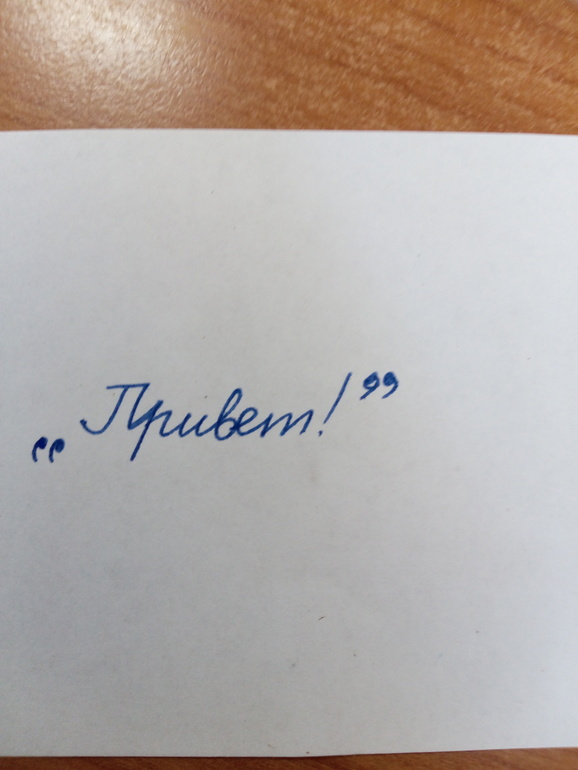
Так?
П.с. учитель сказала, что наоборот. Первый кавычки должны смотреть влево, а вторые — вправо. То есть надо местами кавычки поменять.
Лучший ответ

![]()
Снежная Королева, это ж зависит от начала/конца предложения. Как и знаки препинания. Вопросительный и восклицательный внутри кавычек всегда, а точка не всегда.

а я просто палки ставлю


Ну да, я именно так их и пишу. Как ТС написала у меня с первого раза не получится)
А по-моему, нижние кавычки должны быть такие же, как и верхние (в ту же сторону). Если, конечно, правила правописания за эти годы не поменяли…

По сути, у вас на фото правильно-первые открывают, вторые закрывают.
Но я всегда писала, как две классических запятых (в одну сторону) или две черточки. Никто и никогда не поправлял. Дочь также пишет, никаких проблем.

Мне повезло. Мы, как печатная машинка, сверху ставили, и не снижали.
Как интересно)) Я пишу «кавычки» буквально как напечатано, те по 2 чёрточки сверху. Хотя почерк у меня весьма альтернативный из смеси печатных и прописных букв и для проверки как правильно писать вообще не подходит)))
Придётся ждать когда по программе дочь дойдёт до кавычек и выяснять как правильно.

Я сейчас попробовала написать памятью рук, и написала в точности наоборот от ваших.


Учитель сказала, что не так, а наоборот кавычки местами поменять.
смотри как интересно
у тебя написаны английские двойные кавычки -так учили нас
те кого учили позже пишут немецкие
погугли

Я пишу по-другому первые кавычки. Внизу, но в дркгую сторону, как сверху

Оставшиеся комментарии доступны после регистрации
Зарегистрируйтесь и получите полный доступ ко всем функциям сайта.
Письмовник
В чем разница между кавычками разного рисунка?
Техническое оформление текста
Кавычки – парный выделительный знак препинания. Ими отмечают левую и правую границы слова или отрезка текста; таким образом, кавычки могут быть открывающими и закрывающими, при этом открывающие и закрывающие кавычки, как правило, различаются по рисунку.
В русском письме наиболее употребительны следующие типы кавычек:
Маленькая техническая хитрость. В любом тексте, набираемом на компьютере, можно самостоятельно расставлять «елочки». Для этого надо запомнить следующие комбинации клавиш: нажимаем Alt, набираем 0171, отпускаем Alt – получаем «. Нажимаем Alt, набираем 0187, отпускаем Alt – получаем ».
В других языках могут употребляться кавычки иного начертания. Подробно и интересно об этом написано в «Википедии».
О кавычках внутри кавычек
Если внутри слов, заключенных в кавычки, встречаются другие слова, в свою очередь заключенные в кавычки, рекомендуется (при условии, что для этого есть технические возможности) использовать кавычки разного рисунка: внешние – «елочки», внутренние – „лапки ” (или – в текстах, набранных на компьютере, – «компьютерные кавычки») . Если же такой возможности нет, то закрывающие кавычки ставятся только один раз. Кавычки одного рисунка рядом не повторяются. Например:
Предпочтительно: работа В. И. Ленина «О карикатуре на марксизм и об «империалистическом экономизме»», ЗАО «Издательский дом «Комсомольская правда»», ООО «Компания «Металлинвест»».
Допустимо (если нет технической возможности использовать кавычки разного рисунка): работа В. И. Ленина «О карикатуре на марксизм и об «империалистическом экономизме», ЗАО «Издательский дом «Комсомольская правда», ООО «Компания «Металлинвест».
Неправильно: работа В. И. Ленина «О карикатуре на марксизм и об «империалистическом экономизме»», ЗАО «Издательский дом «Комсомольская правда»», ООО «Компания «Металлинвест»».
Двойные кавычки — правила и примеры употребления в русском языке
На случай необходимости вставить в выражение двойные кавычки, в русском языке правила предусматривают две схемы оформления. Постановка символов не станет проблемой при письме, если помнить о принципах расстановки знаков препинания.
Давайте посмотрим, как расставлять кавычки, если пишутся наименования предметов внутри цитат, предложений или других названий.
Как правильно ставить кавычки в тексте
На первый взгляд, кавычки в кавычках ставятся по правилу обычных парных знаков.
Как и круглые или квадратные скобки, верным кажется употребление четного числа вспомогательных средств:
В штабе командир отчитывал дежурного офицера (ответственного за положение дел в подразделении (лейтенант заступил на пост впервые и растерялся при докладе начальнику)).
Федор промолвил: «Наш отряд называется «Орлята»».
Но если по техническим причинам каждая скобка должна быть в паре, то кавычки в названиях и повествованиях в конце предложения являются общими к обоим открывающим аналогам в начале:
ООО «Страховая фирма «Серебряный заслон».
Диктор вещал: «На площади города вручает сувениры общество «Магия».
Связано это с избавлением предложения и текста от перегрузки знаками – идущие подряд однотипные кавычки выглядят некорректно. Общая пунктуация сохраняется – за последним символом следует точка.
Примеры постановки двойных кавычек в русском языке
Однако соблюдение условия парности допустимо: печатные знаки во втором случае ставятся по два. Здесь правило предполагает разные варианты кавычек.
Например, «елочки» могут содержать слово или выражение, заключенное в „лапки‟:
Недавно составлен отчет «Влияние внешних факторов на работу детектора „Медведь‟».
Внутренние знаки могут быть „нижними и верхними‟:
Формирование «Специальный легион „Империя“» начинает выдвижение на позиции.
Или “прямые однородные”:
Радист доложил командиру: «Связь по каналу “Ловец 343” успешно установлена».
Правило «елочек» неизменно: они всегда выступают как внешние боковые средства выделения. “Лапки” размещаются внутри и выделяют внутреннее сочетание.
Пунктуация преподносит носителям русского языка два принципа размещения кавычек в кавычках.
В зависимости от ситуации можно выделить все специальные знаки в пару либо выставить закрывающий символ в конец предложения и сделать его общим для двух открывающих средств.
Правописание кавычек в русском языке 2 класс
Он отвернулся и, отходя, пробормотал: «А всё-таки это совершенно против правил» (Лермонтов).
Наконец я ей сказал: «Хочешь, пойдём прогуляться на вал?» (Лермонтов).
Она взглянула и вскрикнула: «Это Казбич!» (Лермонтов).
«А что Казбич?» — спросил я нетерпеливо у штабс-капитана (Лермонтов). или:
— А что Казбич? — спросил я нетерпеливо у штабс-капитана.
«Как это скучно!» — воскликнул я невольно (Лермонтов). или:
— Как это скучно! — воскликнул я невольно.
«Умерла…» — эхом откликнулась Аксинья (Шолохов). или:
— Умерла. — эхом откликнулась Аксинья.
«Вон окружной атаман», — шепнул Пантелей Прокофьевич, толкая сзади Григория (Шолохов). или:
— Вон окружной атаман, — шепнул Пантелей Прокофьевич, толкая сзади Григория.
перед словами автора знак вопросительный, или знак восклицательный, или многоточие в соответствии с характером первой части прямой речи, или запятая (если ни один из указанных знаков не требуется), а после них тире;
после слов автора — точка, если первая часть прямой речи представляет собой законченное предложение, и запятая — если незаконченное, далее ставится тире; если при этом прямая речь выделяется кавычками , то они ставятся только перед началом прямой речи и в самом конце её, например:
— Не хотите ли подбавить рому? — сказал я моему собеседнику. — У меня есть белый из Тифлиса; теперь холодно (Лермонтов).
— Ну, полно, полно! — сказал Печорин, обняв его дружески. — Неужели я не тот же? (Лермонтов).
— Выслушайте меня. — сказала Надя, — когда-нибудь до конца (Чехов).
— Меня зовут Фомой, — отвечал он, — а по прозвищу Бирюк (Тургенев).
— Дождь пойдёт, — возразил Калиныч, — утки вон плещутся, да и трава больно сильно пахнет (Тургенев).
Примечание 1. Если в словах автора заключаются два глагола со значением высказывания, из которых один относится к первой части прямой речи, а другой ко второй, то после слов автора ставится двоеточие и тире , например:
— Идём, холодно, — сказал Макаров и угрюмо спросил: — Что молчишь? (М. Горький).
Примечание 2. Правила, изложенные в данном параграфе, относятся также к предложениям, содержащим цитаты с указаниями, кому они принадлежат.
Примечание 3. Внутренний монолог («мысленная речь»), имеющий форму прямой речи, также заключается в кавычки .
источники:
http://nauka.club/russkiy-yazyk/punktuatsiya/dvoynye-kavychki.html
http://therules.ru/?%D0%BA%D0%B0%D0%B2%D1%8B%D1%87%D0%BA%D0%B8