Капс
(англ.
Caps
, сокращение от
Capital Letters
— заглавные буквы[1]) на компьютерном жаргоне – написание текста сообщения большими заглавными буквами.
Название происходит от клавиши ⇪ Caps Lock
на компьютерной клавиатуре, при нажатии на которую включается режим печатания больших букв.
Текст, написанный капсом
, часто используют, чтобы привлечь больше внимания. Письменное сообщение, написанное большими буквами, обычно используется как текстовый эквивалент крику или устному разговору на повышенных тонах. Многие используют Caps (капсят) для рекламы, самопиара, при конфликтах и выяснении отношений. На большинстве сайтов и форумов правила запрещают или ограничивают написание сообщений капсом, поскольку это воспринимается как неуважение к собеседникам.
В сетевом общении КАПС иногда используется для обозначения ударЕ
ния.
Примеры
Соковня-стайл. Соковня.
Эксперт: Ирина Соковня дОБРЫЙ ДЕНЬ! нЕТ, ДОКТОР НИКОГО НЕ БУДЕТ НИ О ЧЕМ ОПОВЕЩАТЬ, ЕСЛИ вАШ ПАРТНЕР НЕ ЗАРАЗИЛ вАС КАКОЙ-НИБУДЬ НЕХОРОШЕЙ БОЛЕЗНЬЮ. СОКОВНЯ
сОКОВНЯ
ICQ: xxx: ПРИВЕТ, КАК ДЕЛА????? Я К ТЕБЕ С ВОПРОСОМ, БУКВЫ МАЛЕНЬКИЕ В КОНТЕ СТАЛИ, ЧЁ СДЕЛАТЬ???
Башорг, тысячи их.
Грабля: АКЦИЯ! В КАЖДОМ ПАКЕТИКЕ СВЕТЛОЙ КРАСКИ ДЛЯ ВОЛОС КНОПКА CAPSLOCK В ПОДАРОК!!!!!!!
190840
<��Мариша> ВСЕМ ПРИВЕТ!!!!!!!!!!!!!!!!!! нажми на кнопку Caps Lock <��Мариша> О, СПАСИБО!!! ТАК СТАЛО НАМНОГО УДОБНЕЕ!!!!! бля!
233375
Josh: ВОПРОС КО ВСЕМ!!! SecureXeC: она находится сразу над левым шифтом
398188
ГламуРрКа: ПрИвЕтИк ATM: Чё надо? ГламуРрКа: Ты ЧиВо ТаКаЯ БукА? =))) ATM: Иди нахуй ГламуРрКа: ЧеГоО?!?!?! ATM: ИдИ НаХуЙ
Small: А ОбЯзаТельНо ВотТ Так вот ПиСАть? XTR1maL: а ЧтО Не УдОбНо ЧитАтЬ? Small: да не, просто такое ощущение что буквы выебываюца
xxx: хорош писать капсом yyy: Я НЕ ПИШУ КАПСОМ yyy: Я ПИШУ С ЗАЖАТЫМ ШИФТОМ ТАК БОЛЬШЕ ЯРОСТИ!!!!111
а почему ты пишешь в капсе? <��Машко> ЧТОБЫ КАЗАТЬСЯ ЗНАЧИТЕЛЬНЕЕ
Смысл
Клавиатура служит не только для набора текста в процессе общения или иной переписки, но и для управления компьютером или иным цифровым устройством. К слову, изначально, до изобретения компьютерной мыши, все команды вбивались непосредственно с клавиатуры. И даже относительно недавно, на заре всеобщей компьютеризации, находились ретрограды, которые принципиально отказывались от использования мыши.
И один из режимов работы клавиатуры – это Caps Loock. Что такое «Капс»? Все очень просто. Активируется он соответствующей клавишей и приводит к тому, что все набираемые буквы будут отображаться в заглавном виде. А остальные клавиши переключатся на написание альтернативных символов. Но зачем это нужно, и кому вообще может понадобиться писать одними заглавными буквами?

Пригодиться это может тогда, когда необходимо ввести длинное слово или несколько слов, чтобы они обязательно отображались заглавными, «большими» символами. Также подобная функция часто требуется при программировании или иной системной работы ведь на многие клавиши привязаны альтернативные символы, которые активируются именно таким образом. Так что теперь мы знаем, что такое «Капс».
Суть
| Слыш! Ты регистр на меня не повышай!! |
| — На одном форуме |
| Военно-морские силы США откажутся от использования исключительно прописных букв в своих приказах и сообщениях, передает The Wall Street Journal. Причиной изменений в правилах называется тот факт, что молодые моряки воспринимают большие буквы как крик. |
| — lenta.ru |
Огромное количество лулзов про сабж связано с тем, что с развитием доступного интернета превалирующими типажами пользователей всевозможных чатов, форумов и блогов стали являться быдло, гламурные кисо и прочие некошерные персонажи с повышенным ЧСВ.
Вариант первый
В случае когда желание выделиться из толпы обратно пропорционально количеству головного моска, а также при справедливом подозрении, что содержание текста не привлечёт внимания, некошерные персонажи начинают использовать самые уёбищные из доступных им методов, такие как:
Особо содрогаются при виде сабжа бывшие фидошники, привыкшие к порядку. Ибо в их фиде капс означает громкий крик. По мере ассимиляции в интернетах им, всё же, становится пох и это. Но тем не менее.
Исходя из этого — использование CAPSLOCK’а зачастую является лишь одной из составляющих быдловыделения. У большинства поциентов это со временем лечится, но не всегда. Быдлонаписание является одним из признаков ФГМ.
Вариант второй
Суть второго варианта заключается в данной фразе — «ПОТОМУ ЧТО МНЕ ТАК НРАВИТЬСЯ!!!)))))» (как правило, с мягким знаком в слове «нравитЬся» и обязательно с наличием одного или более восклицательных знаков в конце предложения). Показатель развитого ФГМ (см. пример). Неотложная помощь — курс лечебных ударов клавиатурой по ебалу. Более подробное раскрытие темы.
Вариант третий
Как известно, многие вполне нормальные программисты создают такие ИдентификаторыВСвоихХорошоЧитаемыхИсходниках. Ну или вот_такие_идентификаторы. И даже ТАКИЕ_ИДЕНТИФИКАТОРЫ_КОНСТАНТ. Связано это с тем, что пробел не может входить в идентификатор, так как является разделителем слов. А если необходимо создать объект «левый глаз Васи Пупкина», то называть его приходится именно как ЛевыйГлазВасиПупкина или левый_глаз_Васи_Пупкина.
У программистов такую манеру написания переняли кулхацкеры (уже с намёком на ЧСВ), а у последних прочие вышеописанные личности.
Вариант четвёртый
Когда-то давно, ещё в этом нашем Фидо, считалось, что текст, набранный с CAPSLOCK’ом, означает крик. Такой крик CapsLock’ом часто встречался в постах разнообразных бокланов, отстаивавших какую-нибудь свою бокланскую хуету типа «БЕЙ ЖИДОВ!!!». Соответственно, стандартная реакция на CAPSLOCK — «Не кричи».
То, что выглядит, как нажатый и забытый cAPSLOCK — тоже не просто так. Логика, если это слово здесь уместно, такая: написание с большой буквы означает уважение, ergo написание с маленькой буквы — неуважение, а написание вОТ тАК — лютая ненависть. Впрочем, как правило, это означает то же, что и просто злоупотребление CapsLock’овой экспрессией: что автор текста — боклан.
И ещё: в plain text (в том же фидо) _прочерки_между_словами_вместо_пробелов_ означают просто-напросто подчёркивание текста.
Расовая теория имени Мицгола
Наличие печатания капслоком у девушек/женщин — признак арийского происхождения. Следовательно, если девушка вам пишет заглавными буквами, то она точно светловолосая арийка и ни в коем случае не является ЕРЖ.
Международный день капслока
22/10/2010 Thepiratebay информируе:
TODAY IS INTERNATIONAL CAPSLOCK DAY GO AHEAD, HIT THAT BUTTON. IT’S OK.
А вот и самопровозглашённая официальная домашняя страница Дня капслока.
Как стать хранителем в Аватарии?
Вы наверно часто встречали аватаров в белой одежде с «крыльями» и задавались кто же это, и как получить это костюм, ведь его нет в гардеробе. Для начала вам надо иметь 15 уровень-это обязательно! А далее, нужно обращать внимание на имена, события и поведения игроков. Если в именах и событиях встречаются какие-либо нарушения надо отправить жалобу. Подавать жалобу на события которые рекламируют или раздают золото, и VIP бесплатно. Это обман! За каждую жалобу Вы получаете +3 балла, а надо набрать 550. Но к сожалению данный костюм не даёт имиджа
Что такое Свадебные кошельки?
Наверно вы часто слышали от аватаров про какие-то кошельки. Что же это такое? Как вы узнали ранее, в Аватарии модно жениться. Создав такое замечательное событие к вам приходят гости и дарят вам маленький, средний или большой подарок. Так это и есть свадебные кошельки. Совсем недавно в Аватарии вышло обновление, теперь эти подарки можно дарить и обменивать с друзьями. Иногда, на стримах в Аватарии дают промокоды в которых даётся как раз этот кошелёк
ИНТЕРЕСНЫЕ ФАКТЫ
- 22 октября весь мир отмечает день этой клавиши. Его придумал житель штата Айова Дерек Арнольд как шутку над своими друзьями, которые постоянно писали ему строчными буквами. Отмечать день можно разными путями – объявить амнистию пользователям, которые пишут Caps Lock, отказаться от этой функции либо целый день ею пользоваться.
- В некоторых азиатских языках нет разделения по регистру букв. Поэтому на их клавиатурах эта клавиша может отсутствовать – она им без надобности.
- Некоторое время существовало движение против использования заглушки регистра. У них был свой сайт, но на момент написания статьи он уже не работал.
Что значит CAPS LOCK?
Для начала необходимо разобраться с дословным переводом на русский язык, а именно — фиксация прописных букв. Это действительно очень комфортный инструмент, особенно при нужде написания одной, некоторое количество букв или же полноценного текста большими символами. На стандартной же клавиатуре ее можно заметить в доступном месте: середина левой части основной стороны оборудования. Возможно найти между клавишами, как «A» (латинская раскладка), «Tab» и «shift». Перейти из одного положения в другое осуществляется с помощью однократного нажатия.
Что касается современных технологий, так эта кнопка (в том числе, и на андроид) создана непосредственно для фиксирования верхнего регистра. Изначально же, она не могла осуществлять работоспособность как отдельная клавиша. Так что раньше же необходимо было удерживать специальный переключатель для того, чтобы текст можно создавать при помощи заглавных букв. Как можно заметить, на сегодняшний же день стало все гораздо проще.
Отключить можно также аналогичным действием — за счет одного нажатия на «capslock». Говоря о знаках препинания и цифрах, стоит упомянуть их не измененную форму в любой сложившейся ситуации. То есть, при удержании соответствующей кнопки или же с ее отсутствием, все равно названные символы будут вводиться стандартным образом.
Индикатор представляется в виде желтого или зеленого цвета. Обычное месторасположения находится на определенной площадке, свободной от других инструментов. Кроме этого, в некоторых изобретениях можно заметить размещение непосредственно под самим «capslock». При этом устанавливается специально предназначенное прозрачное окно. Иногда же функцией выделяется «переключение раскладки», однако, в редких обстоятельствах.
Цифровая эпоха
В наше время компьютерные и смежные технологии развиваются невероятно быстро. То, что еще несколько лет назад казалось фантастикой, сейчас воплощается в жизнь. Яркий тому пример – виртуальная реальность. Современные компьютеры очень сильно отличаются от своих «предков». Сейчас это универсальное устройство работы или развлечения, без которого многие люди попросту не мыслят своей жизни.

Но так было не всегда, и более старшее поколение помнит времена, когда компьютеры могли позволить себе далеко не все. Но если проследить «родословную» подобных устройств, то сразу станет заметно – в отличие от остального оборудования, именно клавиатура изменилась совсем незначительно. Разве что на ней появились некоторые дополнительные клавиши, к примеру, такие, как Caps Loock, в простонародье именуемый «Капсом». Так что такое «Капс» и для чего он нужен? Об этом мы и поговорим.
From Wikipedia, the free encyclopedia
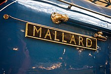
The name of the railway engine Mallard, set in all capital letters.
In typography, all caps (short for «all capitals«) refers to text or a font in which all letters are capital letters, for example: «THIS TEXT IS IN ALL CAPS». All caps may be used for emphasis (for a word or phrase). They are commonly seen in legal documents, the titles on book covers, in advertisements and in newspaper headlines. Short strings of words in capital letters appear bolder and «louder» than mixed case, and this is sometimes referred to as «screaming» or «shouting».[1] All caps can also be used to indicate that a given word is an acronym.
Studies have been conducted on the readability and legibility of all caps text. Scientific testing from the 20th century onward has generally indicated that all caps text is less legible and readable than lower-case text.[2][3] In addition, switching to all caps may make text appear hectoring and obnoxious for cultural reasons, since all-capitals is often used in transcribed speech to indicate that the speaker is shouting.[4] All-caps text is common in comic books, as well as on older teleprinter and radio transmission systems, which often do not indicate letter case at all.[5][6]
In professional documents, a commonly preferred alternative to all caps text is the use of small caps to emphasise key names or acronyms (for example, Text in Small Caps), or the use of italics or (more rarely) bold.[7] In addition, if all caps must be used it is customary to slightly widen the spacing between the letters, by around 10 per cent of the point height. This practice is known as tracking or letterspacing.[8] Some digital fonts contain alternative spacing metrics for this purpose.[9]
Association with shouting or yelling [edit]
Messages typed completely in capital letters are often equated on social media to shouting and other impolite or argumentative behaviors.[10] This became a mainstream interpretation with the advent of networked computers, from the 1980s onward. However, a similar interpretation was already evidenced by written sources that predated the computing era, in some cases by at least a century, and the textual display of shouting or emphasis was still not a settled matter by 1984. The following sources may be relevant to the history of all caps:[11]
-
- The 17 April 1856 edition of the Yorkville Enquirer (South Carolina) uses the expression «This time he shouted it out in capital letters.»
- The 1880 book The Standard speaker and elocutionist has a section titled «SHOUTING STYLE», which states that «This will be seldom needed throughout an entire piece, but wherever the words imply calling, or commanding, it will be in keeping with the words to employ it. As examples note the following selections marked in CAPITAL letters as the appropriate place for shouting emphasis.» A large number of literature examples are then given where all caps has been used to represent shouting.
- The 6 September 1958 edition of Bookseller: The Organ of the Book Trade describes writing in lower-case «rather than shouting with all caps. The effect is pleasing to anybody in a contemplative mood.»
- A 2014 article on netiquette (online etiquette) in New Republic, titled «How Capital Letters Became Internet Code for Yelling»,[12] states that:
-
- According to Professor Paul Luna (of the University of Reading’s department of typography and graphic communication), all caps has been used «to convey grandeur, pomposity, or aesthetic seriousness for thousands of years», and for many years to express anger or shouting in print. Examples are cited such as pianist Philippa Schuyler’s 1940s biography titled «Composition in Black and White», which used all-caps to «yell», and Robert Moses, who in the 1970s used all caps to «convey rage» at a draft of a book.
- Online newsgroups and bulletin board posts from around 1984 show that a user still needed to explain that «if it’s in caps i’m trying to YELL»,[13] or that «Capitalizing whole words gives the impression that you’re shouting».[14] Another summed up that there seemed to be a developing consensus that emphasis was given to words via all caps, or by surrounding them with asterisks.[14]
Usage[edit]

Print media[edit]
Before the development of lower-case letters in the 8th century, texts in the Latin alphabet were written in a single case, which is now considered to be capital letters. Text in all caps is not widely used in body copy. The major exception to this is the so-called fine print in legal documents.
Capital letters have been widely used in printed headlines from the early days of newspapers until the 1950s. In the 1990s, more than three-quarters of newspapers in the western world used lower-case letters in headline text. Discussion regarding the use of all caps for headlines centers on the greater emphasis offered by all caps versus the greater legibility offered by lower-case letters.[2] Colin Wheildon conducted a scientific study with 224 readers who analyzed various headline styles and concluded that «Headlines set in capital letters are significantly less legible than those set in lower case.»[15]
Computing[edit]
All caps typography was common on teletype machines, such as those used by police departments, news, and the United States’ then-called Weather Bureau, as well as early computers, such as certain early Apple II models and the ZX81, which had a limited support for lower-case text. This changed as full support of ASCII became standard, allowing lower-case characters.
Some Soviet computers, such as Radio-86RK, Vector-06C, Agat-7, use 7-bit encoding called KOI-7N2, where capital Cyrillic letters replace lower-case Latin letters in the ASCII table, so can display both alphabets, but all caps only. Mikrosha is switchable to KOI-7N1, in this mode, it can display both caps and lower-case, but in Cyrillic only. Other Soviet computers, such as BK0010, MK 85, Corvette and Agat-9, use 8-bit encoding called KOI-8R, they can display both Cyrillic and Latin in caps and lower-case.
Many, but not all NES games use all caps because of tile graphics, where charset and tiles share the same ROM. Game designers often choose to have less characters in favor of more tiles.
With the advent of the bulletin board system, or BBS, and later the Internet, typing messages in all caps commonly became closely identified with «shouting» or attention-seeking behavior, and may be considered rude. Its equivalence to shouting traces back to at least 1984 and before the Internet, back to printed typography usage of all capitals to mean shouting.[16]
For this reason, etiquette generally discourages the use of all caps when posting messages online. While all caps can be used as an alternative to rich-text «bolding» for a single word or phrase, to express emphasis, repeated use of all caps can be considered «shouting» or irritating.[17]
Some aspects of Microsoft’s Metro design language involves the use of all caps headings and titles. This has received particular attention when menu and ribbon titles appeared in all caps in Visual Studio 2012 and Office 2013, respectively. Critics have compared this to a computer program shouting at its user. Information technology journalist Lee Hutchinson described Microsoft’s using the practice as «LITERALLY TERRIBLE … [it] doesn’t so much violate OS X’s design conventions as it does take them out behind the shed, pour gasoline on them, and set them on fire.»[18]
In programming, writing in all caps (possibly with underscores replacing spaces) is an identifier naming convention in many programming languages that symbolizes that the given identifier represents a constant.
Surnames[edit]
A practice exists (most commonly in Francophone countries)[19] of distinguishing the surname from the rest of a personal name by stylizing the surname only in all caps. This practice is also common among Japanese, when names are spelled using Roman letters.[citation needed]
Military communication[edit]
In April 2013, the U.S. Navy moved away from an all caps-based messaging system, which was begun with 1850s-era teleprinters that had only uppercase letters.[20] The switch to mixed-case communications was estimated to save the Navy $20 million a year and is compliant with current Internet protocol.[20]
Contract law[edit]
An antiquated practice that still remains in use, especially by older American lawyers who grew up before the arrival of computers, is to use all caps text for text that is legally required to be emphasised and clearly readable.[21] The practice dates to the period of typewriters, which generally did not offer bold text, small capitals, or the opportunity to add marginal notes emphasising key points.
Legal writing expert Bryan A. Garner has described the practice as «ghastly».[22] A 2020 study found that all-caps in legal texts is ineffective and is, in fact, harmful to older readers.[23] In 2002, a US court spoke out against the practice, ruling that simply making text all-capitals has no bearing on whether it is clear and easily readable:
Lawyers who think their caps lock keys are instant «make conspicuous» buttons are deluded. In determining whether a term is conspicuous, we look at more than formatting. A term that appears in capitals can still be inconspicuous if it is hidden on the back of a contract in small type. Terms that are in capitals but also appear in hard-to-read type may flunk the conspicuousness test. A sentence in capitals, buried deep within a long paragraph in capitals will probably not be deemed conspicuous…it is entirely possible for text to be conspicuous without being in capitals.[24]
Readability[edit]
Miles Tinker, renowned for his landmark work, Legibility of Print, performed scientific studies on the legibility and readability of all-capital print. His findings were as follows:
All-capital print greatly retards speed of reading in comparison with lower-case type. Also, most readers judge all capitals to be less legible. Faster reading of the lower-case print is due to the characteristic word forms furnished by this type. This permits reading by word units, while all capitals tend to be read letter by letter. Furthermore, since all-capital printing takes at least one-third more space than lower case, more fixation pauses are required for reading the same amount of material. The use of all capitals should be dispensed with in every printing situation.[25]
According to Tinker, «As early as 1914, Starch reported that material set in Roman lower case was read somewhat faster than similar material printed in all capitals.»[26] Another study in 1928 showed that «all-capital text was read 11.8 percent slower than lower case, or approximately 38 words per minute slower»,[27] and that «nine-tenths of adult readers consider lower case more legible than all capitals».[28]
A 1955 study by Miles Tinker showed that «all-capital text retarded speed of reading from 9.5 to 19.0 percent for the 5 and 10-minute time limits, and 13.9 percent for the whole 20-minute period».[29] Tinker concluded that, «Obviously, all-capital printing slows reading to a marked degree in comparison with Roman lower case.»[28]
Tinker provides the following explanations for why all capital printing is more difficult to read:
Text in all capitals covers about 35 percent more printing surface than the same material set in lower case. This would tend to increase the reading time. When this is combined with the difficulty in reading words in all-capital letters as units, the hindrance to rapid reading becomes marked. In the eye-movement study by Tinker and Patterson, the principal difference in oculomotor patterns between lower case and all capitals was the very large increase in number of fixation pauses for reading the all-capital print.[30]
All caps text should be eliminated from most forms of composition, according to Tinker:
Considering the evidence that all-capital printing retards speed of reading to a striking degree in comparison with lower case and is not liked by readers, it would seem wise to eliminate such printing whenever rapid reading and consumer (reader) views are of importance. Examples of this would include any continuous reading material, posters, bus cards, billboards, magazine advertising copy, headings in books, business forms and records, titles of articles, books and book chapters, and newspaper headlines.[31]
Colin Wheildon stated that there is an «apparent consensus» that lower-case text is more legible, but that some editors continue to use all caps in text regardless. In his studies of all caps in headlines, he states that, «Editors who favor capitals claim that they give greater emphasis. Those who prefer lower case claim their preferences gives greater legibility.» Wheildon, who informs us that «When a person reads a line of type, the eye recognizes letters by the shapes of their upper halves», asserts that recognizing words in all caps «becomes a task instead of a natural process».[32] His conclusions, based on scientific testing in 1982–1990, are: «Headlines set in capital letters are significantly less legible than those set in lower case.»[33]
John Ryder, in the Case for Legibility, stated that «Printing with capital letters can be done sufficiently well to arouse interest and, with short lines, reading at a slowed speed is possible – but in principle too many factors of low legibility are involved.»[34]
Other critics are of the opinion that all caps letters in text are often «too tightly packed against each other».[35]
Ambiguities[edit]
Besides the aforementioned speed of reading, all caps is constitutionally prone to character-based ambiguities.
Namely, the upper-case letters are globally simpler than their lower-case counterpart. For example, they lack ascenders and descenders.
Since they are built from fewer positional and building elements (e.g. a smaller grid pertaining to minimalist digital fonts), they are more fragile to small changes.
These variations, generally involuntary but sometimes induced on purpose, are caused by a misinterpretation (the information is transferred) or by a deterioration (the data is lost, in the analysis wording). They can occur horizontally and/or vertically, while misreading (without this extra effort or time), or during a delicate scanning of characters (from a damaged image that needs further contextual text correction).
Depending on the typeface, these similarities accidentally create various duplicates (even quite briefly and without realizing it when reading).
E.g. H/A, F/E or I/T by adding a bar; P/R, O/Q, even C/G from similar errors; V/U, D/O, even B/S while rounding the shape; and more deformations implying mixings.
Adding digits in all caps styled texts may multiply these confusions, which is one aim of Leet (intentional pseudo duplicates) and can provide simple means of concealing messages (often numbers).
See also[edit]
- Caps Lock
- Camel case
- Letter case
- Roman square capitals
- Shift key
- Small caps
- Unicase
- Uncial script
References[edit]
- ^ Ilene Strizver (2011). «ALL CAPS: To set or not to set?». Fonts.com. Monotype Imaging. Retrieved 21 June 2011.; Cohen, Noam (4 February 2008). «Is Obama a Mac and Clinton a PC?». The New York Times. Retrieved 29 January 2011.
Jason Santa Maria, creative director of Happy Cog Studios, which designs Web sites, detected a basic breach of netiquette. ‘Hillary’s text is all caps, like shouting,’ he said.
- ^ a b Wheildon, Colin (1995). Type and Layout: How Typography and Design Can Get your Message Across – Or Get in the Way. Berkeley: Strathmoor Press. p. 62. ISBN 0-9624891-5-8.
- ^ Nielsen, Jakob. «Weblog Usability: The Top Ten Design Mistakes». Nielsen Norman Group. Retrieved 29 July 2015.
- ^ Butterick, Matthew. «All Caps». Practical Typography.
- ^ «Why are military messages in all capitals?». Alternatewars.com. Retrieved 22 January 2013.
- ^ «Sprite Comics Tutorial». Tabmok99.mortalkombatonline.com. 10 December 2004. Retrieved 22 January 2013.
- ^ Butterick, Matthew. «Small caps». Practical Typography. Retrieved 29 July 2015.
- ^ Butterick, Matthew. «Letterspacing». Practical Typography. Retrieved 29 July 2015.
- ^ Lupton, Ellen. «Kerning». Thinking With Type. Retrieved 29 July 2015.
- ^ Willingham, AJ (23 July 2018). «Why typing in all-caps looks like you’re yelling (A brief history)». CNN. Retrieved 6 May 2020.
- ^ «When did people decide that all caps means the writer is shouting?». Stack Exchange. 26 October 2017.
- ^ Robb, Alice (17 April 2014). «How Capital Letters Became Internet Code for Yelling». The New Republic. Retrieved 6 March 2018.
- ^ «Google Groups». groups.google.com. Retrieved 6 March 2018.
- ^ a b «Google Groups». groups.google.com. Retrieved 6 March 2018.
- ^ Wheildon, Colin (1995). Type and Layout: How Typography and Design Can Get your Message Across – Or Get in the Way. Berkeley: Strathmoor Press. pp. 65, 74. ISBN 0-9624891-5-8.
- ^ Robb, Alice (17 April 2014). «How Capital Letters Became Internet Code for Yelling». The New Republic. Retrieved 18 April 2014.
- ^ Matyszczyk, Chris (1 September 2009). «Woman fired for e-mails in all caps». CNET. Retrieved 17 April 2018.
- ^ Hutchinson, Lee (12 July 2014). «The software design trends that we love to hate». Ars Technica. Conde Nast. Retrieved 29 July 2015.
- ^ Laura K. Lawless (2010). «Capitalization of French Titles and Names». About.com. The New York Times Company. Retrieved 9 July 2010.
- ^ a b Payne, Ed, «U.S. Navy adjusts to the times; ditches its ALL CAPS message format» (Archived 13 June 2013 at the Wayback Machine), The Washington Post, 13 June 2013.
- ^ «Why is your Contract YELLING AT YOU? All Caps in Contracts, Explained». Shake Law. Retrieved 29 July 2015.
- ^ Garner, Bryan A. (2013). Legal writing in plain English: a text with exercises (Second ed.). University of Chicago Press. ISBN 978-0226283937. Retrieved 2 August 2015.
- ^ Arbel, Yonathan A.; Toler, Andrew (2020). «All-Caps». Journal of Empirical Legal Studies. 17 (4): 862–896. doi:10.1111/jels.12272. ISSN 1740-1461. S2CID 240784123.
- ^ Kozinsky, Alex (2002). In Re: Darlene M. Bassett. San Francisco: United States Court of Appeals, Ninth Circuit.
- ^ Tinker, Miles A. (1963). Legibility of Print. Ames, Iowa: Iowa State University Press. p. 65. ASIN B000I52NNE.
- ^ D. Starch, Advertising, 1914, Chicago: Scott, Foresman, quoted in Miles Tinker, Bases for Effective Reading, 1965, Minneapolis, Lund Press. p. 136.
- ^ Tinker, M.A.; Paterson, D.G. (1928). «Influence of Type Form on Speed of Reading». Journal of Applied Psychology. 12 (4): 359–368. doi:10.1037/h0073699.. Quoted in Miles Tinker, Bases for Effective Reading, 1965, Minneapolis, Lund Press. p. 136.
- ^ a b Miles Tinker, Bases for Effective Reading, 1965, Minneapolis, Lund Press. p. 136.
- ^ M.A. Tinker, «The Effect of Slanted Text upon the Readability of Print.» 1954, Journal of Educational Psychology, Vol. 45, 287–291, quoted in Miles Tinker, Bases for Effective Reading, 1965, Minneapolis, Lund Press. p. 136.
- ^ M. A. Tinker and D.G. Paterson, «Studies of Typographical Factors Influencing Speed of Reading: IX. Reduction in Size of Newspaper Print,» 1932, Journal of Applied Psychology, Vol. 16, 525–531, quoted in Miles Tinker, Bases for Effective Reading, 1965, Minneapolis, Lund Press. p. 137.
- ^ M.A. Tinker and D.G. Paterson, «Readability of Mixed Type Forms,» 1946, Journal of Applied Psychology, Vol. 30, 631–637, quoted in Miles Tinker, Bases for Effective Reading, 1965, Minneapolis, Lund Press. p. 138.
- ^ Wheildon, Colin (1995). Type and Layout: How Typography and Design Can Get your Message Across – Or Get in the Way. Berkeley: Strathmoor Press. pp. 62–64. ISBN 0-9624891-5-8.
- ^ Wheildon, Colin (1995). Type and Layout: How Typography and Design Can Get your Message Across – Or Get in the Way. Berkeley: Strathmoor Press. p. 74. ISBN 0-9624891-5-8.
- ^ Ryder, John (1979). The Case for Legibility. London: Bodley Head. p. 72. ISBN 0-370-30158-7.
- ^ Squire, Victoria; Willberg, Hans Peter; Forsmann, Friedrich (2006). Getting it Right with Type. London: Laurence King Publishing. p. 59. ISBN 978-1-85669-474-2.
External links[edit]
- All caps – Practical Typography
From Wikipedia, the free encyclopedia
The name of the railway engine Mallard, set in all capital letters.
In typography, all caps (short for «all capitals«) refers to text or a font in which all letters are capital letters, for example: «THIS TEXT IS IN ALL CAPS». All caps may be used for emphasis (for a word or phrase). They are commonly seen in legal documents, the titles on book covers, in advertisements and in newspaper headlines. Short strings of words in capital letters appear bolder and «louder» than mixed case, and this is sometimes referred to as «screaming» or «shouting».[1] All caps can also be used to indicate that a given word is an acronym.
Studies have been conducted on the readability and legibility of all caps text. Scientific testing from the 20th century onward has generally indicated that all caps text is less legible and readable than lower-case text.[2][3] In addition, switching to all caps may make text appear hectoring and obnoxious for cultural reasons, since all-capitals is often used in transcribed speech to indicate that the speaker is shouting.[4] All-caps text is common in comic books, as well as on older teleprinter and radio transmission systems, which often do not indicate letter case at all.[5][6]
In professional documents, a commonly preferred alternative to all caps text is the use of small caps to emphasise key names or acronyms (for example, Text in Small Caps), or the use of italics or (more rarely) bold.[7] In addition, if all caps must be used it is customary to slightly widen the spacing between the letters, by around 10 per cent of the point height. This practice is known as tracking or letterspacing.[8] Some digital fonts contain alternative spacing metrics for this purpose.[9]
Association with shouting or yelling [edit]
Messages typed completely in capital letters are often equated on social media to shouting and other impolite or argumentative behaviors.[10] This became a mainstream interpretation with the advent of networked computers, from the 1980s onward. However, a similar interpretation was already evidenced by written sources that predated the computing era, in some cases by at least a century, and the textual display of shouting or emphasis was still not a settled matter by 1984. The following sources may be relevant to the history of all caps:[11]
-
- The 17 April 1856 edition of the Yorkville Enquirer (South Carolina) uses the expression «This time he shouted it out in capital letters.»
- The 1880 book The Standard speaker and elocutionist has a section titled «SHOUTING STYLE», which states that «This will be seldom needed throughout an entire piece, but wherever the words imply calling, or commanding, it will be in keeping with the words to employ it. As examples note the following selections marked in CAPITAL letters as the appropriate place for shouting emphasis.» A large number of literature examples are then given where all caps has been used to represent shouting.
- The 6 September 1958 edition of Bookseller: The Organ of the Book Trade describes writing in lower-case «rather than shouting with all caps. The effect is pleasing to anybody in a contemplative mood.»
- A 2014 article on netiquette (online etiquette) in New Republic, titled «How Capital Letters Became Internet Code for Yelling»,[12] states that:
-
- According to Professor Paul Luna (of the University of Reading’s department of typography and graphic communication), all caps has been used «to convey grandeur, pomposity, or aesthetic seriousness for thousands of years», and for many years to express anger or shouting in print. Examples are cited such as pianist Philippa Schuyler’s 1940s biography titled «Composition in Black and White», which used all-caps to «yell», and Robert Moses, who in the 1970s used all caps to «convey rage» at a draft of a book.
- Online newsgroups and bulletin board posts from around 1984 show that a user still needed to explain that «if it’s in caps i’m trying to YELL»,[13] or that «Capitalizing whole words gives the impression that you’re shouting».[14] Another summed up that there seemed to be a developing consensus that emphasis was given to words via all caps, or by surrounding them with asterisks.[14]
Usage[edit]
Print media[edit]
Before the development of lower-case letters in the 8th century, texts in the Latin alphabet were written in a single case, which is now considered to be capital letters. Text in all caps is not widely used in body copy. The major exception to this is the so-called fine print in legal documents.
Capital letters have been widely used in printed headlines from the early days of newspapers until the 1950s. In the 1990s, more than three-quarters of newspapers in the western world used lower-case letters in headline text. Discussion regarding the use of all caps for headlines centers on the greater emphasis offered by all caps versus the greater legibility offered by lower-case letters.[2] Colin Wheildon conducted a scientific study with 224 readers who analyzed various headline styles and concluded that «Headlines set in capital letters are significantly less legible than those set in lower case.»[15]
Computing[edit]
All caps typography was common on teletype machines, such as those used by police departments, news, and the United States’ then-called Weather Bureau, as well as early computers, such as certain early Apple II models and the ZX81, which had a limited support for lower-case text. This changed as full support of ASCII became standard, allowing lower-case characters.
Some Soviet computers, such as Radio-86RK, Vector-06C, Agat-7, use 7-bit encoding called KOI-7N2, where capital Cyrillic letters replace lower-case Latin letters in the ASCII table, so can display both alphabets, but all caps only. Mikrosha is switchable to KOI-7N1, in this mode, it can display both caps and lower-case, but in Cyrillic only. Other Soviet computers, such as BK0010, MK 85, Corvette and Agat-9, use 8-bit encoding called KOI-8R, they can display both Cyrillic and Latin in caps and lower-case.
Many, but not all NES games use all caps because of tile graphics, where charset and tiles share the same ROM. Game designers often choose to have less characters in favor of more tiles.
With the advent of the bulletin board system, or BBS, and later the Internet, typing messages in all caps commonly became closely identified with «shouting» or attention-seeking behavior, and may be considered rude. Its equivalence to shouting traces back to at least 1984 and before the Internet, back to printed typography usage of all capitals to mean shouting.[16]
For this reason, etiquette generally discourages the use of all caps when posting messages online. While all caps can be used as an alternative to rich-text «bolding» for a single word or phrase, to express emphasis, repeated use of all caps can be considered «shouting» or irritating.[17]
Some aspects of Microsoft’s Metro design language involves the use of all caps headings and titles. This has received particular attention when menu and ribbon titles appeared in all caps in Visual Studio 2012 and Office 2013, respectively. Critics have compared this to a computer program shouting at its user. Information technology journalist Lee Hutchinson described Microsoft’s using the practice as «LITERALLY TERRIBLE … [it] doesn’t so much violate OS X’s design conventions as it does take them out behind the shed, pour gasoline on them, and set them on fire.»[18]
In programming, writing in all caps (possibly with underscores replacing spaces) is an identifier naming convention in many programming languages that symbolizes that the given identifier represents a constant.
Surnames[edit]
A practice exists (most commonly in Francophone countries)[19] of distinguishing the surname from the rest of a personal name by stylizing the surname only in all caps. This practice is also common among Japanese, when names are spelled using Roman letters.[citation needed]
Military communication[edit]
In April 2013, the U.S. Navy moved away from an all caps-based messaging system, which was begun with 1850s-era teleprinters that had only uppercase letters.[20] The switch to mixed-case communications was estimated to save the Navy $20 million a year and is compliant with current Internet protocol.[20]
Contract law[edit]
An antiquated practice that still remains in use, especially by older American lawyers who grew up before the arrival of computers, is to use all caps text for text that is legally required to be emphasised and clearly readable.[21] The practice dates to the period of typewriters, which generally did not offer bold text, small capitals, or the opportunity to add marginal notes emphasising key points.
Legal writing expert Bryan A. Garner has described the practice as «ghastly».[22] A 2020 study found that all-caps in legal texts is ineffective and is, in fact, harmful to older readers.[23] In 2002, a US court spoke out against the practice, ruling that simply making text all-capitals has no bearing on whether it is clear and easily readable:
Lawyers who think their caps lock keys are instant «make conspicuous» buttons are deluded. In determining whether a term is conspicuous, we look at more than formatting. A term that appears in capitals can still be inconspicuous if it is hidden on the back of a contract in small type. Terms that are in capitals but also appear in hard-to-read type may flunk the conspicuousness test. A sentence in capitals, buried deep within a long paragraph in capitals will probably not be deemed conspicuous…it is entirely possible for text to be conspicuous without being in capitals.[24]
Readability[edit]
Miles Tinker, renowned for his landmark work, Legibility of Print, performed scientific studies on the legibility and readability of all-capital print. His findings were as follows:
All-capital print greatly retards speed of reading in comparison with lower-case type. Also, most readers judge all capitals to be less legible. Faster reading of the lower-case print is due to the characteristic word forms furnished by this type. This permits reading by word units, while all capitals tend to be read letter by letter. Furthermore, since all-capital printing takes at least one-third more space than lower case, more fixation pauses are required for reading the same amount of material. The use of all capitals should be dispensed with in every printing situation.[25]
According to Tinker, «As early as 1914, Starch reported that material set in Roman lower case was read somewhat faster than similar material printed in all capitals.»[26] Another study in 1928 showed that «all-capital text was read 11.8 percent slower than lower case, or approximately 38 words per minute slower»,[27] and that «nine-tenths of adult readers consider lower case more legible than all capitals».[28]
A 1955 study by Miles Tinker showed that «all-capital text retarded speed of reading from 9.5 to 19.0 percent for the 5 and 10-minute time limits, and 13.9 percent for the whole 20-minute period».[29] Tinker concluded that, «Obviously, all-capital printing slows reading to a marked degree in comparison with Roman lower case.»[28]
Tinker provides the following explanations for why all capital printing is more difficult to read:
Text in all capitals covers about 35 percent more printing surface than the same material set in lower case. This would tend to increase the reading time. When this is combined with the difficulty in reading words in all-capital letters as units, the hindrance to rapid reading becomes marked. In the eye-movement study by Tinker and Patterson, the principal difference in oculomotor patterns between lower case and all capitals was the very large increase in number of fixation pauses for reading the all-capital print.[30]
All caps text should be eliminated from most forms of composition, according to Tinker:
Considering the evidence that all-capital printing retards speed of reading to a striking degree in comparison with lower case and is not liked by readers, it would seem wise to eliminate such printing whenever rapid reading and consumer (reader) views are of importance. Examples of this would include any continuous reading material, posters, bus cards, billboards, magazine advertising copy, headings in books, business forms and records, titles of articles, books and book chapters, and newspaper headlines.[31]
Colin Wheildon stated that there is an «apparent consensus» that lower-case text is more legible, but that some editors continue to use all caps in text regardless. In his studies of all caps in headlines, he states that, «Editors who favor capitals claim that they give greater emphasis. Those who prefer lower case claim their preferences gives greater legibility.» Wheildon, who informs us that «When a person reads a line of type, the eye recognizes letters by the shapes of their upper halves», asserts that recognizing words in all caps «becomes a task instead of a natural process».[32] His conclusions, based on scientific testing in 1982–1990, are: «Headlines set in capital letters are significantly less legible than those set in lower case.»[33]
John Ryder, in the Case for Legibility, stated that «Printing with capital letters can be done sufficiently well to arouse interest and, with short lines, reading at a slowed speed is possible – but in principle too many factors of low legibility are involved.»[34]
Other critics are of the opinion that all caps letters in text are often «too tightly packed against each other».[35]
Ambiguities[edit]
Besides the aforementioned speed of reading, all caps is constitutionally prone to character-based ambiguities.
Namely, the upper-case letters are globally simpler than their lower-case counterpart. For example, they lack ascenders and descenders.
Since they are built from fewer positional and building elements (e.g. a smaller grid pertaining to minimalist digital fonts), they are more fragile to small changes.
These variations, generally involuntary but sometimes induced on purpose, are caused by a misinterpretation (the information is transferred) or by a deterioration (the data is lost, in the analysis wording). They can occur horizontally and/or vertically, while misreading (without this extra effort or time), or during a delicate scanning of characters (from a damaged image that needs further contextual text correction).
Depending on the typeface, these similarities accidentally create various duplicates (even quite briefly and without realizing it when reading).
E.g. H/A, F/E or I/T by adding a bar; P/R, O/Q, even C/G from similar errors; V/U, D/O, even B/S while rounding the shape; and more deformations implying mixings.
Adding digits in all caps styled texts may multiply these confusions, which is one aim of Leet (intentional pseudo duplicates) and can provide simple means of concealing messages (often numbers).
See also[edit]
- Caps Lock
- Camel case
- Letter case
- Roman square capitals
- Shift key
- Small caps
- Unicase
- Uncial script
References[edit]
- ^ Ilene Strizver (2011). «ALL CAPS: To set or not to set?». Fonts.com. Monotype Imaging. Retrieved 21 June 2011.; Cohen, Noam (4 February 2008). «Is Obama a Mac and Clinton a PC?». The New York Times. Retrieved 29 January 2011.
Jason Santa Maria, creative director of Happy Cog Studios, which designs Web sites, detected a basic breach of netiquette. ‘Hillary’s text is all caps, like shouting,’ he said.
- ^ a b Wheildon, Colin (1995). Type and Layout: How Typography and Design Can Get your Message Across – Or Get in the Way. Berkeley: Strathmoor Press. p. 62. ISBN 0-9624891-5-8.
- ^ Nielsen, Jakob. «Weblog Usability: The Top Ten Design Mistakes». Nielsen Norman Group. Retrieved 29 July 2015.
- ^ Butterick, Matthew. «All Caps». Practical Typography.
- ^ «Why are military messages in all capitals?». Alternatewars.com. Retrieved 22 January 2013.
- ^ «Sprite Comics Tutorial». Tabmok99.mortalkombatonline.com. 10 December 2004. Retrieved 22 January 2013.
- ^ Butterick, Matthew. «Small caps». Practical Typography. Retrieved 29 July 2015.
- ^ Butterick, Matthew. «Letterspacing». Practical Typography. Retrieved 29 July 2015.
- ^ Lupton, Ellen. «Kerning». Thinking With Type. Retrieved 29 July 2015.
- ^ Willingham, AJ (23 July 2018). «Why typing in all-caps looks like you’re yelling (A brief history)». CNN. Retrieved 6 May 2020.
- ^ «When did people decide that all caps means the writer is shouting?». Stack Exchange. 26 October 2017.
- ^ Robb, Alice (17 April 2014). «How Capital Letters Became Internet Code for Yelling». The New Republic. Retrieved 6 March 2018.
- ^ «Google Groups». groups.google.com. Retrieved 6 March 2018.
- ^ a b «Google Groups». groups.google.com. Retrieved 6 March 2018.
- ^ Wheildon, Colin (1995). Type and Layout: How Typography and Design Can Get your Message Across – Or Get in the Way. Berkeley: Strathmoor Press. pp. 65, 74. ISBN 0-9624891-5-8.
- ^ Robb, Alice (17 April 2014). «How Capital Letters Became Internet Code for Yelling». The New Republic. Retrieved 18 April 2014.
- ^ Matyszczyk, Chris (1 September 2009). «Woman fired for e-mails in all caps». CNET. Retrieved 17 April 2018.
- ^ Hutchinson, Lee (12 July 2014). «The software design trends that we love to hate». Ars Technica. Conde Nast. Retrieved 29 July 2015.
- ^ Laura K. Lawless (2010). «Capitalization of French Titles and Names». About.com. The New York Times Company. Retrieved 9 July 2010.
- ^ a b Payne, Ed, «U.S. Navy adjusts to the times; ditches its ALL CAPS message format» (Archived 13 June 2013 at the Wayback Machine), The Washington Post, 13 June 2013.
- ^ «Why is your Contract YELLING AT YOU? All Caps in Contracts, Explained». Shake Law. Retrieved 29 July 2015.
- ^ Garner, Bryan A. (2013). Legal writing in plain English: a text with exercises (Second ed.). University of Chicago Press. ISBN 978-0226283937. Retrieved 2 August 2015.
- ^ Arbel, Yonathan A.; Toler, Andrew (2020). «All-Caps». Journal of Empirical Legal Studies. 17 (4): 862–896. doi:10.1111/jels.12272. ISSN 1740-1461. S2CID 240784123.
- ^ Kozinsky, Alex (2002). In Re: Darlene M. Bassett. San Francisco: United States Court of Appeals, Ninth Circuit.
- ^ Tinker, Miles A. (1963). Legibility of Print. Ames, Iowa: Iowa State University Press. p. 65. ASIN B000I52NNE.
- ^ D. Starch, Advertising, 1914, Chicago: Scott, Foresman, quoted in Miles Tinker, Bases for Effective Reading, 1965, Minneapolis, Lund Press. p. 136.
- ^ Tinker, M.A.; Paterson, D.G. (1928). «Influence of Type Form on Speed of Reading». Journal of Applied Psychology. 12 (4): 359–368. doi:10.1037/h0073699.. Quoted in Miles Tinker, Bases for Effective Reading, 1965, Minneapolis, Lund Press. p. 136.
- ^ a b Miles Tinker, Bases for Effective Reading, 1965, Minneapolis, Lund Press. p. 136.
- ^ M.A. Tinker, «The Effect of Slanted Text upon the Readability of Print.» 1954, Journal of Educational Psychology, Vol. 45, 287–291, quoted in Miles Tinker, Bases for Effective Reading, 1965, Minneapolis, Lund Press. p. 136.
- ^ M. A. Tinker and D.G. Paterson, «Studies of Typographical Factors Influencing Speed of Reading: IX. Reduction in Size of Newspaper Print,» 1932, Journal of Applied Psychology, Vol. 16, 525–531, quoted in Miles Tinker, Bases for Effective Reading, 1965, Minneapolis, Lund Press. p. 137.
- ^ M.A. Tinker and D.G. Paterson, «Readability of Mixed Type Forms,» 1946, Journal of Applied Psychology, Vol. 30, 631–637, quoted in Miles Tinker, Bases for Effective Reading, 1965, Minneapolis, Lund Press. p. 138.
- ^ Wheildon, Colin (1995). Type and Layout: How Typography and Design Can Get your Message Across – Or Get in the Way. Berkeley: Strathmoor Press. pp. 62–64. ISBN 0-9624891-5-8.
- ^ Wheildon, Colin (1995). Type and Layout: How Typography and Design Can Get your Message Across – Or Get in the Way. Berkeley: Strathmoor Press. p. 74. ISBN 0-9624891-5-8.
- ^ Ryder, John (1979). The Case for Legibility. London: Bodley Head. p. 72. ISBN 0-370-30158-7.
- ^ Squire, Victoria; Willberg, Hans Peter; Forsmann, Friedrich (2006). Getting it Right with Type. London: Laurence King Publishing. p. 59. ISBN 978-1-85669-474-2.
External links[edit]
- All caps – Practical Typography
Updated: 01/18/2023 by

Alternatively known as caps and capital, and sometimes abbreviated as UC, uppercase is a typeface of larger characters. For example, typing a, b, and c shows lowercase, and typing A, B, and C shows uppercase. To type in uppercase, you can use either the Caps Lock key or the Shift key on the keyboard.
Tip
It’s bad etiquette to have everything you type in ALL UPPERCASE CHARACTERS. When reading anything typed in all caps, most readers assume you are YELLING or find the text hard to read.
Why is capitalization important?
Passwords
Passwords are case-sensitive to add an extra level of security. If your caps lock key is enabled while creating your password, but not when you log in the next day, you won’t be able to access your account.
File names, directories, and paths
When dealing with file names, directories, and paths in many operating systems and paths, they are case-sensitive. For example, in Microsoft Windows nothing is case-sensitive. However, when uploading a file to the Internet, the files and directories become case-sensitive. For example, the file name of this web page is «uppercase.htm» and must be typed in all lowercase in the URL while online. However, if you were viewing the file locally on a Windows computer, the capitalization would not matter.
Measurements
When dealing with computer measurements and other measurements, capitalization is important for identifying the exact type of measurement. For example, «Mb» (short for megabit) and «MB» (short for megabyte) are two different types of measurements with different values.
Commands
Command line commands in operating systems like Linux are case-sensitive, which means if you typed «Ls» to list file you would get an error since the ls command is all lowercase.
Programming functions
In earlier programming languages like FORTRAN, the keywords and the names of data objects needed to be uppercase because punch card machines did not have a Shift key.
Acronyms
To help differentiate an acronym from other words in a sentence, they are typed in uppercase. For example, the acronym RAM is typed in all uppercase to help identify the word as an acronym.
Using the uc function
Many programming and scripting languages use the uc function to convert a variable into uppercase. For example, in the example below is how the uc and ucfirst functions can be used in Perl.
my $example = "hello world";
print "$examplen";
$example = ucfirst($example);
print "$examplen";
$example = uc($example);
print "$examplen";
In the above example, the $example variable is set to all lowercase. The third line uppercases the first character making the text «Hello world,» and the fifth line uppercases the whole string making the text «HELLO WORLD.»
What is the difference between capitalize and uppercase?
Capitalize is used when you’re describing the first letter of a word or a single letter. For example, the first letter in this sentence is capitalized. Uppercase describes a word with every letter being capitalized. For example, the acronym CPU is in uppercase.
When should I capitalize text?
Below is a list of general rules that should be followed when capitalizing words.
- Always capitalize the first word of a sentence.
- If the word is a proper noun or derived from a proper noun, the first letter should be capitalized. For example, a name, book, brand, movie, place, product, and trademark are proper nouns and should be capitalized.
- Capitalize the first letter of a quote unless it is part of the sentence.
- Roads and streets should be capitalized.
- A person’s title (not occupation) before their name should be capitalized.
Below is a list of times capitalization should not be used.
- Never user uppercase for emphasis. Instead, italicize any text you want to emphasize.
- When writing the full form of an acronym, each word of the acronym should be lowercase unless it is a proper noun.
- Do not capitalize the word the when used before a proper noun.
Should titles and headings be capitalized?
With formal writing, the titles and headings should use title case. All other forms of writing should follow the rules set by the used style guide. For example, Computer Hope follows the Microsoft Manual of Style and uses sentence case for its headings.
Should I use «uppercase» or «upper case» in my writing?
Both «uppercase» and «upper case» are correct. However, only use one form in your writing. According to The Associated Press Stylebook and the Microsoft Manual of Style, write «uppercase» as one word when used as an adjective and as a noun.
Caps lock, Case, Case-sensitive, Character, Computer acronyms, Font, Lowercase, Proper case, Title case, Typography terms, UC Browser
Updated: 01/18/2023 by
Alternatively known as caps and capital, and sometimes abbreviated as UC, uppercase is a typeface of larger characters. For example, typing a, b, and c shows lowercase, and typing A, B, and C shows uppercase. To type in uppercase, you can use either the Caps Lock key or the Shift key on the keyboard.
Tip
It’s bad etiquette to have everything you type in ALL UPPERCASE CHARACTERS. When reading anything typed in all caps, most readers assume you are YELLING or find the text hard to read.
Why is capitalization important?
Passwords
Passwords are case-sensitive to add an extra level of security. If your caps lock key is enabled while creating your password, but not when you log in the next day, you won’t be able to access your account.
File names, directories, and paths
When dealing with file names, directories, and paths in many operating systems and paths, they are case-sensitive. For example, in Microsoft Windows nothing is case-sensitive. However, when uploading a file to the Internet, the files and directories become case-sensitive. For example, the file name of this web page is «uppercase.htm» and must be typed in all lowercase in the URL while online. However, if you were viewing the file locally on a Windows computer, the capitalization would not matter.
Measurements
When dealing with computer measurements and other measurements, capitalization is important for identifying the exact type of measurement. For example, «Mb» (short for megabit) and «MB» (short for megabyte) are two different types of measurements with different values.
Commands
Command line commands in operating systems like Linux are case-sensitive, which means if you typed «Ls» to list file you would get an error since the ls command is all lowercase.
Programming functions
In earlier programming languages like FORTRAN, the keywords and the names of data objects needed to be uppercase because punch card machines did not have a Shift key.
Acronyms
To help differentiate an acronym from other words in a sentence, they are typed in uppercase. For example, the acronym RAM is typed in all uppercase to help identify the word as an acronym.
Using the uc function
Many programming and scripting languages use the uc function to convert a variable into uppercase. For example, in the example below is how the uc and ucfirst functions can be used in Perl.
my $example = "hello world";
print "$examplen";
$example = ucfirst($example);
print "$examplen";
$example = uc($example);
print "$examplen";
In the above example, the $example variable is set to all lowercase. The third line uppercases the first character making the text «Hello world,» and the fifth line uppercases the whole string making the text «HELLO WORLD.»
What is the difference between capitalize and uppercase?
Capitalize is used when you’re describing the first letter of a word or a single letter. For example, the first letter in this sentence is capitalized. Uppercase describes a word with every letter being capitalized. For example, the acronym CPU is in uppercase.
When should I capitalize text?
Below is a list of general rules that should be followed when capitalizing words.
- Always capitalize the first word of a sentence.
- If the word is a proper noun or derived from a proper noun, the first letter should be capitalized. For example, a name, book, brand, movie, place, product, and trademark are proper nouns and should be capitalized.
- Capitalize the first letter of a quote unless it is part of the sentence.
- Roads and streets should be capitalized.
- A person’s title (not occupation) before their name should be capitalized.
Below is a list of times capitalization should not be used.
- Never user uppercase for emphasis. Instead, italicize any text you want to emphasize.
- When writing the full form of an acronym, each word of the acronym should be lowercase unless it is a proper noun.
- Do not capitalize the word the when used before a proper noun.
Should titles and headings be capitalized?
With formal writing, the titles and headings should use title case. All other forms of writing should follow the rules set by the used style guide. For example, Computer Hope follows the Microsoft Manual of Style and uses sentence case for its headings.
Should I use «uppercase» or «upper case» in my writing?
Both «uppercase» and «upper case» are correct. However, only use one form in your writing. According to The Associated Press Stylebook and the Microsoft Manual of Style, write «uppercase» as one word when used as an adjective and as a noun.
Caps lock, Case, Case-sensitive, Character, Computer acronyms, Font, Lowercase, Proper case, Title case, Typography terms, UC Browser
admin Админ. спросил 6 лет назад
1 ответ
admin Админ. ответил 6 лет назад
Большие буквы также называют прописными и заглавными. При этом
академическое название — прописные. Большие — это допустимое и распространённое название. Заглавные — также является допустимым названием, но его использовать не рекомендуется.
То есть подводя краткий итог: Большая буква = Прописная буква = Заглавная буква.
Академическое название маленьких букв — строчные, допустимым является «маленькая».
Таким образом, маленькая буква = строчная буква
Заглавные буквы
- Заглавные буквы
-


Заглавные прописные буквы — буквы, которые увеличены в размере относительно к строчным буквам. Часто они обладают другой графемой.
Во многих языках они используются в начале первого слова предложения, в начале собственных имён или существительных, зачастую в начале каждой строки стихотворного текста. Часто используют заглавные буквы для выделения. Так, например, в заглавиях слова или целые фразы могут состоять только из заглавных букв.
Разделение на заглавные и строчные буквы присутствует в греческом алфавите и возникших на его основе латинице и кириллице, а также в армянском алфавите. Во многих алфавитах (арабский алфавит, еврейский алфавит, грузинский алфавит, корейский алфавит, глаголица, индийские алфавиты, тайский алфавит и многие другие) буквы не разделяют на заглавные и строчные.
См. также
- Маюскул

Wikimedia Foundation.
2010.
Смотреть что такое «Заглавные буквы» в других словарях:
-
заглавные буквы — (Upper Case, Uc) См. Прописные буквы … Шрифтовая терминология
-
Заглавные (прописные) буквы — Буквы, отличающиеся от строчных высотой, а иногда и начертанием. С прописных букв пишут первое слово в предложении, имена собственные и другие слова, в соответствии с орфографией данного языка. Английское название произошло от того, что в… … Краткий толковый словарь по полиграфии
-
Прописные буквы — (заглавные) буквы, отличающиеся от строчных (см. Строчные буквы) высотой, а иногда и начертанием (например, русские «А», «Б», «Г»; латинские G, Q, R). С П. б. пишут первое слово в начале предложения, имена собственные, различные заголовки … Большая советская энциклопедия
-
Прописные буквы — Заглавные буквы большинства алфавитов, отличающиеся от строчных более крупным размером, а также иным начертанием отдельных букв … Краткий толковый словарь по полиграфии
-
прописные буквы — (заглавные), буквы, отличающиеся от строчных высотой, а иногда и начертанием (например, русская «А», «Б», лат. G, Q). С прописной буквы пишут первое слово в предложении, имена собственные и другие слова в соответствии с орфографией данного языка … Энциклопедический словарь
-
УНЦИАЛЬНЫЕ БУКВЫ — (лат., от uncia дюйм). Заглавные буквы, вышиной в дюйм. Словарь иностранных слов, вошедших в состав русского языка. Чудинов А.Н., 1910. УНЦИАЛЬНЫЕ БУКВЫ лат. unciales sc. litterae, от uncia, двенадцатая часть, то есть дюйм. Заглавные буквы,… … Словарь иностранных слов русского языка
-
Строчные буквы — О форме письма строчными буквами см. минускул. Строчные буквы буквы, размер которых меньше прописных. Используются в европейских алфавитах (греческих, латинских, кириллических и армянских). Например, буква „а“ строчная, а буква „А“ заглавная… … Википедия
-
Прописные буквы — Понятие прописные буквы имеет два значения: Прописной буквой называется напечатанный образец буквы для ручного письма, в основном применяемый в прописях специальной тетради для учеников начальной школы. Прописной буквой называется заглавная … Википедия
-
ПРОПИСНЫЕ БУКВЫ — (заглавные) буквы, отличающиеся от строчных высотой, а иногда и начертанием (напр., русские А , Б , латинские G, Q). С прописной буквы пишут первое слово в предложении, имена собственные и другие слова в соответствии с орфографией данного языка … Большой Энциклопедический словарь
-
Латинские буквы — Латинский алфавит Тип: консонантно вокалическое Языки: Первоначально латинский, языки Западной и Центральной Европы, некоторые языки Азии, многие языки Африки, Америки, Австралии и Океании Место возникновения: Италия Территория … Википедия